⟿ model manipulation

"T R A U M A"
..model manipulation.

˓ ִֶָ𓄲 ☁️ BEFORE WE START 𖦹 ࣪˖ ˒
I want to mention right away that any adjustments regarding models can vary from artist to artist, designer to designer. Everyone has their own techniques and personal styles, tho there are still some "unwritten" rules or "basics", which is what I would like to talk about here.
Another disclaimer: I am not going to get into full on detail about how to blend something, re-adjust colors, mix certain layers or whatever else. Stuff like that always depends on what programs or apps you work with, as they all offer different features and may work differently despite having "similar features". And even if you would use the exact same devices and programs as me, there is no guarantee that our works would turn out the exact same.
⛓
˓ ִֶָ𓄲 ☁️ BUILD A B!TCH 𖦹 ࣪˖ ˒
It has become more and more popular to play a round of "build a b!tch" and basically craft your own character — because you may need them to pose a certain way, wear certain clothing or god knows what else. Yet it is not necessarily the easiest thing to achieve a "natural" or just overall "realistic" looking model manip. So let me try to break it down to what I consider the most important steps you should pay attention to.
₀₀₁ body & posture:
Well, whether you work on a normal human being or create a whole new fantasy creature/beast, their overall body and posture should somewhat make sense. Limbs twisting in an unhealthy looking way or having lengths that are far out of proportion are not cute. And even tho the evil queen from "alice in wonderland" looked kinda adorable, oversized heads do not work for every character. Same goes for "human" characters that seem to have no bones in their neck, turning their head like an owl.. not cute. It is not easy to achieve a perfect "manip" first try and even if you have been practicing for years, not every "manip" will turn out well. The key is practice and that practice never ends. I advice you to do some research for the anatomy of whatever "creature(s)" you are working on and also just google certain postures and poses if you need any reference. Or get one of those fancy wooden manikins that you can twist around.
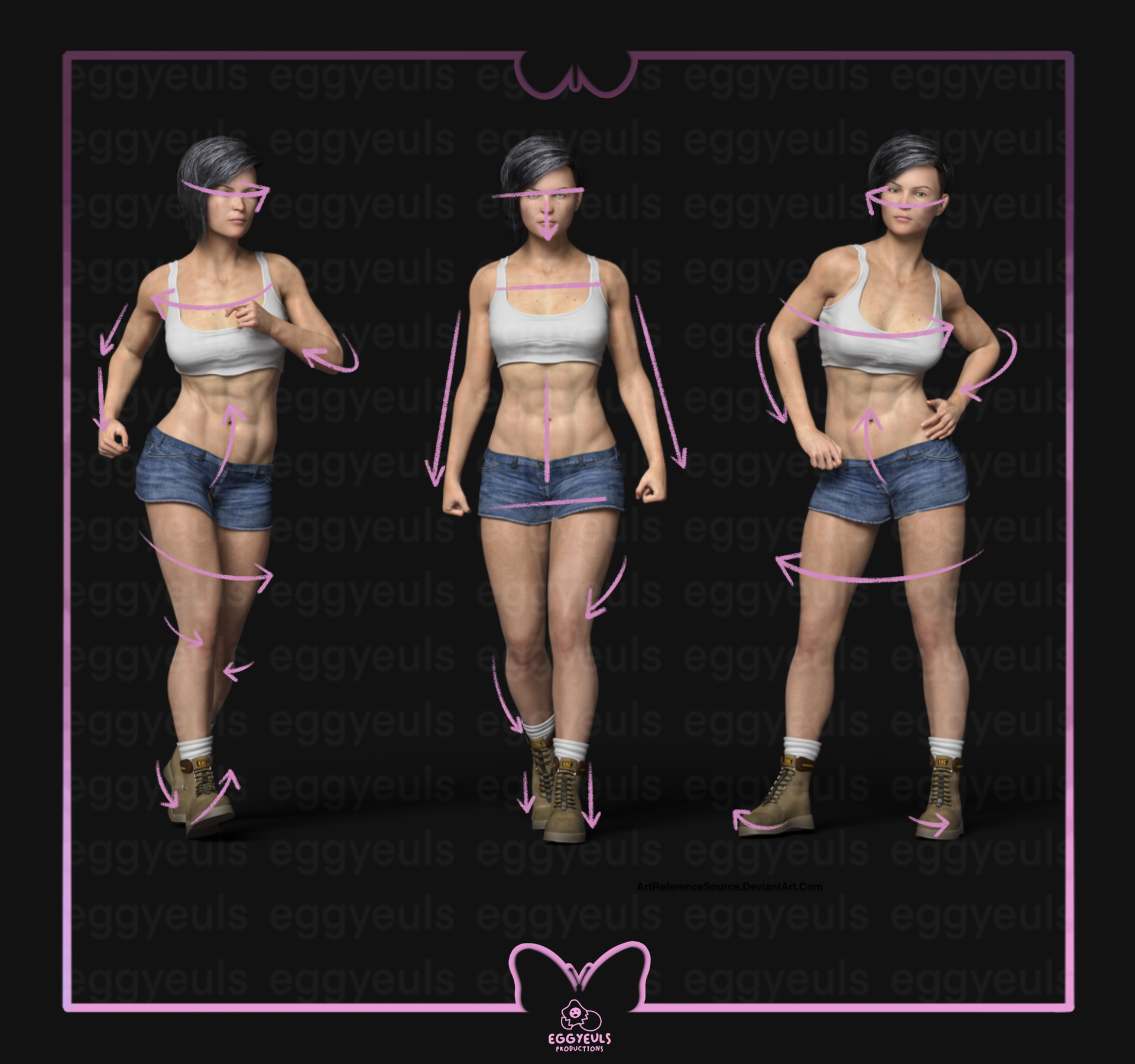
(Image from: https://www.deviantart.com/artreferencesource/art/Free-Stock-PNG-new-3d-character-Kalei-851594586 )
You do not have to over analyze every resource you plan on using for your manip, whether that be heads, limbs, clothing or objects like phones etc. But I advice you to at least roughly look out for whether or not you can combine them well or not. For example, I can not just take the left leg from the model on the right and merge it onto the model to the far left. Their bodies are angled and twisted in completely different directions. It may not be completely impossible, but it surely would be a hell lot of work to adjust everything and there would still be no guarantee that it would end up looking "natural" or at least "semi realistic". So do not just use whatever you stumble upon, have a bit of a plan when you are on the lookout for resources.
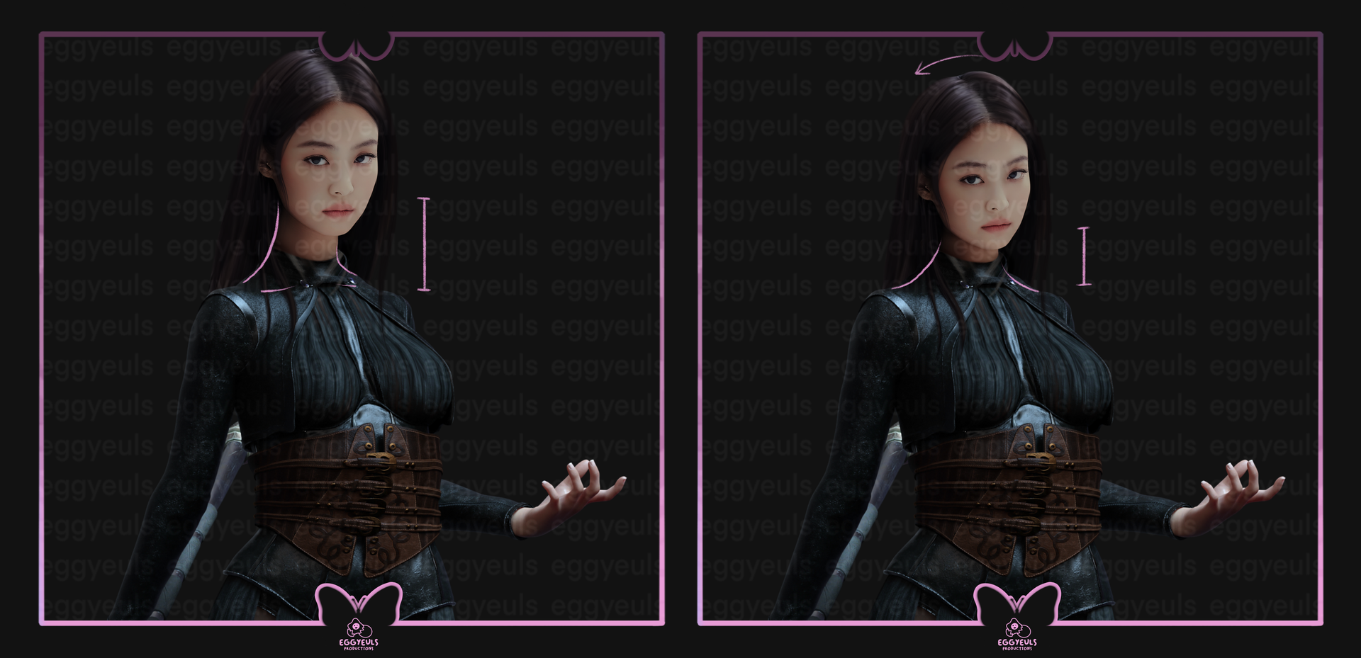
Now, another fun topic are head swaps and probably the most popular thing to do for model manips. Unless you are working on a literal alien or some sort of fantasy creature, long necks should stay reserved for giraffes, not for your MC. Keep an eye on whether you may placed the head too high or too low, how you angled it and if it matched the overall posture of the body. As it can be seen in the examples above, the option on the left is placed far too high and a bit too stiff as well. So I lowered the head placement and also tilted it very slightly "backwards"/to the left, may not be perfect but looks a bit more fitting.
₀₀₂ skin tone(s):
Now, whether you are working on adjustments for one human being/creature or are trying to put multiple together as a pair/group: do not forget to match skin tones if necessary. And I am not referring to having darker or lighter skin alone, I am also referring to undertones and hues. It is difficult to explain through words, so just look at the examples below. It just does not make much sense to give your character's head/face a peachy undertone for their skin, when their body has a more olive/neutral undertone. And depending on the overall scenery, you may need to adjust certain contrasts, undertones and hues on your creatures/characters in general.
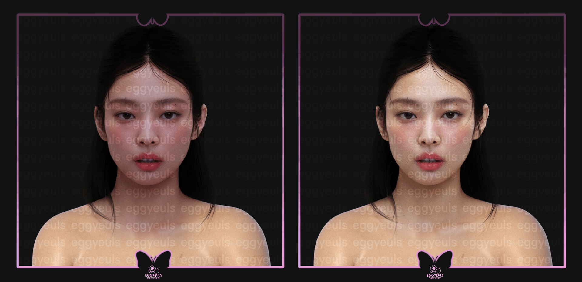
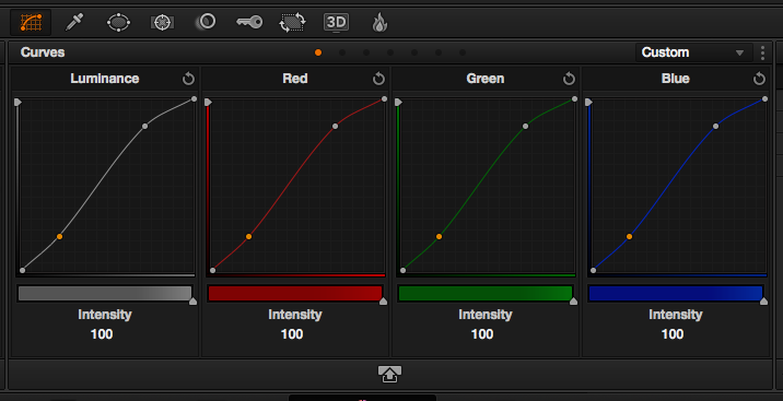
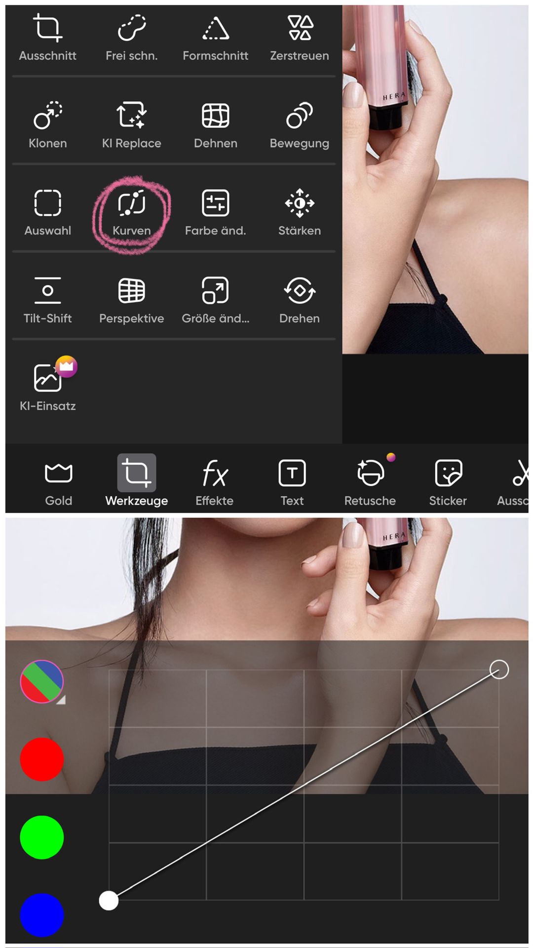
As you can see, the example on the left just does not work out well. The head and neck area have more pinkish/purplish undertones and are generally more contrasted/darker, whereas the shoulders and rest of the body are a tad bit brighter and have more olive or yellowish undertones. An easy way to adjust this is by playing around with settings like „color curves" and „lighting curves" or similar. Otherwise you can also use plain color layers and merge/mix them with the model layer below through „overlay", „multiply", „saturate" or whatever else your app/program offers.
Here are a few examples of what those settings could look like, but they also can look completely different. Just get to know your chosen app/program and play around with its features!
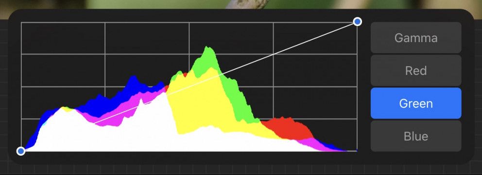
(Image from: https://maryliart.com/procreat-5-tutorial-the-adjustment-curve-tool)
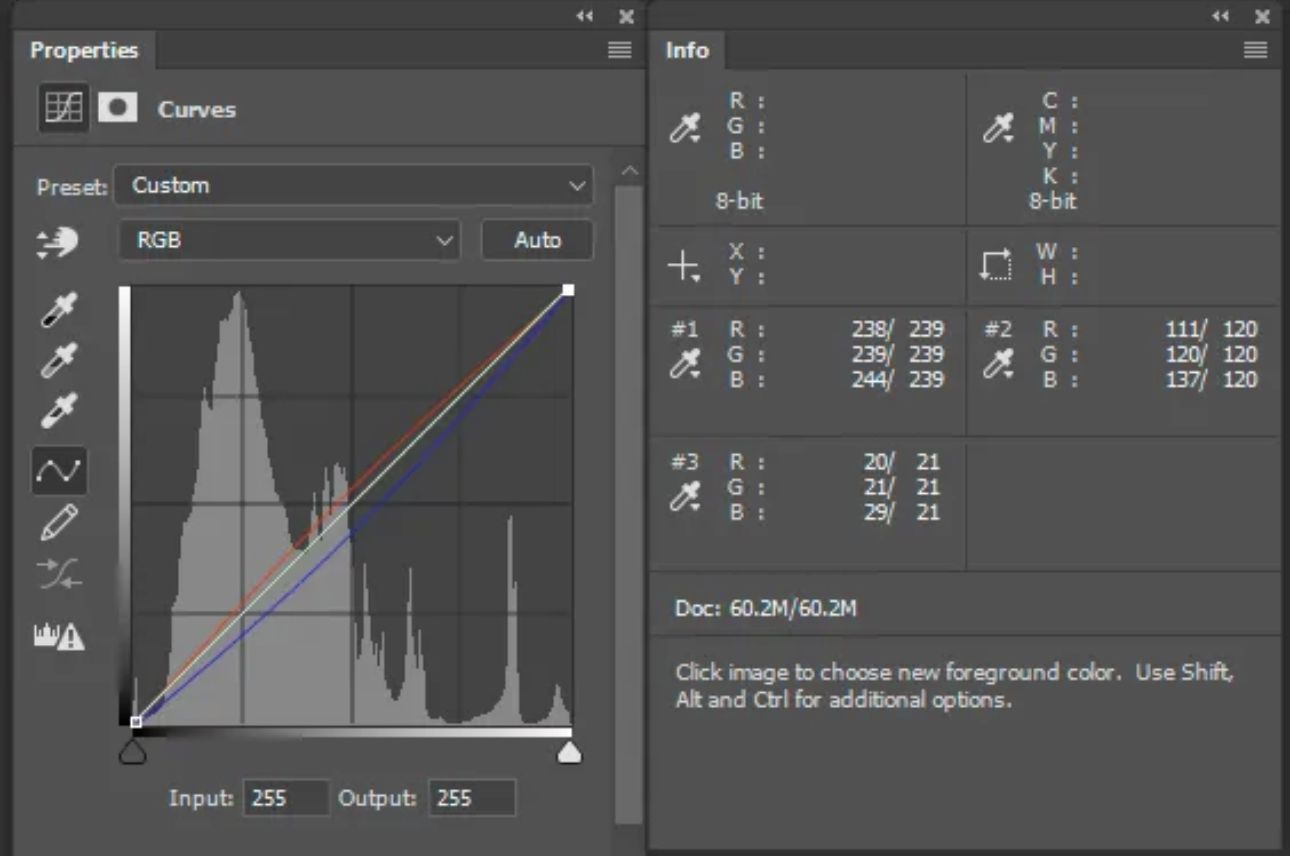
(Image from: https://digital-photography-school.com/color-correction-using-photoshop-curves-tool)
(Image from: https://postproduction.emerson.edu/hc/en-us/articles/226201328-Introduction-to-Color-Correction)
I just checked picsart, as it is a common mobile app used by our design community, and they offer the curves tool as well! Tho it definitely also has multiple other great settings for similar adjustments!
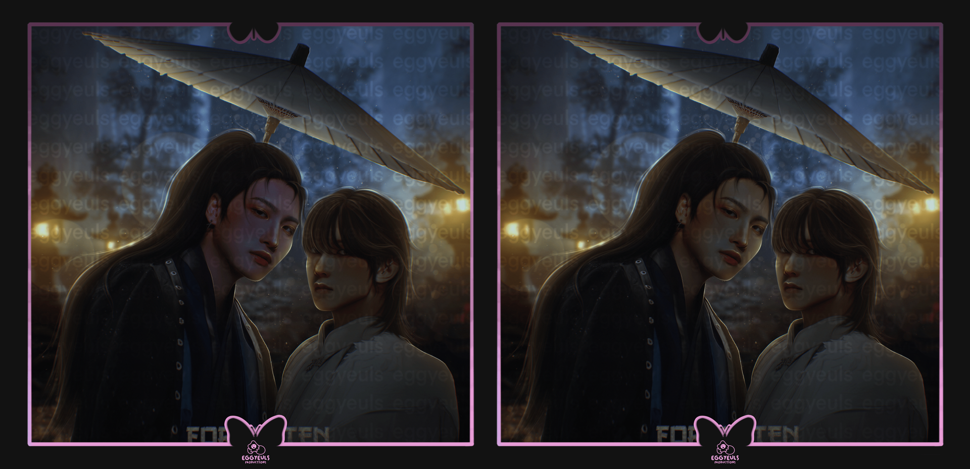
Moving on to the next sub-topic for this tho. Not only should you pay attention to adjustment on one model, but you have to do it for all models all together, according to whatever scenery or setting you put them in. As it can be seen in the example below, we have a night scenery with some lanterns, which provide an overall cool toned and kinda yellowish/greenish setting. So it does not make much sense for one of the models to have more of a pinkish hue to them, combined with yellowish highlights etc., whereas the other model has more of a greenish hue and yellowish highlights. So you gotta adjust them, according to your light source(s) and overall setting. It does not always have to be perfect, I still make mistakes as well, but it can change the overall outcome quite a lot.
₀₀₃ lighting:
If you start to play around with limbs, heads, torsos and whatever else, do not forget to adjust the lighting and contouring on each body part you mix together. And I do not mean only the overall lighting situation, according to the scenery/setting your character(s) is/are placed in. I am also talking about the resources themselves. And this goes for any body parts, clothing, decorations like a phone or wings and horns or masks and jewelry. Anything and everything you plan on using.
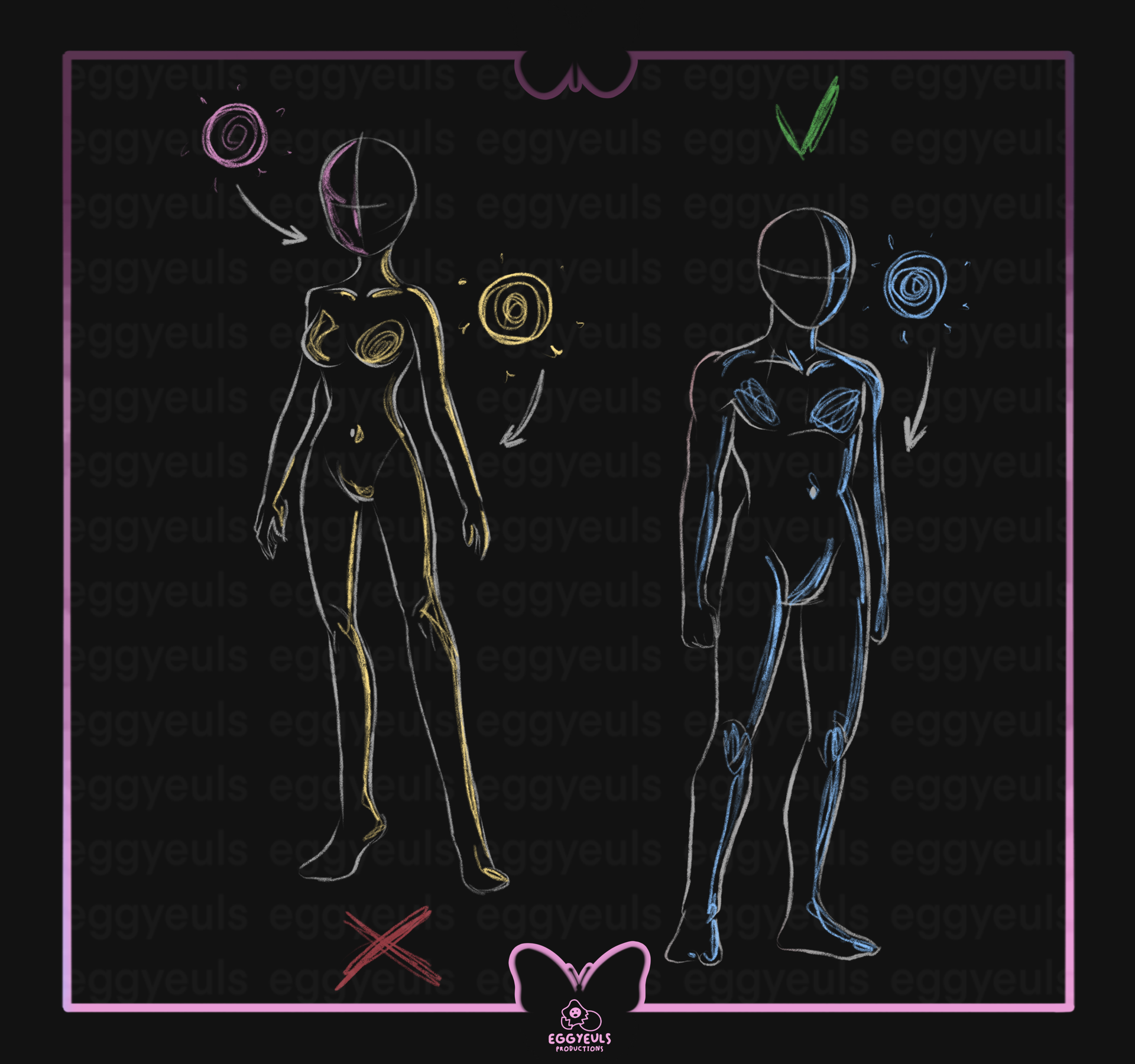
To break it down to a simple example, let us look at the illustration above (which I spent an unnecessary amount of time on wow). It is not impossible to mix resources with contrasting lighting etc., but you will have to go through a lot of adjustments to make them work. So it will be easier if you pay attention to your resources and their respective lighting situations right away. Let us say the female sketch on the left is a manip where the head and the body come from two different resources. Obviously they do not match very well, because the head got highlights on the left and the body on the right, because they originally were hit by two different light sources obviously. An easier way would be to find resources where your desired body parts, objects or whatever else are hit by similarly positioned light sources. So the male sketch on the right was made out of a head and body from two different resources as well, but they had matching light adjustments, which makes it easier to combine them. And this counts for anything else you want to throw in as well, clothing, accessories, wings and god knows what else you come up with. So, I hope that made sense.
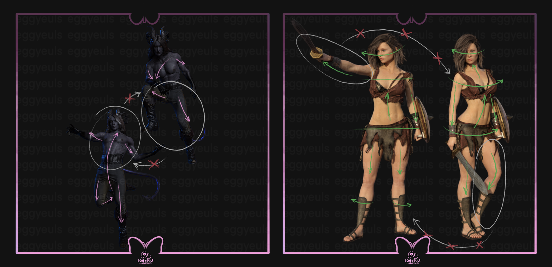
₀₀₄ proportions & perspective:
Sometimes you will need to adjust certain angles and positioning in order to create a "realistic" looking manip for a body, whether it is for a human being or any other creature honestly. If you mix together two images, one where you take the body and the other where you take the head from, the overall angle of the body and the overall angle of the head should match and most likely will require you to make adjustments in order to achieve that. It is relatively easy to make mistakes for this section, so it is more advisable to already pay attention to the angles when doing your research, to avoid having to do many adjustments later on. Especially for those who may work with programs that do not over many features for the required adjustments.
(female model image from: https://www.deviantart.com/artreferencesource/art/Free-Stock-PNG-Female-Warrior-799570835)
(male model bought from: https://fantasybackgroundsstore.com)
Now, I know the examples above look kinda crazy. But like I said earlier, you can not just mix two resources of body parts, where the original bodies had completely different angles, positioning and overall „viewpoints". Take the female warrior for example, you can not just take the left arm from the left character and mix it with the character on the right. They are angled and „looked at" completely differently. Now, I am not saying it is impossible, but it will most likely require you to spend 8191910292 breakdowns on adjusting everything, without guarantee of it working out in the end. Same for the male monster example, one is leaned backwards and one forward, combining and adjusting two poses like that is gonna be hell. So, do yourself a favor and choose your resources wisely. Safe yourself from crying sessions at 3 am or embarrassing manip results.
₀₀₅ decorations:
Now, this sums up anything and everything like adding wings, horns, fur or scales for skin and all that sort of stuff. Even other accessories like phones, headphones, beanies or clothing. Try to keep an eye on reasonable proportions, angles and positioning, as well as anything that requires any sort of adjustments in terms of lighting, blending, color matching and god knows what else. This is honestly such a broad and vague topic (once again), but I hope you get the gist of what I am trying to say here.
⛓
˓ ִֶָ𓄲 ☁️ SOURCES 𖦹 ࣪˖ ˒
SOURCES 𖦹 ࣪˖ ˒
Down below is a summary of all sources used for this chapter.
₀₀₁ Text(s):
No external ones actually, everything said are my personal opinions/experiences
₀₀₂ Image(s):
Examples are my very own (intellectual) property unless stated otherwise.
Otherwise:
https://www.deviantart.com/artreferencesource/art/Free-Stock-PNG-new-3d-character-Kalei-851594586
https://www.deviantart.com/artreferencesource/art/Free-Stock-PNG-Female-Warrior-799570835
https://fantasybackgroundsstore.com
https://maryliart.com/procreat-5-tutorial-the-adjustment-curve-tool
https://digital-photography-school.com/color-correction-using-photoshop-curves-tool
https://postproduction.emerson.edu/hc/en-us/articles/226201328-Introduction-to-Color-Correction
⛓
© eggyeuls, 2023
Bạn đang đọc truyện trên: AzTruyen.Top