03
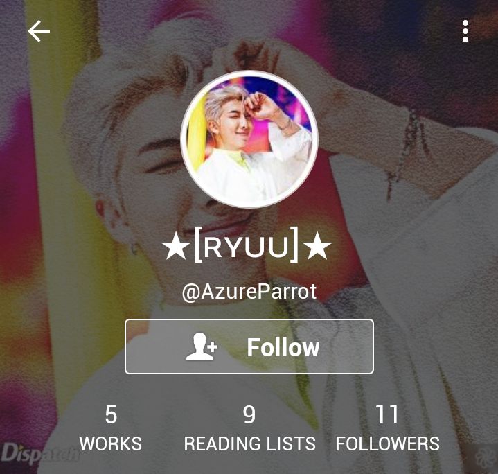
── USERNAME ( 7 / 10 )
Quite a beautiful username! However, I feel it is more desirable to use only lowercase letters as they seem more aesthetic. Using two 'z's might lend a more dreamy touch as well.
For example : azureparrot or -azzureparrot
── DISPLAY NAME ( 3 / 5 )
It's quite pretty!
My suggestion is to remove the two third brackets. Or, as you've already mentioned your name in your bio, you could have just put the first letter ( 'R' in this case ) in a fancy font, preferably a serif one.
That would make it look more aesthetic.
For example : 𝐑.
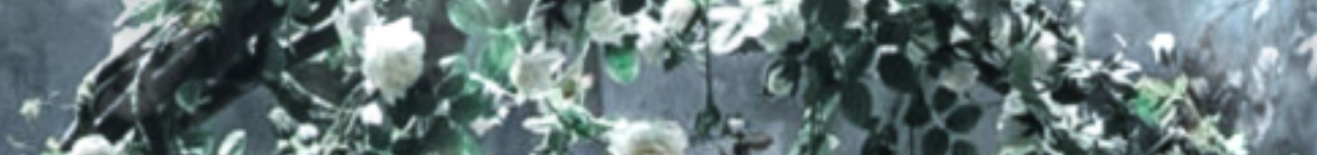
── HEADER ( 10 / 10)
I just love the header! No points taken.
── ICON ( 10 / 10)
Aesthetic! Matches the header.
── BIO ( 9 / 10 )
I really like the bio as well, it matches the overall mood and aesthetic.
── LOCATION ( 5 / 5 )
Plain but convenient. No points taken.
── BOOK COVERS ( 9 / 10 )
Aesthetic! Really nice ones. I just feel that all of them taken, somehow don't fall in tune with the profile's overall aesthetic.
Other than that fact, really well done!
── READING LIST ( 9 / 10 )
Convenient and aesthetic! My only suggestion is to not use the third brackets ( '[ ]' ).
── OVERALL ( 28 / 30 )
A beautiful account you've got there! Just a few changes here and there (you can take my suggestions if you want) and voila! A perfectly aesthetic account.
Also, these are just my opinions. Your account is 'perfect' in itself if you are really satisfied with it.
── TOTAL ( 90 / 100 )
Good job!

Bạn đang đọc truyện trên: AzTruyen.Top