02
U
SERNAME : 9 / 10
It's a really good example of an aesthetic username! I also really like the way you've used an "x" both the times in place of the "a". However, if you'd like to improve upon it, I suggest using lowercase letters as they tend to look more aesthetic!
DISPLAY NAME : 5 / 5
Short and sweet. I love the bold capital "M" along with the single dash in the beginning. The little sparkles in the end add a nice touch and don't make it look boring.
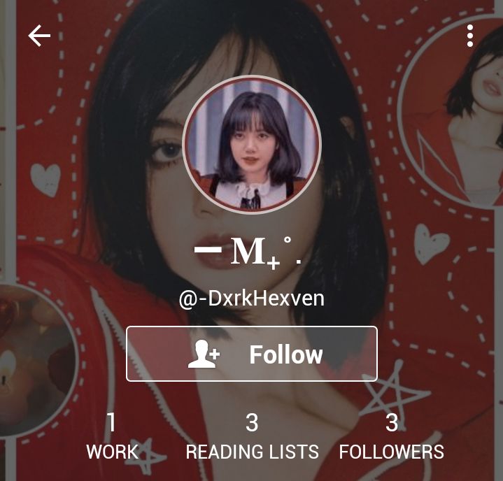
ICON : 8/ 10
It's really well done. The face claim is clear, the filter and colour scheme are on point as well. The border is bold, and its colour compliments the icon! However the colours don't necessarily match with the colours of the header.
HEADER : 8 / 10
So there are 2 suggestions I'd like to make. One, is to adjust the colours. The header has a warmer composition, with bright red, whereas the icon has a cooler colour composition. So they don't match. Secondly, to make it look even better you can try positioning the face claim in such a way so that the icon doesn't end up being smack in their face ^^
LOCATION : 0 / 5
Because you haven't put one yet, and I suggest putting one! Preferably a carrd link or something related to your aesthetic.
BIO : 9 / 10
Really well done! I suggest using only 1-2 fonts, because right now it looks really cluttered and doesn't look that visually pleasing.
BOOK COVERS : 8 / 10
The cover is nice, but it doesn't really match with the theme nor does it have a light aesthetic. However, if your intention wasn't to match it in the first place, then good job!
READING LIST : 10 / 10
I love it! The fonts and the symbols used are so pretty!
OVERALL : 27 / 30
Your account is beautiful, but it doesn't really go into a "light" theme, which is your desired aesthetic as stated by you in the forms. To achieve that, I suggest using softer, pastel colours, and cute/soft face claims! All the best ^^
TOTAL : 84 / 100

Bạn đang đọc truyện trên: AzTruyen.Top