𝗍𝗐𝗈.
black bg ;; sans biggest size
♪
𝙞 𝙬𝙖𝙨 𝙚𝙣𝙘𝙝𝙖𝙣𝙩𝙚𝙙
𝗐𝗁𝖾𝗋𝖾𝗂𝗇 𝖼𝗂𝗇𝖽𝗒 𝗋𝖺𝗍𝖾𝗌 ren's 𝖺𝖼𝖼𝗈𝗎𝗇𝗍
♪
𝙩𝙤 𝙢𝙚𝙚𝙩 𝙮𝙤𝙪
𝙜𝙧𝙖𝙙𝙞𝙣𝙜 𝙥𝙖𝙘𝙠 ;; writer's pack
light mode ;;
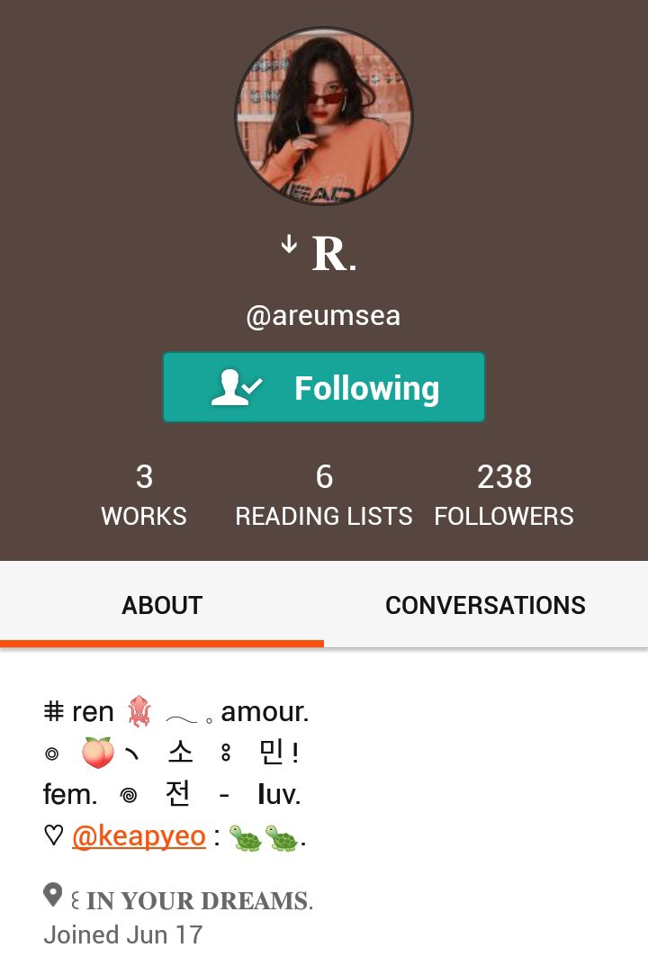
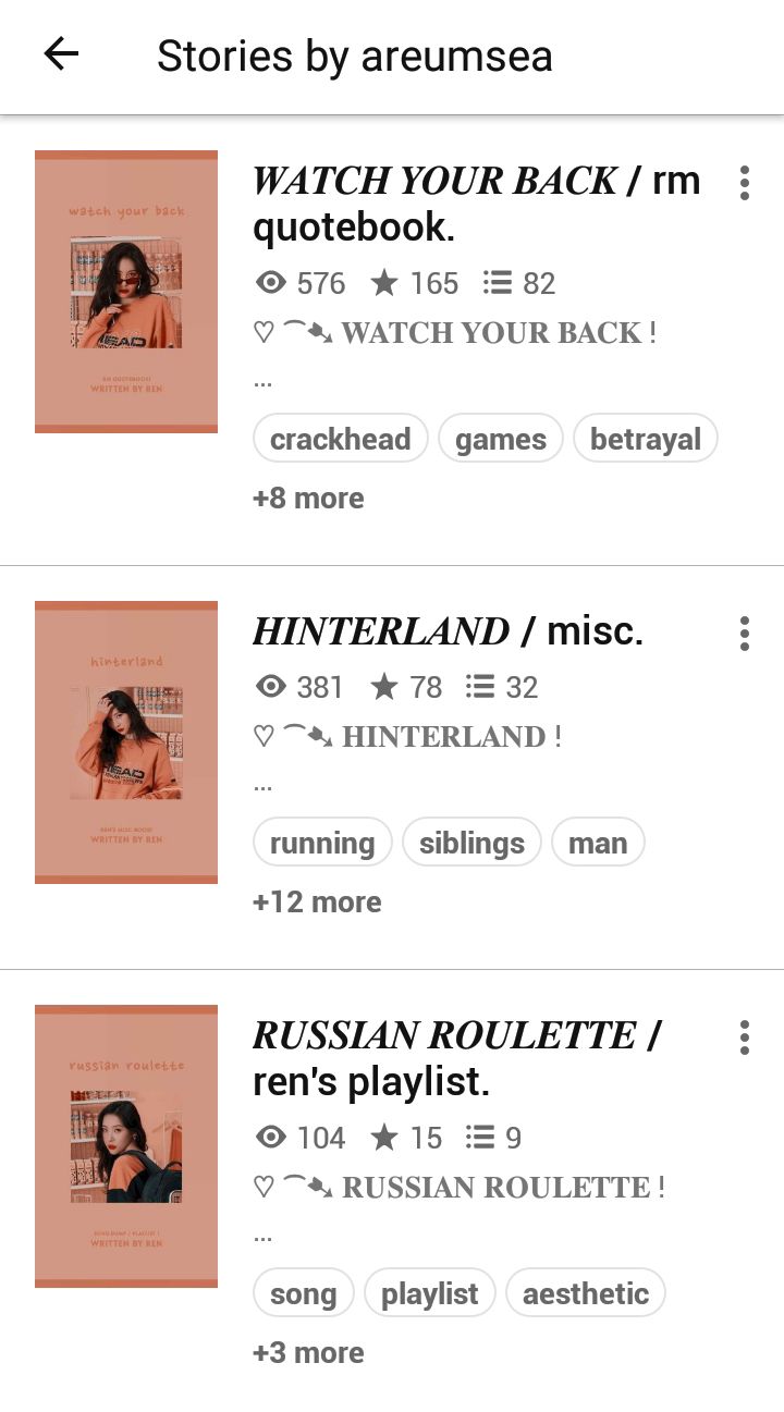
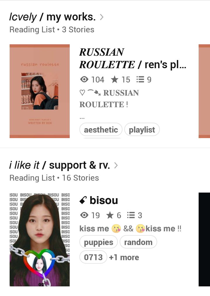
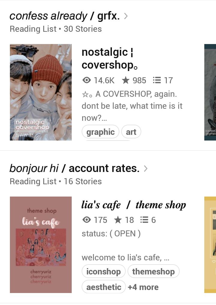
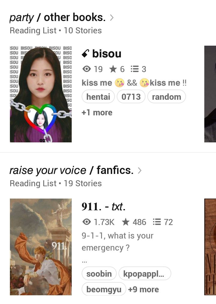
dark mode ;;
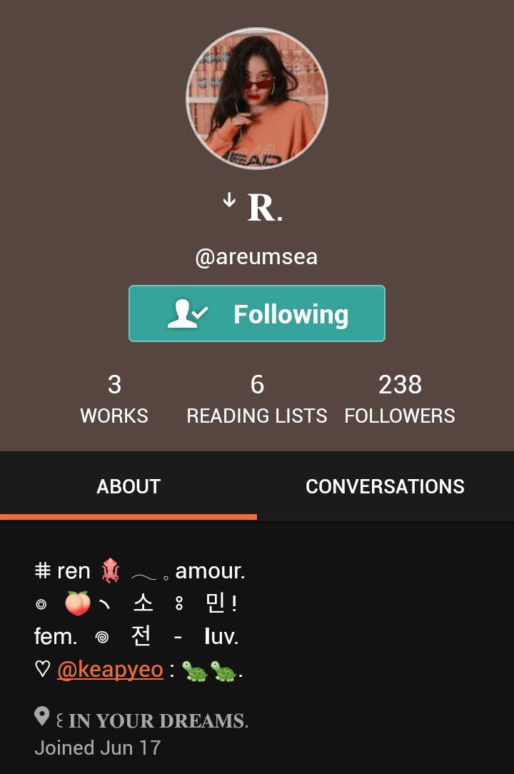
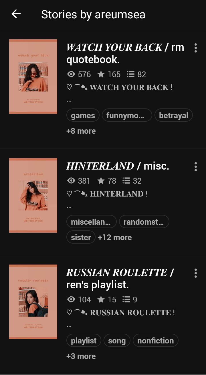
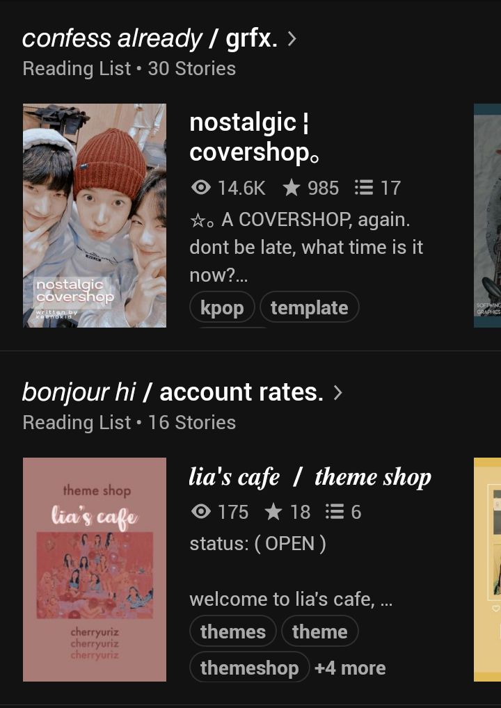
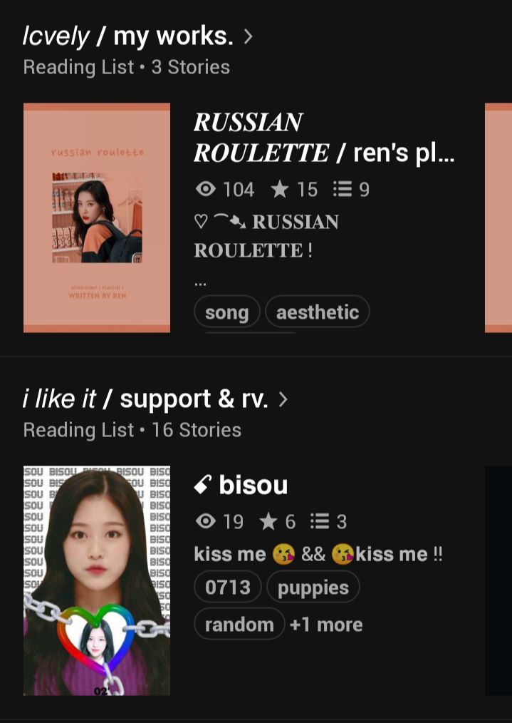
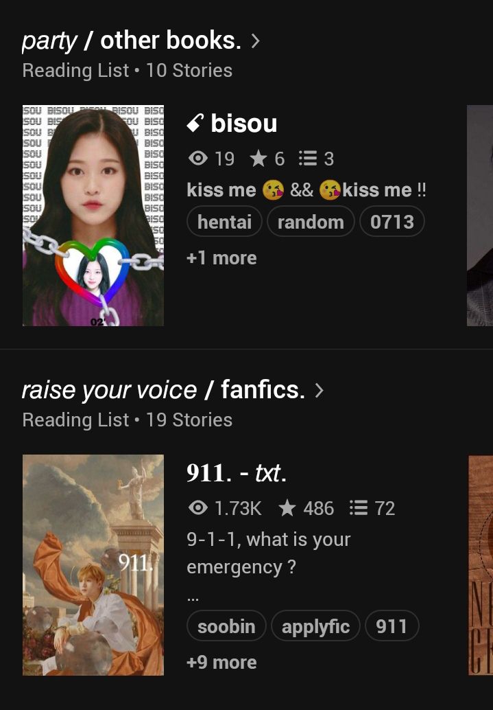
let's begin with the rating !
♪ 𝙘reativity and 𝙧elevance
«7%»
«your username is very pretty and sounds ear-pleasing too. areumsea has a nice ring to it and maybe (correct me if im wrong) it is a play on areum-ssi? i don't personally think it's super creative but it's got a nice ring to it. i like how you've arranged your reading lists but im not a big fan of '/'s. your book titles i like but not the font since it doesn't go with the font you have used for the reading lists, which i will expand on in the next criteria. i do like your header name a lot. idk why i just think it looks very aesthetic. the little arrow is lovely touch:»

♪ 𝙥resentation
«16%»
«okay so i do feel that i would have liked it better had your reading lists titles been in serif itallic (not bold itallic) instead sans itallic. it goes well with your book titles. like i said, i don't like the '/'s too much because they just feel too plain. maybe double '//' might look nicer?? i like the way you start off your book descriptions. it had uniformity and goes well with your location. however, i do think that the "rm quotebook" in "watch your back" was unnecessary. maybe you could write it as "rm quotes" or smth like that. if you are going to abbreviate miscellaneous to "misc." maybe do the same for quotebook? and off topic, ren's playlist sounds super cute.»
♪ 𝙖esthetic 𝙛actor
«28%»
«i really like your covers! the color scheme is super pretty and looks best in black mode imo. ofc bc wp is an a-grade b**** the header is ruined but it still looks very nice. the bio looks very pretty to the eyes except that im super confused about what the "luv" and the extra username stands for. is it a backup account or your bestie's account? maybe specify that. or maybe you did and idk about that bc my dumbass cannot read the romanji. plus i don't trust google translate one bit seeing how it's ruined spanish (rip my grades) for me.»
♪ 𝙘omplete 𝙡ook
«38%»
«personally, i do feel your account has room for improvement. there are little things that can be tweaked and you're good to go! this is mostly subjective so i apologize for being so stingy with the marks. i like the light-hearted vibe your account gives.
i would personally recommend you to go for the editor's or reader's pack because i would honestly expect books that i could read from a writer's account. at the moment, it gives me the impression that it's a reader's account and not a writer's account. however your account gets a firm affirmative from me on the aesthetic side, so you're good!»
♪ 𝙩otal 𝙨core
«89%»
comment your questions/thoughts in the banner below !

Bạn đang đọc truyện trên: AzTruyen.Top