| Critique #1 - Anna_KNG
+ × ♧ × +
__________
FOR Anna_KNG

C R I T E R I A
Elements: Line, shape, form, color, space, texture
Principles: Balance, proportion and scale, contrast, repetition and pattern, unity and harmony
Composition: Framing, dominance/hierarchy, fore/middle/background, lead room, rule of thirds, rule of odds
°•°
[ BEWARE OF THE WOLF ]
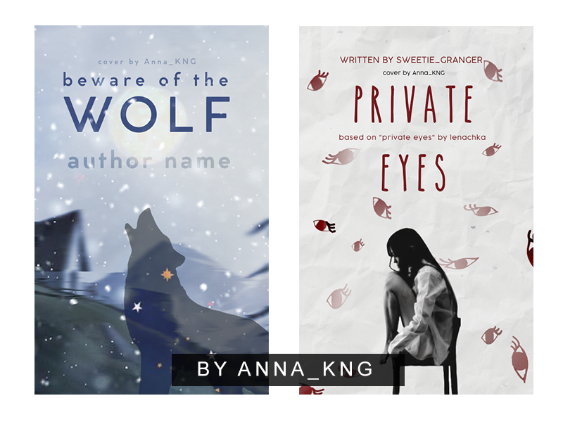
○ There's an established color palette that suits the overall mood of the cover; you used cool tones like blue and white which is spot on for the winter theme showed here. I saw a spot of yellow there--maybe it's a snowflake or just a decoration--you can use the color yellow in this specific design for a pop effect.
○ The typography is simple and legible. I suggest you could capitalize the "Beware of the--" part and change it to a different skinnier font like Arial to create contrast. You can apply it to the author's name, too. Also reduce the kerning (spacing between letters or characters).
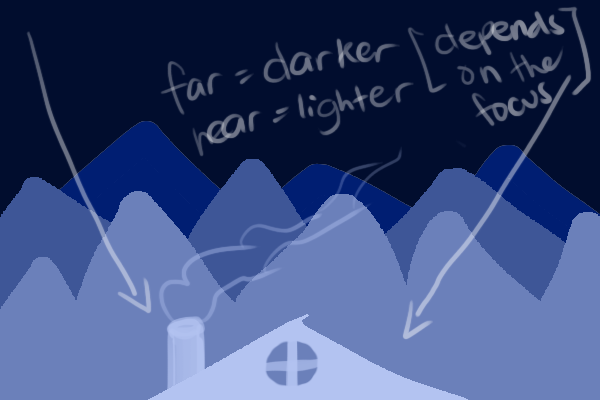
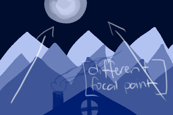
○ Vector graphics tend to be flat and empty since they rely in shapes that are one-dimensional. One way to avoid that is to create depth. For example, take a look at these illustrations that I sketched.


With this, you lead the viewers' eyes to where you want them to focus. Just note that it can be interchangeable depending on how you use it.
○ For the composition, the positioning of the wolf is just alright. However, you can try placing the wolf in the middle, maybe at a top of a boulder or a mountain--perhaps it'd look more compelling to look at. Still, that's just an alternative idea.
Furthermore, the wolf is the most important element in the cover so make sure that it is clearly seen because I see that it's being overlapped too much by the snow overlay and something I am not quite sure--a blurry thing.
○ I noticed that the background is blurred and low quality. Using a high resolution picture despite it being in the background can make a lot of difference. Also blurring can either make or break your design, use it sparingly. I don't see why it would be necessary in this design.
°•°
[ PRIVATE EYES ]
○ I like the color palette of this one as well--red, beige and black. Some of the details of the eyes, the eyelashes and the proportions for example, can be improved. I suggest drawing an eye--guessing that you drew this--and then just copy pasting it around the subject which is the girl to create uniformity. Sizes and positioning should vary.
○ The font of the title is good--simple, legible and fits the aesthetic of the cover. However, looking at the other present texts, it's important to remember the rule of thumb regarding texts. Do not use more than two or three fonts in one graphic. It will look too cluttered and unprofessional.
I'm not sure if the fonts are different or you just capitalized the "Written by --" part, either way the typography looks unbalanced. Maybe change the placing as well. Try changing the color of the title to more of a maroon shade.
○ For the model, I suggest lessening the contrast, looks too distracting and doesn't match the light background. I see that you erased some parts of the eyes which is fine, but make sure there is a purpose. Are you erasing the ones near the model for focal point purposes? If that's your objective, stick to that. At the moment, there is no definite direction.
°•°
Thank you for submitting your work and letting me analyze them, Anna_KNG! I hope you learned something. Keep on designing, I see your potential ❤
_________
+ × ♧ × +
Bạn đang đọc truyện trên: AzTruyen.Top