➼ ROUND #7 RESULTS
Here are the results for round 7:


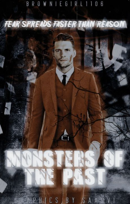
Use of elements: 14/15
Cleanliness: 9/10
Originality: 14/15
Relevance to the prompt: 5/5
Overall design: 5/5
TOTAL: 47/50
I was in love with this cover. Not only did I like the overall theme of this cover but I also loved the small details you included on the face claim and in the background. I thought everything perfectly reflected the horror theme I gave you and it looked like everything belonged there with nothing sticking out. My only feedback would be to reduce the glow effect on the title a bit to make it easier to read without glare. Great job on this one!


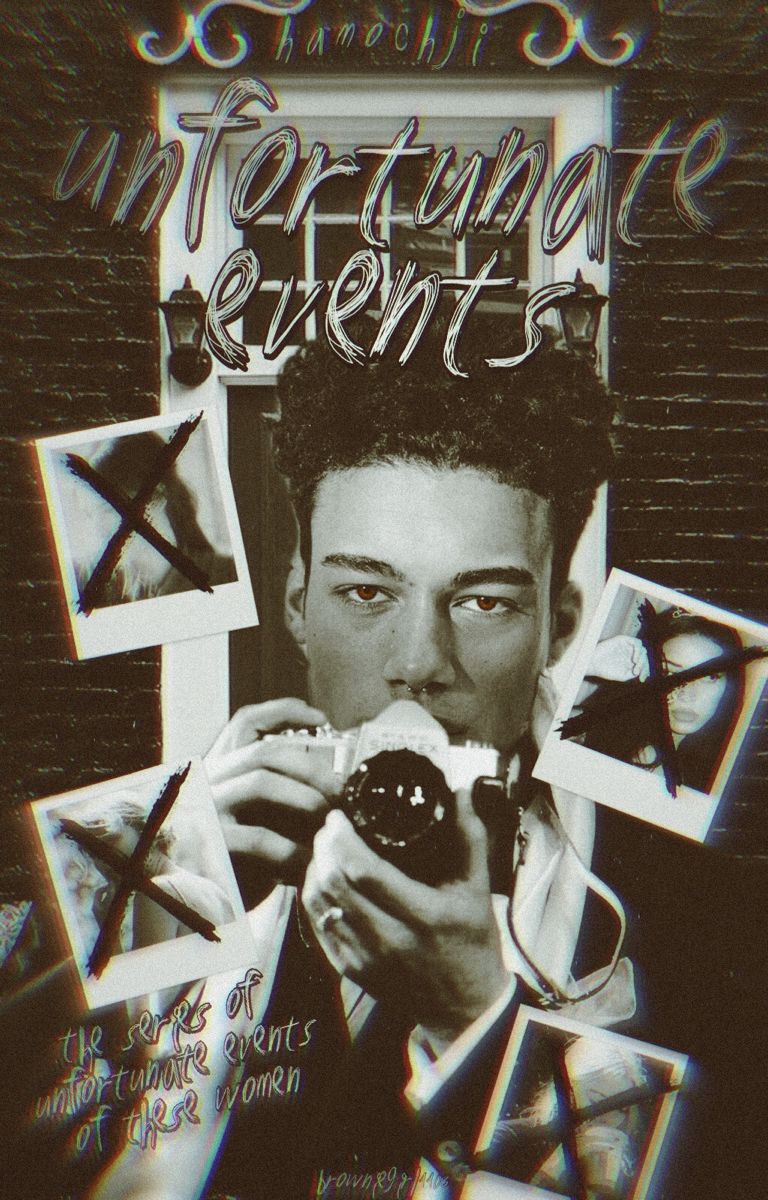
Use of elements: 14/15
Cleanliness: 9/10
Originality: 13/15
Relevance to the prompt: 5/5
Overall design: 5/5
TOTAL: 46/50
Firstly, I was in love with the font you used here - it really did add some creativity and uniqueness here. But, I did think my username was too big here. Nonetheless, the cover was perfect for the horror prompt I gave you with the all the blood stains and most importantly, the eye detail you included. I thought that was really impactful. Great job!


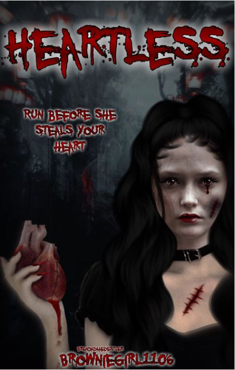
Use of elements: 13/15
Cleanliness: 9/10
Originality: 13/15
Relevance to the prompt: 5/5
Overall design: 5/5
TOTAL: 45/50
The overall filter you used here was great and the black and white theme was great and unique. The little blur effect you have around the sides was great, although it did kind of smudge your username as well as mine. So perhaps lowering that a little bit would help. But, this was still a great entry and accurately reflected the prompt I gave you. Good job!


Use of elements: 13/15
Cleanliness: 9/10
Originality: 12/15
Relevance to the prompt: 5/5
Overall design: 5/5
TOTAL: 44/50
Wow, I thought this cover was breathtaking. Firstly, the amount of effort you put for the face claim was insane and definitely did make your cover an eye-catcher. I just wished there was a better font for the title - I just wasn't completely sure if the font you used was the right one.
But, it was still a great cover! Good job!
AND

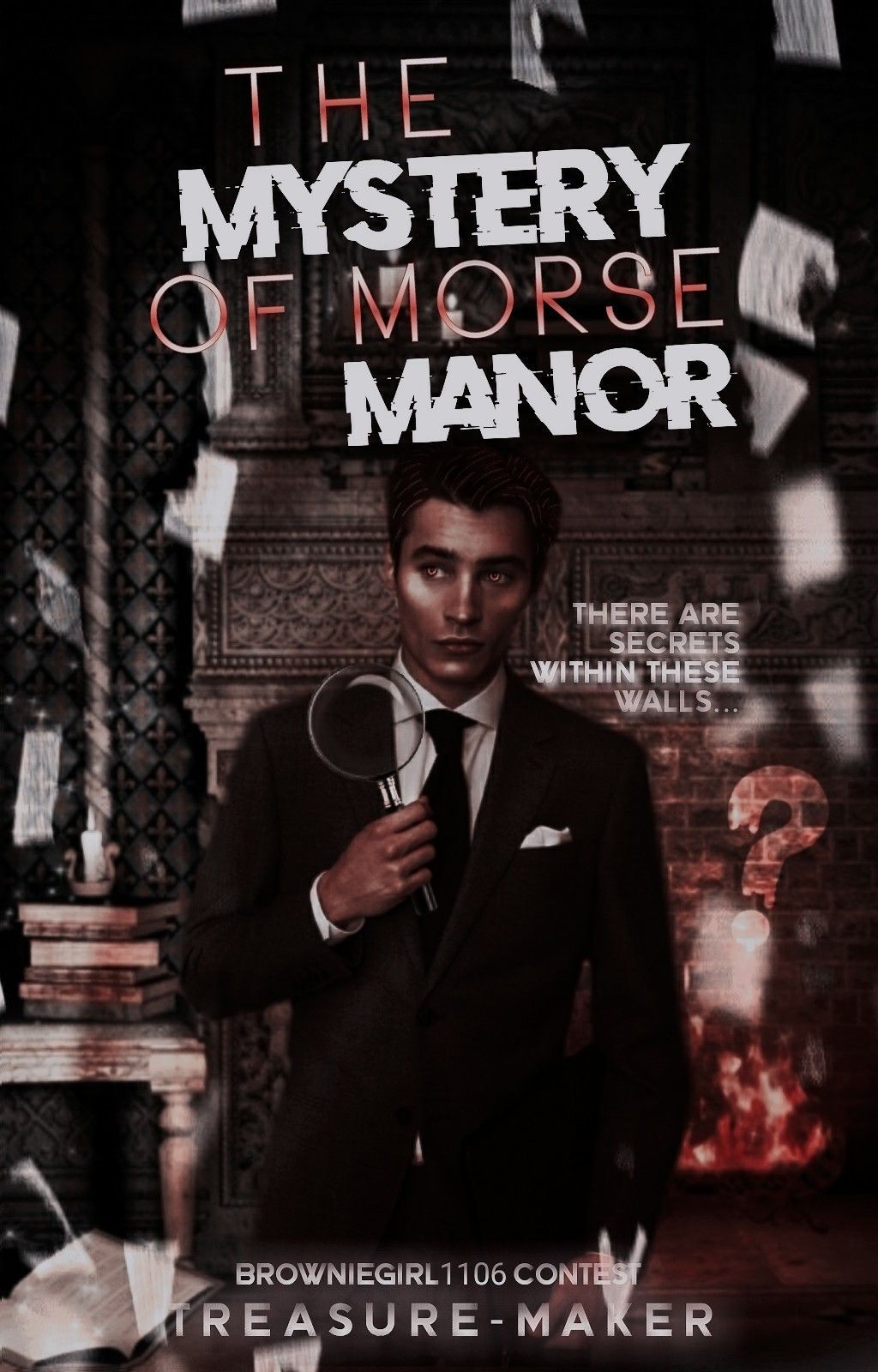
Use of elements: 13/15
Cleanliness: 8/10
Originality: 13/15
Relevance to the prompt: 5/5
Overall design: 5/5
TOTAL: 44/50
This was a great entry as it definitely did transform the face claim into something that was a perfect complement for the cover. I also thought the magnifying glass was a great addition to the cover and reflected the theme given to you. However, I just thought the font combination was an odd choice. I definitely did like the idea of having two different fonts for the title, but perhaps using a different font for "THE" and "OF MORSE" would be an improvement. Nonetheless, great job!
__
NOTE:
For future rounds, there will be no honourable mentions until the finale round.
__
ELIMINATIONS
Congratulations to the winners! After much thought, I have decided to eliminate PerriMakenna.
Thank you so much participating up until now, I hope you had fun! You may PM me for the participant sticker now if you would like! Everyone else will be continuing on to the next round.
If anyone would like their feedback and score, please PM me and I will get back to you with them.
Round 8 will be up at 8PM EDT (Eastern Daylight Time), so look out for that!
Bạn đang đọc truyện trên: AzTruyen.Top