― graphic dump + graphic-related rants.
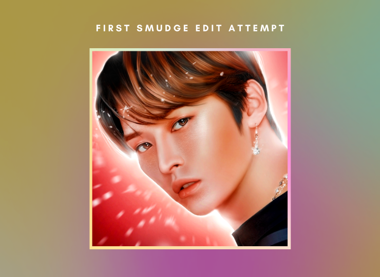
I kind of had no idea what I was doing here- This was actually the first time I watched tutorials on something graphic-related, smudge-edit-related to be specific. I've always admired editors who specialize in smudge edits! The overall attention to detail amazes me.
This was sort of just me experimenting, trying out new things with highlights, shadows, colors, all that fun stuff. I didn't really add that many details, specifically in illustration. I'll be sure to experiment more with illustrations in the near future! Overall, I'm proud of this! Especially the eyes and hair.
Side note: my laptop crashed at least fifteen times while making this edit :''D

I don't really like how this turned out at all. I wanted this to look full of life, fire, and motion, but I was having lots of trouble creating that look. However, with the look it ended up with, it's not entirely terrible. It just doesn't satisfy my original vision. On a more positive note, I do think the horns and wings fit in well, and I'm proud of my play on words with the title! (And I placed second!)
For the Kpop fans here: I'm not sure if it's been completely obvious, but Lee Know from Stray Kids is my ultimate bias! Stray Kids as a whole is one of my favorite groups. Their group chemistry is what won me over! They're also one of the most well-rounded and talented groups in the industry at the moment, in my opinion. I'd love to rant more about them some other day.
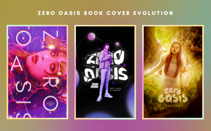
Fun fact: I actually really hated the first cover I made for this book, the one on the left. I couldn't wait to replace it, but it actually ended up growing on me! It could still use some adjustments, but it doesn't look as terrible as I remember it being. I'm also proud of the middle cover, and I had a lot of fun with the typography and colors! It does feel a bit empty though.
The most recent and current cover is on the right, and I'm extremely happy with how it turned out! While it's been looking a bit bland lately, I'm still proud with how it matched my original visions for it. This cover helped reassure me that I'm capable of expressing my ideas well, and I enjoyed every second of making it.
But what about you? Which cover do you like the most?
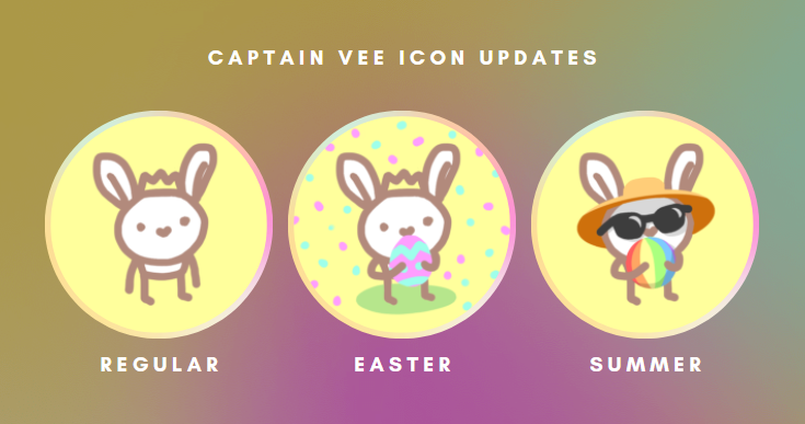
If you're wondering where the past Captain Vee outfits are, I'm sorry to tell you, but I lost them :''D
And that actually really sucks because I was proud of them. We had a Party Captain Vee with a party hat and confetti. We had a Cupid Captain Vee for Valentine's Day. We even had a Leprechaun Captain Vee for St. Patrick's Day! R.I.P. to the past Captain Vees.
Just in case some of you don't know who Captain Vee is, she's just a little character of mine! She was originally a little doodle crafted from boredom, but she ended up being featured as a major character in a past graphic shop of mine!
So far, Summer Captain Vee has to be my favorite! What about you?

ON TO THE RANTS!
1. Typography and composition is pretty much all you need in a cover.
Of course, if you want to make your book covers more eye-catching and interesting, you can (and should) definitely develop your skills in various kinds of design! However, if you want a book cover that's simple but clickable enough, good typography and good composition is the way to go.
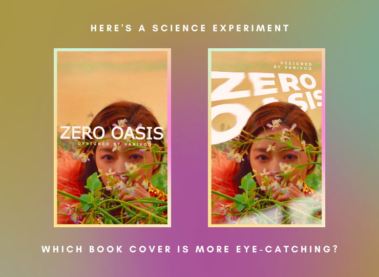
The book cover on the right is quite obviously (and hopefully) more eye-catching. While the cover on the left doesn't actually look too terrible, the depth and various lines in the right cover create imagery that is much more interesting for the eyes to follow.
Now, the book cover on the right is still nowhere near perfect, I put these together in only a couple of minutes. I just wanted to demonstrate how typography and text placement can drastically change the appeal of a book cover! I'm not sure how this turned into a design tip- I was just randomly thinking about this one day.
2. What's up with all of the aesthetic contest prompts?
I don't mean "aesthetic" as an adjective, I mean it as a noun. I remember scavenging for graphic contests the other day, and almost all of the books had a "make an aesthetic for your favorite singer/person/thing/literallyanything" prompt for their most recent contest.
And this isn't a bad thing! It was just strangely coincidental that so many contest books released an aesthetic-based prompt at around the same time. Or am I just missing something? It doesn't matter- all of those contests have probably ended by now. (Please tag me in contests, I'm always curious.)
3. IT'S SO DIFFICULT TO SAY NO TO REQUESTS KDFJKEFW
One of the major mechanics of my shop is that I either will or won't accept a request within the span of one week. So if I don't accept someone's request, I won't respond to it. I did this to avoid saying any harsh "no"s to requesters because I feel like it sounds too rude, but I also feel rude for kind of leaving requesters hanging?
I mean, I think the one-week response mechanic is pretty clear for "yes"s and "no"s, but I still feel bad for not replying at all. I'd really like to know your guys' thoughts on this!
4. I don't think a follow should be a mandatory payment.
Especially since no one does it-
I wrote a "permanent follow" as one of the payments in my last two graphic shops, and I've come to the conclusion that no one cares enough follow permanently. (Not even me.) It actually kind of bothers me when designers ask for permanent follows, so I don't see why I should ask for it myself.
It also kind of bothers me when graphic contest/war hosts ask for permanent follows. Almost every graphic contest requires you to permanently follow, even if the contest is non-commitment. And no, I don't think the "this is just in case there are sudden announcements" excuse is valid. You can just tag your participants.
I understand that you'd like some sort of payment in return for doing a form of service,-I wanted follows too, we've all been there,- but follows barely mean anything. Of course, having a bigger following gives you more promotion and gives you a bigger chance of getting your work recognized, but does it really matter in the end if none of your followers are genuine supporters?
You're not the devil for wanting followers, it feels incredible to have a following! I myself am extremely grateful to have been lucky enough to reach a few large milestones. This is my opinion. I just think that being able to have your work be genuinely recognized is already a payment in itself. Follows are simply a bonus!
All right, that was a long one-
5. The color green is underappreciated.
And I get it, I'm guilty of this too. Green is associated with plenty of nasty things, but then again, it's also associated with plent of beautiful things! Then again again, green is barely used anyway.
Even though green is technically considered a cool color, it isn't really used as a cool color, nor is it used as a warm color. Green is literally in the middle of blue and yellow, the two colors that divide warm and cool colors into their opposite sections.
Green's in such a strange spot. Same with pink, really, even though pink is usually considered as a warm color, but both colors can steer into both cool and warm hues pretty easily. (Both of them are also complementary/opposites, so no wonder.)
#ApologizeToGreen #AppreciateGreen #StanGreen
6. Please stop insulting yourself or your work in order to compliment others!
Once again, I get it, I'm guilty of this too. I know that you just want to express how untouchable someone's graphic skills are by saying that you wouldn't be able to execute their styles as well as they do. However, you could just say that their graphic skills are untouchable and that they execute their styles really well. Without all of the self-deprecation.
Insulting yourself in order to compliment others will hurt you a lot more than it will help them, which is wayyy more than you might think. When you continuously repeat such compliments, you begin to believe them, that other designers are just so untouchable and you could never reach their skill level. Even though you can!
It's difficult to accept those kind of compliments too, when you're on the receiving end.
Please know that you are talented! Everyone has to take their time and work hard to get where they are, and even then, their skills still aren't perfect. There's always room for improvement, and that should motivating, really! Always improving sounds a lot better than staying at the same level of skill.
#AppreciateYourself #StanYourself
#StanCaptainVee

Bạn đang đọc truyện trên: AzTruyen.Top