𝐁𝐄𝐒𝐓 𝐂𝐎𝐕𝐄𝐑 𝐑𝐄𝐕𝐈𝐄𝐖 & 𝐑𝐄𝐒𝐔𝐋𝐓𝐒 🎭
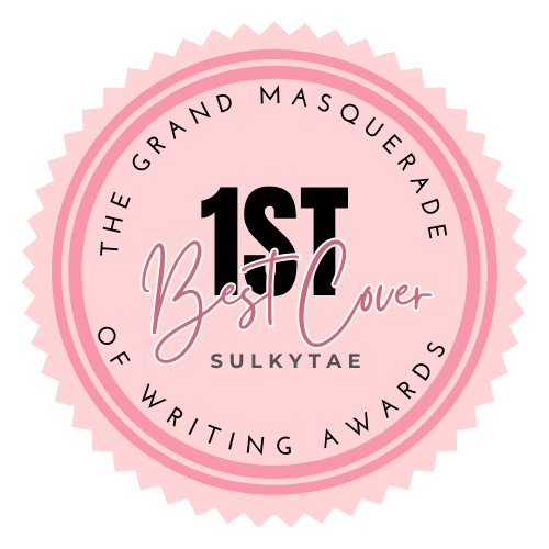
1st PLACE WINNER: Pretty Reckless by sulkytae
FIRST IMPRESSION: 10/10
RELEVANCE TO THE TITLE: 09/10
FONT/ TYPOGRAPHY: 10/10
READABILITY/ PLACEMENT: 10/10
DESIGN EXECUTION: 10/10
Total: 49/50
REVIEW: I'll start off with the first impression, if I say honestly, I sighed in satisfaction upon the very first view of it, maybe I even simped. The colors you've used are so appealing to the eyes, the pallette unfurls a pop of unique hues & undertones. Font is catchy & unique, metallic vibrancy giving it a desirable edge.Placement is not overdone but it fits really well. Overall design execution has been maneuvered very professionally & beautifully.
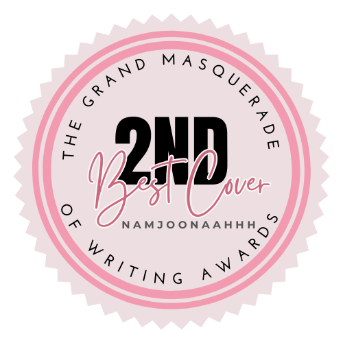
2nd PLACE WINNER: Age of Love by Namjoonaahhh
FIRST IMPRESSION: 09/10
RELEVANCE TO THE TITLE: 09/10
FONT/ TYPOGRAPHY: 10/10
READABILITY/ PLACEMENT: 10/10
DESIGN EXECUTION: 10/10
Total: 48/50
REVIEW: The overall impression of the cover came with different tones, the most prominent one being that of unique appeal & romantic vibrancy. The color palette as a whole really appealed to my eyes, the background image surprisingly complimenting the typography really well. The color combination of pink & jet black with a pinch of elements had me on edge of awe. Typography is nothing unique or unseen but it isn't a big deal if it goes well with the overall cover with such an ease.
3rd PLACE WINNER: Arsonist of the Heart by strawberry1d
FIRST IMPRESSION: 08/10
RELEVANCE TO THE TITLE: 10/10
FONT/ TYPOGRAPHY: 09/10
READABILITY/ PLACEMENT: 08/10
DESIGN EXECUTION: 08/10
Total: 43/50
REVIEW: To begin with relevance to the title, the cover is coherent. The font used is simplistic with no such unique tweak to it. Though I wasn't really awed with the placement of the title, it could've compelled a bit more of centre attention. Author's name too slips off major attention. If I talk about the design execution, you've fairly incorporated the elements of your storyline in the cover, like the protagonist's press background, newspaper cuttings, etc. But keeping in view the theme of 'Arson', there could've been more palettes of fiery colors. Also try to reconsider the placement of main characters on the cover, they look like they've been simply cropped & pasted with no editing.

CONGRATULATIONS TO YOU ALL!

OTHER REVIEWS:
August by clara_bell11
FIRST IMPRESSION: 08/10
RELEVANCE TO THE TITLE: 10/10
FONT/ TYPOGRAPHY: 07/10
READABILITY/ PLACEMENT: 09/10
DESIGN EXECUTION: 06/10
Total: 40/50
REVIEW: First impression: Simple & light. No graphic elements, no creative tweaks yet the sense of soothe is undeniable. The overall theme of summer delight & vacay is relevant to the title. The fonts could've been more appealing, I doubt if readers would be intrigued to have their fingers lay on it at first look. You may reconsider color palette & typography for better effects.

Lightning Forged by CamelliaCarroll
FIRST IMPRESSION: 08/10
RELEVANCE TO THE TITLE: 09/10
FONT/ TYPOGRAPHY: 08/10
READABILITY/ PLACEMENT: 08/10
DESIGN EXECUTION: 07/10
Total: 40/50
REVIEW: The overall impression is that of intrigue & awe. The color palette soothed the tones with a stark contrast of lightning, a bittersweet aftertaste. However the choice of fonts seems off to me. You can also consider some font combinations to bring out the overall beauty of the cover. The cover's theme is relevant to the title.

Russian Roulette: Family Secrets by TheAlixDavenport
FIRST IMPRESSION: 08/10
RELEVANCE TO THE TITLE: 08/10
FONT/ TYPOGRAPHY: 07/10
READABILITY/ PLACEMENT: 07/10
DESIGN EXECUTION: 07/10
Total: 37/50
REVIEW: Starting off with the first impression, should I say I got a feeling of too many elements on it with incoherent detailings. Typography combination is commendable but isn't executed well as per its needs. The fonts seem vague, especially the word 'RUSSIAN'. The background color palette overshadows the fonts visuals overall. There are also some unnecessary elements, like handcuffs or something dangling in a casual fashion. For a good cover, it's a BIG no. Overall design execution needs some more work.
Sexologist by Namjoonaahhh
FIRST IMPRESSION: 08/10
RELEVANCE TO THE TITLE: 07/10
FONT/ TYPOGRAPHY: 06/10
READABILITY/ PLACEMENT: 08/10
DESIGN EXECUTION: 06/10
Total: 35/50
REVIEW: The only thing that intrigues is the title of the cover for a reason. The background image seems simply the filtered picture of the protagonist with no extra complimentary elements. Typography lacks appeal, seemingly exuding a beginners vibe. Readability is good to go but placement. Overall design execution needs some more creative tweaks.

Queen by Taeamo10
FIRST IMPRESSION: 07/10
RELEVANCE TO THE TITLE: 07/10
FONT/ TYPOGRAPHY: 06/10
READABILITY/ PLACEMENT: 08/10
DESIGN EXECUTION: 06/10
Total: 34/50
REVIEW: The cover's background is extremely vague, the over-white color palette irritating the eyes. Typography lacks uniqueness & genuine appeal. No elements to uplift the mood of the cover, there's no such thing as design execution in it. Readability is okay but placement offers disinterest. Kindly reconsider the overall design of your cover.

Euthanasia mxtsuro
FIRST IMPRESSION: 07/10
RELEVANCE TO THE TITLE: 07/10
FONT/ TYPOGRAPHY: 06/10
READABILITY/ PLACEMENT: 06/10
DESIGN EXECUTION: 06/10
Total: 32/50
REVIEW: The overall impression for the cover was vague & a bit overwhelming. I don't know how to comment if it was relevant to the title or not. The background image is of a manga/anime character if I'm not wrong. Font disappointed me so much as its placement. Readability isn't on the list. Overall design execution has offtones that needs major attention.

Bạn đang đọc truyện trên: AzTruyen.Top