ʀᴇᴅʀᴀᴡ - ʟᴏꜱᴛ
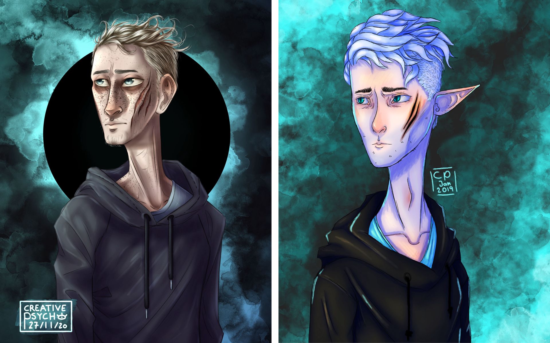
my lovelies! I am back with a redraw of mine. Some of you may be able to recall those three companion pieces, that I drew in January 2019 when I was ill and at home.
The first was called "Empty" and if was my profilepicture for the longest time ever xD
The last was called "Drowned" and it was my first attempt at rimlighting and drawing something underwater.
And the one in the middle was called "Lost" and is the piece we will be looking further into today:
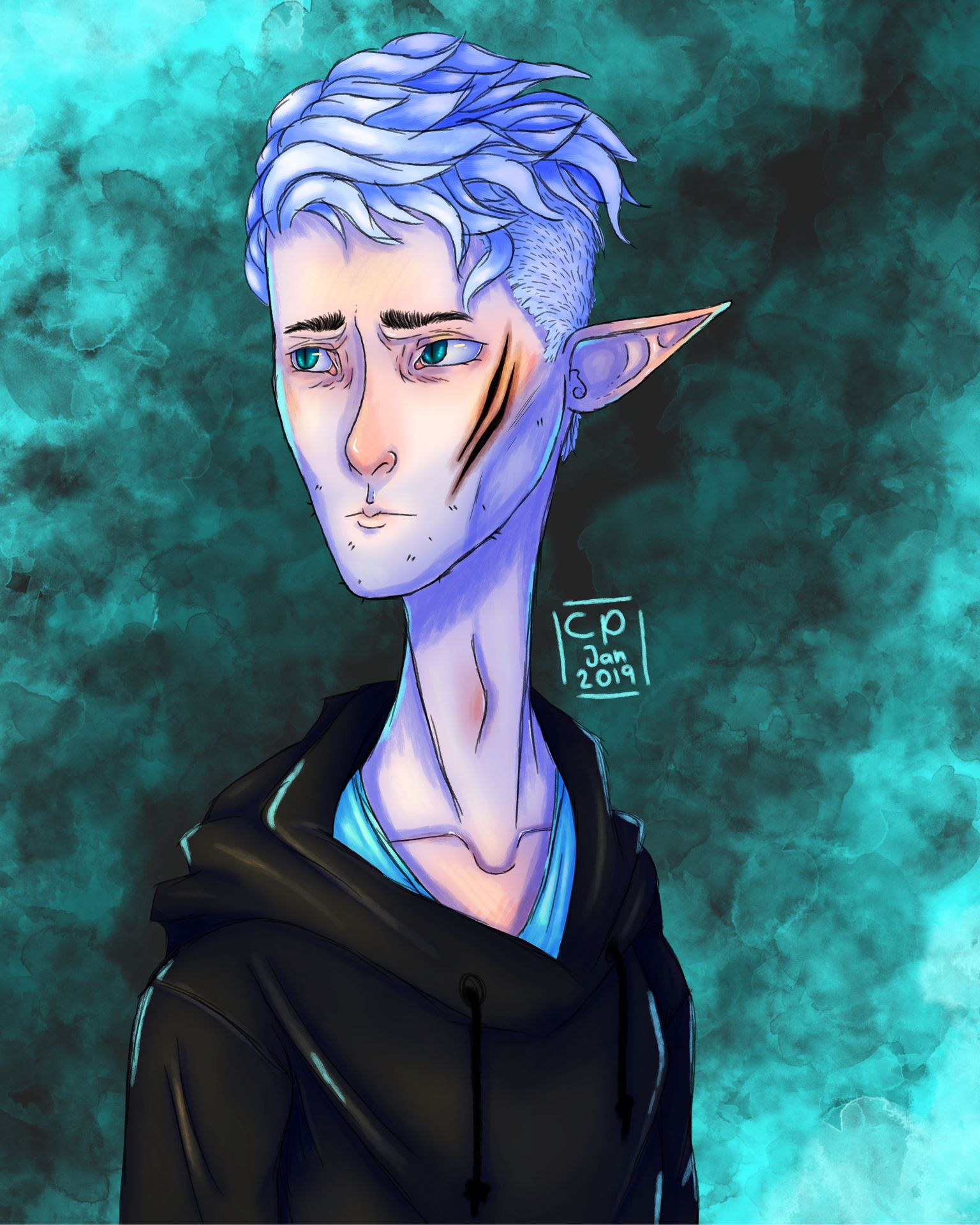
So my attempt with lost was, to create some sort of feel and story in the image... I think I did a pretty good job, for my skills at the time ^-^"
Anyways, I picked this drawing of the three to start with the redraws, since... it's a boy... and I like it more than "drowned" .....
yeah...
SKETCH THINGY!!
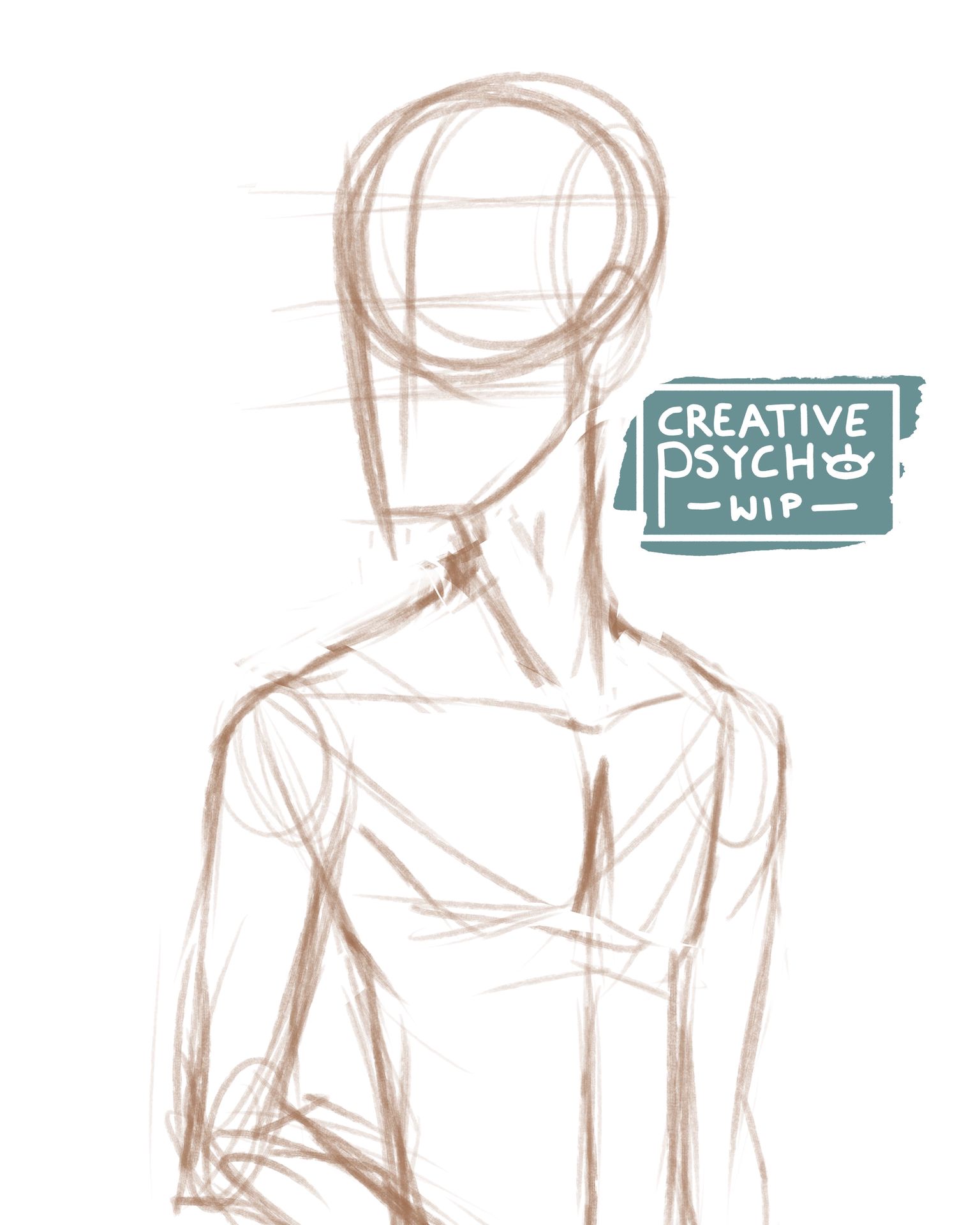
As always, just a rough guide of what goes where, figuring out the rough proportions... the usual stuff.
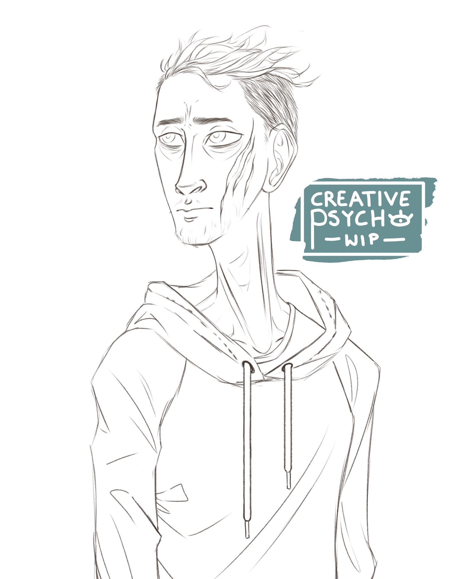
Next up I went ahead with the lineart, again, nothign all that special... just me doing my usual thing...
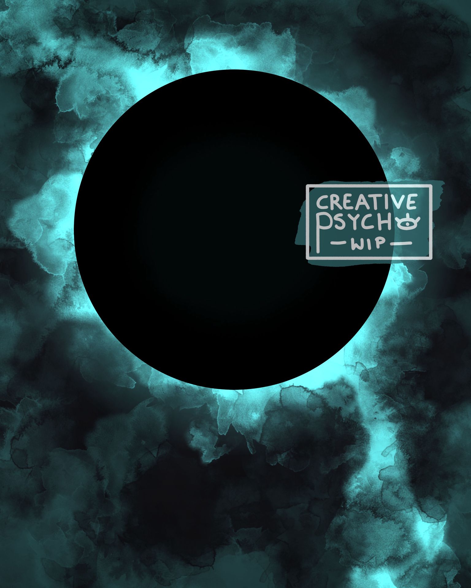
And after that I went ahead and did the background. My goal was to make it similar to the one in the first picture, but make it more focal to the character, since the composition guides the eye away from the picture.
I decided to make the character stand in front of this flat, black circle that seems to emit some sort of light. This should pull the eye through contrast right to my focal point.
To stay true to the original composition though, I kept that diagonal line. I did indeed make it run from the upper left to the bottom right corner though, to guide the view from the top corner to the characers face, where the eye settles, before hovering around the black circle.
I already was planning on enhancing the compositional choices through overlay- and multiply-layers in the end, when the character was all done and rendered.
Yeah... I have fun thinking about composition-crap, when it comes to more abstract backgrounds like this >w<""
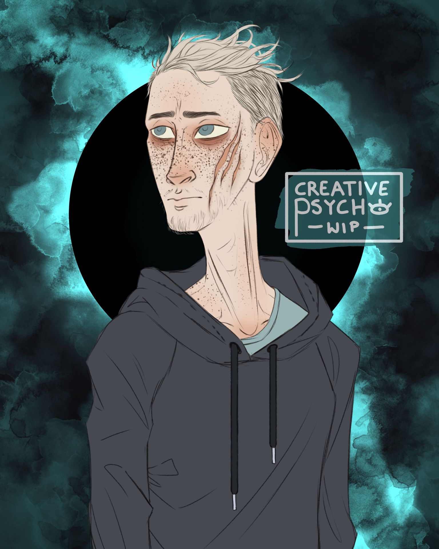
So I bunged the background behind our character and started to flat him out. I tried to keep as true to the original as possible, ignoring my... questinable shading (it is indeed very weird, but I somehow still like it a lot... I plan on trying that shading style sometime soon again...)
So we have the white hair, pale and red-tinted skin, grey jumper and blue shirt. I did indeed change his eye colour, for simple aesthetical reasons, and make the jumper lighter, for >>throws glitter in air<< CONTRAST.
I also made his hair all flowy.... because I think I tried to do that in the original... I'm not all that sure about that though...
Anyways, I went ahead and shaded the thing. Slowly but surely, chiseling away in his features and just having fun with the icy lighting >w<
I wanted to add some strong, blue rim-lighting in there, but... I forgot... yeah, shame on me, that might have pushed the piece a bit more.
Otherwise I went ahead with numerous gradients on top of the entire drawing, to make the top left corner more focal and push the bottom right one more in the background. Again I wanted the eye to focus on the face, which I also achieved through >> throws glitter in the air again<< CONTRAST IN DETAIL.
On the topic of "detail" here's the face... especially the eyes that I am proud of :D
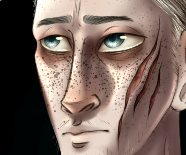
So yeah... I really like the eyes.....
BUt other than that I am a bit sad, that I didn't push his expression more. It seems way more subtle than in the first one and I think I could've done a better job on the expression-end of things...
Anyways, enough to all the ramble, here's the finished piece:
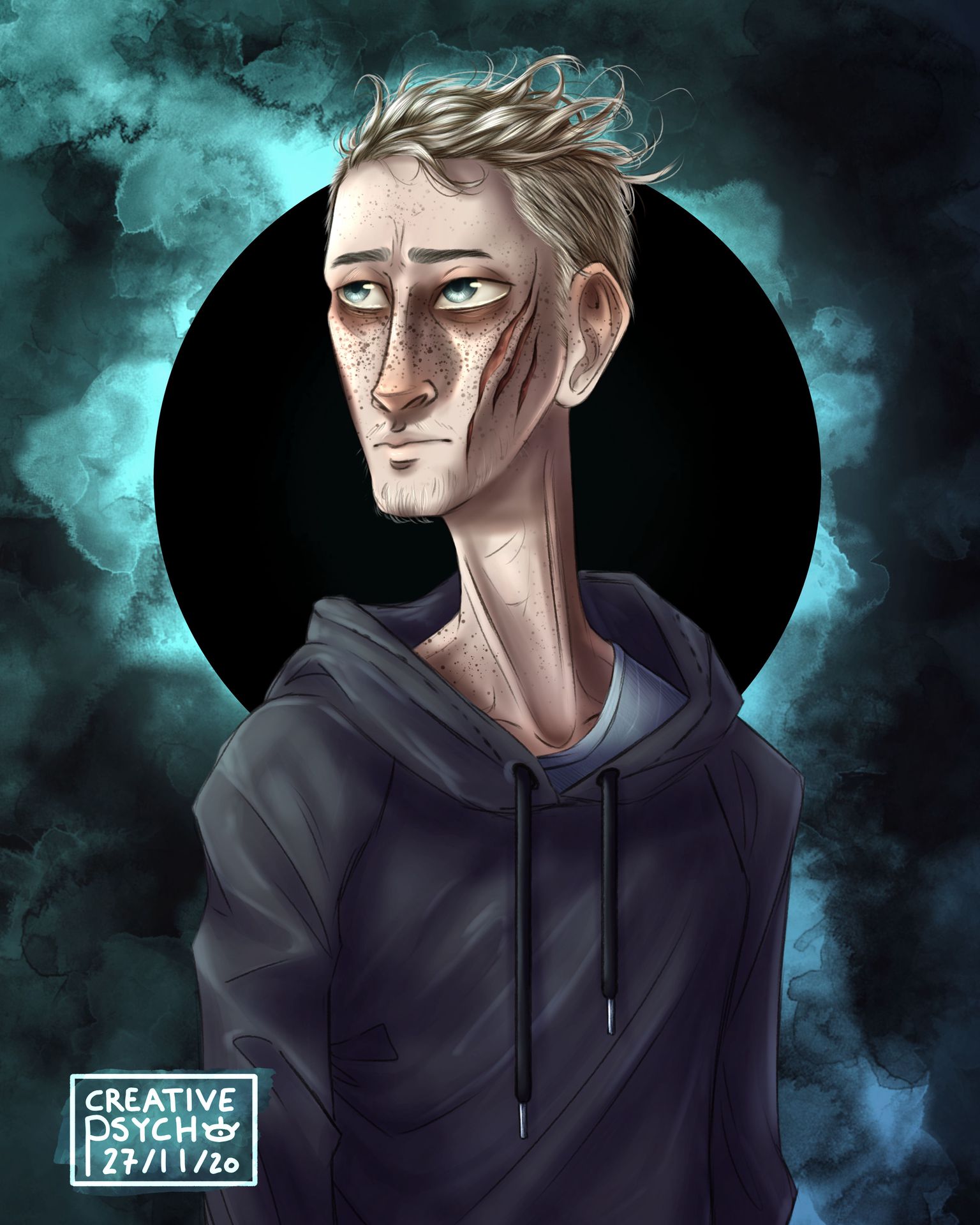
I like it. A lot. And I am proud of it. A lot.
And I think I did indeed improve quite a bit, in comparison to the first one ^-^
Over time I got a way better feeling for shading, composition and anatomy I think... my style has also come a long way, and I am happy to see how far I have come :D
So I hope you like the drawing and stick around for another while...
>>gives you hugs and a warm beverage of your choosing<<
So until we see each other next time:
Bạn đang đọc truyện trên: AzTruyen.Top