✐ styles of covers pt. 3 ✐
i've had some free time to really just edit photos so i hope you guys enjoy. let me know which ones are your favorite styles are and don't be afraid to sign up! these are a little more advanced and took more time to make. these don't have the xee shop sign but all covers will usually have it. these covers are involving the characters to be in different sides from one another.

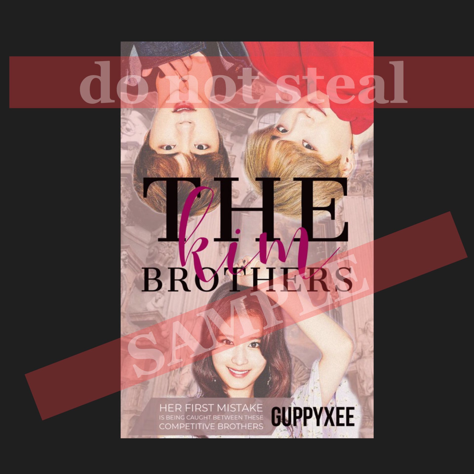
1. this is the main boy x girl x second male kind of poster. if you want both characters plus the second lead to be in the poster to create a love triangle, always let me know! it's better for you to have more details when you request so that I am able to make an eye catching cover. if you want a short sentence of the main plot then let me know

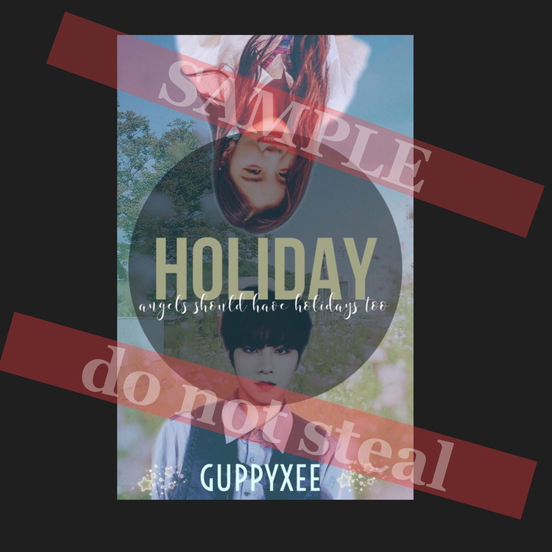
2. if you want space in between the two characters then let me know. between the space would be used to the title and probably a small, simple description since stickers can be distracting to use. the characters would be facing the sides which decorations would be difficult to use because the characters will fill up both halves of the sides.

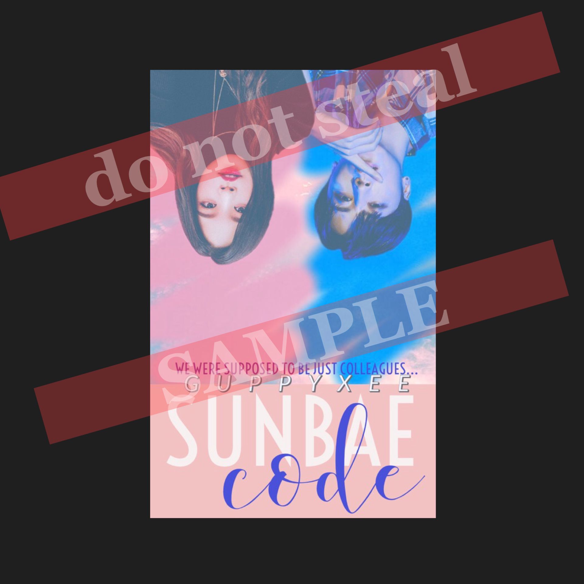
3. this is an example of a collage + color focused poster. as you can see, there are only two colors with many different shades of it. pink and blue. if you want your photos to include just two shades let me know! often times, darker themes are better so the colors would be seen they are contrasting like red and blue or white and gray. if you want, you could have the characters laying backwards.

4. this is the same kind of concept like the first and second one, but this is a much simpler kind of style and also only includes the main two characters. again, the titles and a short sentence would be in the middle and i would try to add stickers or other details in order to help the cover pop out.
Bạn đang đọc truyện trên: AzTruyen.Top