| r e v i e w s : p a r t 3 |
17.
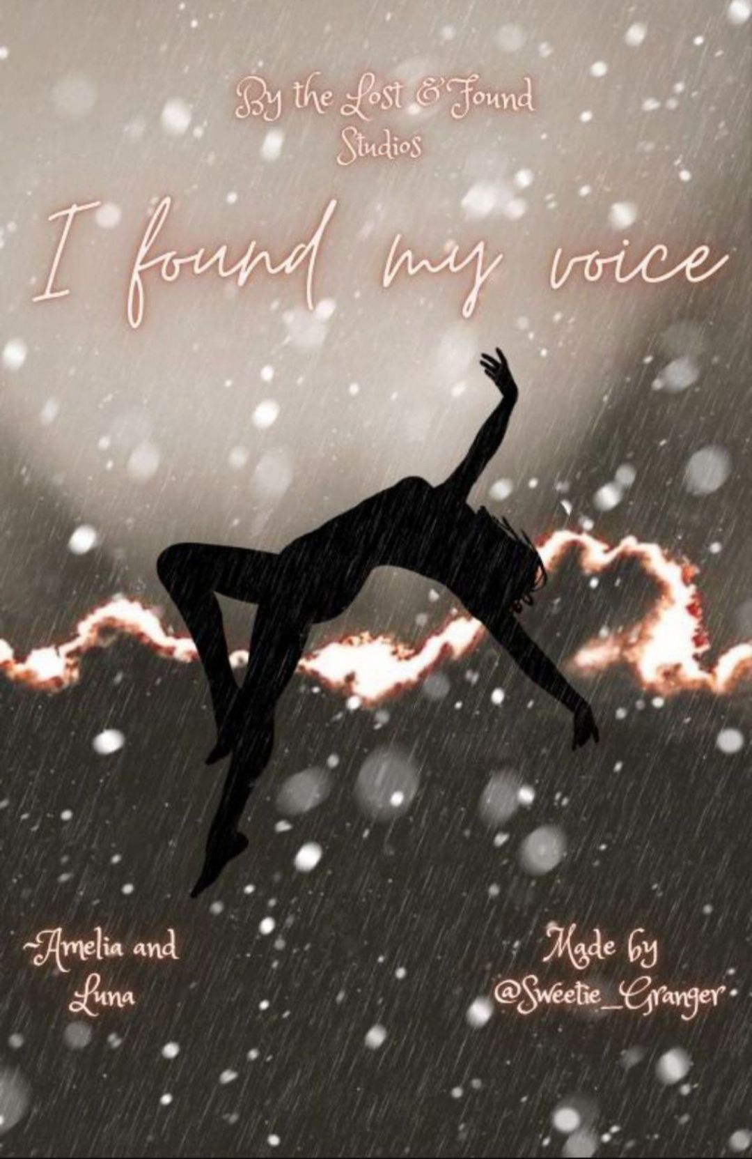
💜I like how you tried to portrayed the meaning of the song in the cover. I appreciate your efforts you put in.
🖤 The font, their colours aren't great, the placements and size could've been much better.
The author's name placement doesn't look right.
🖤 The colour combinations doesn't go well together, its kind of dull. The colours don't match and kind of spoil the overall appearance of the cover.
🖤 The silhouette kind of merges into the background so again the colours...
18.
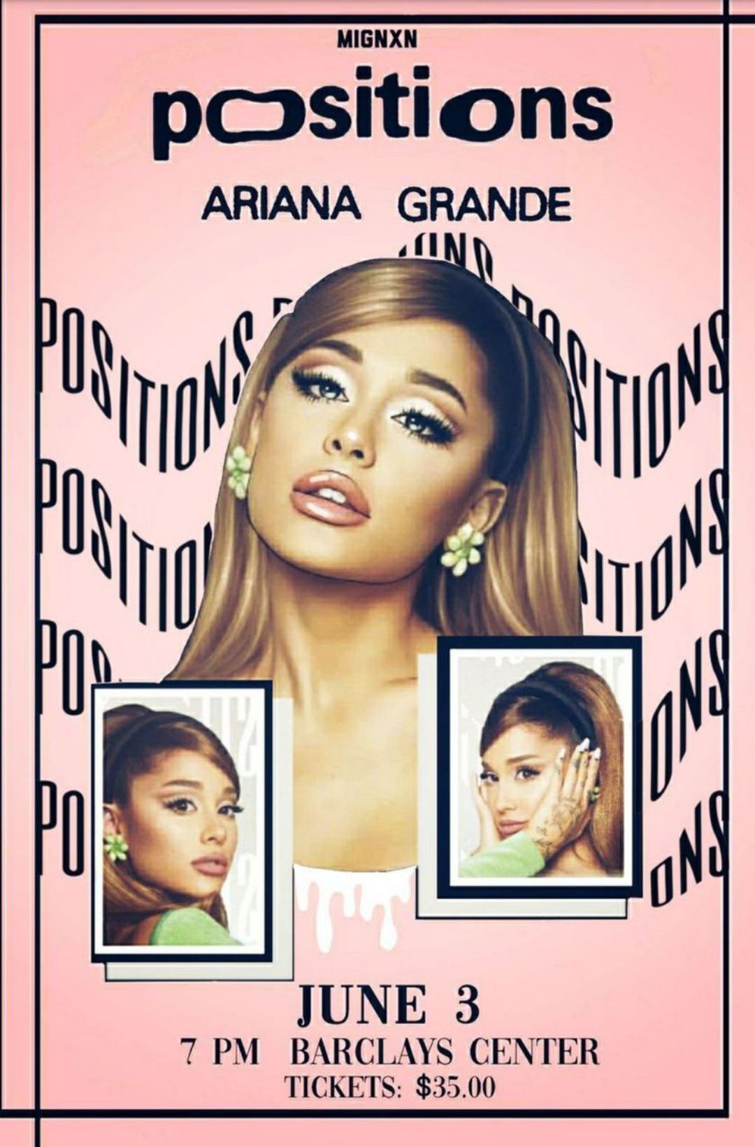
💜 The cover looks vibrant and the colours go together well!
💜The editing is well done and fonts are nice.
🖤I feel it could've been more creative, its just my opinion that it kinda looks simple.
19.
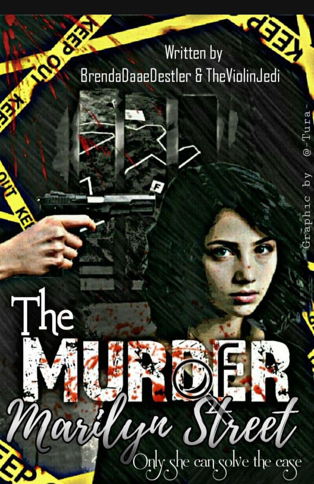
💜 There's a lot of work put into this cover! And I appreciate all the details you've put in it!
💜I like the blood stained font with the magnifying glass. That's the best part of your cover. I like the filter you've used, it gives a nice effect.
🖤 I feel that you've put so many things into it that it looks a little too crowded and messy. But it's still a great cover!
20.
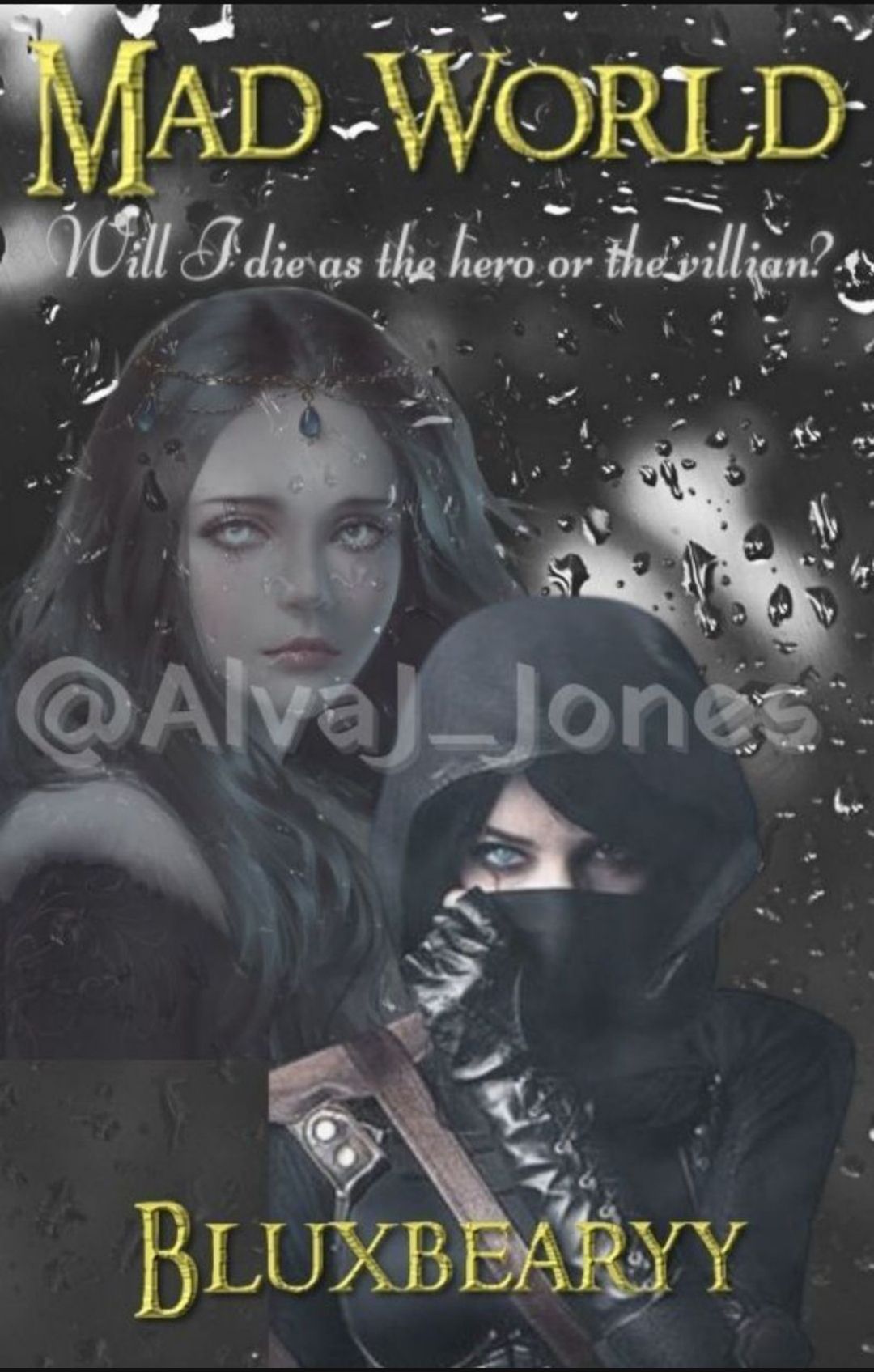
💜 I like your idea and how the pictures you chose for the cover.
🖤The fonts not that attractive. The cover isn't very eye-catching
🖤The picture quality is bad.
🖤The size of the watermark is too big for a watermark.
21.
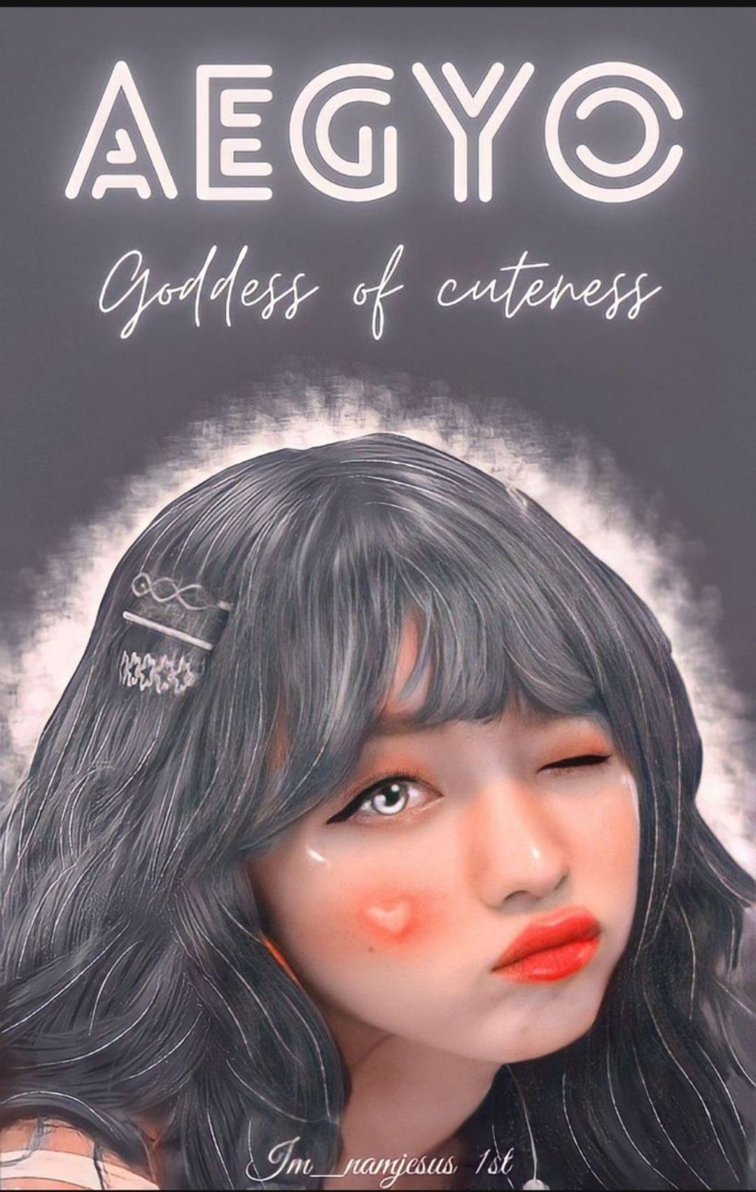
💜 This is such a cute cover!
💜The editing looks great! You are really good at vectors. The fonts go well with your cover too.
🖤 I feel like the cropping of her hair isn't done well. At some parts its very sharp like on top of her head and the right side.
23.
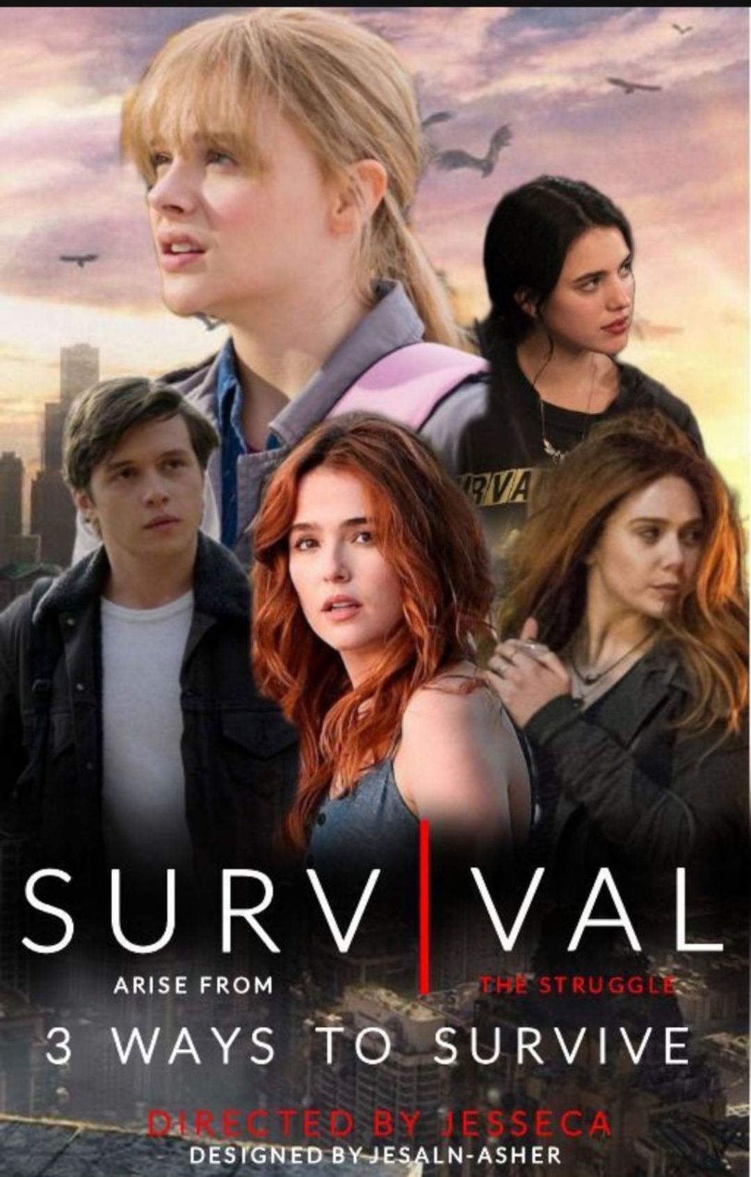
💜Your cover looks great! And the colours go well together.
💜The placement of the pictures is good.
🖤 I feel that 'I' in survival should have been normal.
🖤 The line directed by jessica should've been in some other color.
🖤 The cropping is not neat in some parts.
Bạn đang đọc truyện trên: AzTruyen.Top