| r e v i e w s : p a r t 2 |
11.
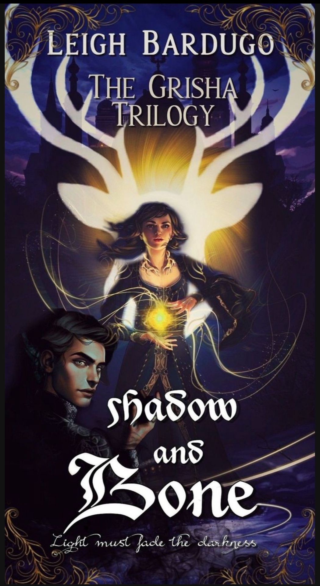
💜 I really liked your cover!
💜 The editing and cropping is done nicely.
💜 I like it how every element of your cover has a meaning behind it.
🖤 I don't like the borders you've used, they kind of spoil the look of your cover as they are covering the reindeer silhouette.
🖤 The fonts and size choice could've been better. The placement of the texts is not well organised. The subtitle font size is too small.
12.
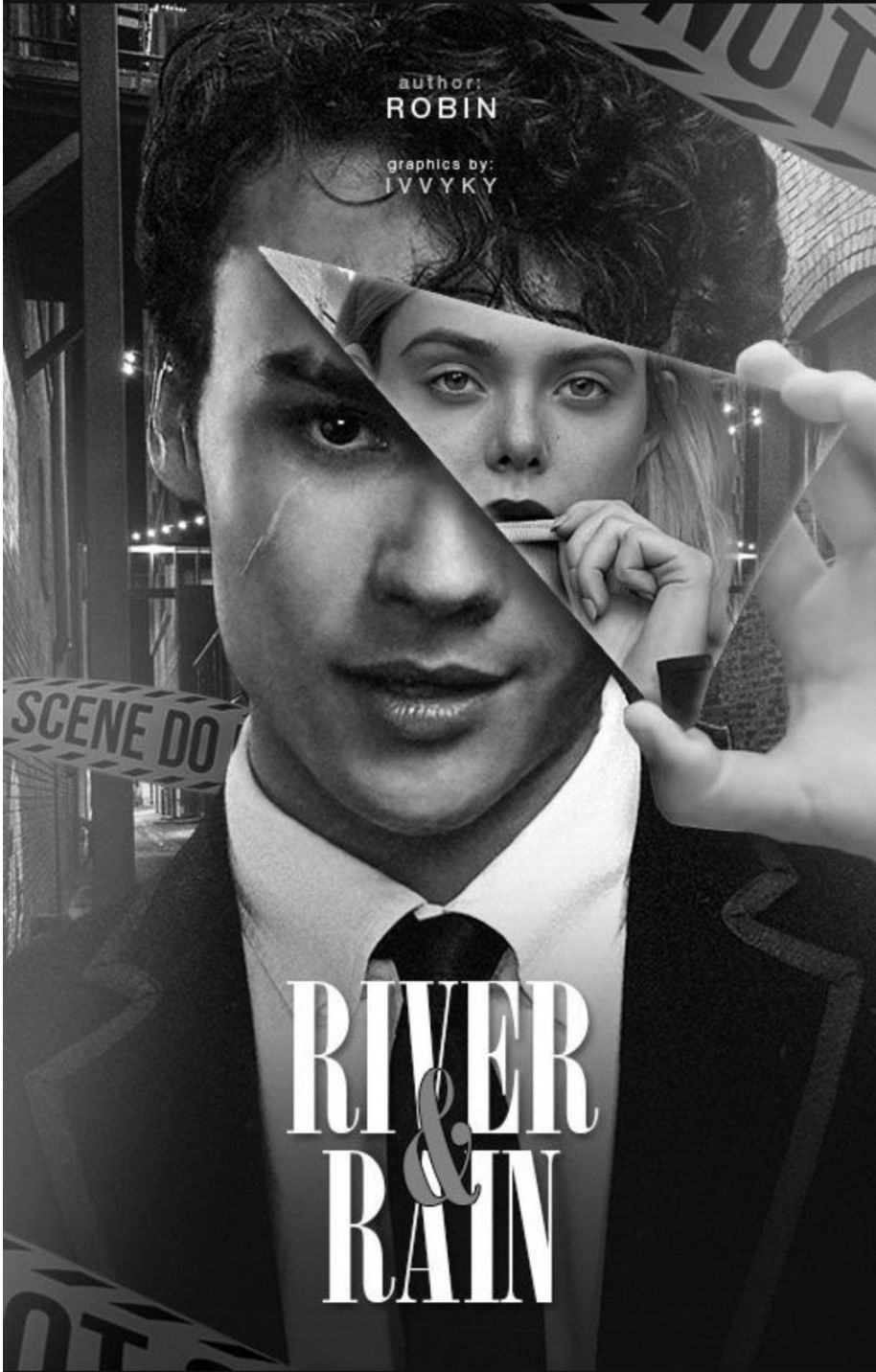
💜 It just looks perfect! Amazing idea and amazing editing. I'm speechless!
🖤 Can't find a fault!
But I feel the font size of the author's name could've been bigger.
13.
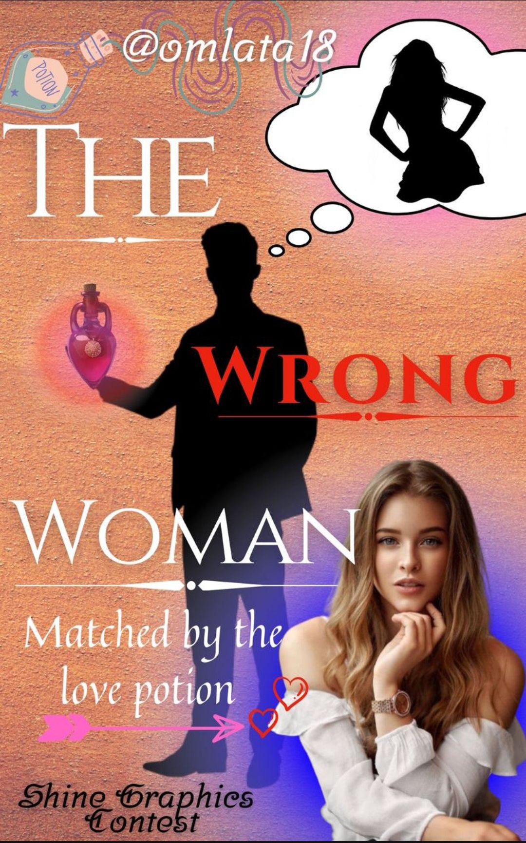
💜 I like the idea behind the graphic but looks like you couldn't lay it perfectly in the cover.
🖤 The colour combinations aren't good. It looks all messed up as the colours don't blend together at all.
🖤 The fonts are very plain and the font colors are not nice.
🖤 I think you should have used a silhouette for the girl in the front also cause it looks odd. The pictures dont go well together, they look very random.
🖤 The background isn't nice. All the elements don't come together well. Looks like you've made this cover in a hurry and didn't devote much time to design it creatively.
14.
💜 The cover looks good and the font is also nice!
🖤 The whole upper part of the cover looks very blurred.
🖤 I don't like the font being placed on the girl, maybe you could've placed above her.
🖤 You could've tried being more creative with editing as you've used very less resources.
l5.
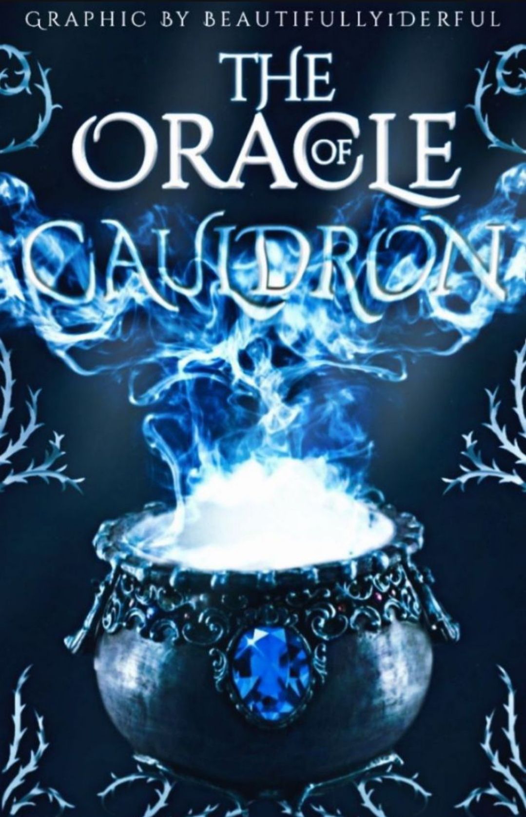
💜 This is such a cool cover! You did a commendable job in your first try at object based cover.
💜 The fonts are great! The colour combination is great as well.
💜 I love that blue magical smoke coming out of that magical cauldron.
🖤 I don't know if it's wattpad or what, I feel the picture quality should've been better.
16.
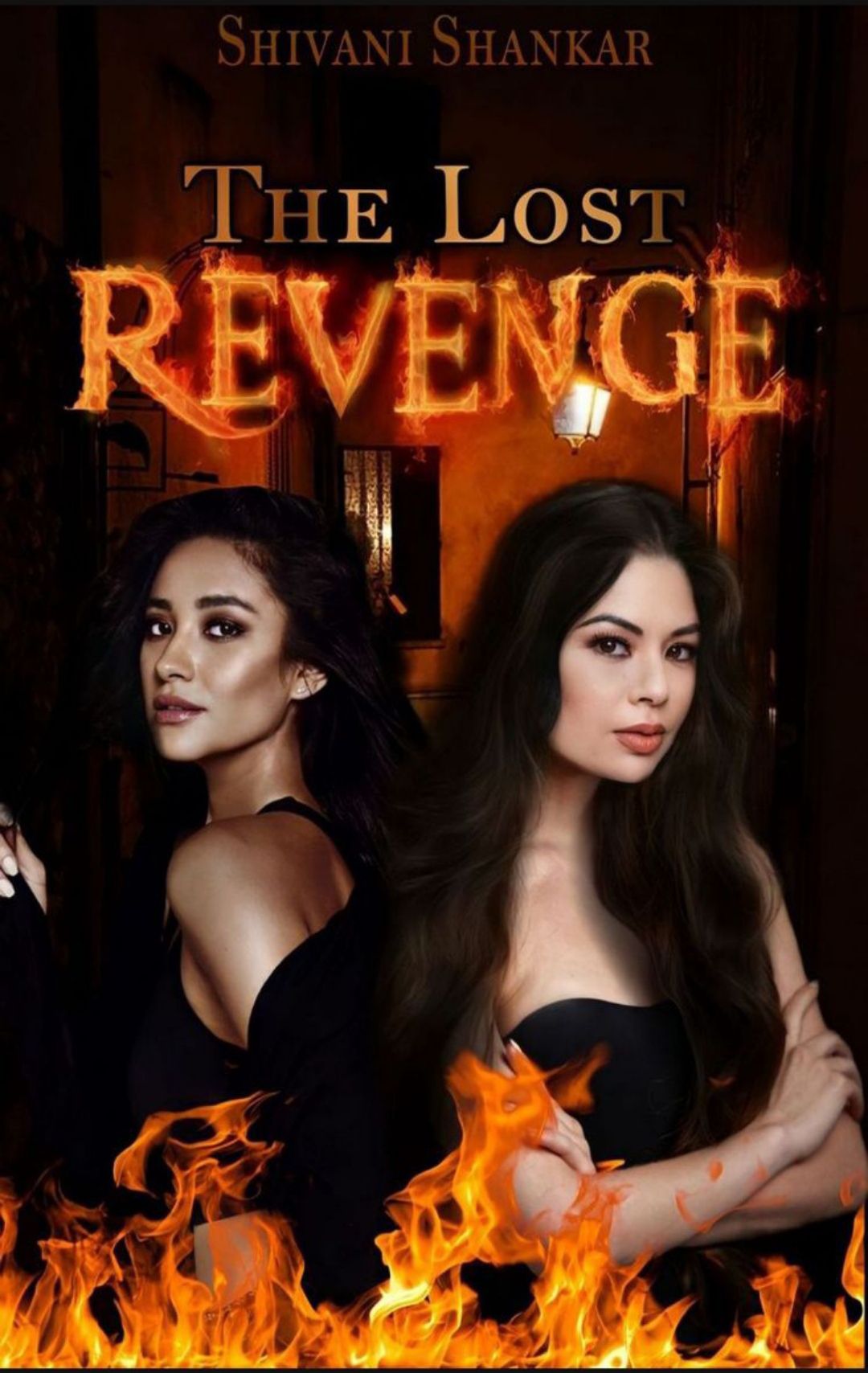
💜 Fabulous fiery font! I like how the word Revenge is on fire!
💜The editing is great and I love the colour combination of orange and black.
🖤The author's name could've been in some other color as it isn't visible clearly.
🖤 The hair of the girl on the right is too softened, I'd prefer it to be sharper. Other than that, well done!
Bạn đang đọc truyện trên: AzTruyen.Top