| r e v i e w s : 2 |
You all have submitted awesome entries.
*Disclamer*
These reviews are completely based on my opinion.
💛 Areas of Improvement
And here are my (awesome😅) reviews:
1.
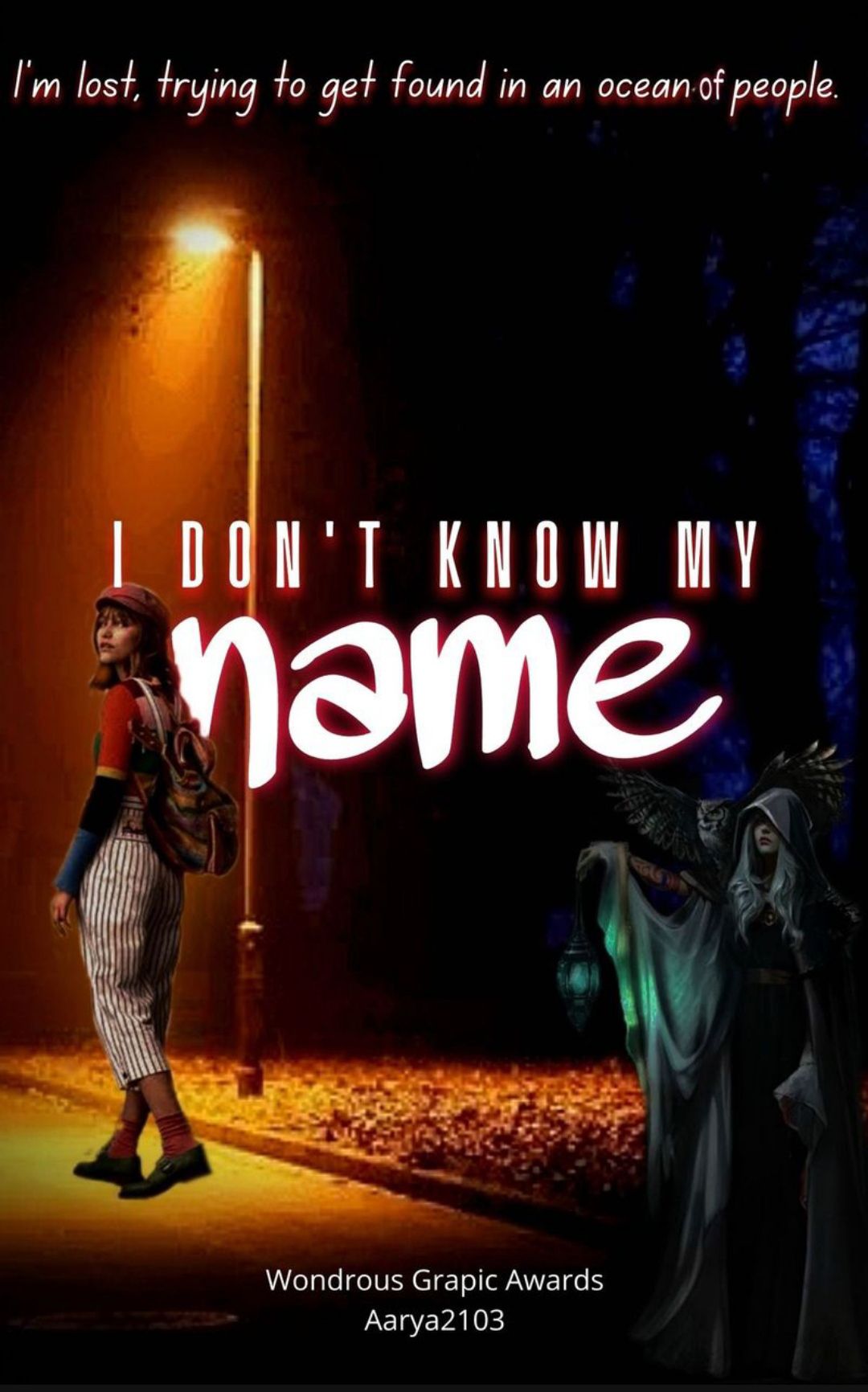
💜 I loved the whole concept you built up!
💜 The pictures and subtitle chosen are
cool too. The colour contrast in your cover is also nice!
🖤 Umm I don't like the font of the word 'name'.
🖤 That lady with the lamp looks a bit shorter. I know you've tried to show as if she is following Grace but still.
💛 You need to explore more font styles according to me.
2.
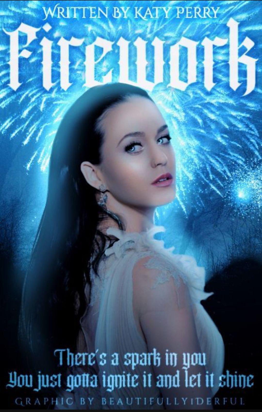
💜 I really liked the blue vibes in your your cover!
💜 Fonts look good too!
🖤 I didn't like how you've done hair of Katy Perry. It's too much softened and the hairline looks ruined, according to me.
🖤 In my opinion it looks like a very simple cover compared to your previous entry. I was expecting more from you.
💛 I feel you need to work on the editing part, try not to soften the image too much.
3.
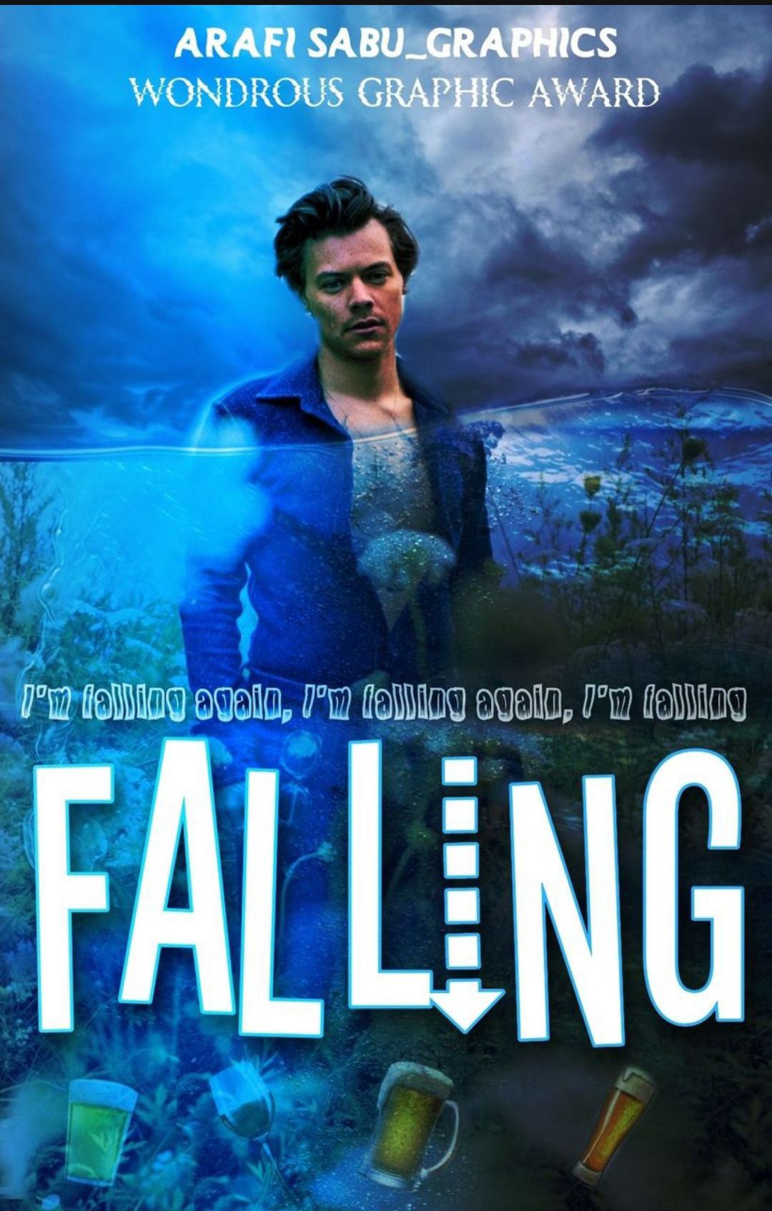
💜 The picture selection was great! I like how the greenery in the original picture looks like sea plants and weeds in the edit.
💜 The fonts look nice. I like how you added the downward pointing arrow in the title.
🖤The picture quality seems to be low ( I don't know if its because of wattpad)
🖤 The cropping in some parts of your cover is not neat. I feel picture doesn't actually represent the title...according to me.
💛I think you should use better quality images.
4.
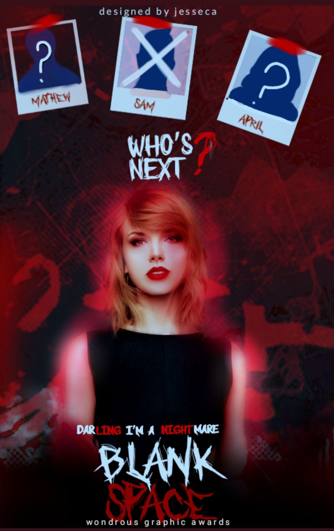
💜 This is a really cool cover! I like the black and read colour combination you chose, it goes well with the mystery genre. I like the polaroids you've used.
💜The fonts looks awesome!
🖤 I think the font size of the title should've been bigger to differentiate it as the title.
🖤I feel the subtitle doesn't match the story you made up.
🖤 I somehow don't like the way you've edited Taylor, especially her hair. It looks so soft and I think it would have looked better if the the image would've been sharper.
💛 I think you should work on the cropping and editing, especially hair.
5.
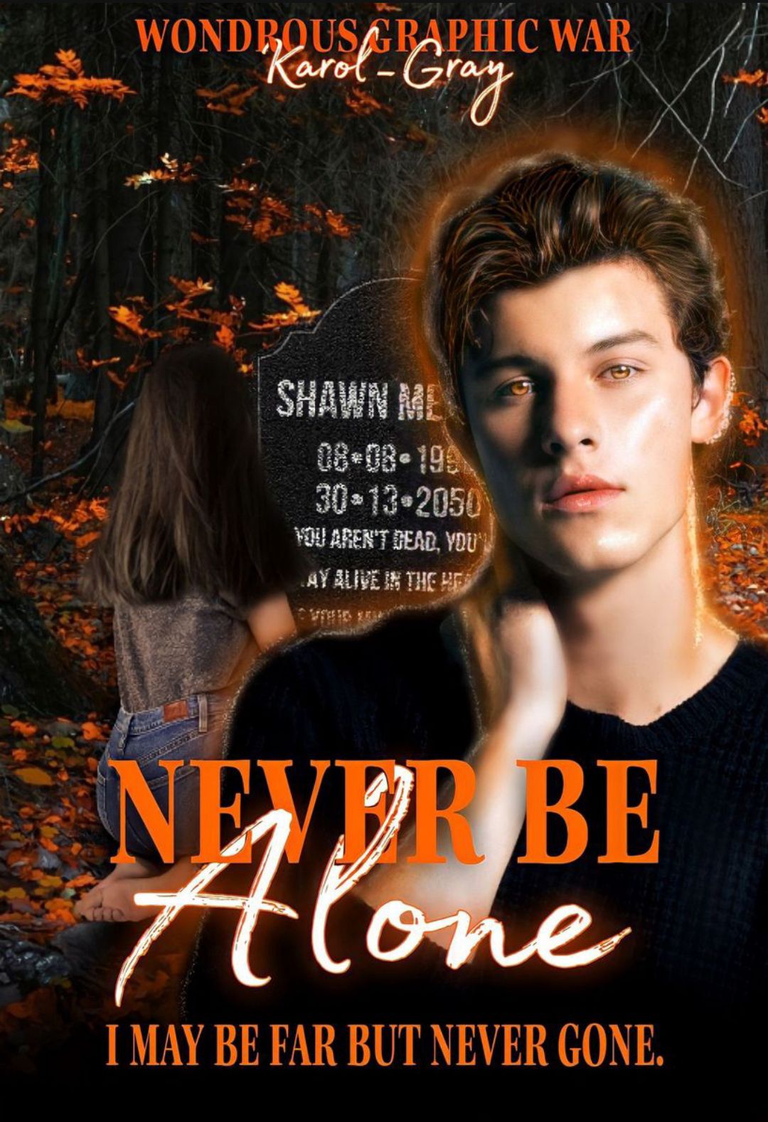
💜 The colours and the font look great! (Are black and orange your favourite colours?)
The subtitle chosen is good too!
💜I liked the whole story you created and the edit is very well done. I like how you've shown a date that doesn't exist on the grave. The ghostly appearance of Shawn looks cool!
🖤 The girl's hair in your cover is kind of camouflaged, in my opinion.
🖤 I feel the cropping and editing in some parts could've been better.
💛 I think you need to work a litte on editing, explore different colours combinations.
6.
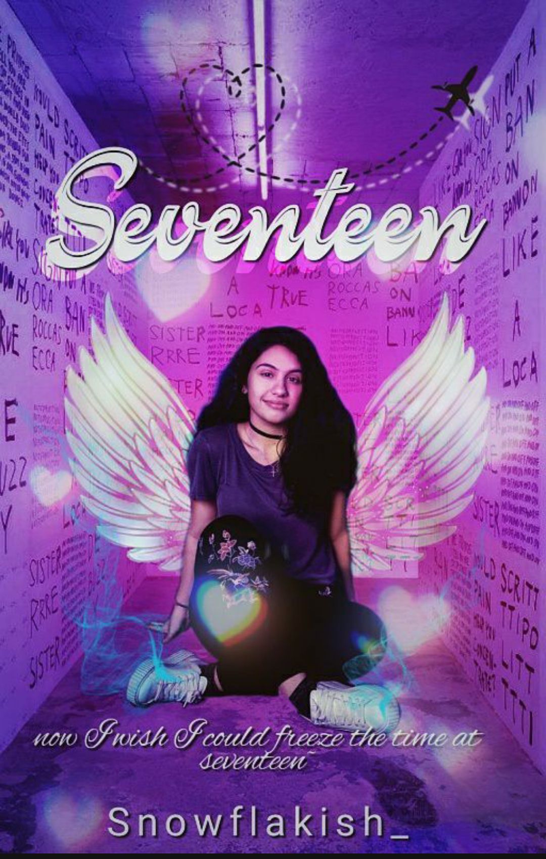
💜This cover is so pretty! I love the purple theme you chose, it's perfect for a fantasy cover!
💜I loved your explanation behind using all the elements in the cover. I like the chosen subtitle too!
🖤The fonts could've been better in my opinion.
🖤I feel the picture quality could've been better.
💛I feel you need to use better quality images and be creative with the fonts.
7.

💜 Your idea behind designing the cover is unique!
💜The christmassy vibes of your cover looks wonderful.
💜I like the font used for the title
Memories!
🖤I feel the font of the subtitle looks very plain in front of the title.
💛I think you need to work a little on the fonts.
8.
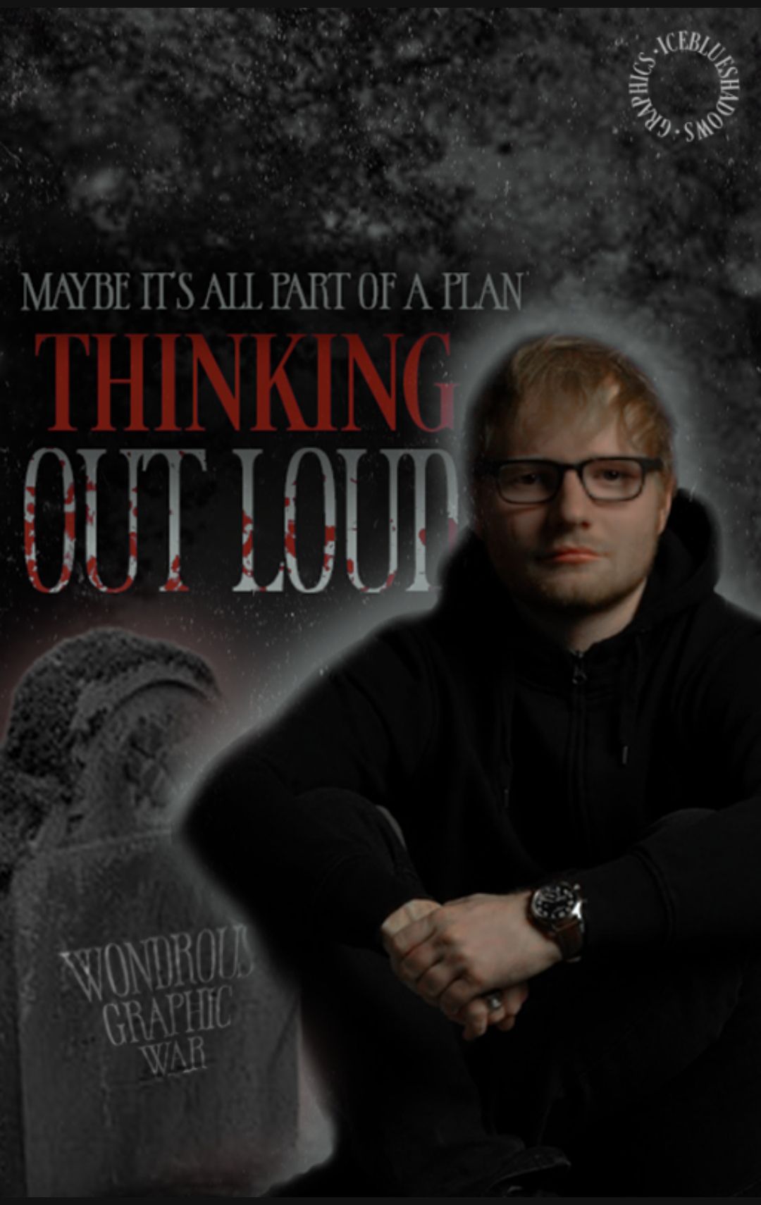
💜I Appreciate the effort you've put in creating the cover. I know creating a mystery cover for such a song ia hard.
💜The subtitle is PERFECT.
💜 I like the blood stained fonts and how you've added the watermark on the grave.
🖤 To my eyes, the cover looks kind of faded and dull. The editing could've been a little better.
💛 I feel you need to work on the picture quality.
9.
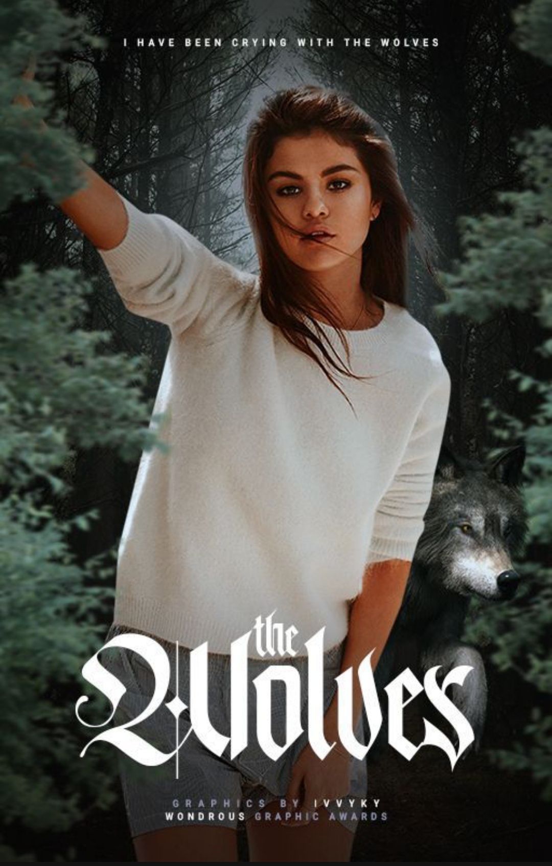
💜 I was expecting to see a dark mystery cover with howling wolves and all. But this was a pleasant surprise showing a Selena as girl who loves forest and spending time with wolves!
💜 I like the title's fonts and the subtitle is well chosen too.
🖤 I feel the font size of the subtitle is small again,I had pointed out the same last time as well.
💛 I think you need to work on font size and remember to follow all the requirements carefully.
Bạn đang đọc truyện trên: AzTruyen.Top