Auswertung Runde 3/Evaluation round 3
Hier eure Bewertungen:
Music_Dream24:
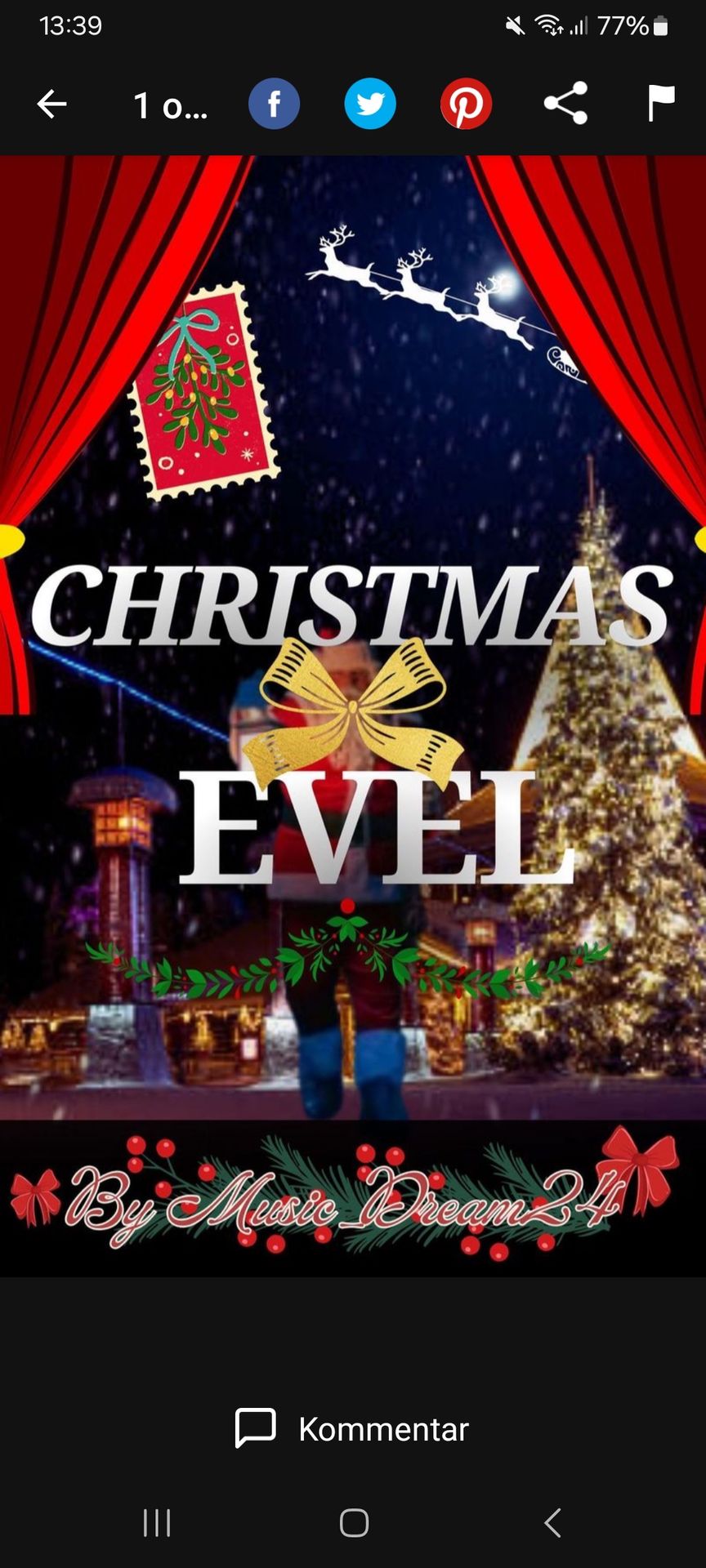
Ich:
Titel: 8,5/10
- vorhanden: 1/1
- lesbar: 2/2
- Autorenname: 1/1
- ansprechend: 1/2
- Thema: 2/2
- eigene Idee: 1,5/2
Hintergrund: 3,5/6
- passt zum Titel: 3/4
- scharf: 0,5/2
Insgesamt: 12/16
Feedback:
Das Bild ist nicht wirklich scharf und wirkt ein wenig überladen. Ansonsten sehr schöne Idee.
EmiShiroi:
Titel: 8,5/10
- vorhanden: 0,5/1
- lesbar: 2/2
- Autorenname: 1/1
- ansprechend: 1/2
- Thema: 2/2
- eigene Idee: 2/2
Hintergrund: 3/6
- passt zum Titel: 3/4
- scharf: 0/2
Insgesamt: 11,5/16
Feedback:
Die Idee mit der Bühne ist sehr schön und kreativ, aber insgesamt ist das Cover stark überladen und die einzelnen Bilder sind nicht so gut miteinander verarbeitet.
-kristallprincess-:
Titel: 8/10
- vorhanden: 1/1
- lesbar: 2/2
- Autorenname: 1/1
- ansprechend: 1/2
- Thema: 1,5/2
- eigene Idee: 1,5/2
Hintergrund: 4,5/6
- passt zum Titel: 3,5/4
- scharf: 1/2
Insgesamt: 12,5/16
Feedback:
Das Cover ist sehr schön nur finde ich, dass der Hintergrund sehr belebt ist und mit ein paar Elementen weniger würde es auch sehr gut aussehen.
WildFantasy2011:
Titel: 9/10
- vorhanden: 1/1
- lesbar: 2/2
- Autorenname: 1/1
- ansprechend: 2/2
- Thema: 2/2
- eigene Idee: 1/2
Hintergrund: 5/6
- passt zum Titel: 3/4
- scharf: 2/2
Insgesamt: 14/16
Feedback:
Irgendwie wirkt es auf mich so, als wäre keine Idee für einen Titel dagewesen und als sei einfach ein Titel eines Songs von Stray kids genutzt worden. Dagegen ist zwar nichts einzuwenden aber meiner Meinung nach passt es nicht zum Hintergrund.
Beyond_Borderland:
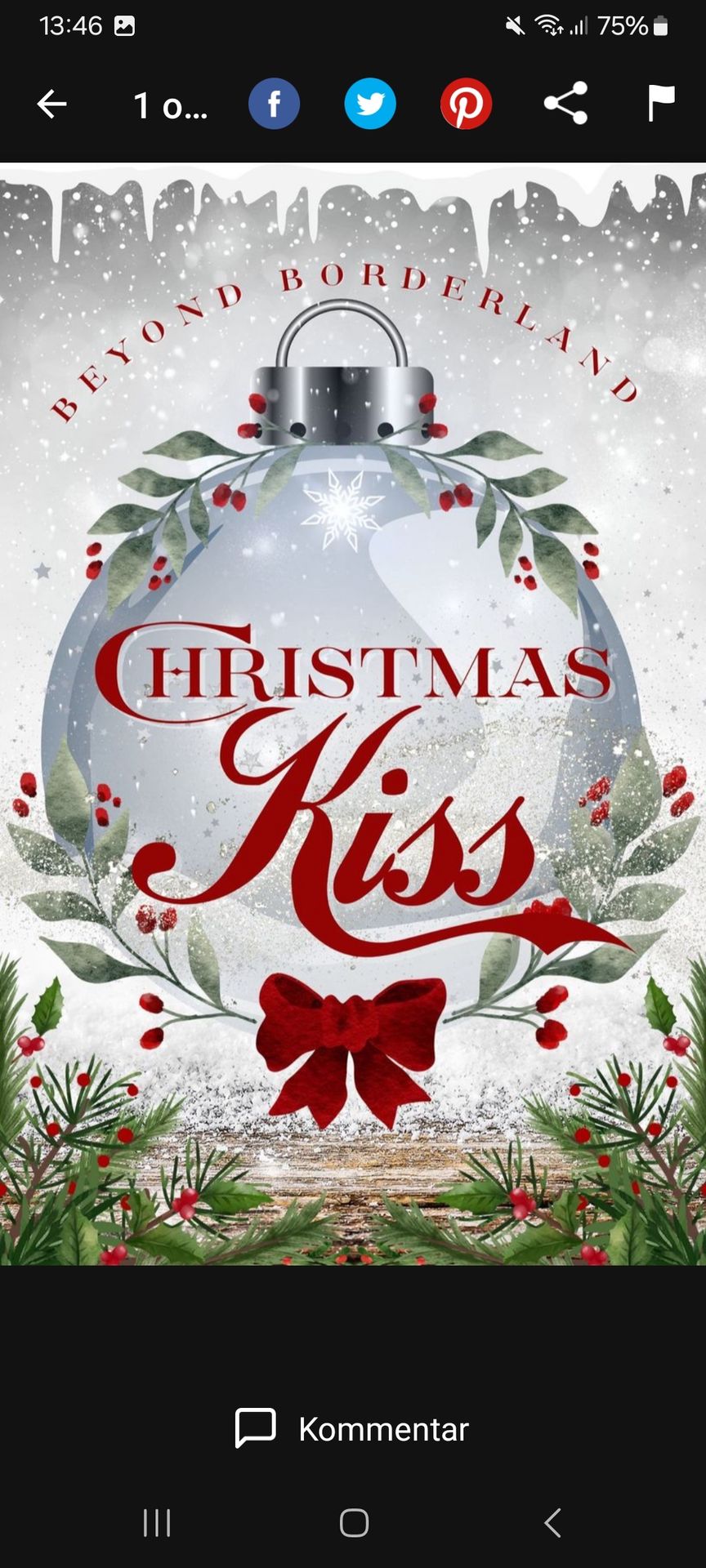
Ich:
Titel: 10/10
- vorhanden: 1/1
- lesbar: 2/2
- Autorenname: 1/1
- ansprechend: 2/2
- Thema: 2/2
- eigene Idee: 2/2
Hintergrund: 5/6
- passt zum Titel: 3/4
- scharf: 2/2
Insgesamt: 15/16
Feedback:
Das Cover ist sehr schön und passt gut zum Thema.
EmiShiroi:
Titel: 9,5/10
- vorhanden: 1/1
- lesbar: 2/2
- Autorenname: 1/1
- ansprechend: 1,5/2
- Thema: 2/2
- eigene Idee: 2/2
Hintergrund: 5,5/6
- passt zum Titel: 3,5/4
- scharf: 2/2
Insgesamt: 15/16
Feedback:
Die Farbgebung passt perfekt zu Weihnachten und die Idee ist sehr schön! Das einzige, was man meckern könnte, wäre dass der Titel stark nach Romantik klingt, das Cover gibt das allerdings nicht so rüber.
-kristallprincess-:
Titel: 9/10
- vorhanden: 1/1
- lesbar: 2/2
- Autorenname: 1/1
- ansprechend: 1,5/2
- Thema: 1,5/2
- eigene Idee: 2/2
Hintergrund: 4/6
- passt zum Titel: 3/4
- scharf: 1/2
Insgesamt: 13/16
Feedback:
Ich finde das Cover sehr schön gestaltet, nur hätte ich da der Titel ja 'Christmas Kiss' heißt, mehr Details zum Thema Liebe eingebaut.
WildFantasy2011:
Titel: 10/10
- vorhanden: 1/1
- lesbar: 2/2
- Autorenname: 1/1
- ansprechend: 2/2
- Thema: 2/2
- eigene Idee: 2/2
Hintergrund: 6/6
- passt zum Titel: 4/4
- scharf: 2/2
Insgesamt: 16/16
Feedback:
Dein Cover wirkt sehr harmonisch und die Farben passen gut zusammen. Außerdem wirkt es so als hättest du dir viel Mühe für das Cover gegeben.
buterflx1:
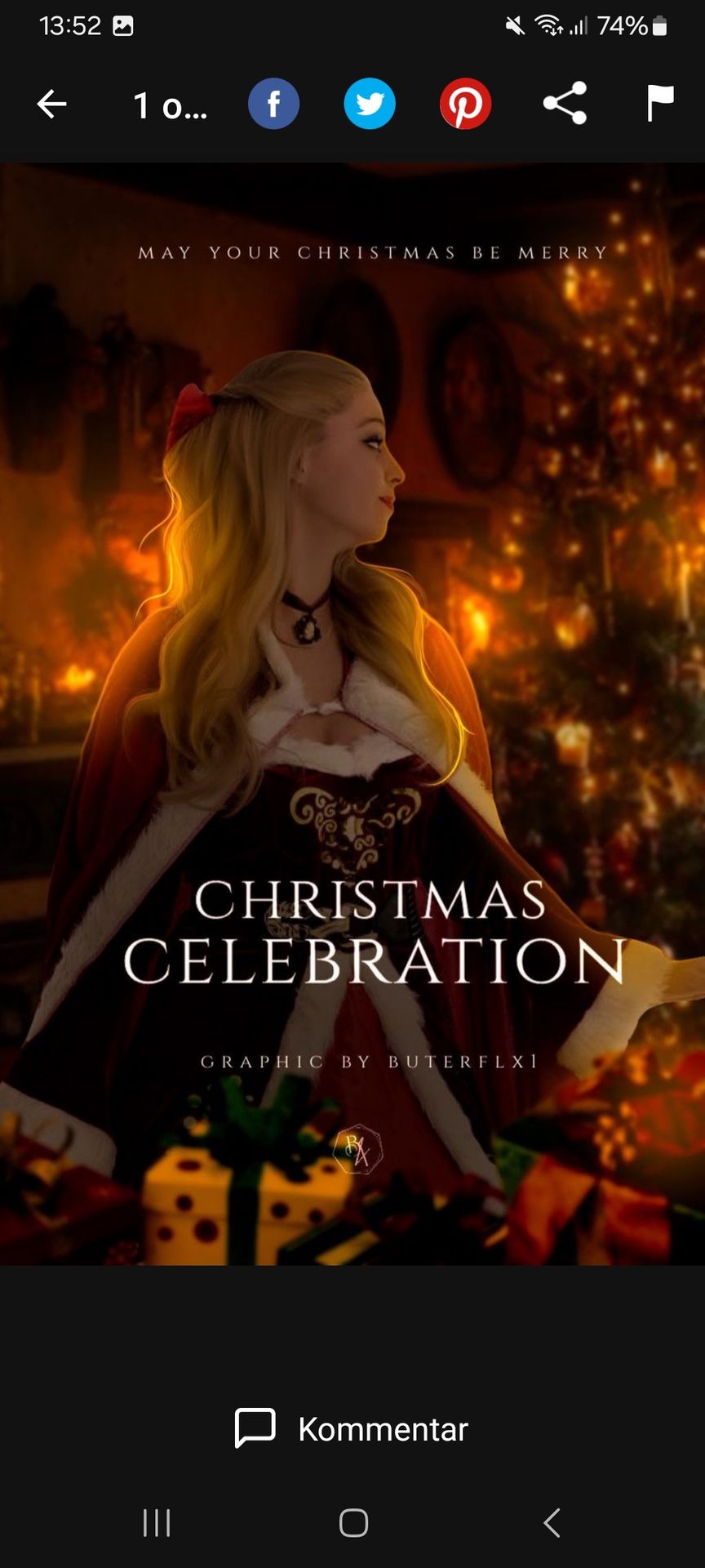
Ich:
Titel: 9,5/10
- vorhanden: 1/1
- lesbar: 2/2
- Autorenname: 1/1
- ansprechend: 2/2
- Thema: 2/2
- eigene Idee: 1,5/2
Hintergrund: 6/6
- passt zum Titel: 4/4
- scharf: 2/2
Insgesamt: 15,5/16
Feedback:
Das Cover ist insgesamt sehr schön gestaltet.
EmiShiroi:
Titel: 9/10
- vorhanden: 1/1
- lesbar: 2/2
- Autorenname: 1/1
- ansprechend: 1/2
- Thema: 2/2
eigene Idee: 2/2
Hintergrund: 6/6
- passt zum Titel: 4/4
- scharf: 2/2
Insgesamt: 15/16
Feedback:
Die einzelnen Bilder sind perfekt zusammengefügt, das sieht richtig schön aus! Die Schrift ist dafür sehr basic und ein bisschen langweilig.
-kristallprincess-:
Titel: 10/10
- vorhanden: 1/1
- lesbar: 2/2
- Autorenname: 1/1
- ansprechend: 2/2
- Thema: 2/2
- eigene Idee: 2/2
Hintergrund: 6/6
- passt zum Titel: 4/4
- scharf: 2/2
Insgesamt: 16/16
Feedback:
Ein sehr schönes Cover, aber für mich sieht es so aus als hättest du sehr viel mit KI gearbeitet.
WildFantasy2011:
Titel: 10/10
- vorhanden: 1/1
- lesbar: 2/2
- Autorenname: 1/1
- ansprechend: 2/2
- Thema: 2/2
- eigene Idee: 2/2
Hintergrund: 6/6
- passt zum Titel: 4/4
- scharf: 2/2
Insgesamt: 16/16
Feedback:
Es gibt einen dieses gemütliche Gefühl und es sich sehr schön aus.
Enni07:
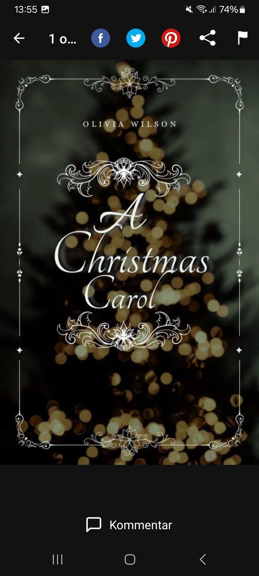
Ich:
Titel: 8/10
- vorhanden: 1/1
- lesbar: 2/2
- Autorenname: 1/1
- ansprechend: 2/2
- Thema: 1/2
- eigene Idee: 1/2
Hintergrund: 3/6
- passt zum Titel: 2/4
- scharf: 1/2
Insgesamt: 11/16
Feedback:
Das Cover zwar sehr schön aber mit den Lichtern etwas verwirrend.
EmiShiroi:
Titel: 7/10
- vorhanden: 1/1
- lesbar: 1,5/2
- Autorenname: 1/1
- ansprechend: 1,5/2
- Thema: 1/2
- eigene Idee: 1/2
Hintergrund: 3/6
- passt zum Titel: 2/4
- scharf: 1/2
Insgesamt: 10/16
Feedback:
Die mittige Anordnung sieht durch das schiefe A nicht richtig passend aus, dadurch wirkt es leicht durcheinander, genau wie die vielen Lichter im Hintergrund sehr unruhig sind. Ansonsten ist die Idee aber wirklich schön, mir gefallen die Ornamente gut.
-kristallprincess-:
Titel: 9/10
- vorhanden: 1/1
- lesbar: 2/2
- Autorenname: 1/1
- ansprechend: 1/2
- Thema: 2/2
- eigene Idee: 2/2
Hintergrund: 6/6
- passt zum Titel: 4/4
- scharf: 2/2
Insgesamt: 15/16
Feedback:
Das Cover ist sehr schön, der Hintergrund harmoniert sehr gut.
WildFantasy2011:
Titel: 9/10
- vorhanden: 1/1
- lesbar: 2/2
- Autorenname: 1/1
- ansprechend: 1/2
- Thema: 2/2
- eigene Idee: 2/2
Hintergrund: 3/6
- passt zum Titel: 2/4
- scharf: 1/2
Insgesamt: 12/16
Feedback:
Der Hintergrund passt weniger zum Titel und ist relativ langweilig. Außerdem fehlt mir ein wenig dieser Weihnachtsvibe. Es ist trotzdem auf seine eigene Art schön.
Disqualifiziert wird leider 26julii04 wegen keinem vorhandenen Cover.
Für die Siegerehrung werde ich all eure Punkte von der letzten Runde und dieser zusammen rechen und wer die meisten hat gewinnt den Contest und wer die zweit meisten hat, gewinnt den 2. Platzt und genauso beim 3. Platz. (Die der 1. Runde nicht weil ich leider, aus mir unerklärlichen Gründen die Punktzahlen nicht mehr finde...)
English:
Here are your reviews:
Music_Dream24:
(Photo is above)
From me:
Title: 8.5/10
- present: 1/1
- readable: 2/2
- Author name: 1/1
- appealing: 1/2
- Topic: 2/2
- own idea: 1.5/2
Background: 3.5/6
- fits the title: 3/4
- spicy: 0.5/2
Overall: 12/16
Feedback:
The image isn't really sharp and looks a little overloaded. Otherwise very nice idea.
From EmiShiroi:
Title: 8.5/10
- present: 0.5/1
- readable: 2/2
- Author name: 1/1
- appealing: 1/2
- Topic: 2/2
- own idea: 2/2
Background: 3/6
- fits the title: 3/4
- sharp: 0/2
Overall: 11.5/16
Feedback:
The idea with the stage is very nice and creative, but overall the cover is very overloaded and the individual images are not processed well together.
From -kristallprincess-:
Title: 8/10
- present: 1/1
- readable: 2/2
- Author name: 1/1
- appealing: 1/2
- Theme: 1.5/2
- own idea: 1.5/2
Background: 4.5/6
- matches the title: 3.5/4
- spicy: 1/2
Overall: 12.5/16
Feedback:
The cover is very nice, but I think the background is very busy and with a few less elements it would look very good.
From WildFantasy2011:
Title: 9/10
- present: 1/1
- readable: 2/2
- Author name: 1/1
- appealing: 2/2
- Topic: 2/2
- own idea: 1/2
Background: 5/6
- fits the title: 3/4
- spicy: 2/2
Overall: 14/16
Feedback:
Somehow it seems to me as if there was no idea for a title and as if a title from a Stray Kids song was simply used. There's nothing wrong with that, but in my opinion it doesn't fit the background.
Beyond_Borderland:
(Photo is above)
From Me:
Title: 10/10
- present: 1/1
- readable: 2/2
- Author name: 1/1
- appealing: 2/2
- Topic: 2/2
- own idea: 2/2
Background: 5/6
- fits the title: 3/4
- spicy: 2/2
Overall: 15/16
Feedback:
The cover is very nice and fits the theme well.
From EmiShiroi:
Title: 9.5/10
- present: 1/1
- readable: 2/2
- Author name: 1/1
- appealing: 1.5/2
- Topic: 2/2
- own idea: 2/2
Background: 5.5/6
- matches the title: 3.5/4
- spicy: 2/2
Overall: 15/16
Feedback:
The color scheme is perfect for Christmas and the idea is very nice! The only thing you could complain about is that the title sounds a lot like romance, but the cover doesn't convey that.
From -kristallprincess-:
Title: 9/10
- present: 1/1
- readable: 2/2
- Author name: 1/1
- appealing: 1.5/2
- Theme: 1.5/2
- own idea: 2/2
Background: 4/6
- fits the title: 3/4
- spicy: 1/2
Overall: 13/16
Feedback:
I think the cover is very nicely designed, but since the title is called 'Christmas Kiss' I would have included more details about the topic of love.
From WildFantasy2011:
Title: 10/10
- present: 1/1
- readable: 2/2
- Author name: 1/1
- appealing: 2/2
- Topic: 2/2
- own idea: 2/2
Background: 6/6
- matches the title: 4/4
- spicy: 2/2
Overall: 16/16
Feedback:
Your cover looks very harmonious and the colors go well together. It also looks like you put a lot of effort into the cover.
buterflx1:
(Photo is above)
From me:
Title: 9.5/10
- present: 1/1
- readable: 2/2
- Author name: 1/1
- appealing: 2/2
- Topic: 2/2
- own idea: 1.5/2
Background: 6/6
- matches the title: 4/4
- spicy: 2/2
Overall: 15.5/16
Feedback:
The cover is overall very nicely designed.
From EmiShiroi:
Title: 10/10
- present: 1/1
- readable: 2/2
- Author name: 1/1
- appealing: 1/2
- Topic: 2/2
own idea: 2/2
Background: 6/6
- matches the title: 4/4
- spicy: 2/2
Overall: 16/16
Feedback:
The individual images are put together perfectly, it looks really nice! The font is very basic and a bit boring.
From -kristallprincess-:
Title: 10/10
- present: 1/1
- readable: 2/2
- Author name: 1/1
- appealing: 2/2
- Topic: 2/2
- own idea: 2/2
Background: 6/6
- matches the title: 4/4
- spicy: 2/2
Overall: 16/16
Feedback:
A very nice cover, but to me it looks like you've worked a lot with AI.
From WildFantasy2011:
Title: 10/10
- present: 1/1
- readable: 2/2
- Author name: 1/1
- appealing: 2/2
- Topic: 2/2
- own idea: 2/2
Background: 6/6
- matches the title: 4/4
- spicy: 2/2
Overall: 16/16
Feedback:
It gives you this cozy feeling and it looks very nice.
Enni07:
(Photo is above)
From me:
Title: 8/10
- present: 1/1
- readable: 2/2
- Author name: 1/1
- appealing: 2/2
- Topic: 1/2
- own idea: 1/2
Background: 3/6
- matches the title: 2/4
- spicy: 1/2
Overall: 11/16
Feedback:
The cover is very nice but a bit confusing with the lights.
From EmiShiroi:
Title: 7/10
- present: 1/1
- readable: 1.5/2
- Author name: 1/1
- appealing: 1.5/2
- Topic: 1/2
- own idea: 1/2
Background: 3/6
- matches the title: 2/4
- spicy: 1/2
Overall: 10/16
Feedback:
The central arrangement doesn't look right because of the crooked A, which makes it look a bit confused, just like the many lights in the background are very restless. Otherwise the idea is really nice, I like the ornaments.
From -kristallprincess-:
Title: 9/10
- present: 1/1
- readable: 2/2
- Author name: 1/1
- appealing: 1/2
- Topic: 2/2
- own idea: 2/2
Background: 6/6
- matches the title: 4/4
- spicy: 2/2
Overall: 15/16
Feedback:
The cover is very nice, the background harmonizes very well.
From WildFantasy2011:
Title: 9/10
- present: 1/1
- readable: 2/2
- Author name: 1/1
- appealing: 1/2
- Topic: 2/2
- own idea: 2/2
Background: 3/6
- matches the title: 2/4
- spicy: 1/2
Overall: 12/16
Feedback:
The background doesn't match the title and is relatively boring. I'm also missing a bit of that Christmas vibe. It's still beautiful in its own way.
Unfortunately 26julii04 is disqualified because there is no cover available.
For the award ceremony I will add up all your points from the last round and this one and whoever has the most wins the contest and whoever has the second most wins 2nd place and the same for 3rd place. (Not the ones from the 1st round because unfortunately, for reasons I can't explain, I can no longer find the scores...)
Bạn đang đọc truyện trên: AzTruyen.Top