24 || Use of Cutoff PNGs
Often it's difficult to find the perfect image for your cover. Either the images are fuzzy, too small, or sometimes things go off the edge of the image.

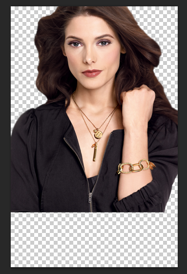
As you can see the top of the model's head is cut off.

This would be an improper use of the PNG. You don't want your cover to look like you hacked the person's head off. It looks unprofessional and as an author and a designer I'd never use a cover like this to represent my work. It looks incomplete.
You can still use a PNG with the top cut off like this, it simply requires a little creative thinking. Make the PNG larger and place it at the top of the cover.

Add the background images.

Add a gradient at the bottom to disguise the fact the image doesn't go all the way to the bottom of the cover.

The cover looks much better with the model at the top of the cover where you can't see that her head is actually cut off. You can do this with PNGs that are cut off at the edges as well.

This image is cut off on the one side.

All you have to do is make it a little larger and you can't tell the edge is cut off.
Tutorial by DarkAngelGraphics
Bạn đang đọc truyện trên: AzTruyen.Top