Before Noon cover tut || @elzarion
Yo guys, it's Jenna elzarion here on the other side! And today I'm here with a tut that I'd promised a few days ago. Hope you guys enjoy and learn and have fun making it! I won't post the link to every stock image I'd used, mostly because I honestly don't remember where I found them; secondly because I want you guys to make something more unique following the same steps -- each different from the other.
So here we go, woop! Tag me elzarion in the comments to ask your questions. I'll try and answer to all your queries. <3
Step 1: As per usual, open up a blank canvas of dimensions 512x800 and fit your city background within the blank canvas in whichever orientation you like. Could be tilted, could be upside-down. Anything you want, really. See the picture below as reference:
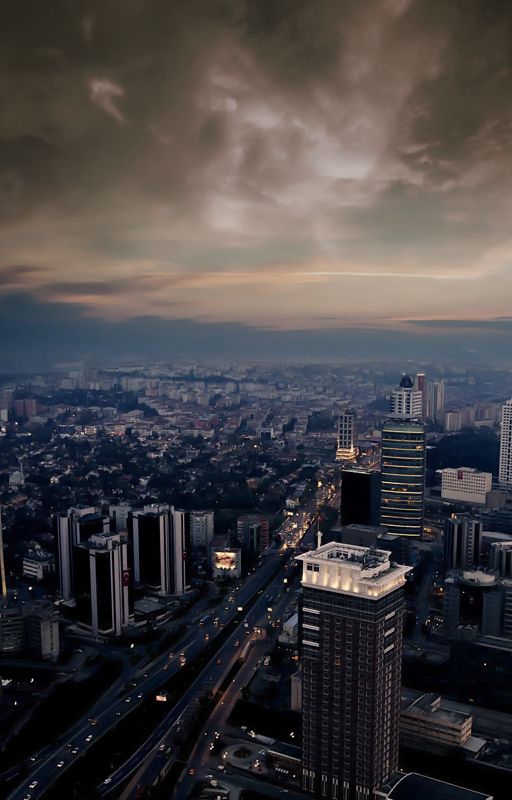
I had the city and sky as two different stocks btw, which I blended together.
Step 2: You must know something about me: I abuse levels and curves like crazy. So that is what we're gonna do now. We'll abuse levels and curves lol. xD Oh, and colour balance too.
On changing the tones to a yellowish tinge, and on adjusting the curves as given below, we get what you see in the picture.
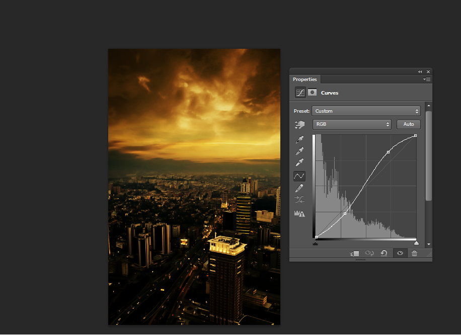
And we have the background completed!
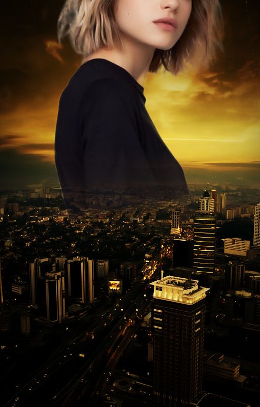
Step 3: Now for the model. I hope I don't have to explain the cutting out process? xD Anyway, you could always use a pen tool to cut out your model. After you've done so, free transform and place it over background to make it look something like this:
Step 4: Create a new layer, clip it to the model and head over to the edit drop down menu. Click on the option Fill and check 50% gray. Like this:

I already have the layer made so I cannot exactly show what it might look like. But on checking 50% gray, you'll find the model get's coloured entirely gray. Now set this clipped layer to overlay and the model won't appear gray anymore. It'll go back to the way it looked before. But now here's the catch: You will use this gray layer to enhance the highlights and shadows using dodge and burn tool respectively. Those of you who are aware of the usage of dodge and burn tool, go ahead and follow this step. But those who aren't entirely certain, skip this part for now.
I'm not going into the details of that in this tut because that's some advanced level stuff that will require an entirely different tut to discuss the specifics, but I thought I'd mention it anyway. I think in one of the previous tuts though, Amy (elphadora) had spoken about it on her tut video. If you want you can go ahead and check that out. It's pretty simple tbh, but it'll require a lengthy explanation imo. *shrugs*
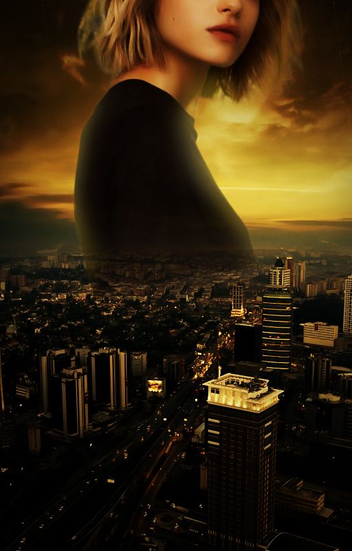
Step 5: Now, I have pretty much abused every kind of adjustment possible. Colour balance, levels, curves -- you name it. So I have a dozen of layers there. I won't show all of them because it simply isn't possible for me to capture all those screenshots (THERE'RE TOO MANY OMFG), so you do it your own way. Adjust the layers to your liking to make it look something like this:
Step 6: Now to make it a little bright and glowing we'll add lens flare. On adding lens flare this is what it looks like:
Uh yes, I've toned down the opacity of the flare a little to save it from the glaring brightness lol. That part's up to you though.
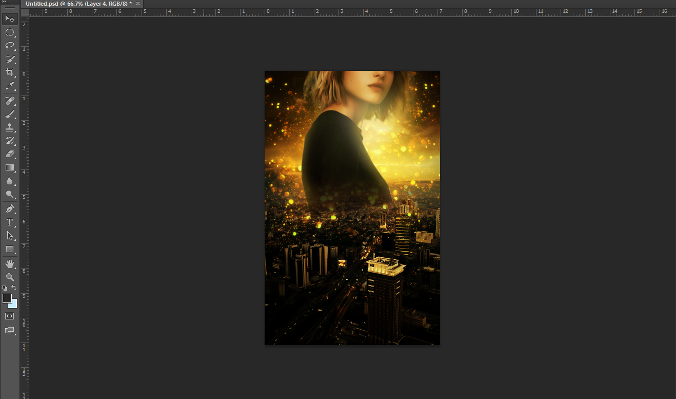
Step 7: Now I used a glitter texture (in screen mode) and added it behind the model to make it look something like this:
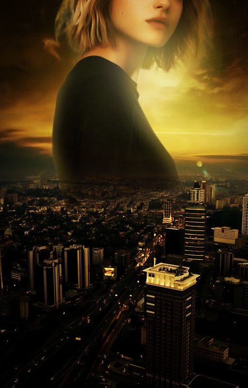
Step 8: Aaaand we're almost done. The text's the only thing left. Add your text and the cover's finished, woop!

I adjusted the RGB levels a little to tone down the yellowish tinge and enhance the reddish tinge. But that's optional. Finally this is what you get!
I hope this tut was helpful. I'm really sorry if you didn't understand anything. xD My explanations are clumsy like that haha. But if you did, kudos to you!
Let me know if you have any queries in the comments down below.
Have a great day, you guys! <3
~Jenna
Bạn đang đọc truyện trên: AzTruyen.Top