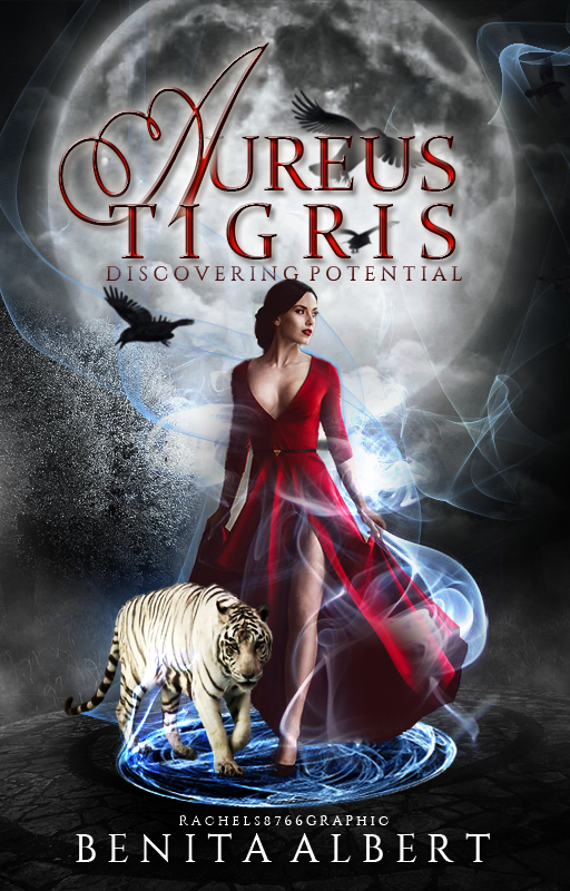
"Aureus Tigris" || @RachelS8766

Software: Photoshop CS2
Style of Cover: Manipulated
Level of Difficulty: Intermediate
Notes/Tips:
Unfortunately, I can't give a full explanation of all the steps shown in the gif above mainly because I've forgotten how to do some steps, oops...
Anyhow, here's some basic tips.
1. Fill the 512x800 canvas black.
2. For blending, I tend to use a soft eraser to get rid of the sharp edges. When I added the moon and the ground/pavement bit, I used an eraser set at around 60% opacity until I achieved what I wanted.
3. Use those adjustment options! You can find them by going to Image>adjustment
The three I use the most often are curves, Levels and colour balance.
Curves: adjusts tones to brighten, darken and add contrast. (I just play around with this until I get the desired result.)
Levels: "Corrects the tonal range and colour balance of an image by adjusting intensity levels of image shadows, midtones and highlights." (Adobe)
Colour Balance: "Commands changes of the overall mixture of colours in an image for generalised colour correction." (Adobe)
4. For the smoke, I downloaded a photoshop brush set from Deviantart. If you want the link to it then please just ask or if you are unsure of how to download them then also ask! When adding the smoke, create a new layer and set to Linear Dodge. You can change the colour of the smoke by either going to Image>adjustment>hue and saturation or when adding the smoke, simply change the colour of the brush.
5. When I was cutting out the model, I used a combination of two tools: the magic wand tool and a soft/hard eraser. The magic wand tool selects pixels based on tone and colour, and this can be extremely handy. To clean up the edges of the model, I used an eraser of varying opacity until I was happy. (Hair could have been cut better, but I'm super lazy when it comes to cutting)
6. To get the glow-y effect of the shield behind the model, I set the original layer to linear dodge and duplicated it three times. I also adjusted the curves.
7. The birds and the tiger were PNGS, so not much effort required to add them. xD
8. Fonts
For the 'A' I used: champange
For 'Ureas' and 'Tigris' I used: Constantia
For the author's name I used: Constantine
Okay, so prepare for a lot of details and stuff that won't make sense until you add a layer style.
To get the effect on 'Aureas Tigris' I used the following settings.
Drop Shadow
Blend Mode: Multiply
Opacity: 75%
Angle: 120
Distance: 5
Spread: 8
Size: 5
Contour: Linear
Noise: 0
Inner Shadow
Blend Mode: Multiply
Angle: 120
Distance: 8
Choke: 0
Size: 5
Contour: linear
Noise: 0
Outer Glow
Blend Mode: Screen
Opacity: 90
Noise: 0
Colour: #fdf3e4
Technique: softer
Spread: 0
Size: 16
Contour: linear
Range: 50
Jitter: 0
Bevel/Emboss
Style: Inner Bevel
Technique: Smooth
Depth: 291
Direction: up
Size: 2
Angle: 120
Altitude: 30
Contour: linear
Highlight Mode: screen
Opacity: 75
Shadow Mode: Multiply
Opacity: 75
Contour
Type: Linear
Range: 50
Satin
Blend Mode: Multiply
Opacity: 50%
Angle: 19
Distance: 11
Size: 21
Contour: Gaussian
And remember to Invert it.
Colour Overlay
Colour: #fsod02
Probably would have been easier to take screenshots of the font settings.
Any questions please just drop them in the comments and I'll do my best to explain! I hope this half-tutorial helped in some way!
Bạn đang đọc truyện trên: AzTruyen.Top