C O N. 2 〰️ RESULTS ✨
Here are the results of Contest 2!
In this round all of you also done a great job so, here are results and my comment on all works! This was very interesting round for me!
_______________________________________
1. MMoon2400

[ 71/75 ] points
- editing; 18/20
- creativity; 18/20
- blending; 10/10
- colors; 10/10
- font; 10/10
- does it fit well with the theme; 5/5
- did you post entry on time; [ ✔️ ]
MY OPINION; The song that I gave you is absolutely fitting with the theme of the song and with the point of the spot when you are watching it. When I first saw it, I thought 'that's it' so really in this round you didn't dissapointed me in any way. You choose a perfect background for your song, and colors are also weel fitting and giving a little vibe of the song. I love the font, you really did a good job. I don't have a lot to say because everything else is good and you showed as your creativity. So for now, 71 points!
_______________________________________
2. Shadhoes
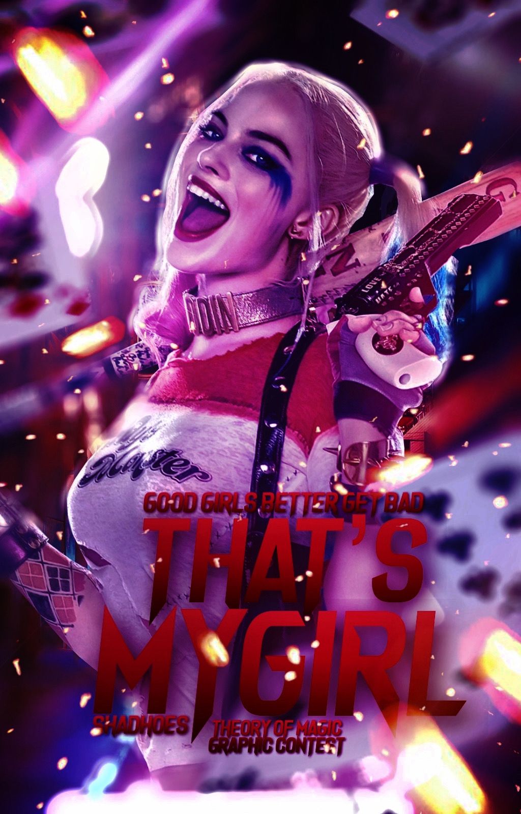
[ 70/75 ] points
- editing; 18/20
- creativity; 19/20
- blending; 10/10
- colors; 9/10
- font; 9/10
- does it fit well with the theme; 5/5
- did you post entry on time; [ ✔️ ]
MY OPINION; Based on the song and video that I gave you for your cover inspiration, in this round you also did a very good job. I didn't expect any bad cover from you, let's be honest because you have a good skills and you are great graphic designer. In previous round you had pretty works, and in this you also showed that you can make a good manip cover. Blending is great, Harley is fitting well with the background and the effects you put on the cover. Harley is really good inspiration for making a good cover, so I appreciate your creativity in this. Everything else is okay and I don't have a lot to say expect that that you did a great job. But, for now, 70 points!
_______________________________________
3. airenssi
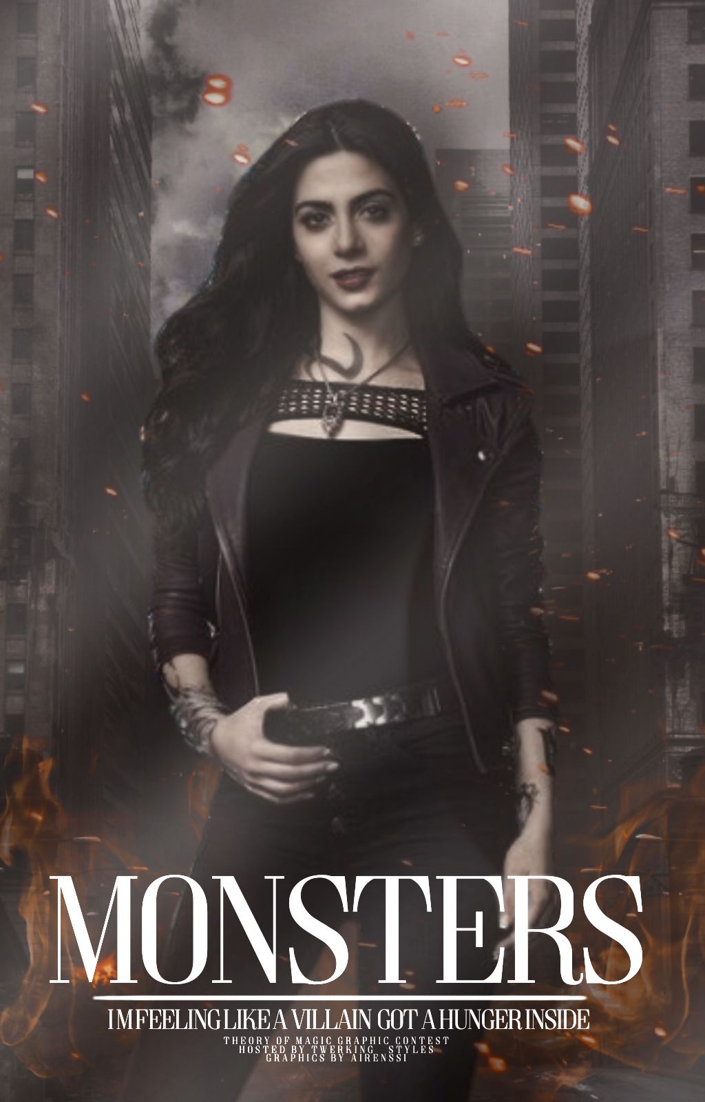
[ 62/75 ] points
- editing; 17/20
- creativity; 17/20
- blending; 8/10
- colors; 8/10
- font; 8/10
- does it fit well with the theme; 4/5
- did you post entry on time; [ ✔️ ]
MY OPINION; In previous round you had a good points for your first entry in this contest, but when I saw this I thought that this is much better cover from you. For your song and video that I gave you you had a great inspiration for making something mysterious, choose dark colors, background that is fitting well with the character so you have a good point. This is not your best, but it's better from the previous cover and let's be clear; this is my honest opinion and I'm not telling you this because I want to make you happy or for some other reason. This contest is actually book to show what you can do and within the time, you can be better if you really want to learn something new and if you love doing this. So, I know that this words are gonna motivate you to do better next time. Background is pretty but I would definitely put a little dark color on the cover, I love that you choose fire for this so the cover doesn't look boring. Your blending skills are really good, I don't have a lot to say so you did this time okay job. Maybe I would put some dark effects just as I would change the color for the whole cover and on the character I would put more black color on her hair so it looks more pronounced. Font is good but I would put some shadow on it. For all this things you have for now, 62 points! Keep going!
_______________________________________
4. Bangtan_Vibe
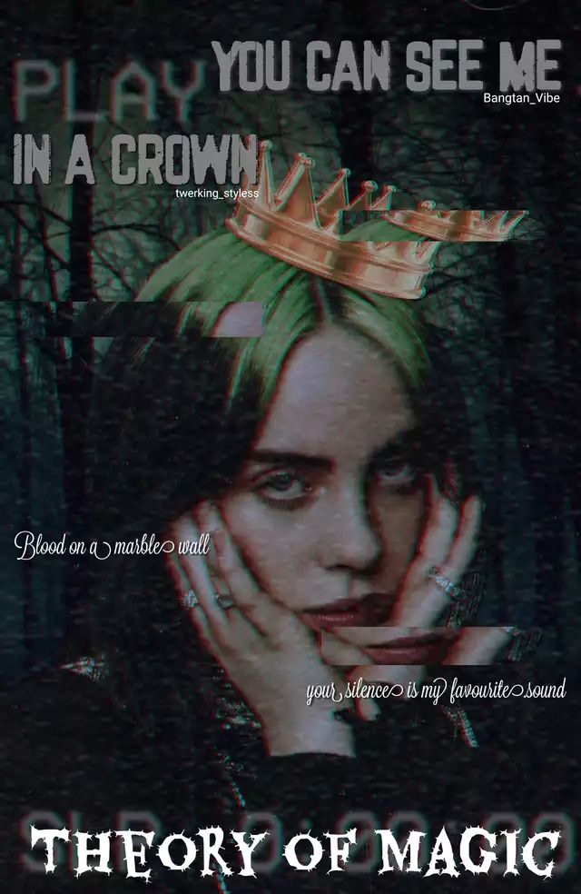
[ 50/75 ] points
- editing; 15/20
- creativity; 10/20
- blending; 6/10
- colors; 8/10
- font; 7/10
- does it fit well with the theme; 4/5
- did you post entry on time; [ ✔️ ]
MY OPINION; Even if I gave you another faceclaim/person for your cover inspiration in some way I was expecting that you will choose Billie Eilish so I'm not that surprised because the song that you had is hers anyways so I'm not minding that much and it's okay. The song for my opinion is in a little darker mood, it's acting like she is a little bad girl who thinks that can be a queen and also own the whole world. Like she is a special gift, and all her songs are special in some way so you actually did this cover in that mood. Background is okay but I would change the colors and put one effect so it looks more intriguing. I would put another font, something that's more fitting with the whole cover and I would remove the quote (subtitle) and put it somewhere in the middle of the cover. Also, I would put username (in this case mine) right next to the name of the contest. In that case you have a more empty space for putting some effects, overlays or some detail you want on cover, so next time be more organized about putting text. If you are using phonto, you really have a lot of choices to 'decorate' your text, put color, shadows, anything you like. Also, you can download your own fonts so that's a big plus. When I look all this together your cover is not bad but I would change some things. For all this reasons I gave you 50 points! But I'm sure that you can do better so don't give up!
_______________________________________
5. _Mingi_Chan_

[ 45/75 ] points
- editing; 13/20
- creativity; 12/20
- blending; 6/10
- colors; 6/10
- font; 5/10
- does it fit well with the theme; 3/5
- did you post entry on time; [ ✔️ ]
MY OPINION; Based on the song that you had and the video for the cover inspiration, you did for this round pretty good. The truth is that I would change some things, especially the background and choose something that's more similar with the spot of the song. I'm sure that you could find something like that if you searched it. I'm glad that in this case you didn't put Ariana or Lady Gaga because that wasn't necessary, but with the character you had a good idea and point. I can see that you really tried to make this cover just how it's the vibe of the song but it would looked much better if you put a little rain effect/picture and blend it with the background. For this song you could definitely go with more manip (type) cover, you would not make a mistake if you focused more on the character you had and background. I would also change the font and put other colors than pink you mostly have on the cover and be more creative. For all this things I gave you 45 points so that's not a big number but also it's not bad! You have potential so I'm sure that's not your maximum you can put in graphics! You will still have chance to show your skills so I hope that this words motivated you to be more better!
_______________________________________
6. pebreroanim

[ 54/75 ] points
- editing; 15/20
- creativity; 15/20
- blending; 7/10
- colors; 7/10
- font; 6/10
- does it fit well with the theme; 4/5
- did you post entry on time; [ ✔️ ]
MY OPINION; This is actually really good cover, better than in previous round - let's be honest. I can see that your went with the idea of the song and video you had for your cover inspiration so I'm glad that I gave you some good 'material' for making this. This is not the best cover from you, but it's not the worst but I can see that you listen my advices I told you in last round so I'm also happy with that. You are going in good way - that's sure! This time I would not change a lot of things - eventually, I would put some effects, something that's more fitting with the theme of the video you had. Background is really good, just as a character but I guess that you used png and blend it with the background, or you used template for cover. You blend okay, you don't have mistakes like lot of people are doing when they don't blend (cut) well, but I would definitely put other font this time. You had mostly a horor video, that was the point so I would choose something that's more mysterious, that stole your attention when you see it first time. For all this reasons, even when I said that your cover is okay I didn't want to give you high points. So for now, 54 points! Just keep going, you have big potential!
_______________________________________
7. xvestax
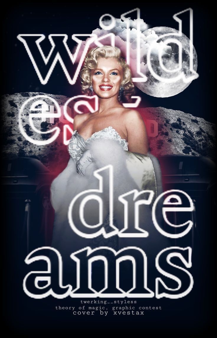
[ 65/75 ] points
- editing; 17/20
- creativity; 18/20
- blending; 9/10
- colors; 9/10
- font; 8/10
- does it fit well with the theme; 4/5
- did you post entry on time; [ ✔️ ]
MY OPINION; When I first saw your entry I was a little surprised when I looked better to see that you didn't used Taylor Swift for this round and I really like it. I'm happy with the faceclaim you choosed and how the cover is looking pretty with the background, moon and blue color. Definitely what I would change is font because, currently what you have is not that bad but I think that's not fitting with the whole picture and point. And the important thing; it would look better if you add subtitle. You don't have subtitle or quote of the song so that's also the reason why I didn't want to give you more than 65 points! Subtitle was important, but I'm not that mad about your mistake but please, next time read carefull! Everything is okay, but I'm leaving space for your better works in the future!
_______________________________________
8. peachyjjk_
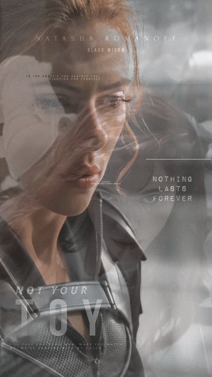
[ 65/75 ] points
- editing; 15/20
- creativity; 17/20
- blending; 9/10
- colors; 9/10
- font; 10/10
- does it fit well with the theme; 5/5
- did you post entry on time; [ ✔️ ]
MY OPINION; You had a really good idea about your cover inspiration and you did this pretty well. I love the faceclaim you have on your cover so I think that Natasha is fitting very well with the whole point and vibe of the song. I love your blending skills and you blend it good with the background, so I like colors you had but I would definitely put some effects on and I would make the quote and subtitle a little bigger. Sometimes, small letters are dificult for reading so only for that reason because I can't read clearly and see all details. I don't have a lot to say because cover is really good but I didn't want to give you more than 65 points! You have big potential so keep going!
_______________________________________
9. jwimochii
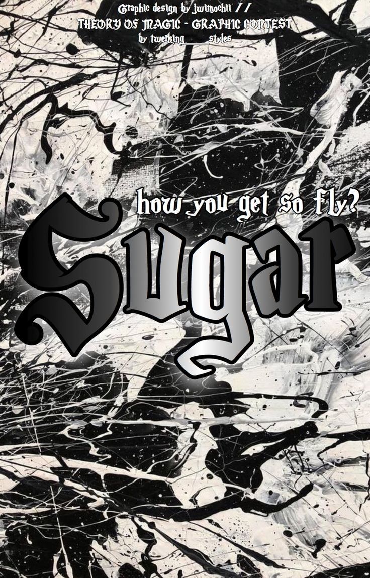
[ 48/75 ] points
- editing; 10/20
- creativity; 10/20
- blending; 10/10
- colors; 10/10
- font; 6/10
- does it fit well with the theme; 2/5
- did you post entry on time; [ ✔️ ]
MY OPINION; We already talked in inbox about your problem for this round because you didn't had inspiration as usual so you did this cover with no faceclaims. This is simple cover but mixed with typography, which is style I don't usually prefer but this is not the worstest cover I've seen. So, the song you had with this cover is not making too much sense and giving some point, but I promised you that I will not give you very low points. I really appreciate your effort in this and how you really tried for making something because you told me in the start that you don't want to join in this round but you changed your mind, and I'm glad with that. I don't have much experience with typography but if you look at this, for some random book it's not bad cover. I know you have experience, just this round didn't give you right chance to show what you can really do, and as I previous said, you didn't had inspiration. As a graphic designer, I know that this probably takes hours to make something like this, so for all this and your situation I gave you 48 points! Not too low, not too high! I always appreciate effort from graphic designer so I hope that you're okay with my honest opinion and given points! Head up, you will show your skills in future rounds!
_______________________________________
10. IvvyKy
[ 73/75 ] points
- editing; 20/20
- creativity; 20/20
- blending; 10/10
- colors; 10/10
- font; 9/10
- does it fit well with the theme; 4/5
- did you post entry on time; [ ✔️ ]
MY OPINION; This time you really give enough effort to make this cover really pretty, especially what I really love is the background. I'm glad that you choose Lily Collins for the faceclaim but I expected in some way that you would go with The Rolling Stones. When I look at this together in some way it looks aesthetic but it's definitely manip and you really have good skills. On this cover I wouldn't change anything, it's not even necessary the effect what's usually the detail that's missing on cover. Only, I would make the subtitle/quote a little bigger because sometimes small letters are dificult for reading. That's all from me and you have 73 points! Just keep going in that way!
_______________________________________
11. StoryWriterKato
[ 67/75 ] points
- editing; 19/20
- creativity; 19/20
- blending; 8/10
- colors; 9/10
- font; 7/10
- does it fit well with the theme; 5/5
- did you post entry on time; [ ✔️ ]
MY OPINION; For this round, I gave you for my opinion really good song and the video for your cover inspiration so you did this pretty well. In the previous round, your cover was simple but cute, so for this you really give your effort to make this the best you can and I love the background and dominating green color. What I would definitely change is the font and put something that's more fitting with the character but with the current font it's not that bad. Even the effects are not necessary because this is enough to look good. You don't have a problem with blending as I can see so in that you are okay, but what I noticed is that you don't have a watermark. You probably forgot to put my username and the name of my contest on your cover so I'm not mad for that but please read carefull form next time! For all this things I gave you 67 points so keep going!
_______________________________________
12. miss_katsudon
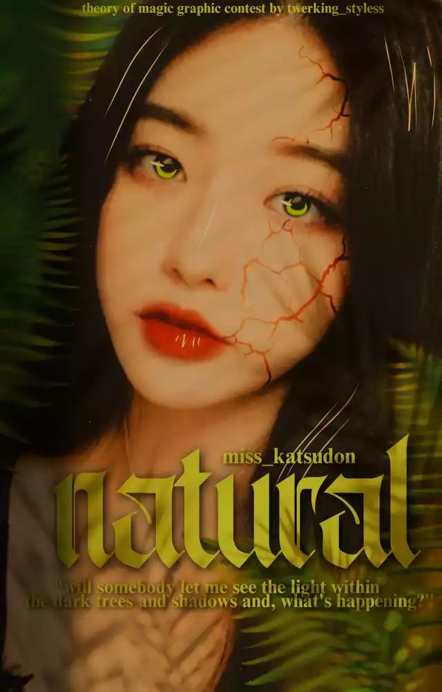
[ 62/75 ] points
- editing; 16/20
- creativity; 17/20
- blending; 8/10
- colors; 9/10
- font; 8/10
- does it fit well with the theme; 4/5
- did you post entry on time; [ ✔️ ]
MY OPINION; You had a really good point of this cover and it's telling a lot, especially about the song you had for this round. It's fitting well with the song but not completely, so I didn't want to give you total 75 points because this isn't for that points but you have good skills so keep going. I love the character, png is good just as doninating green and yellow but I would put some effect so that cover would look more interesting, mysterious. You definitely have creativity, I didn't expect this work from you so I was little surprised when I saw it first time. Everything else is okay expect the font choose that I would change, the quote is good but the font for the title is what I would change. For all this reasons I gave you 62 points, but you have potential so keep going!
_______________________________________
13. MHADekuGirl2020
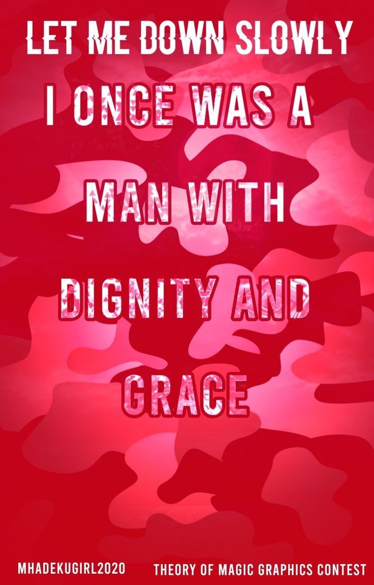
[ 45/75 ] points
- editing; 15/20
- creativity; 11/20
- blending; 7/10
- colors; 4/10
- font; 6/10
- does it fit well with the theme; 2/5
- did you post entry on time; [ ✔️ ]
MY OPINION; For my honest opinion, this cover is not making too much sense with the song that I gave you for this round, and I can't say is this some random simple background you used, or is it the typography style cover. Whatever is this, I can't say too much because you didn't used any faceclaim, you don't have effects if I understand your cover and see all clearly, this is too simple. Basic cover with the title and some color. I don't understand that much meaning of this so I can't give you points like the others I gave because this is not for high points, and it's not fair for the other designers who really gave all effort in this round. Let's be clear; I don't think you didn't give effort in this, just you didn't fulfill my expectations in this round. This is more random cover so for all this I gave you 45 points! Hopefully, you will be better in next rounds and be more creative because you have potential!
_______________________________________
14. vishuel
❌
0 points (you didn't post entry on time)
_______________________________________
15. sidneetlover
❌
0 points (you didn't post entry on time)
_______________________________________
❌
0 points (you didn't post entry on time)
_______________________________________
17. NikitaGulati8
❌
0 points (you didn't post entry on time)
_______________________________________
18. DarkWizardess
❌
0 points (you didn't post entry on time)
_______________________________________
That's it for the Contest 2! I hope you're all happy with your works for this round! I enjoyed in this and it was very interesting!
Soon I'm posting Contest 3 so be prepared! ✨
Also, check out 'Leaderboard' where I post currently points of all participants! ✨
Bạn đang đọc truyện trên: AzTruyen.Top