C O N. 1 〰️ RESULTS ✨
Here are the results of Contest 1!
All of you done a great for the first round, and I hope that this results are gonna motivate you to done better in next round. I post entries how you send me for a contest, of the first to the last one (basically how looks the entries list) . So, here we go:
_______________________________________
1. airenssi
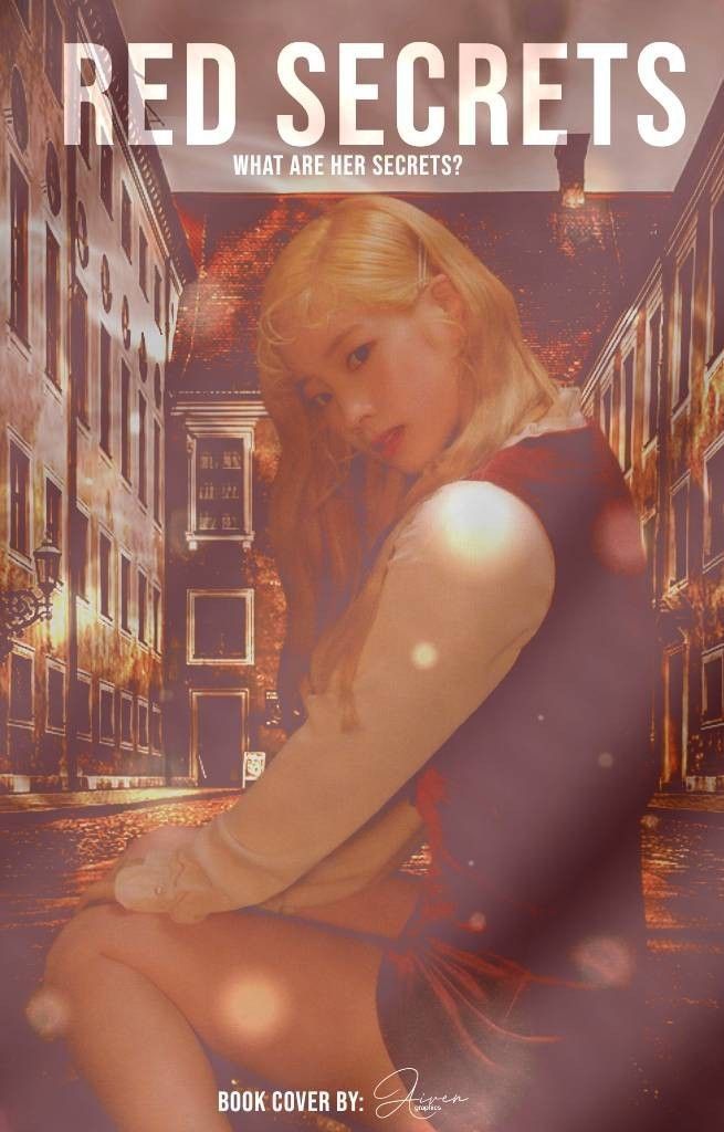
[ 47/75 ] points
- editing; 15/20
- creativity; 10/20
- blending; 8/10
- colors; 6/10
- font; 5/10
- does it fit well with the theme; 3/5
- did you post entry on time; [ ✔️ ]
MY OPINION; You did for the first round very good but for me, cover is not so special that I can give you bigger points but I know that you can do better. I love moodboard, it's cute but when I look together with your story cover it fits okay. On your place I would make colors a bit darker, maybe put darker hair on the character, put some lights, effects so it looks a bit dark mood because your title is reminding me of a blood, mystery. For the first step, it's good. You have 47 points so keep going!
_______________________________________
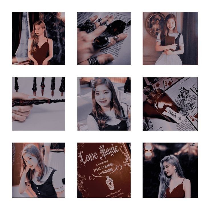
2. Shadhoes
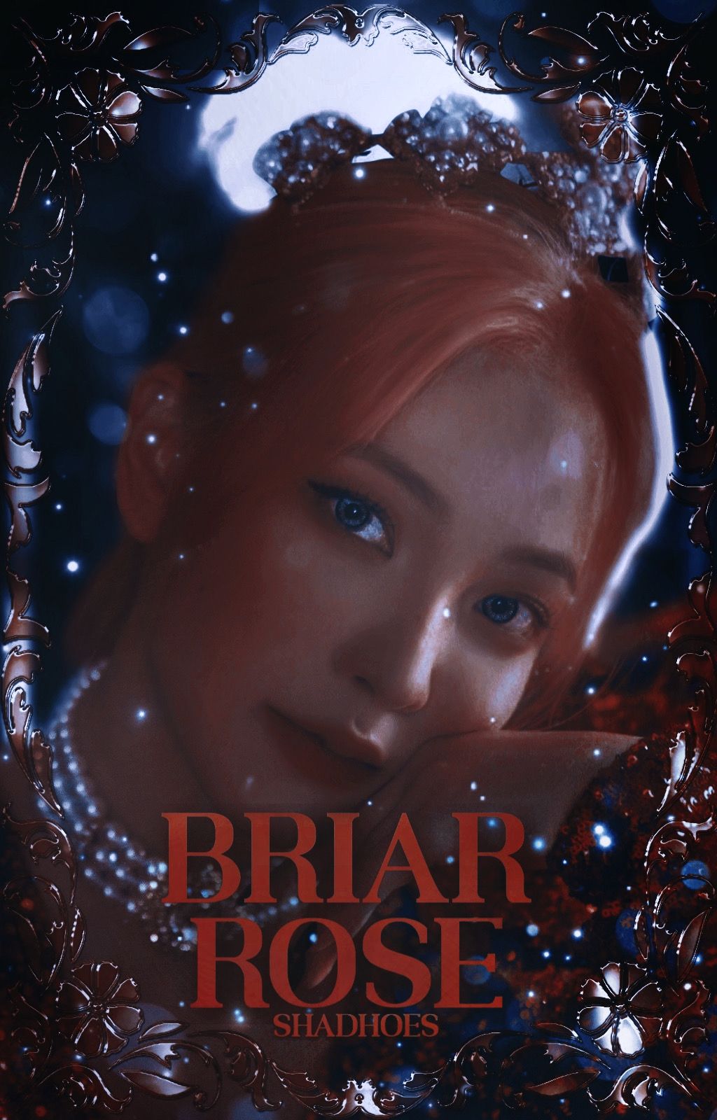
[ 73/75 ] points
- editing; 20/20
- creativity; 20/20
- blending; 10/10
- colors; 10/10
- font; 8/10
- does it fit well with the theme; 5/5
- did you post entry on time; [ ✔️ ]
MY OPINION; I really like your cover, especially moodboard. When I first saw it, it was a little aesthetic but when I looked at the cover it fits very good. Only thing I would change is font and put something that looks little mysterious, something that stole your attention when you see it first time, but, I can see that you know what are you doing. Blending, colors, editing. Very good. Keep going with 73 points!
_______________________________________
[ 47/75 ] points
- editing; 14/20
- creativity; 9/20
- blending; 6/10
- colors; 7/10
- font; 7/10
- does it fit well with the theme; 4/5
- did you post entry on time; [ ✔️ ]
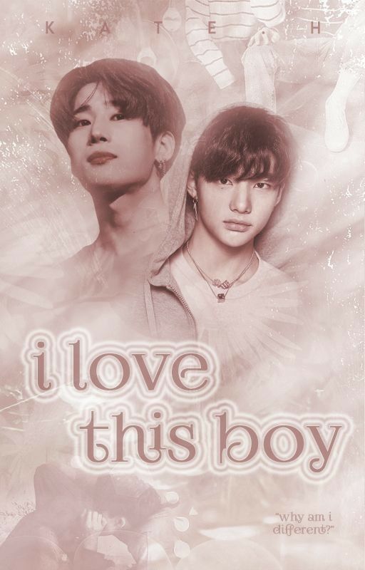
MY OPINION; When I first saw your entry I thought, 'this is actually cute'. For my opinion, this is simple cover, simple moodboard but nothing too much and for that I can't give you big points. With the theme, I would on your place change color for moodboard and put, actually the same color how it's on your cover. I really like the quote, "why am i different?", this is the base of the story I think so I would definitely make it bigger and put it under the title or on the end of the cover. Font is also good, I like the color but after all, you can do it better. With all 47 points you are on good way so keep going! You are not bad!
_______________________________________
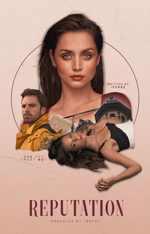
4. IvvyKy
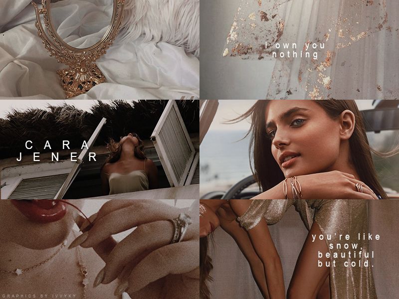
[ 66/75 ] points
- editing; 18/20
- creativity; 18/20
- blending; 9/10
- colors; 8/10
- font; 8/10
- does it fit well with the theme; 5/5
- did you post entry on time; [ ✔️ ]
MY OPINION; I know that you are good at this because I started recently to follow your graphic book, but I didn't expect this, let's be honest. This is so aesthetic but on the other side you made this cover so professionally, and simple. You have that style of cover that it looks like the simple cover, but it's not. You know how to blend, choose good colors, png, and to make a good point of cover and also moodboard. Moodboard is very pretty and I like it. On the cover I would change the font, but with this is very pretty. You are not the best, but also I don't want to give you high points because you will have more chance to show your skills so, for now, 66 points!
_______________________________________
5. peachyjjk_
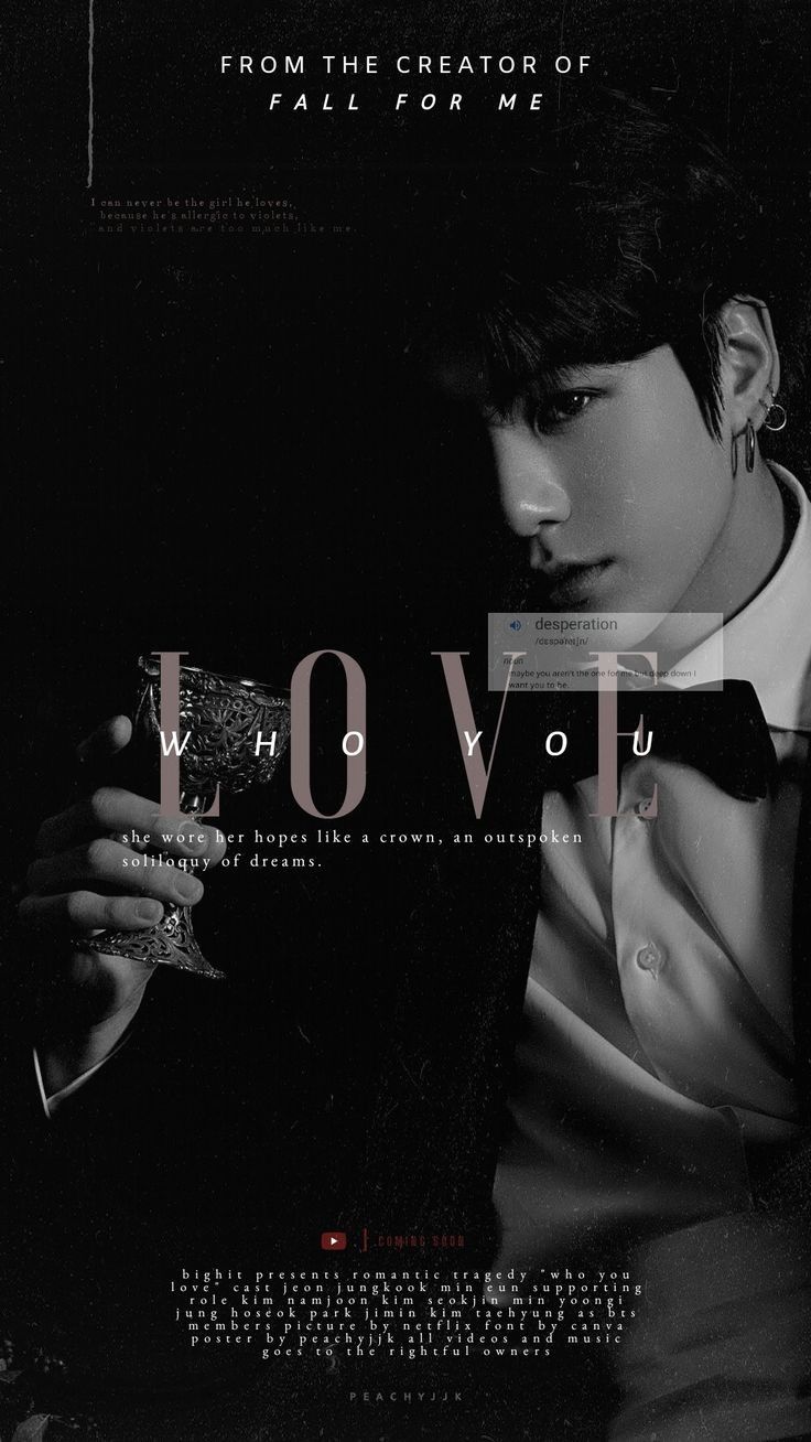
[ 58/75 ] points
- editing; 17/20
- creativity; 15/20
- blending; 7/10
- colors; 7/10
- font; 8/10
- does it fit well with the theme; 4/5
- did you post entry on time; [ ✔️ ]
MY OPINION; I really love the dark covers, so yours is pretty good but also simple. Your skills are not actually bad, you are good in this but I know you're gonna be better in a few rounds. I love black color on cover, font is good but I would on your place put more details, effects, something what's distinctly so your cover looks more darker and the character. Moodboard is okay but I would change the color or put some effects but it fits with the theme. It's good but I'm leaving more space for higher points so for now, 58 points!
_______________________________________

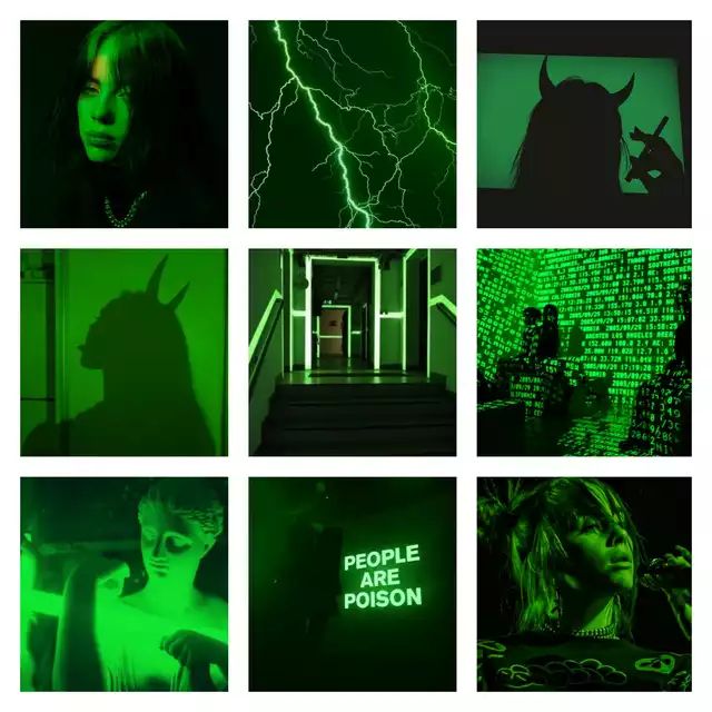
[ 54/75 ] points
- editing; 14/20
- creativity; 14/20
- blending; 7/10
- colors; 7/10
- font; 8/10
- does it fit well with the theme; 4/5
- did you post entry on time; [ ✔️ ]
MY OPINION; When I saw Billie Eilish I knew that are you gonna choose dark mood for the cover so you did this pretty well. It's not perfect but it's good. You fit moodboard and cover in one point so it makes sense but I would change the font of the quote and make it a bigger and put some effect. I love the green on the eyes and hair, and also the background, and the moodboard is pretty. I would not change a lot of things, but for the first round it's good. So I give you 54 points and leaving space for higher points! Keep going!
_______________________________________
7. jwimochii
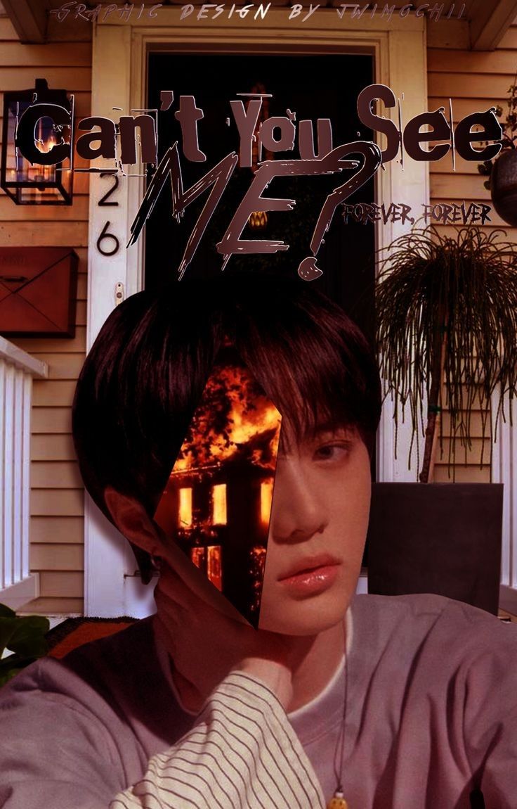

[ 56/75 ] points
- editing; 16/20
- creativity; 15/20
- blending; 7/10
- colors; 8/10
- font; 6/10
- does it fit well with the theme; 4/5
- did you post entry on time; [ ✔️ ]
MY OPINION; When I first saw your cover I thought that it's pretty, but I would on your place change the font and add some effects so it looks more mysterious because of the title of the book. Png is okay, you blended fine with the background but when I look better at the character, where is his ear you can see little black shadow but it's not too much but even that I would remove that (erase it). Only what I can clearly see is that you put something with fire, I don't know if that's some old building or some house but you didn't blend it too good so it looks like you put a picture on his one eye and cover it, basically. My opinion, I would rather blend that picture with the background if that detail is important for the book or remove it and put something else. Your moodboard is pretty so I would on cover put some blood on his hand or on T-shirt because you have blood on moodboard so it would look better, but even that cover is okay. I would not change a lot on the cover, but I really love moodboard because it's fitting well with the cover. So, for all this and the first round I didn't give you high points. But I know you can do better so for now, 56 points!
_______________________________________
8. MMoon2400

[ 70/75 ] points
- editing; 18/20
- creativity; 19/20
- blending; 9/10
- colors; 9/10
- font; 10/10
- does it fit well with the theme; 5/5
- did you post entry on time; [ ✔️ ]
MY OPINION; Your cover is absolutely amazing. I really like every single detail, especially the font of the title, colors are perfect and they are fitting very well with the moodboard and the theme of the book. I don't have a lot of things to say because I recognized that you know what are you doing and you don't have a lot of mistakes. You blend very well, you have good skills and you were creative with both things (cover and moodboard) but I didn't want to give you total 75 points so I'm leaving space for better works! Also, I love little gif on the moodboard, it makes moodboard even better and quotes are also good. Keep doing this good work, and for now, 70 points!
_______________________________________
9. xvestax
[ 52/75 ] points
- editing; 16/20
- creativity; 14/20
- blending; 7/10
- colors; 7/10
- font; 4/10
- does it fit well with the theme; 4/5
- did you post entry on time; [ ✔️ ]
MY OPINION; On cover is mostly dominating the green color and the character, but I would on your place put some green effect, or effect with some dark color who will go well with the background and the theme of the book. When I first saw it, I thought that it's good but I really don't like the font. I have feeling that the font don't fit with the whole picture and the mood so I would pick something that's more mysterious, interesting and I would also put the green shadow on the font, and definitely put some darker color on the whole cover. I love green eyes on the character, and png is good so you blend it good with the background. I don't have much to say about your moodboard, I really think it goes well with the cover even if I would change some things on cover. You are good for now, but I'm leaving space for better works from you and higher points, so for now 52 points! Keep going!
_______________________________________
NEXT ENTRIES IN NEW CHAPTER
⬇️
Bạn đang đọc truyện trên: AzTruyen.Top