Stef's Guide to Graphic Making 101 (hopefully)
Note: This was written in 2016. My views and software and laptop/computer have changed vastly over time.
I have been swamped with questions on graphic making. So I've decided to throw together a simple guide to graphic making ( at least, how I do it).
1. Get a good software

Can't stress this enough. Without a good software, you can't make a good graphic. By good software, I mean softwares that are not apps which you use on your phone. What I am talking about are Photoshop, GIMP and Pixlr.
There are three categories:
(i) The really broke one
You have no money for Photoshop, you have no money for any decent software, and you want to make graphics. This is where Pixlr editor comes in for you. Pixlr is a free online editing software with very basic tools for you to make graphics with. Don't look down on the power of Pixlr, I've seen people come up with mindblowing graphics with Pixlr (and paint).
Also, Photoshop cs2 comes free with your computer now.
(ii) The still very broke one but with some knowledge of photo editing
Now you have the grasp of graphic making basics, it's time to upgrade! GIMP is a free photo editing software which is as good as photoshop. It has a ton of amazing tools, filters, and features. It takes time, however, to get around these new tools which Pixlr lacks.
(iii) The still very broke one but with the mind of a hacker in which you somehow manage to land yourself free photoshop you all know what I mean/ the one who finally persuaded their parents to buy photoshop/ professional who buys photoshop for work
Adobe Photoshop is one of the best editing softwares out there. I use Photoshop cs6 (edit: fast-forward 2018, I am using Photoshop cc, the legal version). Photoshop now comes with many MANY versions ranging from psc 3-7, cc, Elements, Illustrator etc. Photoshop shares some same features with GIMP, but they are not totally the same.
2. Get to know your tools

You can't make a good graphic if you spend 21415 hours figuring out where the lasso tool is. Pinpoint your tools, read up on them, try them. Right now I am so used to my Photoshop cs6 tools my mouse just flies over them and grab whatever I want to make my graphics. Make sure that your work space is at its full potential, which means you're very comfortable with the way your tools are arranged and the way your features ( actions, brushes, text, styles, swatches etc) are arranged. My tools are normally in a single line on the left and the features on the right.
Get to know your canvas size, your canvas resolution as well as color mode. RGB and sRGB are totally different things as well as 72 dpi vs 300 dpi. These are one of the few steps wattpad designers almost never know.
General wattpad cover size: 512x800
Banner size: 1200x400, as long as it is a rectangle
Icon size: 360x360, as long as it is a square
General wattpad graphic resolution/ Amazon ebook resolution: 72 dpi
Digital painting/ Paperback: 300 dpi
Fair warning though, the higher your dpi, the greater your psd size will be. I've had graphics shooting over 1.6 GB in file size which is scary because my canvas size normally is over 4200x5000 at 300 dpi.
3. Get good resources
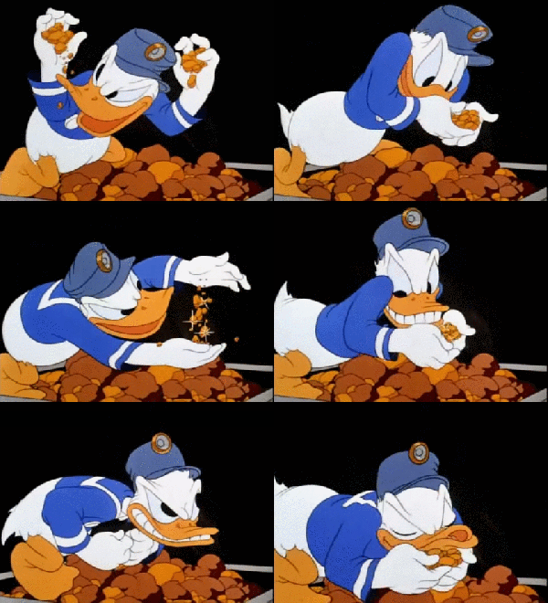
Without good resources, you can't make a good graphic. Try stretching a 100x100px pic you simply nabbed off Google and you'll get something with looks like poop aka pixelation.
Good resources can't just be plucked off random google images. There are a few good graphic resource place I know ( it's mostly free!)
1. DeviantArt ( can't express my love enough for it)
2. pixabay
3. freestockimages
Big stock, deposit photos and shutterstock are great places to look for images if you're aiming for commercial-free photos.
Oh, and those pretty art pictures you see on Google? News flash, those are not stocks. Those are beautiful artworks of DeviantAt artists who spend 5+ hours creating it just for people to grab them for a text slap cover.
4. Textures
I am going to get shot here, I know I will. Textures are something like this:
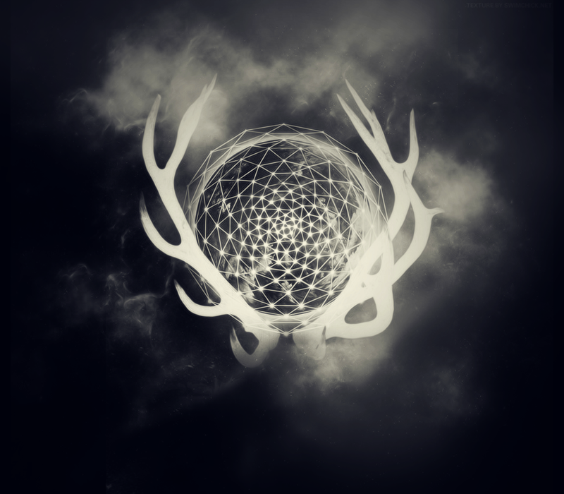
And that ^ is one of the most common texture you can see floating around on wattpad graphics. Textures are beautiful, they make your graphics blend together and mash up the color tones. However, when overused, it just looks like you threw 20 textures together and I can't see what the model really is under all those textures.
I hate to say this but that kind textures mess up a graphic. Big time.
When you use a texture, you use it so that your colors blend together, not because the cover looks empty and you want something to fill in the space. Overuse of textures is not a good thing. It gives people a headache and normally the text would be squeezed somewhere in the midst of the textures. Textures are beautiful only when you use them correctly.
For my own graphics, I use 1-2 textures tops. And those are color textures, unless I am going for a super texture-based cover.
Remember, the importance of a book cover is to show the readers what the story is about. Cover making is not just about producing a visually attractive piece of art but it needs to tell the story! Everything in the cover, the spacing, the font, the colors but correspond to something in the story.
5. Fonts

Fonts are very important in a graphic. Imagine if Harry Potter used comic sans as its font. Fonts can tell a story better than a model can sometimes. I especially love font based covers, its simple yet meaningful.
I have over 600 fonts downloaded in my C Drive. Insane, I know, but I need it.
Places where you can get good fonts:
(i) dafont
(ii) 1001 free fonts
(iii) cool fonts
(iv) befonts ( this website is for professional looking fonts and not those grimy and far too fancy fonts. The sad thing is a lot of them are just demo fonts, so you have to pay for them).
Sans serif and Serif are one of my favorites. I hate curly fonts, they're just so...curly and messy. And they never really agree with me. Hmph.
6. Practice
Practice until you are like the gif below
Once you can tell the difference between a png and a JPEG, and can read the fonts off every single item you see in Walmart, you know you're ready for the graphics journey. There is no easy way to game graphic making. You practice and you improve, always. I don't believe there is such a thing as the "best", but rather, "better". We all get better with practice. Don't expect to become a professional in a day, it will never happen even if the gods of graphics kissed you.
7. Seek to improve
Look at amazing graphics and cry. Go back to practicing. Look at more amazing graphics and weep blood. Go back and continue practicing.
8. GET A GOOD COMPUTER/ LAPTOP. PWEASE
Please don't be like me. Get at least a 8GB RAM computer/laptop if you're operating huge graphics that will zoom over 2GB in file size. I use a crappy windows xp desktop which freezes and crashes whenever my graphics go over 1GB and it is NOT FUN.
Edit: I'm using a 4GB RAM ASUS laptop now. Which is much better than my old desktop.
Edit 2: I am now using a 24GB RAM Predator laptop. My bank is crying.
Do yourself a favor and get a good computer. You will thank me for this advice later.
You're welcome.
These are the very basics to keep you rolling on your graphics journey. I don't have the time to go into super detailed stuff like photoshop tools etc but I hope this was helpful to you guys!
Bạn đang đọc truyện trên: AzTruyen.Top