Graphic Contest
👑 𝐆 𝐑 𝐀 𝐏 𝐇 𝐈 𝐂 𝐂 𝐎 𝐍 𝐓 𝐄 𝐒 𝐓 👑
𝙴 𝙽 𝚃 𝚁 𝙸 𝙴 𝚂


𝙲 𝙾 𝙼 𝙼 𝙴 𝙽 𝚃 𝚂
This took me a long time to publish mainly because I couldn't pick a winner. Picking the winner was one of the toughest decisions I had to make, because they all looked stunning respectively. And once I evaluated them side by side, each set had different aspects I liked, but also some I didn't like.
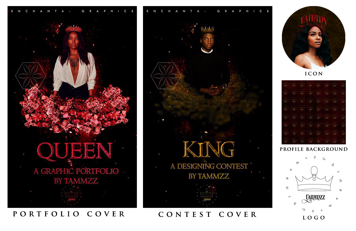
SET 1
Upon first glance, the first entry is a marvelous set which really showcases your blending skills. I loved the dark tone and composition of the designs. However, once I scrutinised them a little more I noticed inconsistencies in the set, with the king cover specifically. For instance, the cloud by the guy's waist could do a little more work and the crown on his head doesn't sit right on his head compared to the girl's. Moreover, while I love the colour schemes respectively, you didn't follow the original prompt I set forth. I would've loved to see red and gold incorporated in both covers instead of pink and gold separately. Nevertheless, I like the addition of a logo to the set.
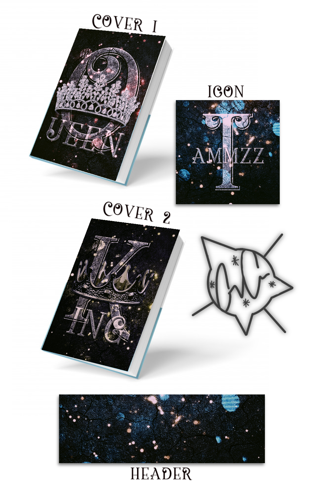
SET 2
I absolutely love the consistency and simplicity of the set. I feel like you nailed it for the most part, except for not adhering to the colour scheme I set forth. Again, that's where I feel your weak point was with this design as well. I also didn't like the background much because it was a bit too busy and distracted me from looking at the main elements in the foreground. Nevertheless, I loved the typography and how you incorporated the crowns into your design.
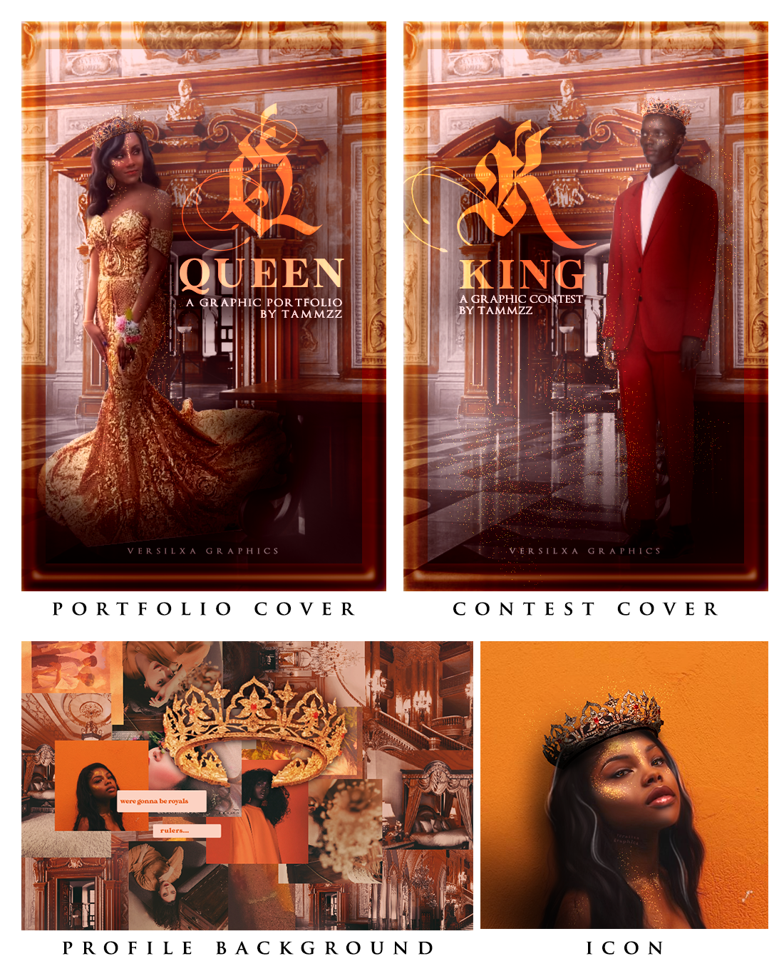
SET 3
One thing that you managed to do compared to the rest was use my desired colour scheme. That's what stood out to me the most. I really liked the font choice for the titles. It was creative and neat. The icon was probably my favourite out of the whole set. Moreover, I like how consistent you were with the covers. The background gives me a very royalty feeling and I especially like the faceclaim you went with for the Queen cover. However, I can't say the same for the King cover. The guy looks more like a statue than a king, and I feel like there was so many other black faceclaims you could've gone with that would've elevated the design, instead of choosing just a random black guy for the sake of it. I also didn't like the border, it felt unnecessary imo. I also like the profile background, but I feel it suits more for aesthetic purposes than a profile background since there is a lot going on. However, I do like the crown you added at the center, a very nice touch.
𝚁 𝙴 𝚂 𝚄 𝙻 𝚃 𝚂
Runner up: GeekGoddess-
Winner: enchanta-
Thank you all for participating. Dm me for your prizes!
On another note, it's annoying that only three entered because that means one was bound to be the odd one out and that makes me feel bad. VERSILXA, I just want you to know that it was definitely a hard decision to make and it was quite close between you guys. I hope to see you join my future contests so you can make a comeback. :)
UP NEXT: Graphic Remake

Bạn đang đọc truyện trên: AzTruyen.Top