7 | Riverdale & Elite [CE]
👑 𝐂 𝐎 𝐍 𝐓 𝐄 𝐒 𝐓 𝐄 𝐍 𝐓 𝐑 𝐘 👑
Contest 9 - Netflix Original Book Covers
Hosted by: Miss_Sarcastic27
Due: October 16, 2019 | Delivered: October 12, 2019
Type of Graphics: Cover
No. of Entries: 2
• • •
𝚃 𝙸 𝚃 𝙻 𝙴 𝚂
Riverdale & Elite
𝙰 𝚄 𝚃 𝙷 𝙾 𝚁
Tammzz
𝙶 𝙴 𝙽 𝚁 𝙴 𝚂
Mystery, Crime, Teen Drama
𝙴 𝙽 𝚃 𝚁 𝚈 𝟷


𝙴 𝙽 𝚃 𝚁 𝚈 𝟸


• • •
👑 𝐂 𝐎 𝐍 𝐓 𝐄 𝐒 𝐓 𝐑 𝐄 𝐒 𝐔 𝐋 𝐓 𝐒 👑
🥈 2nd Place
𝙾 𝙼 𝙼 𝙴 𝙽 𝚃 𝚂
You can tell I was super excited about this contest by me posting my entries way before the deadline. For my first entry, I chose Riverdale. Now for all you American people out there, I know it is a CW show, but there has been a bit of a confuzzlement. For viewers outside the US Riverdale appears as a Netflix Original. These regions include Europe and Canada. I happen to be living in Europe so that's why it appeared in the Netflix Originals list. The CW and Netflix engaged in an exclusive deal that enabled Netflix to have broadcasting rights internationally, so the episodes are released on a weekly basis just like on TV. Hence, because of those streaming rights, Netflix decided to slap a good ol' 'Netflix Original' label on it. So technically, this was a loophole that enabled me to choose Riverdale for my entry *shrugs innocently*.
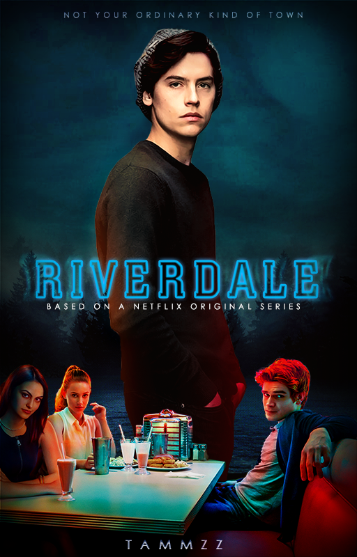
Hemingways, let's get down to the nitty-gritty. I went with a dark and clean style for my first entry. I really like Riverdale posters so I picked two, from the plethora of posters on google images, to incorporate in my graphic. The first poster was an image of Pop's Chock'lit Shoppe. I used the top half for the sky of my graphic. The second poster included the main characters inside Pop's Chock'lit Shoppe. What reeled me in was the bold colours of reds, yellows, and oranges. I thought it would really stand out against a dark background creating contrast in the graphic, that's why I chose it. I cut out the core characters sitting in the booth.
Since Jug wasn't sitting with Archie, Betty and Veronica, I decided to add a png of Jug in the background. (I didn't crop it myself) Jughead standing tall in the background makes sense if we consider his role in Riverdale; he is the omniscient narrator of the series and also writes a novel about the events that unfold in the town of Riverdale. I struggled quite a bit with adjusting his skin tone to fit the graphic. It was a little ash-laden so I tried my best to colour correct his skin by adding a goldish yellow hue. I also painted in some colours on the bottom half of his body and used gaussian blur to create a glow effect. This produced a nice transition from the bright colours of the booth to Jughead.
As for the background, I had to use a blending technique to get all the images of the forest, river and sky to appear as one coherent unit. I think it looks decent for the most part, though the sky may be a little too bloated than I intended it to be. As for the Riverdale font, I added a blur effect behind the title-I just thought it'd look cooler so that's why I did that. For the subtitle, I came up with it myself. It's pretty basic, but meh, it's not that important.
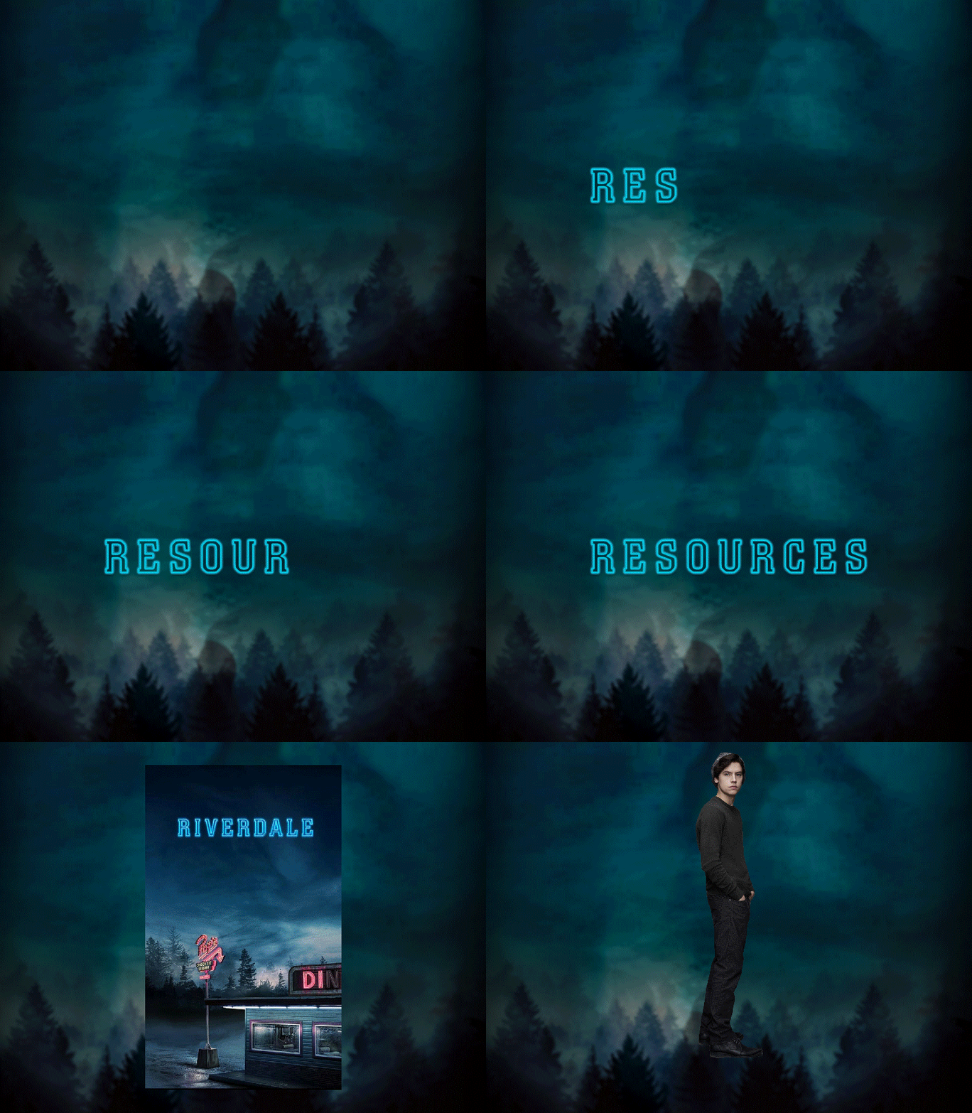
I completely forgot to document my process for my first entry, so I just showed the resources I used in the gif above.
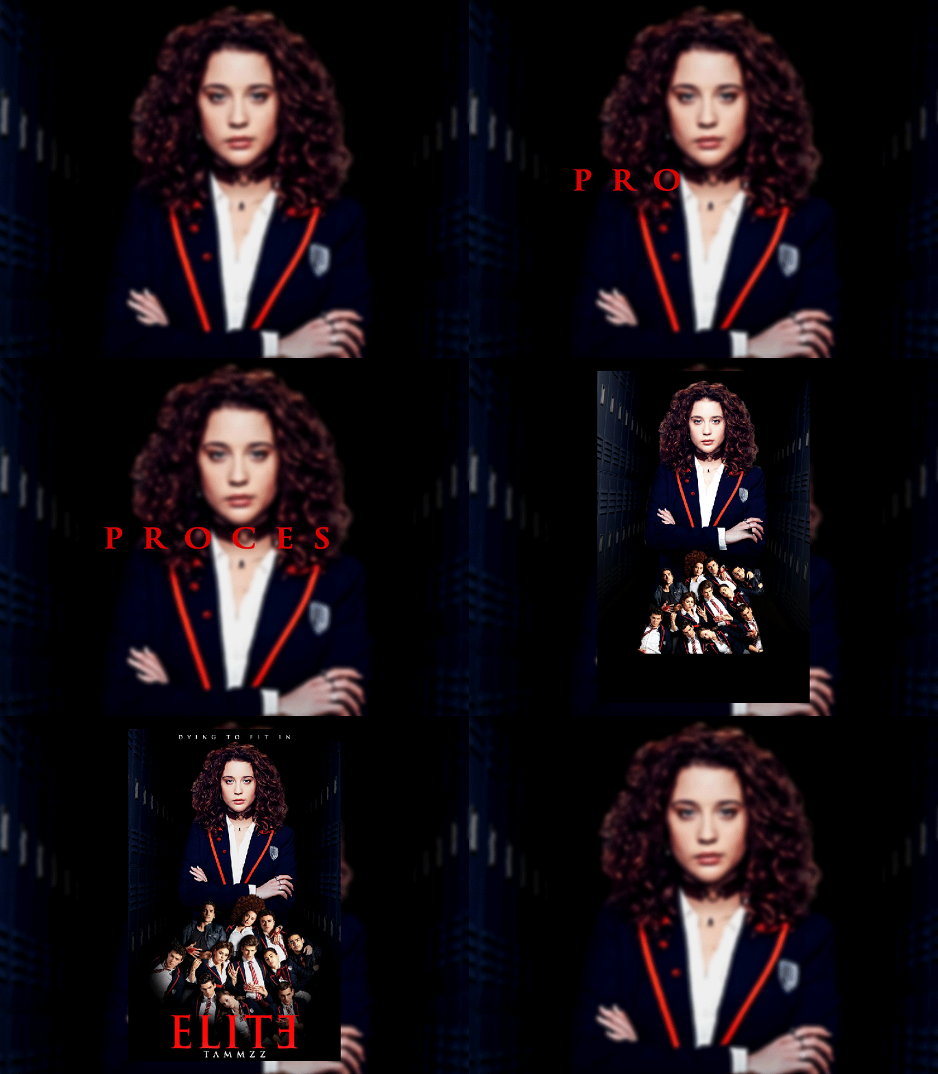
For my second entry, I chose my latest obsession on Netflix-namely, Elite. If you haven't watched it, slap yourself and go watch it. Now! Oops, Kenny popped up a bit there lol. (For those of you who didn't get the reference it's a character, Kennedy Holmes, from my book. He's always stern.) Hemingways, back to the main topic. I chose a quite minimalistic approach with this one too. It was quite hard to find resources for the cover, so I tried my best to work on the most useful ones I could acquire. As the process demonstrates above, I worked a lot on the saturation and positioning of the layers. Since it is a teen drama/mystery show, I made the colours darker to create an obscure tone. The background does well to portray that as the school hallway full of lockers leads to darkness, and this darkness also surrounds the characters at the bottom. The series is centered around Marina's death, so it made sense to center the graphic around her. The image of Marina was pretty pale, to begin with, but I think it turned out alright compared to how it looked like initially. I thought the image of the all the characters looked super cool so I also incorporated it into my design. As for the title, I didn't write it myself, I took it from Uncle Google and changed the white colour to red. I also retrieved the subtitle from the original Elite poster. For the 'Netflix Original' subtitle at the bottom, I realise I got a bit too carried way with the tracking of the letters. I probably could've made the text smaller so it looked relatively proportional to the text above and below.
Overall, I have to say my favourite out of the two covers is Riverdale. Though, I'm satisfied with how both of them turned out. Sorry for my long rant (the longest thus far), but I hope you like them!
May we meet again.
~Tammy
Bạn đang đọc truyện trên: AzTruyen.Top