Review inteligentwwh

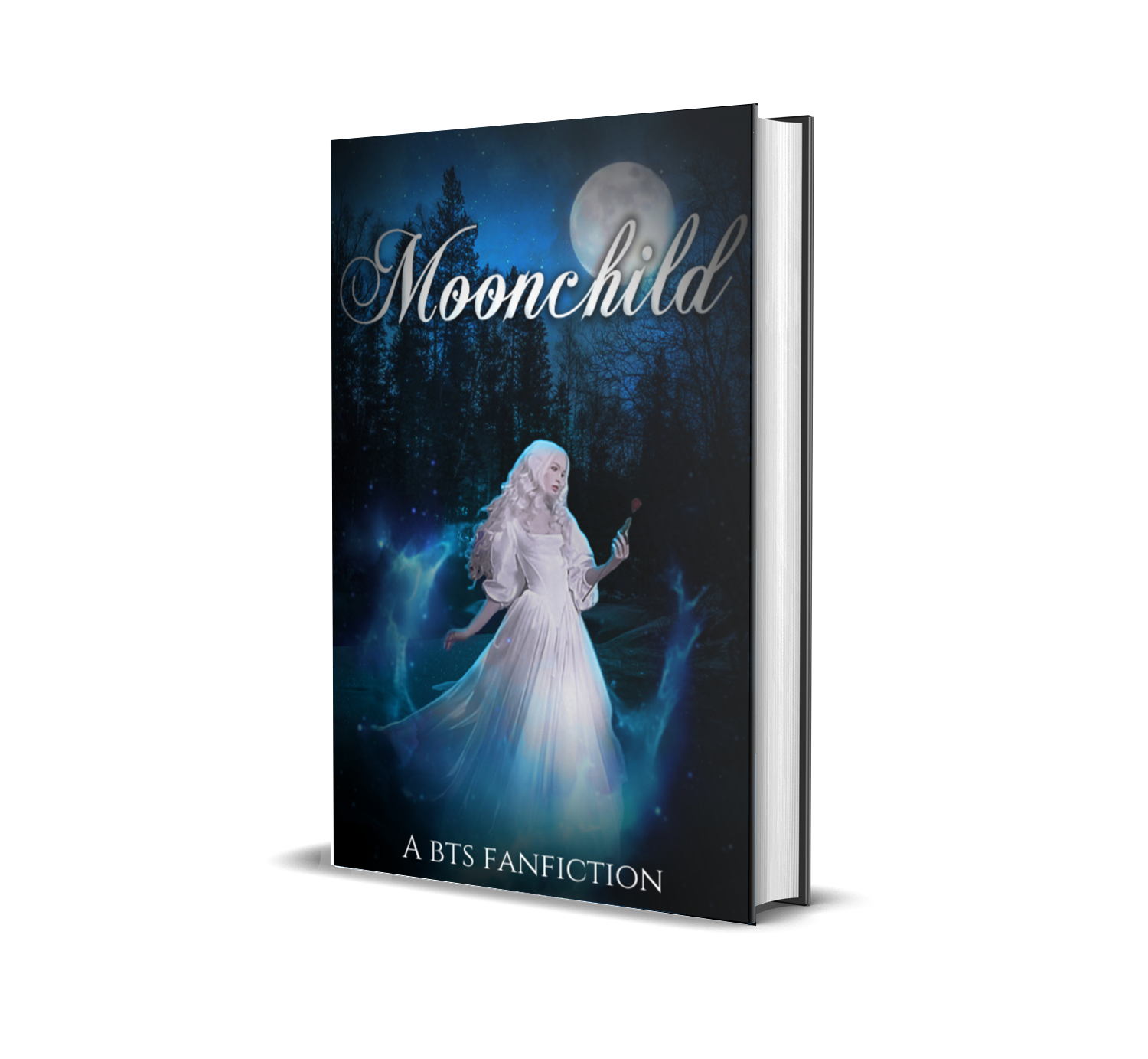
Title – 6/10
I love the mix of title fonts, but the placement of the "M" feels a bit off. Additionally, the font is too thin, making it less impactful. On the bright side, you positioned the title against a black background, ensuring visibility.
Blending – 4/10
The blending could be improved. BTS has warm tones, while the girl appears cold-toned and overly white, making them look mismatched. Additionally, the cutout edges of the person are visible. Try softening your brush while using the eraser tool, or if you used a background eraser, refine the edges for a smoother transition.
Colors – 5/10
You included blue and white as requested, but they remain minimal. Brown and gray tones are also present, which slightly disrupt the intended color scheme.
Image Composition – 3/10
Including BTS was your goal, but having eight faces makes the cover feel overcrowded. Since the story revolves around the girl, she should be the focal point. Instead of adding all the members, consider placing a clear label like "This is a BTS fanfiction" on the cover to convey their involvement without cluttering the design.
The background choice, however, is well thought out.
Overall Cover – 5/10
The cover feels too busy, and refining the placement of elements could improve the overall balance. Consider whether adding extra images enhances or overwhelms the design. While it's not bad, I believe you can achieve a more polished look with practice.
Total: 23/50
Don't be discouraged by the score! You have talent—what's needed is a sharper eye for composition and color harmony. Experiment with blending warm and cool tones to create a cohesive look. Adjusting brightness, contrast, and saturation can also help unify the elements. Keep practicing, and you'll see great improvement!
I also posted a cover that I made with the advice I have giving you with the same 'pictures' you gave me.
Bạn đang đọc truyện trên: AzTruyen.Top