The New Leader - Process
This is for you Ezol <3
(Definitely check them out, they're an amazing artist @Ezol13 )
This is where I try to explain the process of drawing "The New Leader". Enjoy!
Before I start the actual drawing I usually make some doodles on my sketch block to figure out the general vibe I want, especially with big Illustrations like this. That's what you saw in the Teasers. I also made some doodles in class and looked up mafia aesthetics on Pinterest etc.
Once I know the rough layout and idea I start with a rough sketch:

I use circles to figure out the proportions. Each circle is about the size of the character's head. The legs are half of our body, so a mark in the middle shows me where the torso ends. And the knees are just over the lower quarter.

In the next step, I figure out the pose and shape of the body. I do that by simplifying everything into its most basic shape. Arms and legs are ovals connected by circles and the torso is made up of two overlapping parts. It kind of looks like those poseable art dolls.
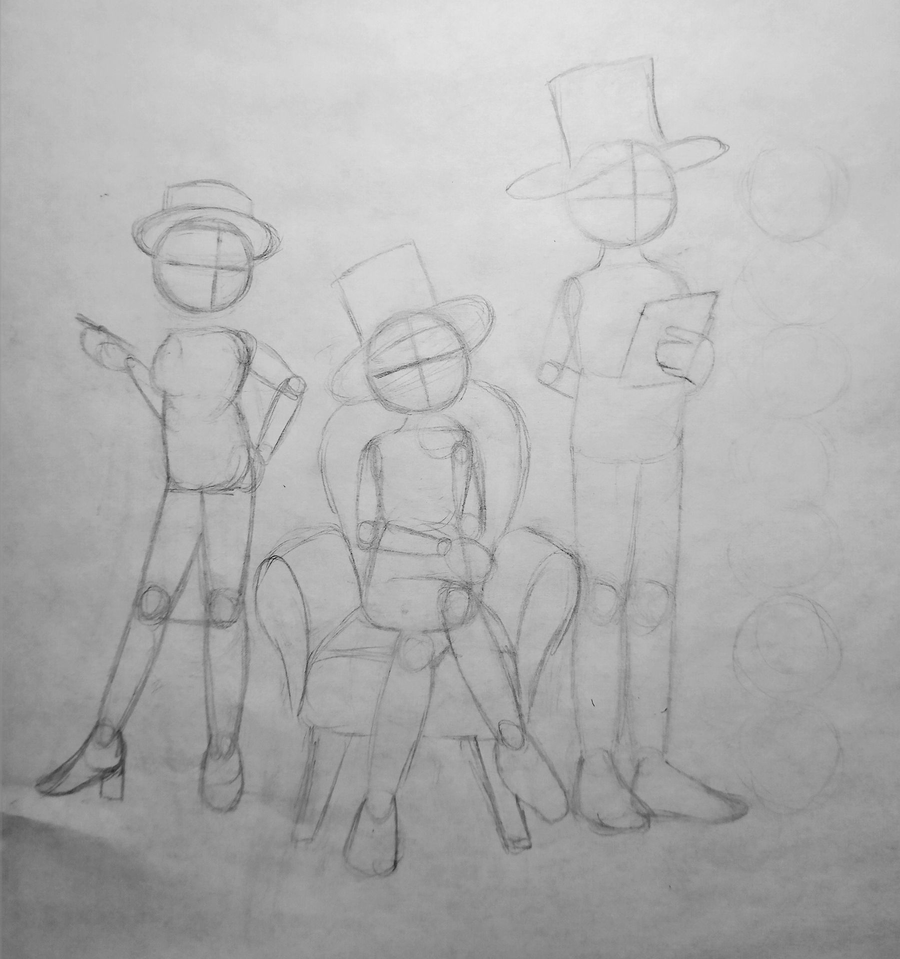
Once I'm satisfied with the pose I add clothes. Wrinkles are where movement is and concentrate around the joints. Since business clothes have slightly stiffer fabric I draw small, slightly pointy wrinkles. Burt's turtleneck is the exception with completely round wrinkles. The ones on his arm are very small and the ones around his neck bigger because the fabric is looser in the latter area.
(I kept changing Carol's pose so you might notice her shift around)

Once the body is finished I add faces using the cross technique to figure out where the eyes are. When drawing hair I start with blob shapes to visualize the silhouette of the hair. Then I start adding strands until I'm satisfied.

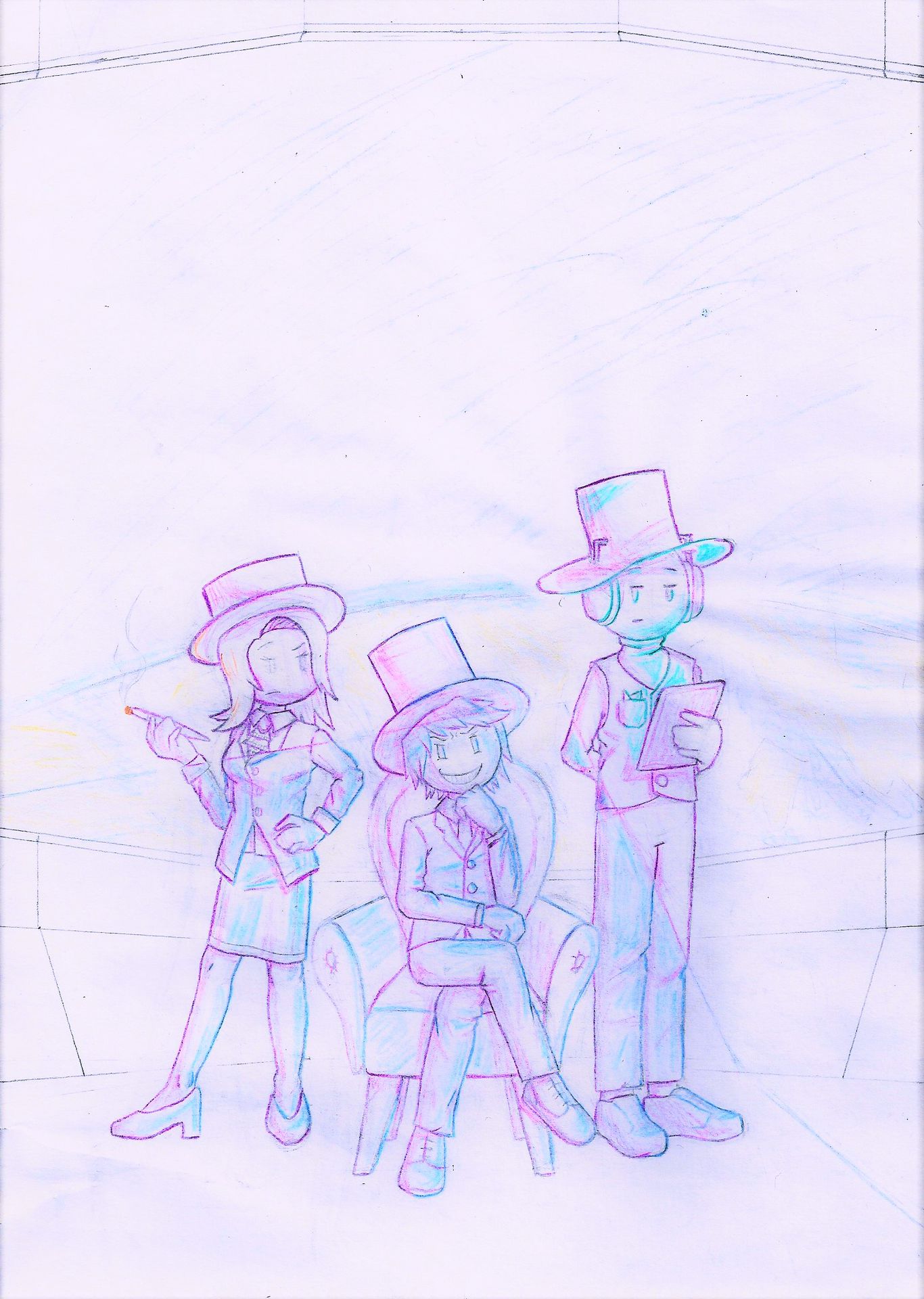
Then I stop procrastinating drawing actual hands and trace everything with a harder pencil. After looking for some more inspiration I decided on a background and added it. I used colored pencils for the parts that wouldn't get lineart. I also added a dark blue line to keep track of where the light is since I wanted to experiment with dramatic lighting.

I decided to do a light-and-shadow sketch for this sake. I used a purple pencil for shadows a light blue one for highlights and a turquoise one for the light coming from Burt's tablet. I also traced the lines in the corresponding colors.
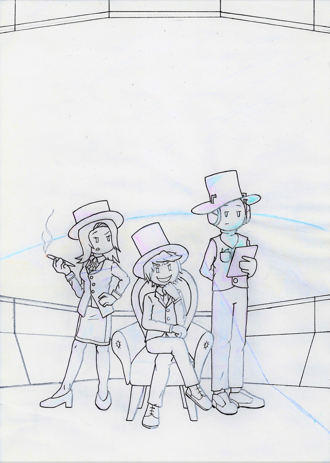
That concludes the sketch phase. Next step: lineart. Usually, I just do black lineart. But I decided to use different colors this time to emphasize the lighting. It's a little hard to see on the scan: The lines that are being hit by light are a lighter gray. The ones that are being illuminated by the tablet are blueish turquoise with a white center.
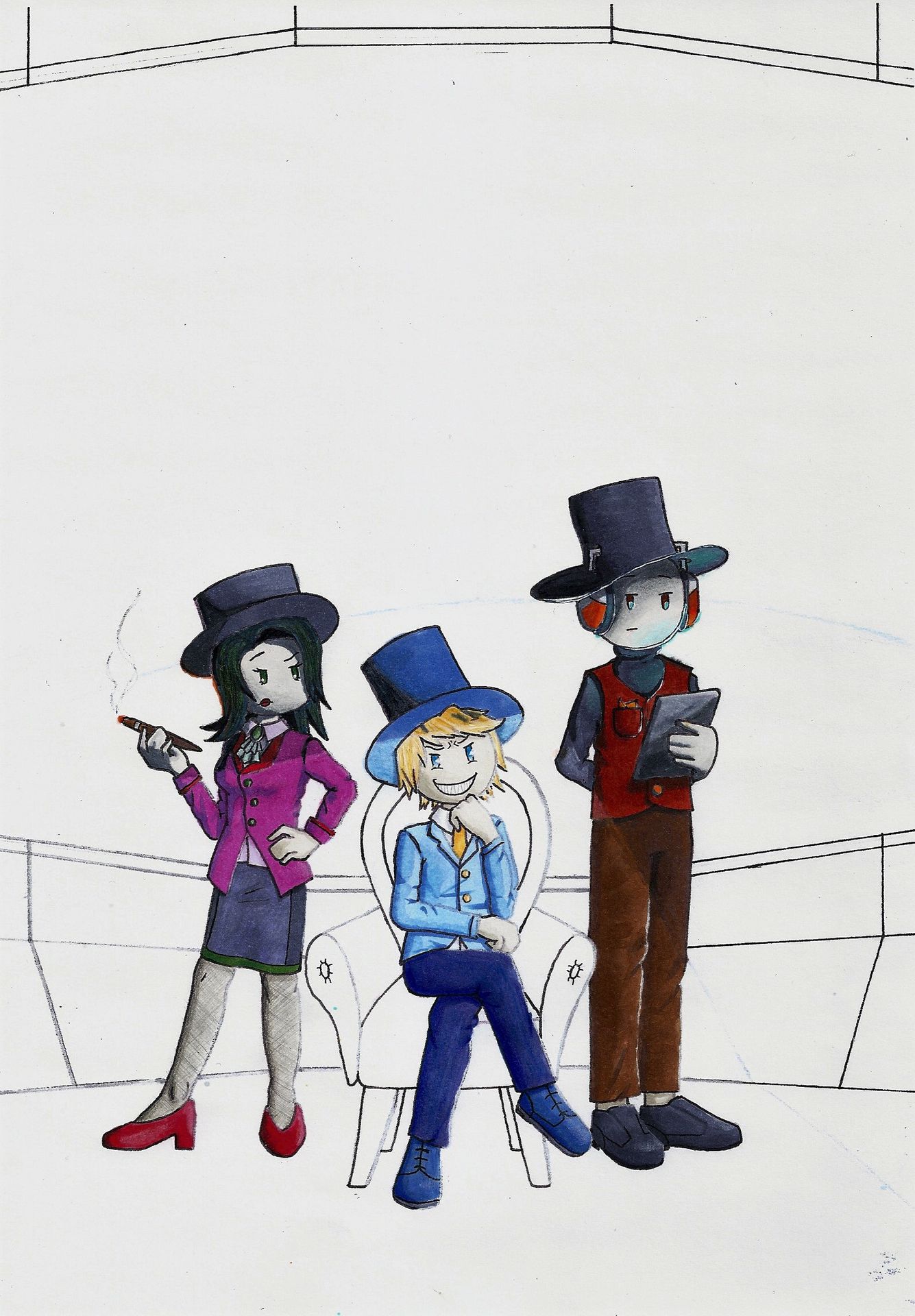
With the lineart done it's time for some color! And that's when I realized that I had no idea what I was doing with the light... I ended up making two slightly different versions. That way I could experiment without being scared of ruining everything.
First, I colored the characters. I start with the lighter colors and blend them with the darker ones for shadows. In the A version, I also added hard black shadows outside of the light area on the bottom left.
All colors were done with Copic markers. But I did use some colored pencils for details or to keep the colors from blending together. Carol's tights were done with a very sharp pencil and a ruler.
A:
B:
At the moment the only thing that's different in B is the softer shadows and that I forgot to color the soles of Sven's shoes. But that changes when I add the background.
Drawing space outside the window was fun. I started with the light spots and the atmosphere around the earth and worked my way into the darker areas. Then I worked backwards to blend everything. As a finishing touch, I added loads of stars with a withe gel pen.
The earth was done with colored pencils and a gel pen. Then I went over it with a blue Copic marker to darken it a little.
A:
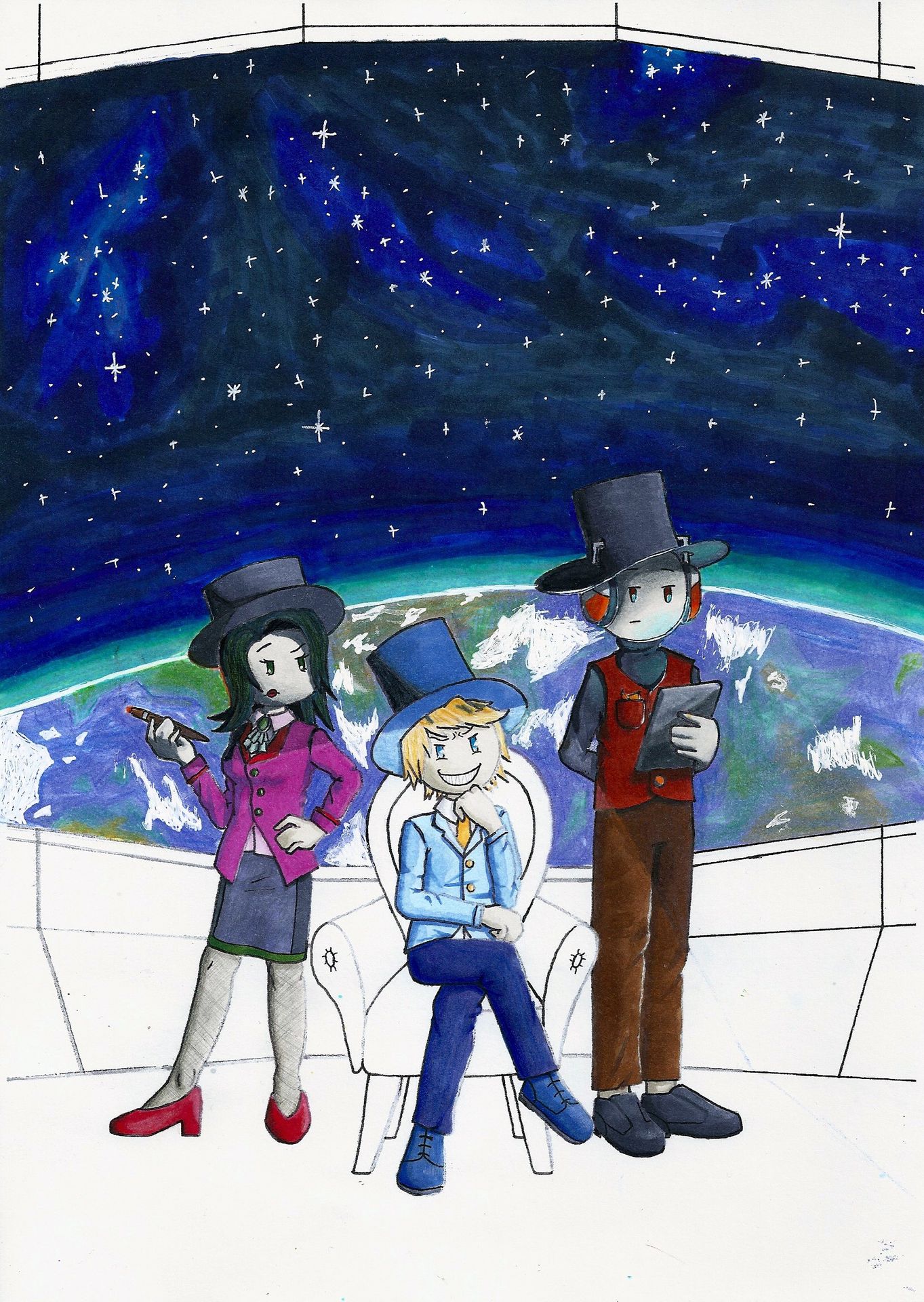
B:

The B version has a purple color scheme instead of the blue-turquoise one in A. In addition, the earth is much darker.
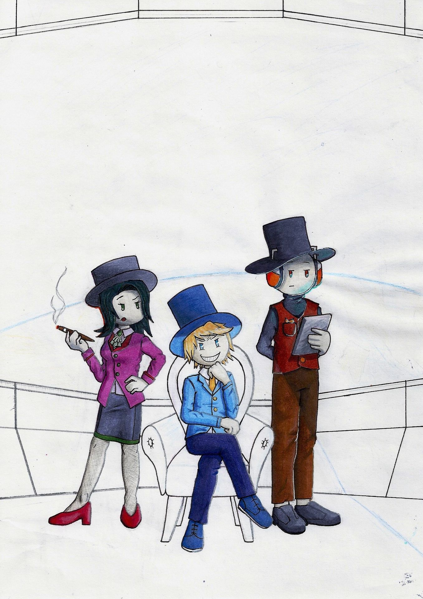
All that is missing now is the interior of the space station.
I looked at screenshots from the game where Henry is in the space station but none of the rooms fit the look that I wanted. So I mixed and matched different aspects of each.
The walls are mostly inspired by Henry's cell in Free Man. I added the blue stripe from the cafeteria 'cause why not? I don't remember where the carpet came from. But since it has the same color as Carol's shoes I made the high heels more purple with colored pencil.
I made the walls in the B-version first. Turns out that brush tip pens aren't made for very fine straight lines. That's why I used a normal pencil in the A-version
A:

B:

For the finishing touch, I scanned the drawings and edited them with the standard foto app. Since I wasn't satisfied with the light I used the free Paint Net Online Editor to emphasize it. I simply drew a bright yellow shape on a new layer and made it transparent for the light area. I did the same in dark blue for the shadow and in turquoise for the light from the tablet. Then I added some white stripes on the window and I was done!
A:

B:

That was pretty much all. I hope the explanation made sense ^u^
If you have any questions feel free to ask.
I hope you have a great day/night!
Bạn đang đọc truyện trên: AzTruyen.Top