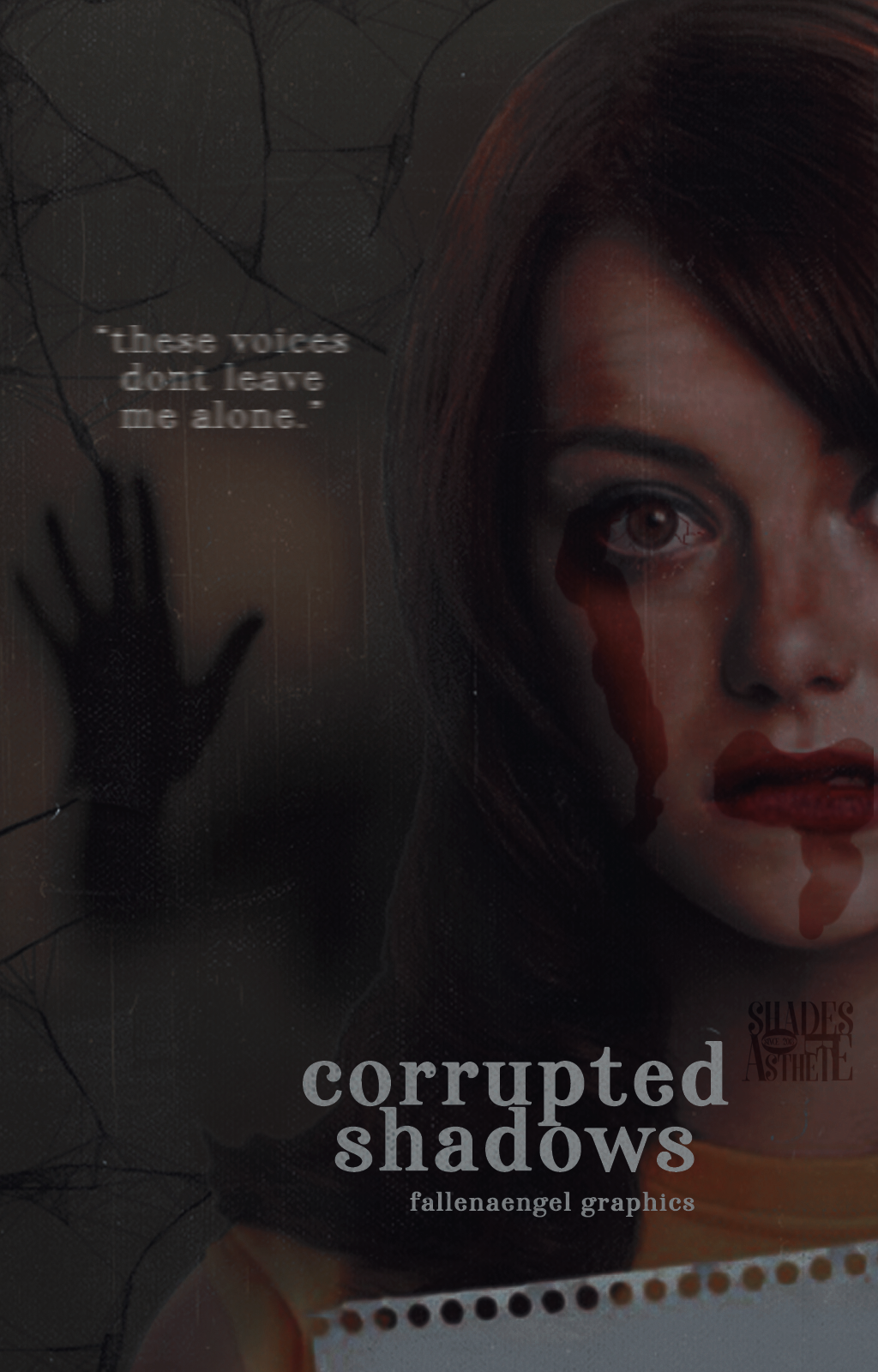
S4 } (013) #1 [corrupted shadows] .... fallenaengel
HD/clearer version above.

title: corrupted shadows
any descriptions of your work? out of nowhere, a young ordinary woman starts hearing whispering voices. whenever she turns around in the direction of voices, she's see nothing but a silhouette of a person walking away. this continues for a few days, but then, the voices and the whispers in her head multiply--to the point that she cant function properly anymore. she starts having nightmares, in which she fights off some sort of 'monster', but she is never able to win. but here's the thing, when she wakes up, her body, is covered with blood and scars and the pain that she feels is so real--as if, they werent just nightmares, but the reality...
so i think it's pretty obvious that the genre of my graphic is horror/thriller. the subtitle 'these voices wont leave me alone' is a song lyric by halsey in her song--gasoline. and it refers to the voices/whispers that the woman keeps hearing. the shadow of the hand in the background represents how she feels trapped, inside her own head, her mind and is unable to escape the voices. her disheveled appearance is representing her trauma.
how did you come up with this idea? this wasnt going to be what i'd thought i'd do, originally. initially, my thought process was going in a different direction, i was going to show a girl whose shadow is a monster but i thought that, that could border humour so i started looking for background textures and pngs for it, when i found this png of emma stone and when i opened it on ps, it was very large (covering half the canvas) idk if you understand what i mean lmao but that's when it struck me, that i could show some ghosty-shadows in the empty space left.
hints on how you did this cover/graphics? so as i told previously, the png was set and i searched for 'ghost shadows' on google for the side image. i was painting her lips darker when my mouse did it's thing (i accidentally shifted my hand hehe) and it got out of the shape of the lips, but i thought oo this could look cool, so i added some more red paint near her eyes (bc im extra like that) and put it on the overlay mode. i also edited the rest of her face to make it more 'disheveled' like i mentioned before. i shaded the outline of the hair a bit to blend with the bg a bit. but the cover on the whole looked a bit empty so i added the spider webs and the song lyric, put some overlays on top and adjusted the colours, added a couple psds and i was done! i wanted to go for a simple typography and nothing fancy because there was already a lot of stuff in there and i thought a clear font would look the best.
rate your own work from 1-10: im at that point where i dont know if this looks good or not so im just gonna go with a 5/10.
goodluck, fallenaengel !!!
....
// notes:
oh to add something, rate her entry from 1-100% !! by doing so, your rates will be added to her overall points. you can add your critiques by commenting below.
how do we rate/critique your entry?
i will rate it but just partial because after all of the entries are posted, i will add the audience rates which will be a great help!
i will consider the following,
uniqueness & creativity 40% - (is your cover/graphic creative and unique? does it look rare like once in a blue moon?)
typography, color scheme, theme & cleanliness 50% - (does the cover/graphic so clean? does it look so messy? does the typography and color scheme matches the cover/graphic theme and the way it was put in? does the strand matches your cover/graphic?)
overall, 90/90%
+ 10% for the audience. (does it look good to you? any comments why you gave this score/rate?) this will be added at the end of the round. you can also rate her entry using the 90/90% criteria.
TO THE AUDIENCE, PLEASE DO NOT HESITATE TO LEAVE YOUR RATES AND CRITIQUES! THEY ARE IMPORTANT TO THE CONTENDER'S ENTRY. THANK YOU! And to the contenders who haven't made some critiques, please start now! Good luck!
....
S4 } (013) #1 [corrupted shadows] .... fallenaengel
Bạn đang đọc truyện trên: AzTruyen.Top