S2 } (003) #7 [our doom] .... serayume
HD/clearer version above.

title: our doom
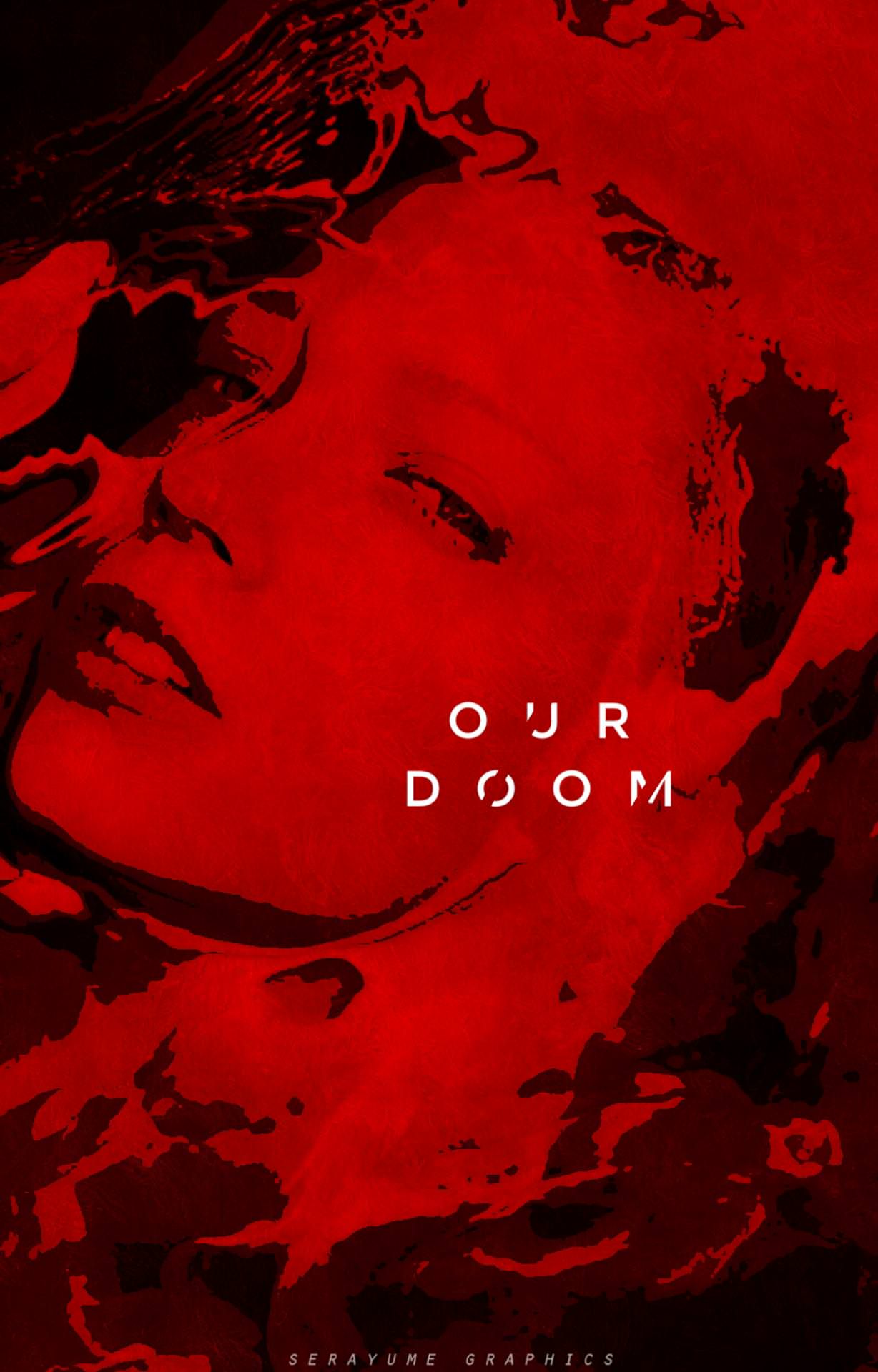
any descriptions of your work? the title was very dystopian, in a sense, so i decided to make my main color scheme dark red. red symbolizes a fair share of negative and positive things, and here it represents fury and indulgence of all the wrong things. the woman (model) is in a cataclysmic event, but she's basking in it — the fire, the ashes, the destruction — she's part of it. she's the doom.
how did you come up with this idea? my chosen style was fanart. i, personally, think fanarts focus more on the artistic sense, to make it vaguely like a painting, a portrait of sorts. hence the swirls and the other components of the cover that looks lax. i don't know if it's noticeable to you, but the cover looks kind of twisty to emphasize the illustrated-vibe instead of the edited-vibe. and the typography, as you can see, is simple and a little small. i figured that's what texts in fanarts look like most of the time — small and cast-aside without a fancy font to accompany it, but simple and just enough. the outcome was influenced highly by the strand i chose.
hints on how you did this cover/graphics? the model came first. once i had her on, i inserted the other stuff on the sides like the swirls and dark splotches, mixed them with the model to look somehow (hopefully) natural. that's the best i could explain it — i just experimented with the rest.
rate your own work from 1-10: solid 6 (or maybe 5.5 um)
goodluck, serayume !!!
....
// notes:
oh to add something, rate her entry from 1-100% !! by doing so, your rates will be added to her overall points. you can add your critiques by commenting below.
how do we rate/critique your entry?
i will rate it but just partial because after all of the entries are posted, i will add the audience rates which will be a great help!
i will consider the following,
uniqueness & creativity 40% - (is your cover/graphic creative and unique? does it look rare like once in a blue moon?)
typography, color scheme, theme & cleanliness 50% - (does the cover/graphic so clean? does it look so messy? does the typography and color scheme matches the cover/graphic theme and the way it was put in? does the strand matches your cover/graphic?)
overall, 90/90%
+ 10% for the audience. (does it look good to you? any comments why you gave this score/rate?) this will be added at the end of the round.
HELLO GUYS! PLEASE RATE EACH OF THE CONTENDER'S WORK :D It rates will be a very big help to the final scores of the contestants. So please, please rate!
....
S2 } (003) #7 [our doom] .... serayume
Bạn đang đọc truyện trên: AzTruyen.Top