XI - ANALYSING FONTS
Let's hop right into it shrimps.
First I will discuss what makes a pretty font and what makes an ugly font.
(Please note that these are just broad generalisations and there will be some special cases)
WHAT MAKES A PRETTY FONT
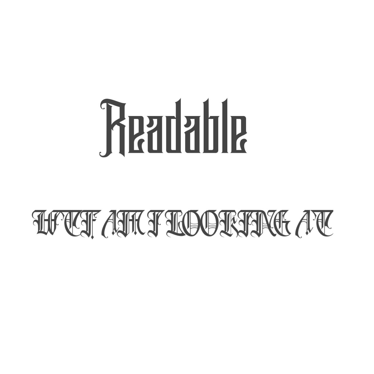
1. Readability : fonts that are readable, meaning they don't make your eyes hurt when you look at them (eg. A lot of bad gothic fonts).

2. Spacing : fonts that have an even amount of space between them
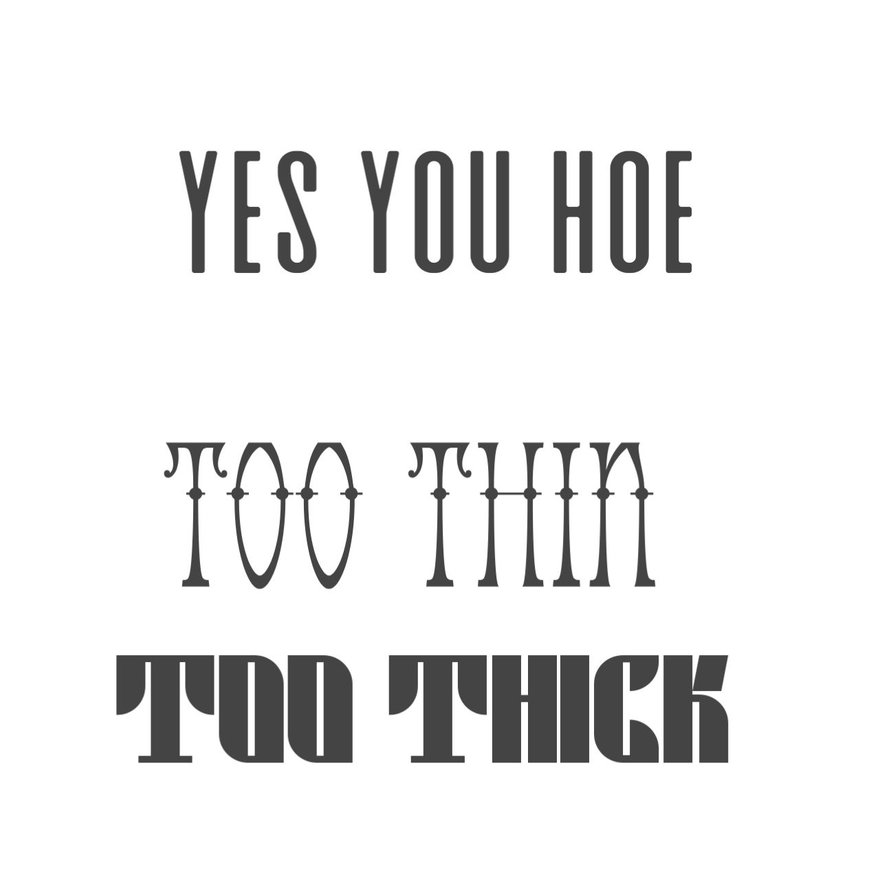
3. Balance : fonts that display the right amount of balance in thickness, length and flair.

3. The Font
i. FONTS FOR FANTASY COVERS
–Qaardos
–LHF Encore
–Cinzel Regular or Decorative
–Rumble Brave
–Desire
–Maleficent
-Bataler
-Black Crow
-Alice in Wonderland
-Cairlinn
-Bvas Estadas
Do not use script fonts for fantasy covers unless the fantasy isn't really implied in the cover as much.
(This is subjective advice)
ii. FONTS FOR ACTION COVERS
-28 days left
-Abandon
-Alcatraz
-Black Road
Any thin and long font/thick, long and blocky font usually works well for action covers.

iii. FONTS FOR SWEET ROMANCE/SWEET TEEN FIC–LITERALLY ANYTHING SWEET
–all the script fonts :)
iv. Fonts for Fun covers
-dopestyle
-coolvetica
-retro menthro
-any other thick ass script font
v. Fonts for Horror
-any brushy font
-any font you find under the Halloween section in dafont.com
vi. Universal fonts you should have stored already
-BEBAS
-BASARO
-Champagne and Limosines
–Eh Eh Nothing else i can do
-Elevation
-keep calm
-Moon light
^all these universal fonts are great for subtitles and author's names except bebas (most times)
Do not use magazine fonts if your cover is not a damn magazine
: :
Since my computer wiped out all my files I'll have to make another one of these when I download my fonts back.
Bạn đang đọc truyện trên: AzTruyen.Top