VI-TEXT PT 3
I'M BACK WITH MORE ON TEXT :D
1. Smudging Your Text
It can look really good to give your text that aesthetic vibe or baddass vibe (depends on what you're going for). Usually I use the SMUDGE TOOL, and I choose the WATERCOLOR brush (to give the smudge some texture).
And then i use moving blur to even it out
Here is a simple text :

With a little smudge and blur.

2. Your text preceding your model or object
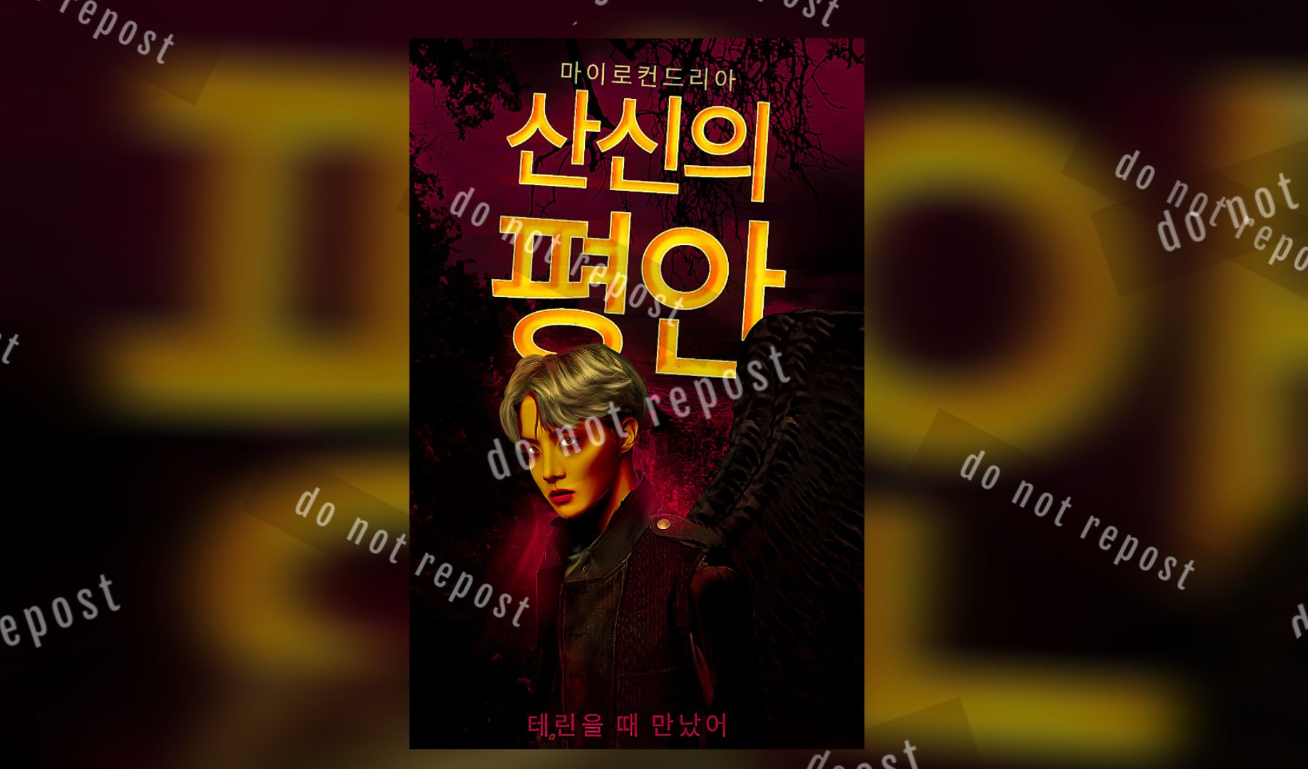
I need you guys to know that although putting your model in front of your title so your model covers part of the title is super cool and nice for unserious books

the fact is that if you want to make your book cover look more professional then your title needs to be at the FOREFRONT.
You're making a book cover not a manip, and though i do agree that the model is very important, the fact is the title is what your readers want to see so

Keeping your title at the front is usually the best decision for your book.
3. From Ibispaintx to Pixellab
Sorry, but when you make your edit in Ibispaintx and slap your text on it in pixellab– you've really limited your choices. Because you can't draw on the text, smudge the text, airbrush the text, overlay the text, etc.
The order is better when you do it like this : Pixellab to Ibispaintx
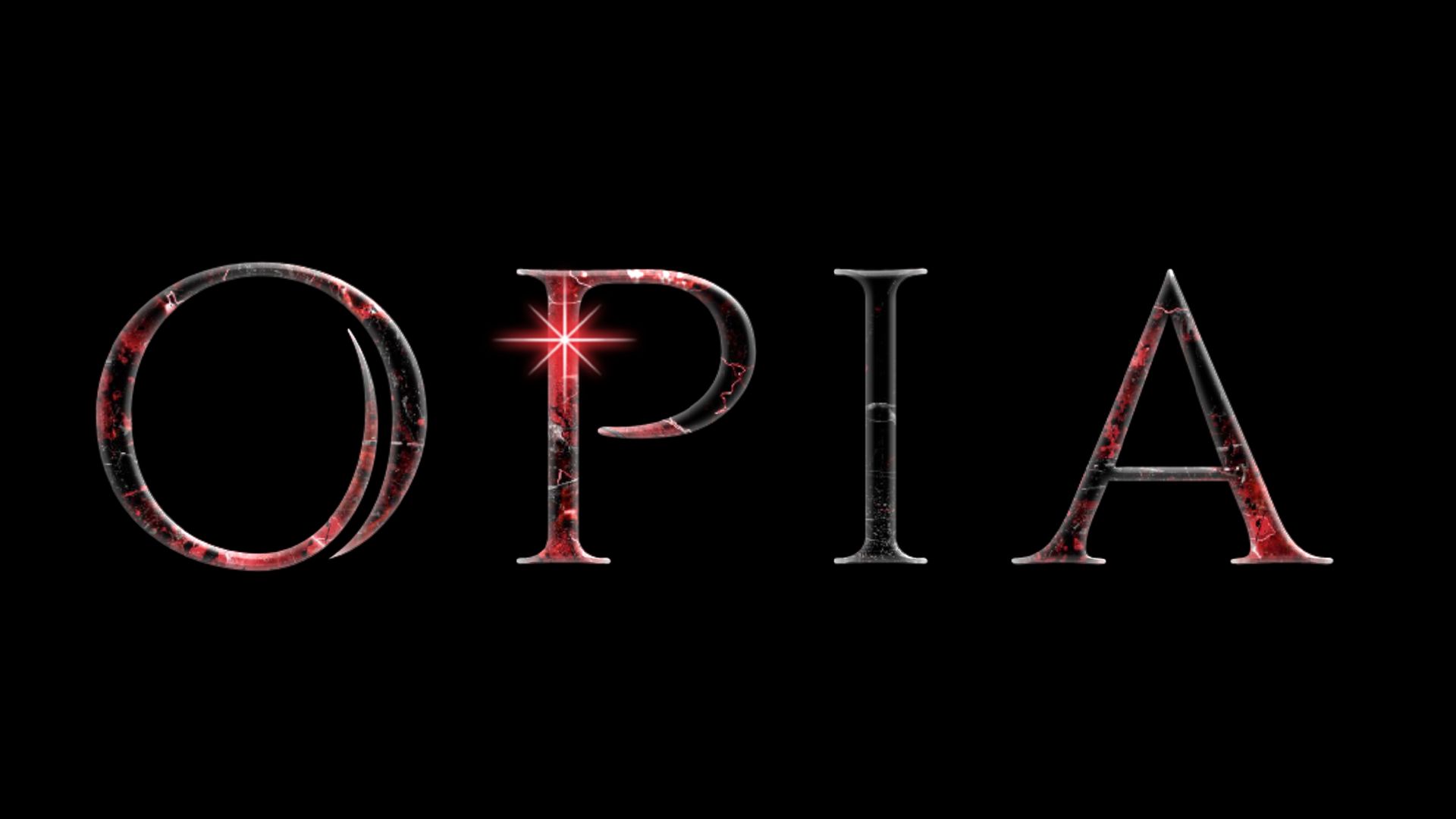
What does that mean? It means make your text as a transparent png in pixellab (from the title to the author's name) then add it to ibispaintx using "import picture"

(Png from pixellab)

(Ibispaintx)
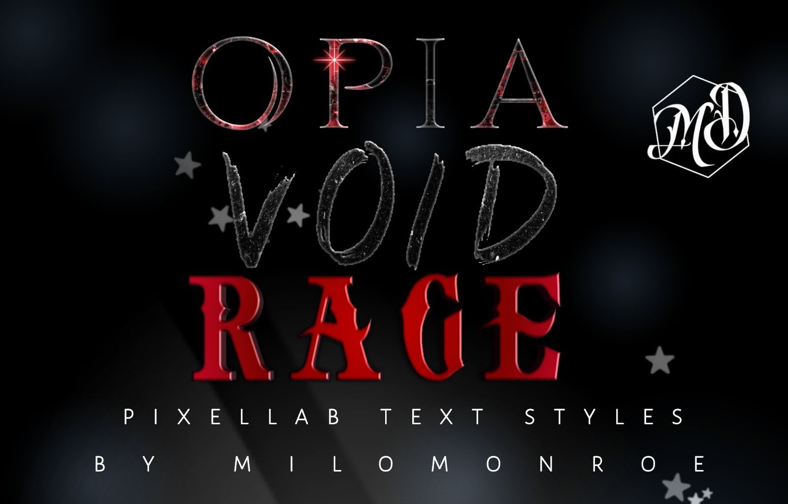
(Check out my Deviantart page milomonroe for some nice text styles 💃)
Or you could just type the text in Ibispaintx–but i like my text styles in pixellab so i never do that.
4. Space out your author's name and subtitle. And don't make your subtitle so huge

(Ignore the bad editing)
When the author's name and subtitle looks like that, the entire design just looks incredibly unbalanced.

See the difference?
5. This shit

I absolutely despise this style of text placement ie squeezing a long word into a small space.
There are so many better ways to do this
A. Split up the word

B. Fill up empty space to give it balance

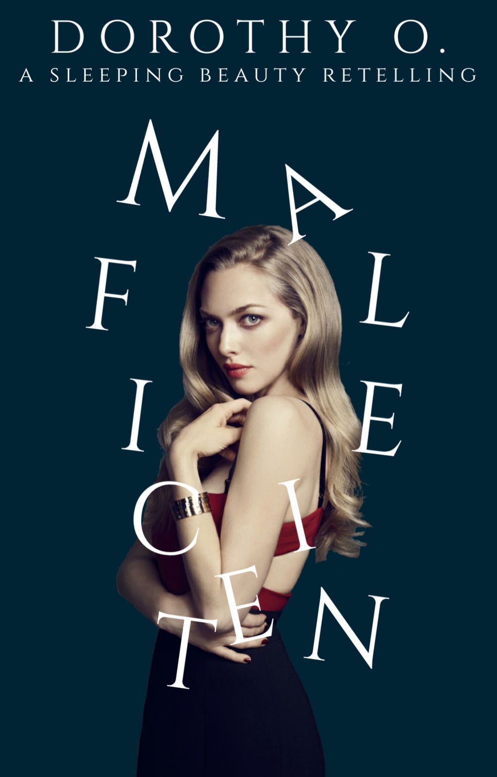
C. Scatter the letters

7. There is no point in your title of we cannot see it
Don't blend your title in too much. We need to see it guys.
Please.
Bạn đang đọc truyện trên: AzTruyen.Top