V-MISTAKES YOU NEED TO STOP MAKING
I wanna put this in tutorial so bad. But these are MY pet peeves, so just in case anyone complains imma just say this is a rant pfft.
: :
I might sound a little mean but please know that i mean nothing but love uwu.
MISTAKES THAT YOU NEED TO STOP MAKING
1. Putting that harsh glow around your models.
Lemme guess. You duplicated the model and set the lower one to add, then blurred it, then made it a bit bigger.
Hahahaha.
No.
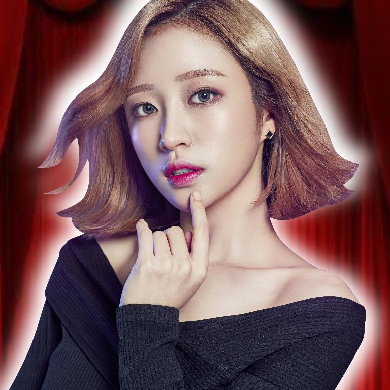
Have you ever seen a glow like that in real life? EVER? Come on, tell me, I'm waiting 🗿
(Update : Loving how I used to do this before but I'm acting like i never did lmao)
That's not how glows work. If you want to make a glow, please first and foremost make a glow ACCORDING TO WHERE THE LIGHTS COMING FROM WTF
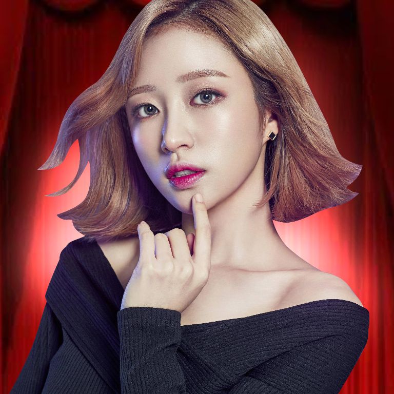
i be seeing glows in some dark ass areas and i just be like lmao???? sis where's the light coming from? WHERE
Please. I'm begging you. This needs to stop.
AND IF YOU PUT A GLOW AROUND YOUR MODEL THEN IT'S GOING TO FUCKING AFFECT YOUR MODEL GODDAMN PUT A LIGHT AROUND THEM LIKE THIS :

2. The background lighting affects your model's colouring
Let me tell you something about that random png you got. It was cut by someone else, and the picture it was cut from has a different background with different light sources
So there's no way your model won't be coloured different than your background
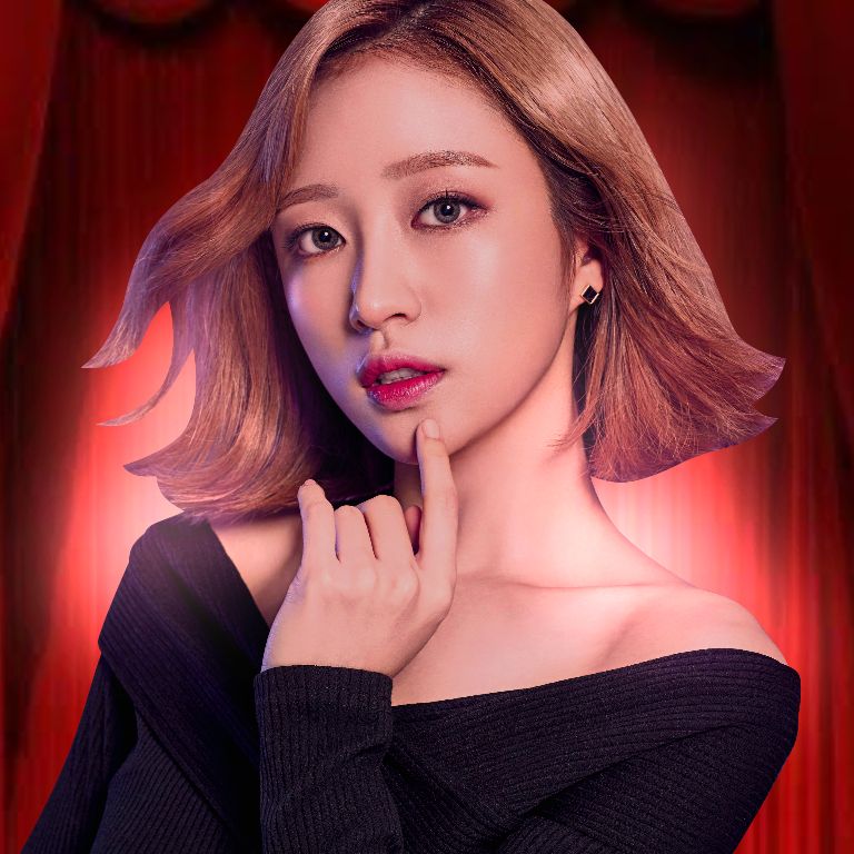
Oh my god, please guys, Ibispaintx gave us colour balance for a reason. Photoshop has all the editing tools, and Picsart is useless but I'm sure y'all can use filter or whatever.
The background affects your model
Please.
Listen to me.
Learn how to edit your models.
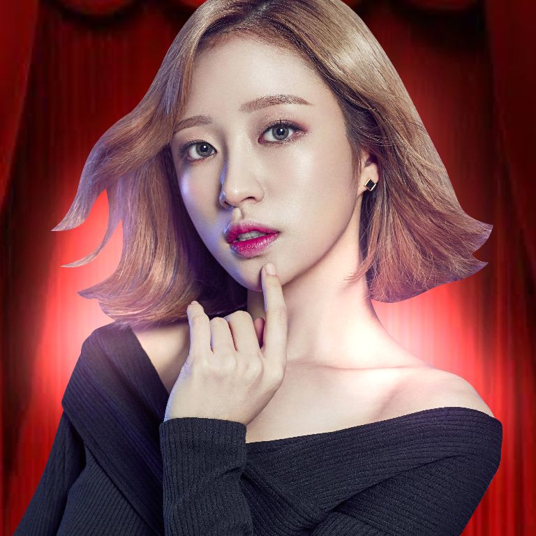
With some.colour balance
3. Stop with the ugly contouring.
I will keep saying it until it sticks 🗿.
Stop it.
4. Using different disjointed fonts in one cover.
Why do you need so many fonts in one cover? No, tell me, why? I wanna know if there's a legitimate reason for this font madness🗿
5. Making your title block key elements of your graphic.
Imagine, you have a WHOLLEEEE EMTPY ASS SPOT IN YOUR GRAPHIC LIKE
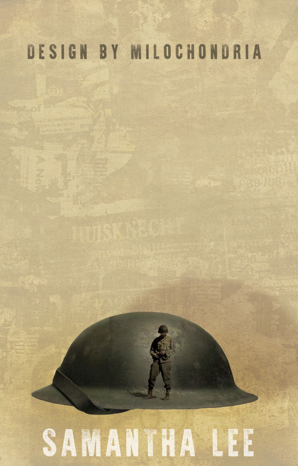
And you will put the title like this
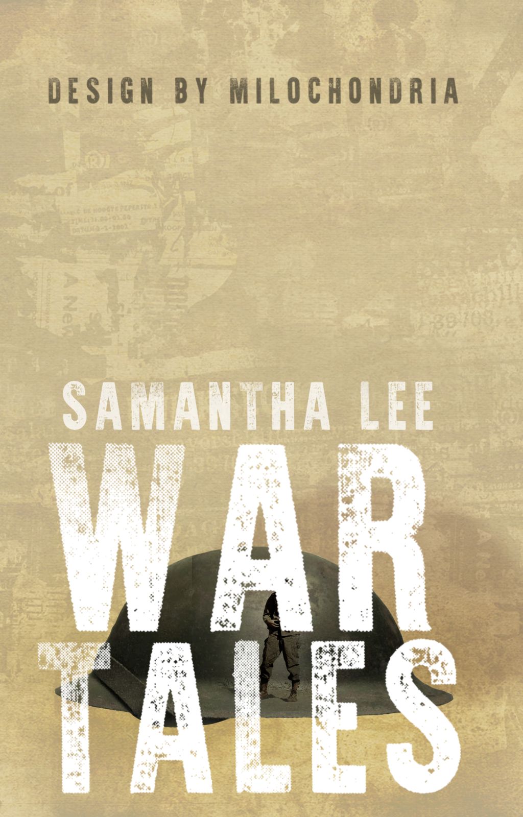
Thank you. I can now see the hat very clearly. And the title WOW, so visible.
Mtchew.
Or there'll a a PERFECT SEEABLE SPOT ON THE BOTTOM LIKE
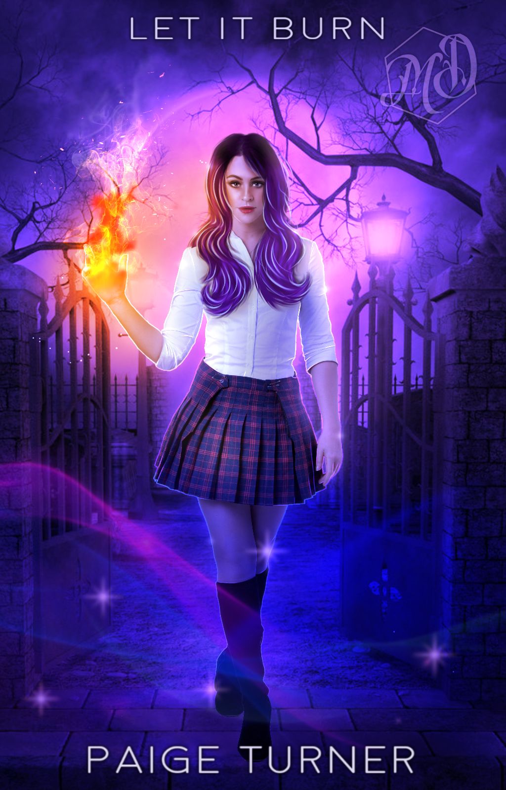
and they'll put the title on top so the head can cover it as if it's the head we are going to be reading 😭

Thank you. I now will use my imagination to guess what the rest of the words are. Such brilliance. Such skill.
When there is space at the bottom you will be micromanaging the top as if it's data 😭
6. Use a complicated font for a damn author's name.
No no. Do not make your author's name a calligraphy font . Do not overedit your author's name.
Keep it at a simple squarish/serif font. You don't need anything extra. It's an author's name for God's sake
: :
Hope this helps you even if it's a rant. If you feel personally attacked then i am glad and that means I'm doing my job right : )
I have so many tutorials in my head but I'm too lazy to execute them
However next chapter will contain a detailed explanation and analysis of FONTS, which to use and which to avoid, and why Picsart fonts are the ugliest thing to ever exist ❤️
Bạn đang đọc truyện trên: AzTruyen.Top