IX-TEXT PT 4 (im sick of y'all)
Enjoy
: :
I'm done with y'all ruining beautiful edits with ugly ass text.
say it with me boys and girls :
if your text looks like shit then your cover AIN'T SHIT.
Idc if your editing looks like digital art magic
if your text is ugly then it ruins the entire design.
Because that's one of the first things people are drawn to when they see your cover! They want to KNOW what it's about and the text does half of the explaining for them.
DIFFERENCE BETWEEN GOOD TEXT AND BAD TEXT
1.
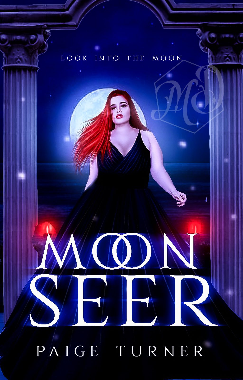
(font : cinzel)
GOOD TEXT
+ it's easy to see and the words are easy to identify
+the font matches the mood of the cover
+there's blue motion blur around it to match the blue of the bg
+there's just a little bit of flair (the two "o"s overlapping) in it.
+the text is balanced and in proportion to the cover
+the font isn't overambigous and it's simplicity speaks for itself
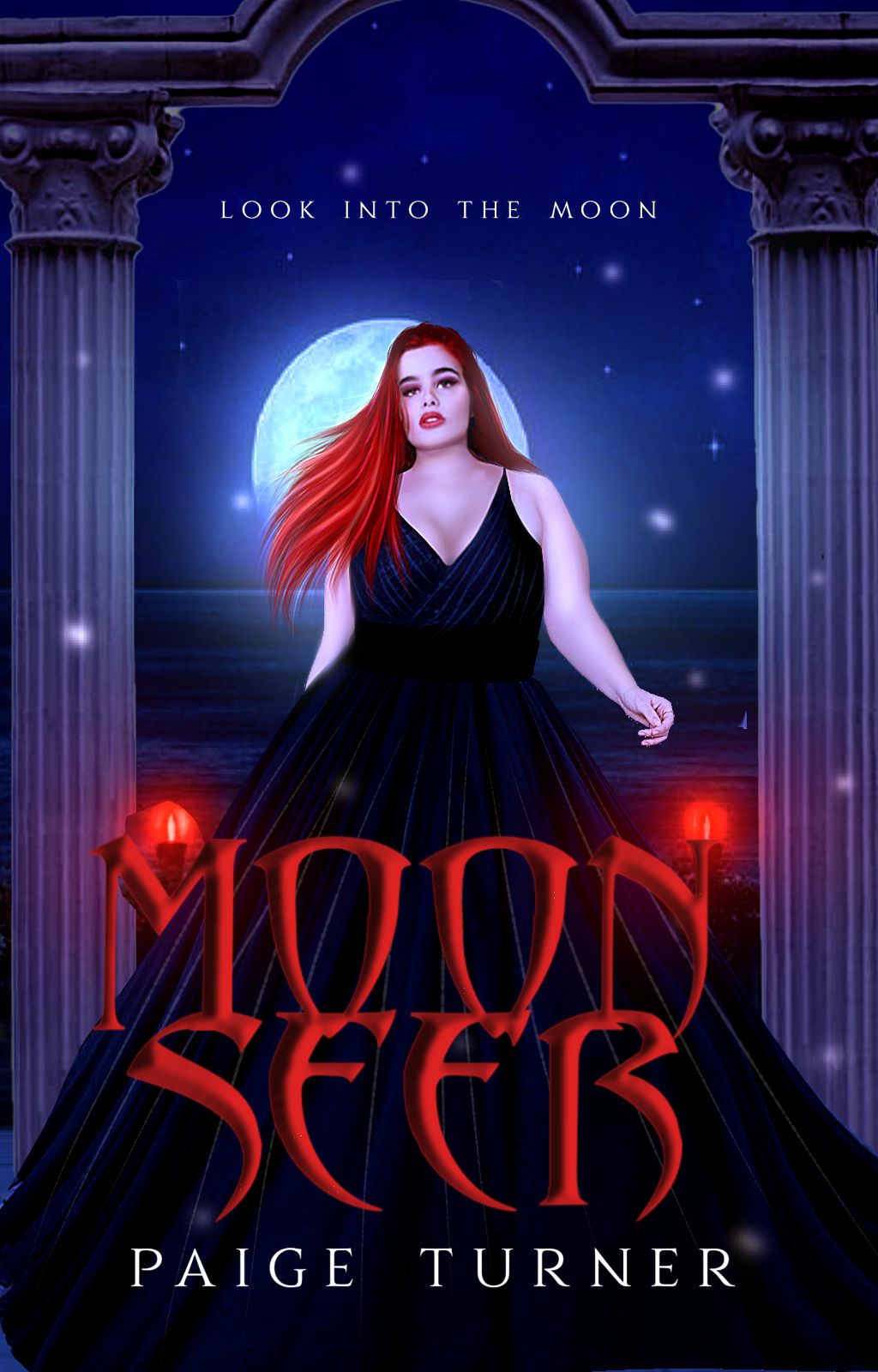
BAD FUCKING TEXT
+it blends to the point where it's very hard to see
+the font looks like something you'd see in vampire horror and has nothing to do with "moon seer"
+the red colour bleeds into the red lights and unbalances the colour scheme of the entire cover because blue bg(1)–red light red hair red lips red text (4)
+The bevel is fucking unnecessary and smoothened to the point that it's ugly
+the text is so imbalanced i just–
+The bevel darkens the red making it hard to see against the black dress because the dark red and black almost look the same.
2.
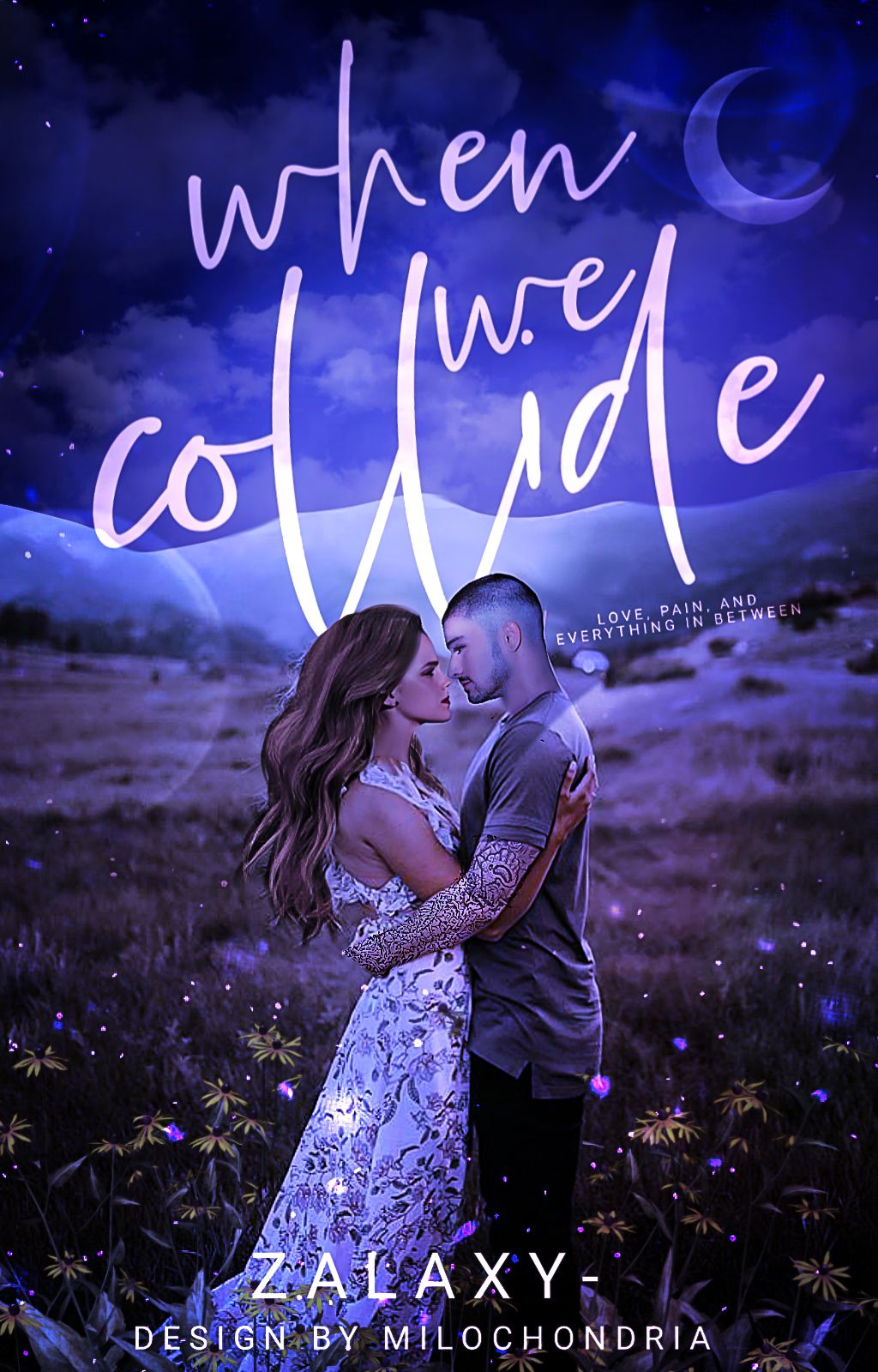
GOOD TEXT
+the title is put at the area with the largest space
+the title is very easy to spot and obvious, which is key for these types of book covers
+the author's name is small but readable
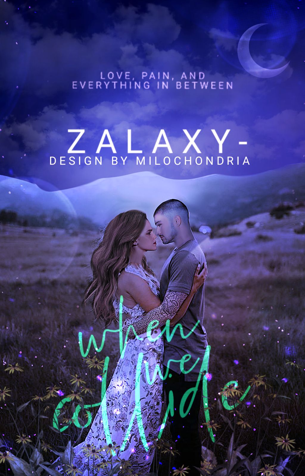
BAD TEXT
+Now the author's name looks like the title for some fucked up reason
+the title obviously should not be at the bottom when there's an entire seeable space up there
+ yes fuck with the colour scheme some more why don't you
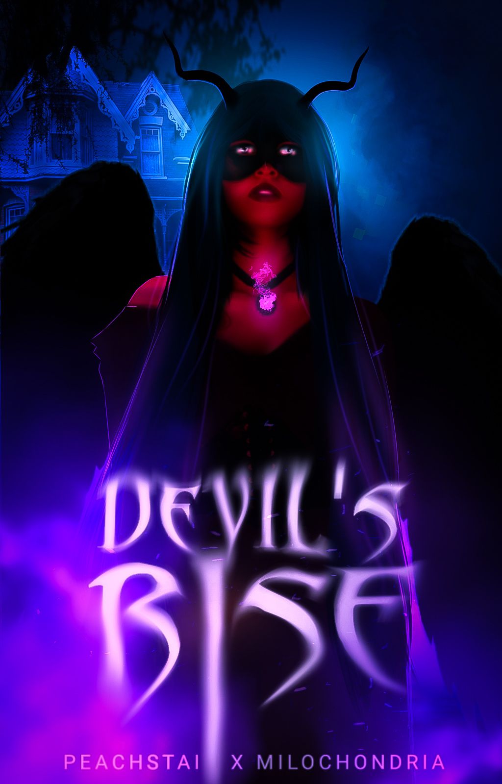
(Font : abbadon)
GOOD TEXT
+ The text is placed in the right place, where it preceeds everything and can be seen properly
+ the font looks devilish enough and fits the theme
+ the colour borders on to purple just a little bit, therefore not fucking with the colour scheme nor blending into the cover weirdly
+the editing done to the font suits it and this time overambigous was good
(This was a collab with jeonspeaches)
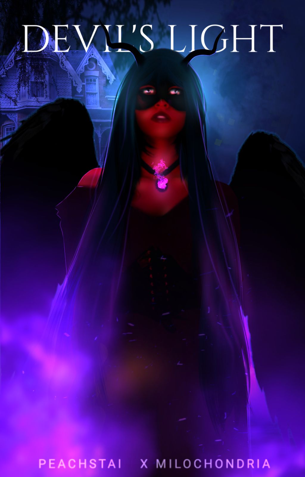
BAD TEXT
+is this dora bc there's literally a wHOLE SPACE RIGHT AT THE FUCKING BOTTOM WHY ARE YOU LOOKING AT THE TOP
+WHY IS IT ON TOP
+ WHY DOES IT LOOK LIKE IT'S FIGHTING FOR SPACE
+ WHY WOULD YOU SQUEEZE YOUR TITLE LIKE THAT WTH
+ WHY IS IT THERE
+IT'S COVER NOT A MANIP
: :
SUBTITLES REALLY DO MAKE A WHOLE DIFFERENCE
1.
GOOD SUBTITLE
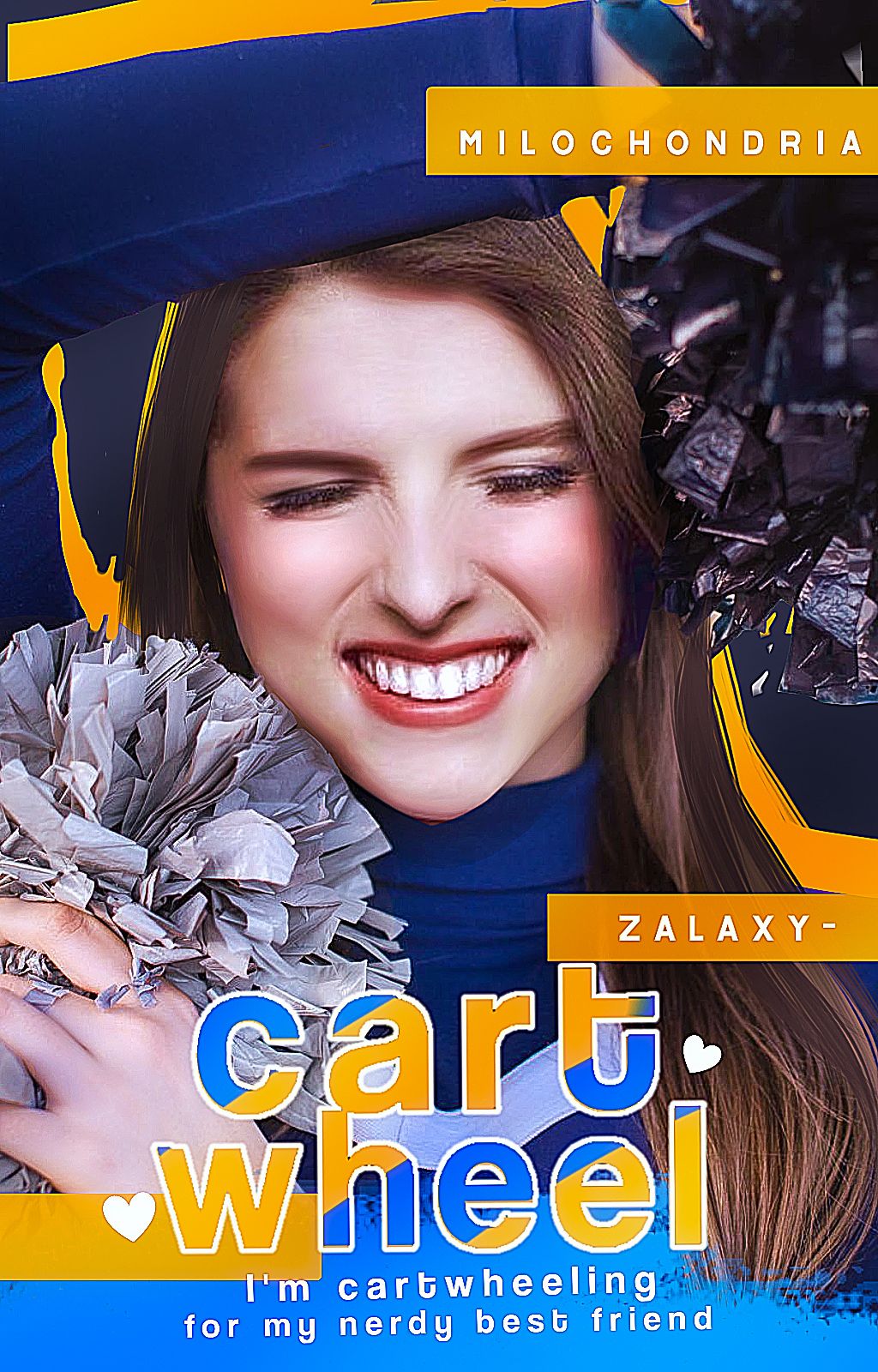
Font : coolvetica
+ the title is bigger than the subtitle
+the subtitle is a simple font, and is similar to the title
+the subtitle can be seen
BAD SUBTITLE
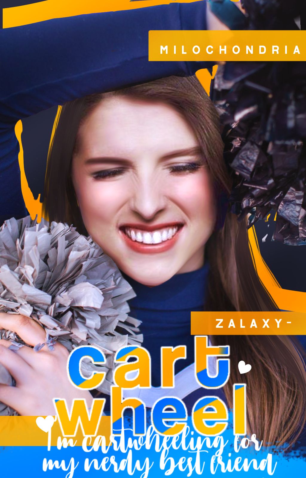
+ why the actual fuck is the title and subtitle fighting for dominance over here
+the subtitle is a script font (usually a terrible idea to make your subtitle a script font, usually) and is not similar at all to the title or author's name
+ as big as that shit is i have no idea what is says, and I'M the one who wrote it
: :
PRETTY TEXT LITTLE EDITING
You don't need to have all the editing skills in the world to make a good book cover (speaking directly to non graphic designers or newcomers). This is just a tip, but if you're making a book cover for YOUR story in particular and not a practice book cover then honestly keep it simple and focus on just the beauty of the text.
You can easily do a text slap, or a simple text based cover. Don't stress too much about the editing. Just focus on CONVEYING A MESSAGE through the book cover using the TEXT and/or stock photo.
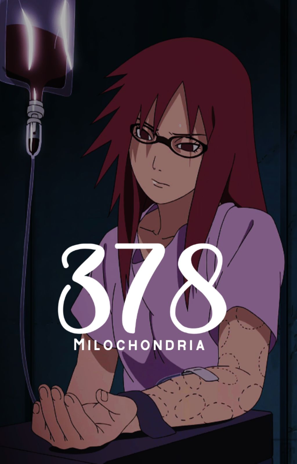
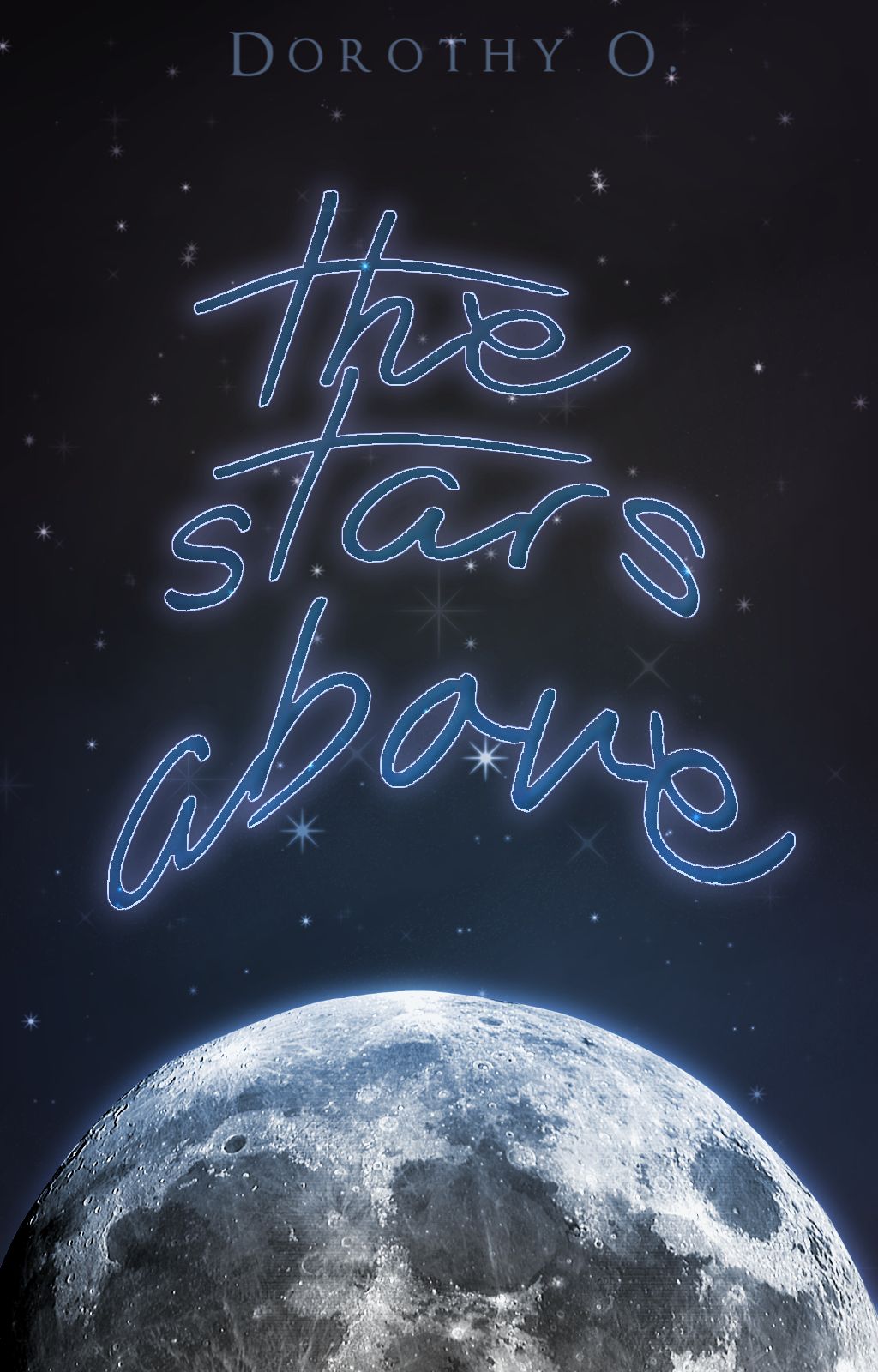
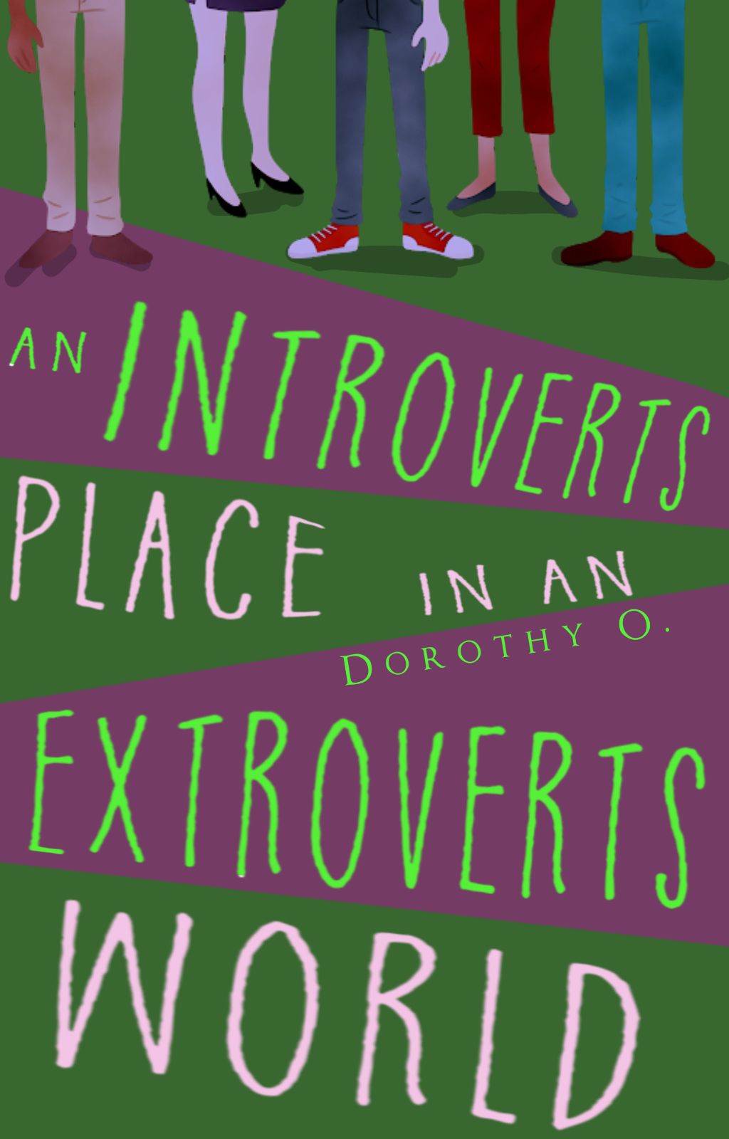
making a book cover shouldn't have to be rocket science
Bạn đang đọc truyện trên: AzTruyen.Top