II - TEXT PT 1
Yes I'm dividing this into parts bc if you know me and you know the graphics I make well then you know I love typography covers with all my life
Like, i never realised my blinding love for typography until i was cruising through my gallery and practically half my covers were text based lmfao
(Update : not anymore 😔 F)
: :
THE BASICS OF TYPOGRAPHY
This chapter is not about text based covers but rather for text in general.
Text has the ability to turn something basic into something amazing, OR turn something amazing into something basic.
I think it's because when making a cover or any other graphic, people want to see the TITLE or the words to give an explanation of what the graphic is for. If the title is not appealing or the typography doesn't suit the image, then people will immediately think the cover looks off.
So here are some things to take note of when titling your cover or other.
1. PAY ATTENTION TO GENRE
Making a Horror fic? Great! Search under the Horror genre on dafont.com! Romance? Script fonts work really good for them! Fantasy? Try Cinzel or Rumble Brave.
Please stop using script fonts for fantasy looking covers. It's weird to say the least.
Stop using fantasy fonts for romance looking covers too. Most of the time it just looks off.
Like take this for example
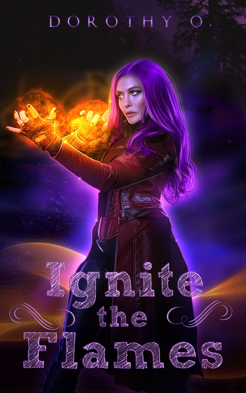
Lmao?
The edit is ruined, or dulled down bc the text looks like it's meant to be in some sort of diary book when the edit CLEARLY is a fantasy one.
Now if we look at all the good fantasy fonts and pick any :
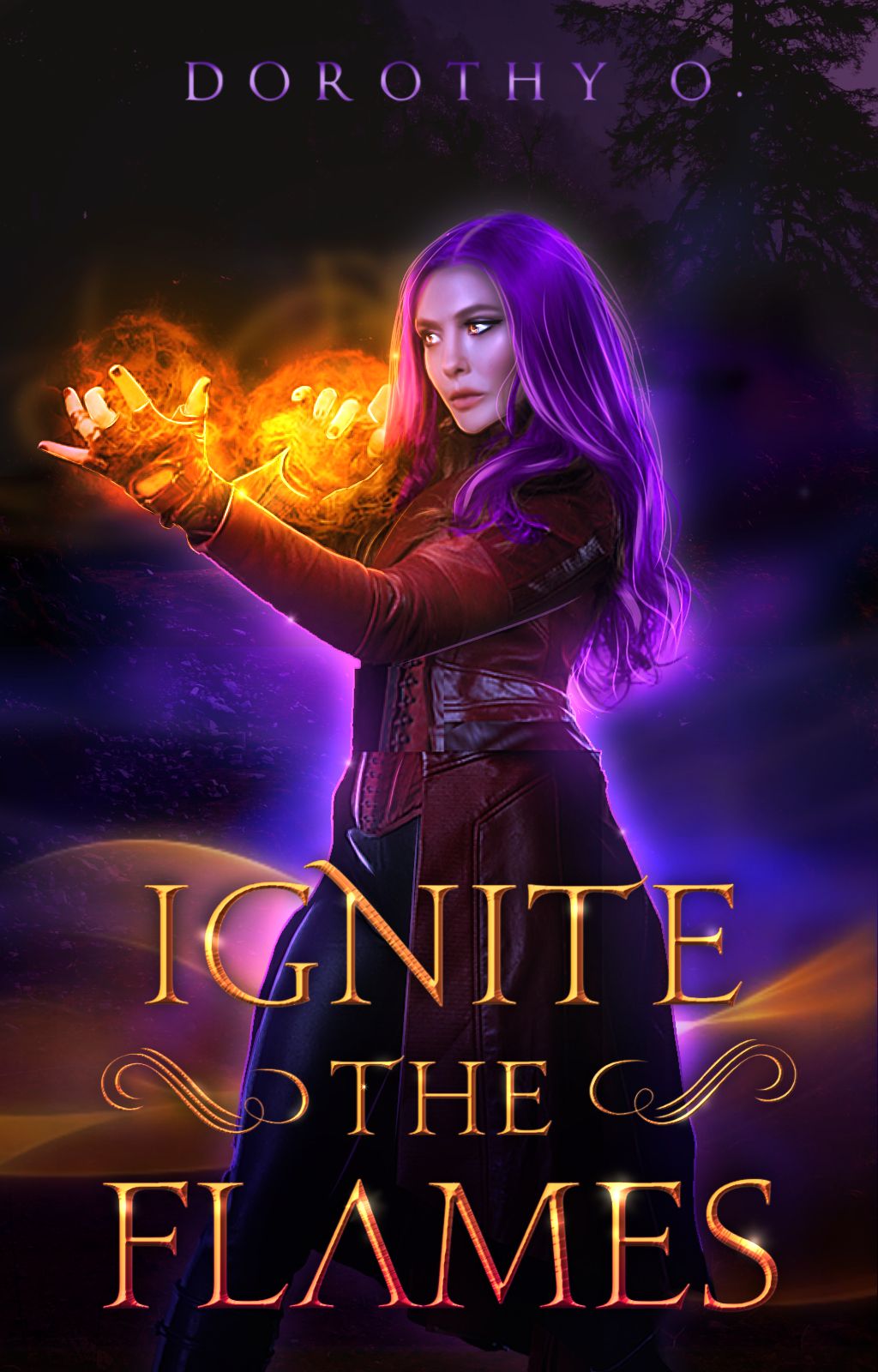
Now we're talking!
Update : Font name is probably Augustus. There is a bevel function in pixellab and ibispaintx which I used to get that thin bevel, I clipped a layer and brushed dark orange airbrush over the bottom text then added sparkles. And if you don't understand that then sorry, I'm not the teacher that repeats themselves
👁️👄👁️
2. MAKE SURE YOUR TEXT SENDS ACROSS A MESSAGE
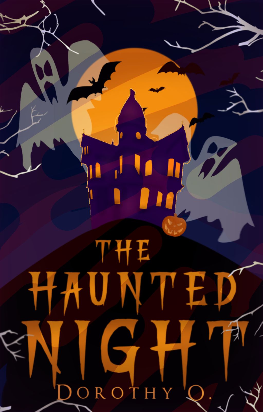
Look at this! You can tell it's a Horror fiction! Maybe one for kids even!
Look at that text!
Do you think it would have the same feel if I used something like Bebas? (The answer's no)
With every cover or other you make there's a message you're trying to put across. Think–do I want this to be scary? Do i want this to look kind of happy and light? Could this make the cover look like a serious fantasy fic?
Don't just, slap text in there bc you think it looks good. It needs to have a FEEL to it to.
Update : Another good example is when you're making light covers–choose fonts that look fun to play with, like Gilmoore.
3. THE SPACING METHOD
I can't remember where I learnt this from, but I saw this on a graphic design website on "How to make Covers look Appealing" or something like that and well.
The trick is to space your letters in the title (and if you don't know how to space letters then lol wtf) to make the title (and cover) look more appealing and subtle.
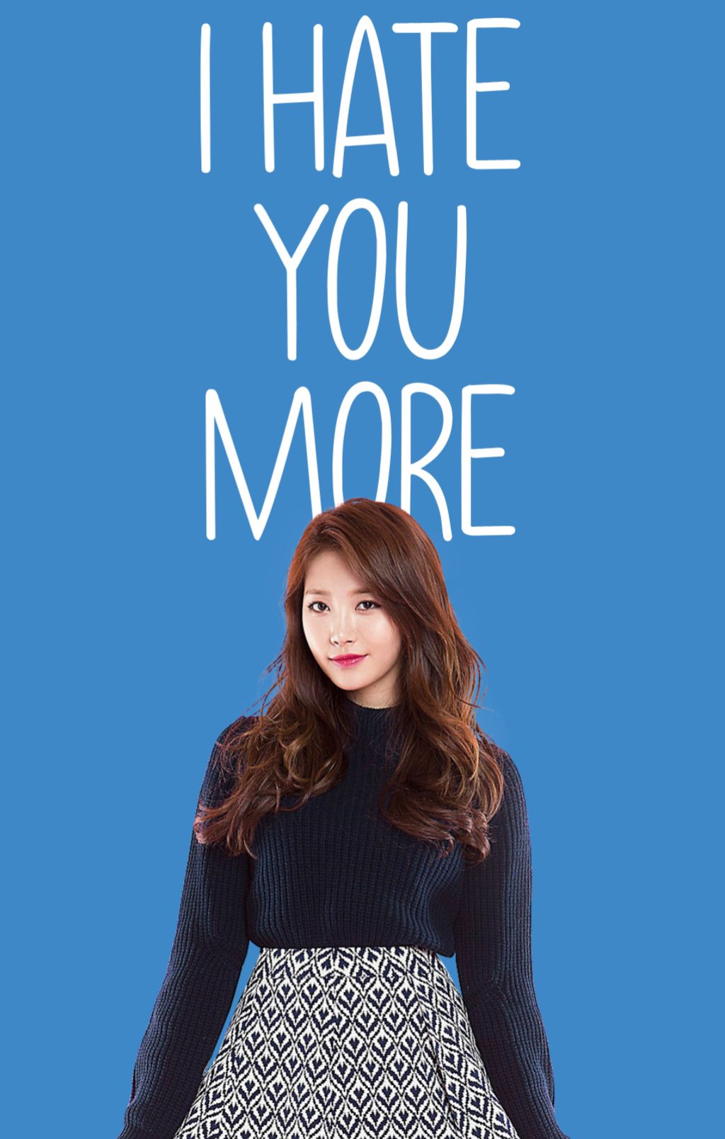
With a little spacing
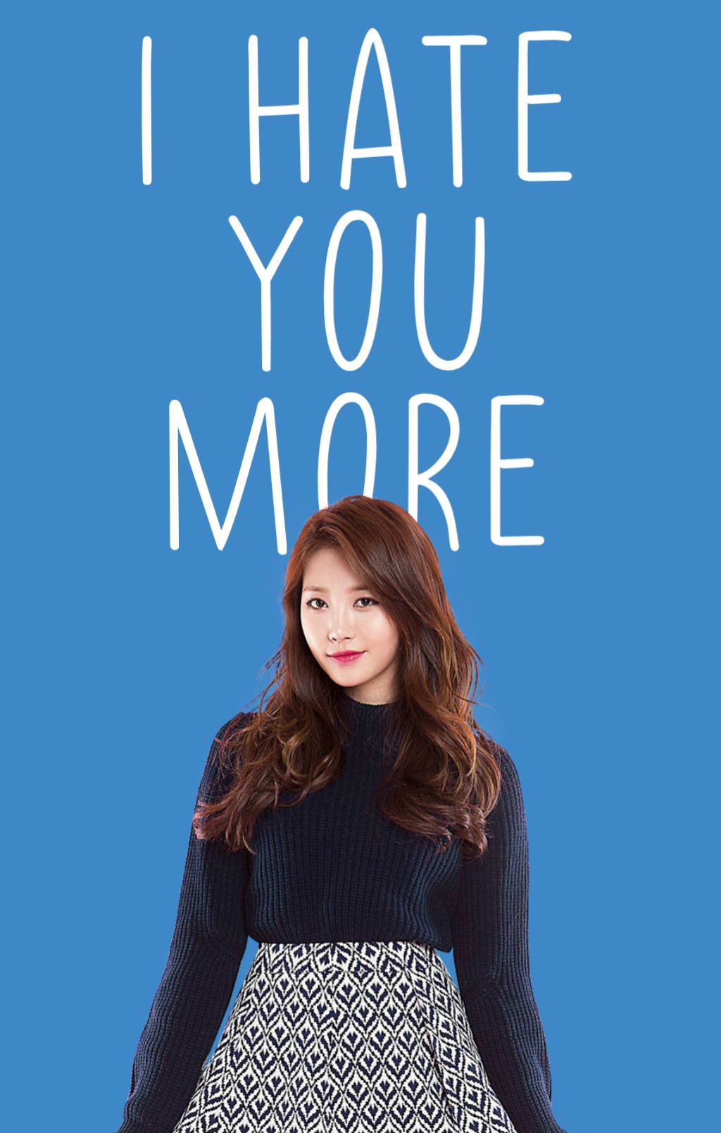
It's the subtlety that matters.
(This doesn't apply for all cases. Sometimes some texts will look better when they aren't spaced, like script fonts.)
(Update : please space out your fucking subtitles I'm tired of seeing jam-packed text.)
4. PROPORTIONS
it irks my soul when i see this :
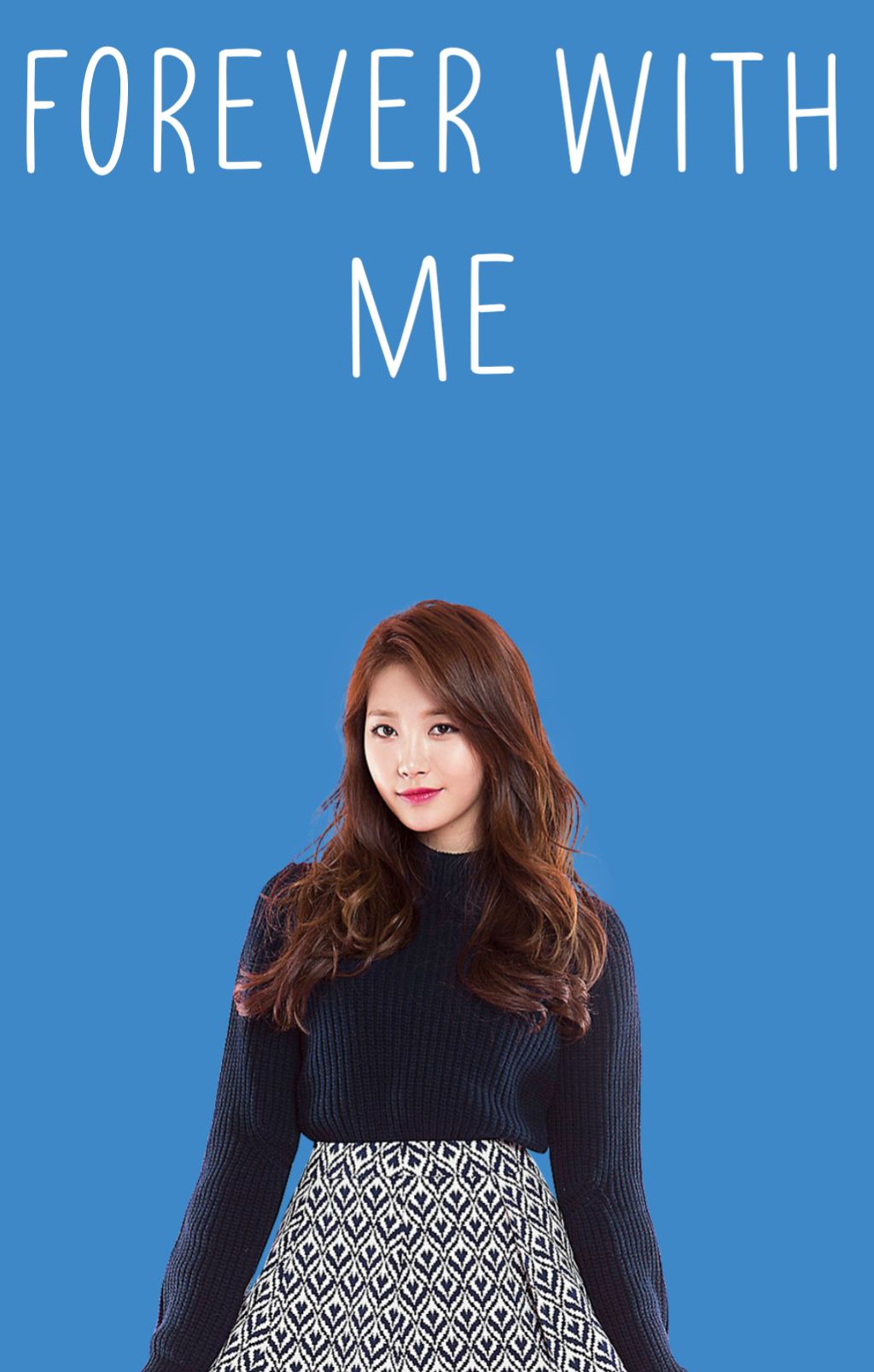
Wtf are those whack ass proportions? This irritates me as much as excessive highlights (and that's saying something)
LEARN HOW TO EVEN OUT YOUR TITLE. If your fucking title is "Forever with me" THEN I EXPECT IT TO LOOK LIKE THIS :
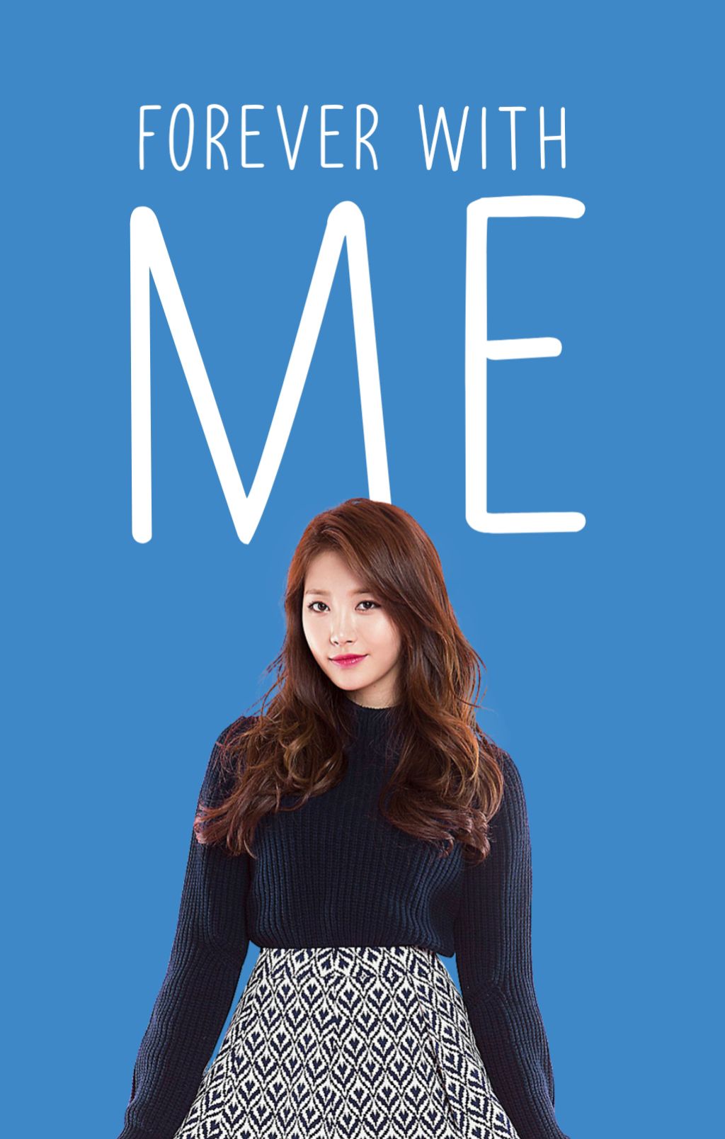
OR THIS :
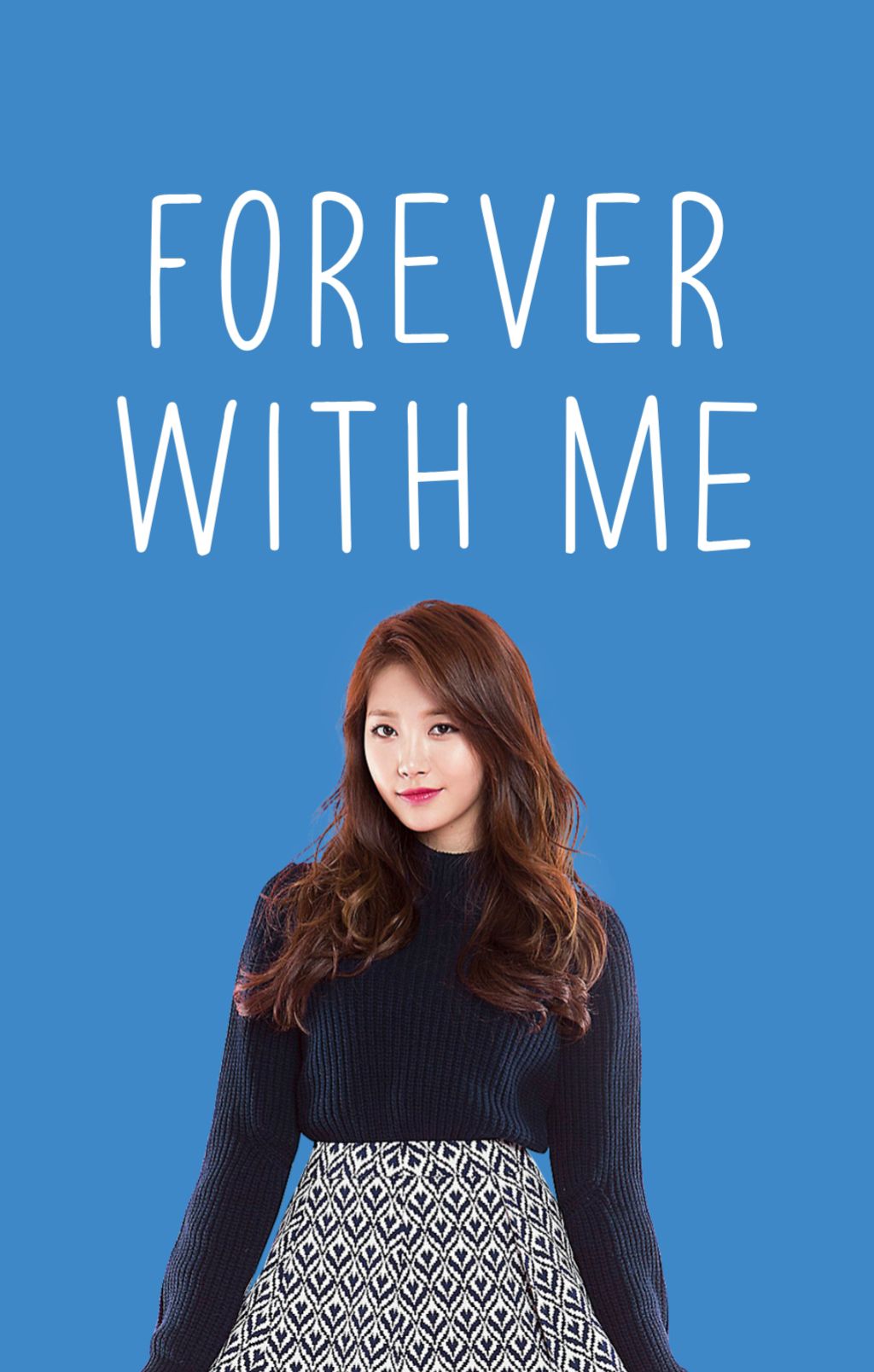
OR WHATEVER OTHER WAY YOU KNOW THAT WILL MAKE THE TEXT LOOK BALANCED!
don't jam two long ass words on one line, and then leave the next for some lonely ass tiny ass text.
(Update : keeping the text balance is something you need to practice over and over to get the hang of. After a while you'll begin to do things instinctively)
Also learn how to balance the size of your texts. For example:
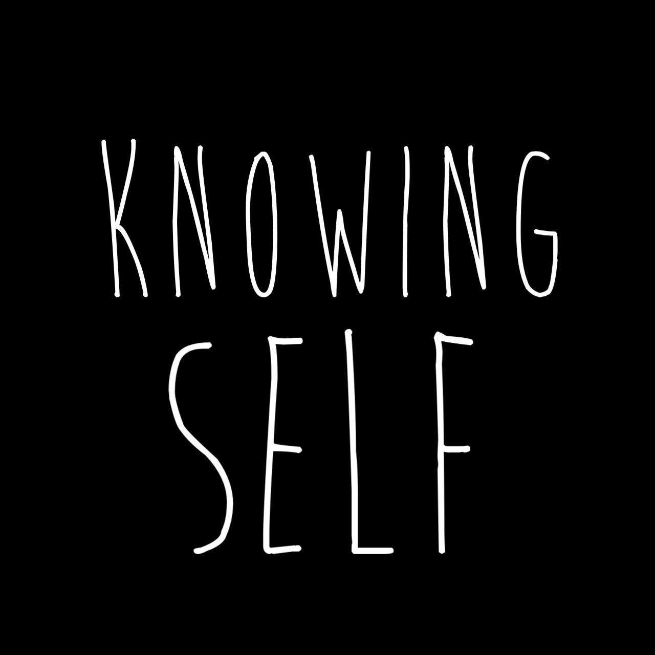
"Self" looks like her head bout to break from carrying "Knowing"'s fatass all day.
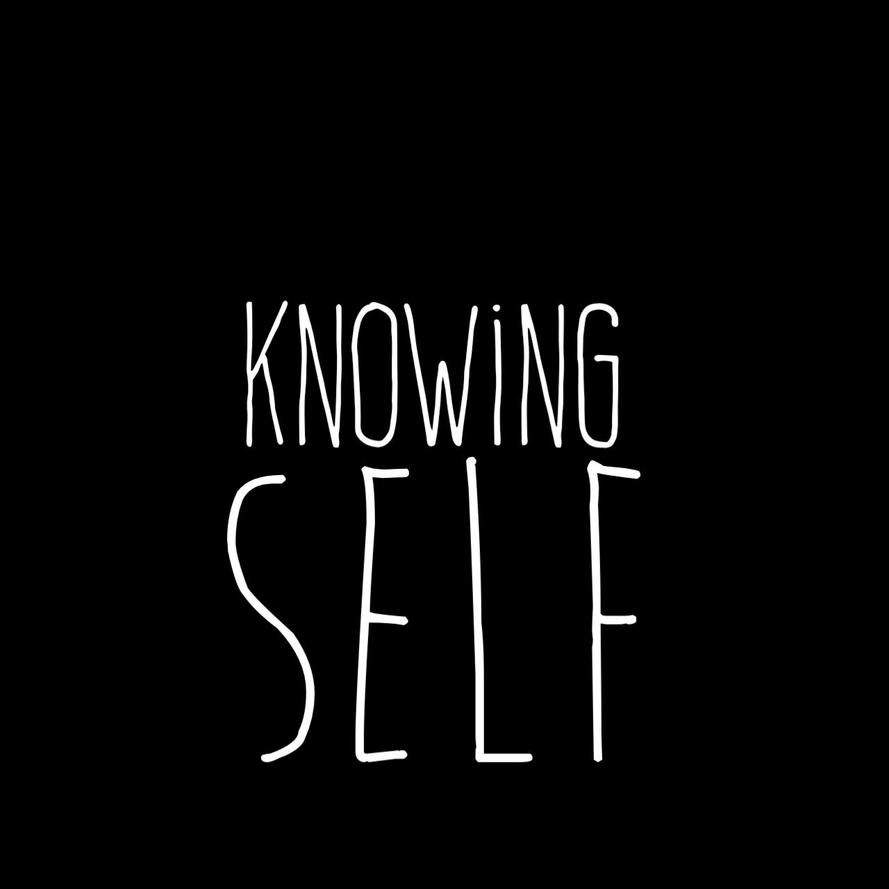
Yes! Balance matters! Proportions matterrr!
Stop imbalancing your texts.
5. Don't you dare misuse stroke that way
Stop stroking your titles so fucking vigorously
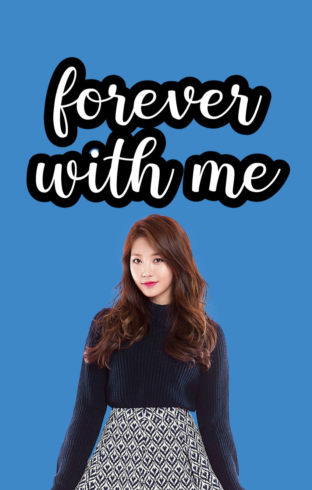
It does not, and I REPEAT, DOES NOT NEED THAT MUCH STROKE!
thank you.
6. Learn how to play around!
Tbh whenever I'm making a typography cover i just think "so how many ways can i fuck with this simple text" and roll with it till i come up with these :
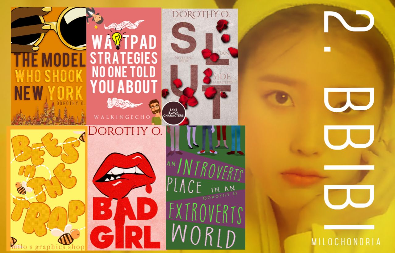
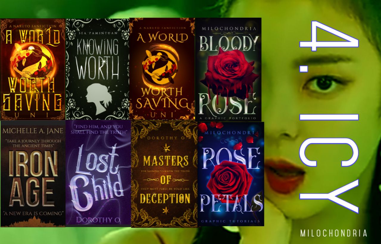
So it's really just about having fun till it looks good!
(Update : This was really just me flexing tbh lmaoo)
: :
That's all for now!
Next chapter will still be about text but it will be about ways to edit text to make it look nice.
Btw, since I can very easily recreate a lot of texts, you can ask me to do a tutorial on how to make any text you've seen in one of my graphics and imma do it lol.
(Update ! : No sorry I don't do that anymore. For text styles go to my Deviantart milomonroe xoxo)
Man i love text based covers.
Stay safe or walk the plank xx
Bạn đang đọc truyện trên: AzTruyen.Top