01 | REVIEWS
▹▹▹
( HELLO, AND WELCOME TO THE
REVIEWS SECTION
OF OUR FIRST ICON CONTEST. )
━
HERE, we will be posting brief reviews on all of the contestants' icons before publishing the actual results.
But first, a reminder of the criterias:
• FACE CLAIM: Adam Cole.
• COLOR SCHEME: Blue.
• MOOD: Dark.
• QUOTE: Optional.
• TEXTURES / OVERLAYS: Optional.
• SIZE: Whatever size you prefer, as long as it fits the layout of the profile picture.
• YOUR USERNAME / NAME.
━
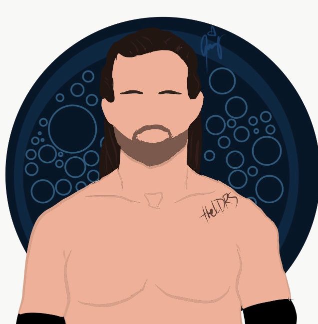
( by Dana, theldrs.)
• You fully respected the criterias and did an amazing job with the coloring and the background. We also love the fact that the icon isn't an actual picture of Adam, but a drawing. That move was super cute, creative and totally unexpected. Overall, your icon is really pretty and we wanted to thank you for participating and to congratulate you on doing a good job.
━
( by Daria, RowenaTargaryen.)
• The face claim, color scheme and mood were applied, however your username / name was absent. The picture you chose isn't really clear and is a bit blurry. The size was also quite small, but once we cropped the icon it was fine. Asides from that, we liked how you drew these dark blue lines around Adam's features to highlight him. That gave a lot more life to the picture. Thanks for participating and good job.
━
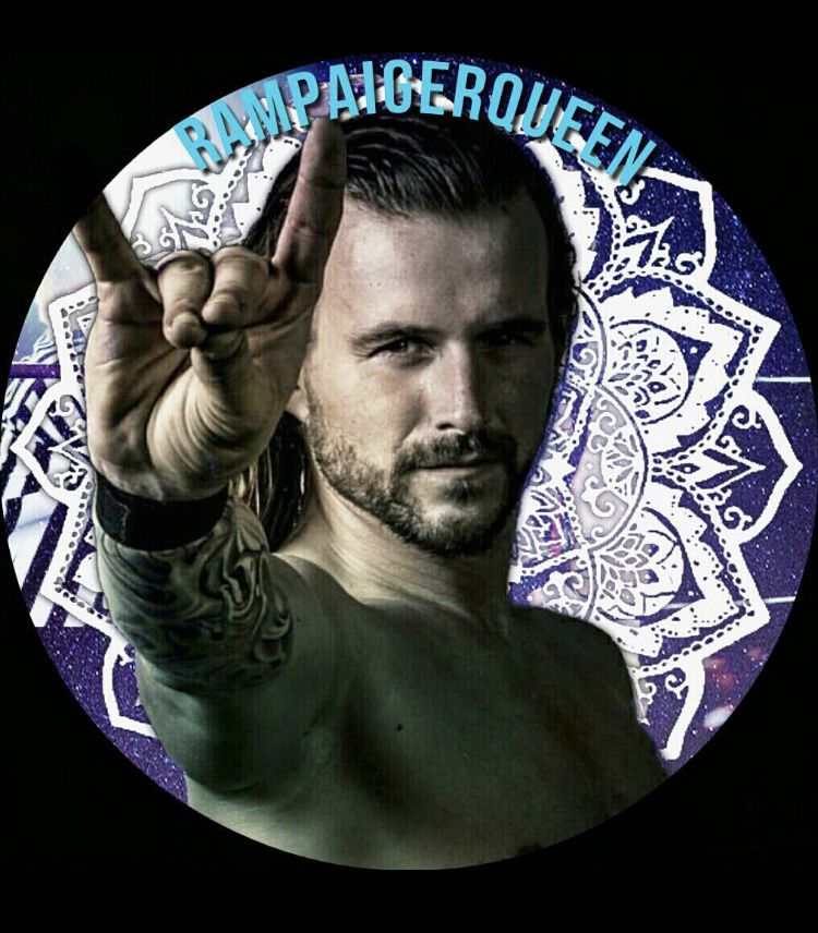
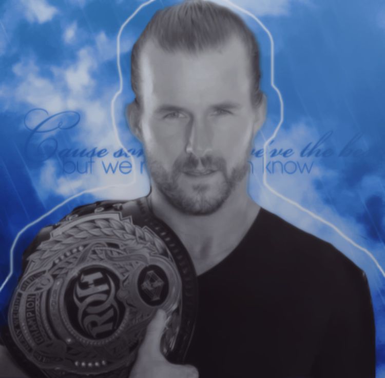
( Brandi, RampaigerQueen.)
• The face claim, mood and username / name were followed, but we found that the coloring was more purple than blue. The picture is really well blended with the background, and its texture is very cute and aesthetic. The only change we'd suggest is the color of your username. It's a nice shade of blue but we don't find that it fits the background and picture. All in all, you did a good job. Thanks for participating.
━
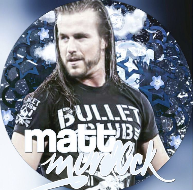
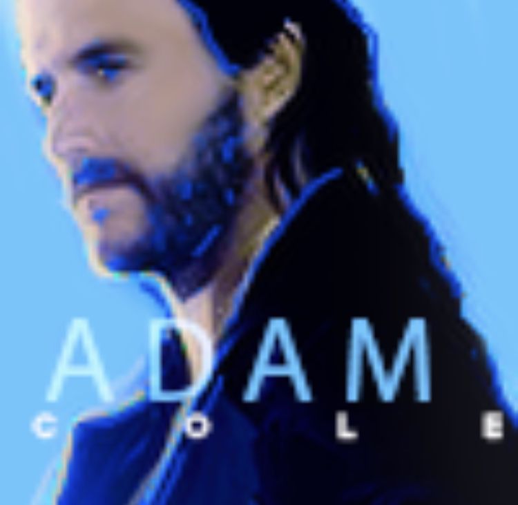
( by Alyssa, mattmurd0ck.)
• Out of the three icons you posted, we found that this one respected our criterias the most and was the prettiest. The background has a really cute galactic theme that we picked up on since you added a few stars, the moon, the planet earth, etc. The picture blends well with it, yet we feel as if it is overlooked by your username. The fonts you used are very pretty, but we'd only suggest to minimize its size. Other than that, you did a good job. Thanks for participating.
━
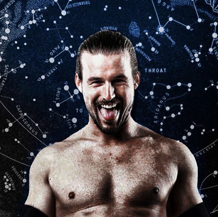
( by Shane, WWEAmbrophobia.)
• Out of all the icons you posted, we chose to pick this one since we found that it was the prettiest. The criterias were all followed, except for the username / name part. The background is gorgeous, and the font and coloring go perfectly with it and the picture. We love the white line you have drawn around Adam, whose black and white coloring really underlines his presence in the picture. Good job, and thanks for participating.
━
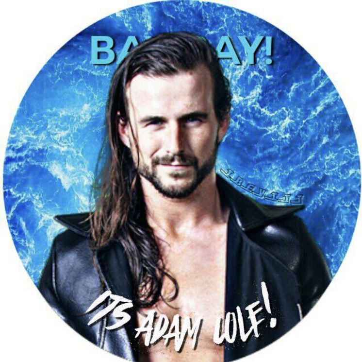
( by Ivy, POISONBLOODSTREAM.)
• The face claim, color scheme and mood were utilized but the username / name wasn't inserted. The picture you used is super pretty and its effect is gorgeous and very appealing to the eye. It also matches very well with the background, whose simplicity and texture is stunning. Thanks for participating, and good job.
━
( by Akansha, iBevitt.)
• All the criterias were respected in your icon, however the username was hard to decipher. The size is fine, but we'd only suggest using another font. Other than that, your design is cute. The background is super pretty, and the picture really goes well with it. The fonts and colors of the quotes do too, since they give off a simple and very chill vibe. Thanks for participating, and good job.
▹▹▹
Bạn đang đọc truyện trên: AzTruyen.Top