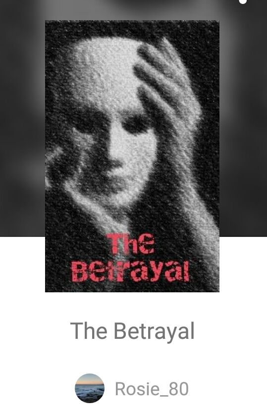
"The Betrayal"

“The Betrayal”
By: Rosie_80
The cover is basic and too grainy. Remember, the first thing people notice is the cover. Create one or have one made, that shows off your story. Always include your name or username on the cover so no one can steal your cover and readers know who the author is.
Description: 8/10-
The description is short and sweet. When giving readers a short summary like this, try to add a scene or dialogue with it to fully hook the reader. I would also move the awards to a special awards chapter with the stickers, it will be more organized that way.
Grammar & Punctuation: 15/20-
When telling readers whose point of view the section is in, write POV or point of view after their name. Example: Jerry POV, Carla POV, Billy POV, Scott POV. The biggest issue is the font! Only use regular font. Don't use italics and bold to distinguish between characters. It looks as if only one person's point of view is in each chapter (so far), since you don't title your chapters you can title each chapter with the character's name. Example: 1- (name) POV or simply use his/her name. Don't do this if you switch POV. Go with the fort advice above. Some sentences have words switched around, they need re-worded to flow better. Only use dots when necessary, use commas or an em-dash (–, —) instead. The grammar is a little off in places and needs a slight edit. There are some punctuation where it's not needed, but it's not overwhelming.
Originality: 5/5-
I like this creative story! You bring your ideas to life very well. This is an idea that is used sometimes with your unique spin, great job!
Character Development: 17/20-
I would like to know the characters physical features. There are a lot of POV in this, find a way to show their features in their chapter. I like how they all are each different and don't blend into one same personality. I definitely understand the mom frustrations Carla deals with, so she's relatable on that end.
Plot Development: 18/20-
Chapter one, wasn't very informational, it felt like a filler chapter. The first chapter should grab readers and pull them in. Chapter 2 is really good! 3, 4 and 5 continue to be very interesting.
Overall Look: 8/10-
The different font throws uour book off a lot. Italics are for thoughts and flashbacks. Bold just feels like the character is screaming. I do suggest an edit for this and a new cover.
Enjoyment: 8/10-
This is a good book, so far! My only major issue is the font, it pulls me away and make me cringe. The grammatical mistakes aren't major and doesn't take away from the plot.
Total: 82.5/100
(Bonus Points)
+5 for following
+2 for + my novel to a list
+5 for comments on my novel
★94.5/100★
♥To Rosie_80 ♥
Sorry your review is a month late. Life happened and I for backed up. I had planned on creating a cover for you but you pm me wanting your review right at this moment so I didn't have time to edit one. I will post one with my next update. If you like those just let me know and we can work something out for you. I hope you enjoy this review.

Next review to be posted:
“Saving The World: Book 1– The First Light”
By: FateofReckoning
Bạn đang đọc truyện trên: AzTruyen.Top