delivery #4
Covers by goldenways
The first one got cancelled, because it didn't fit her story.
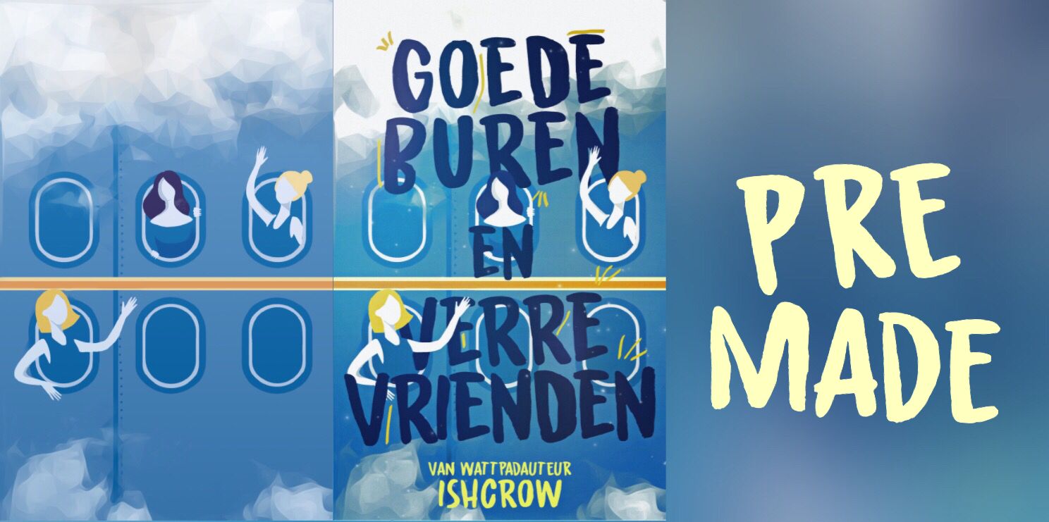
So I turned it into a premade! I still have the background so I could also change the title if you want to.
Credits
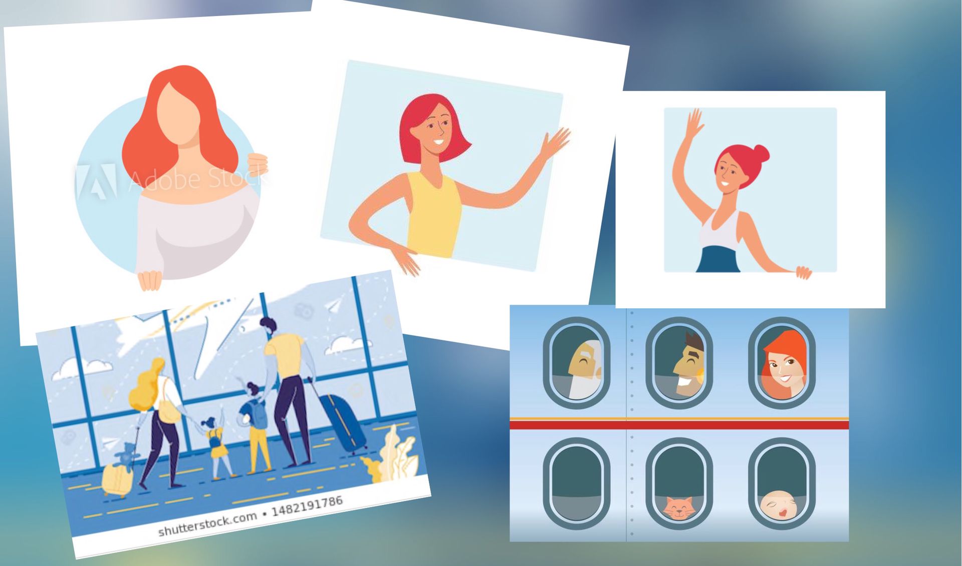
Girls I used as outline: IStock, AdobeStock
Colour scheme family: shutterstock
Airplane windows I used as outline: vecteezy
Ow I forgot, I also used a cloud png from deviantart.
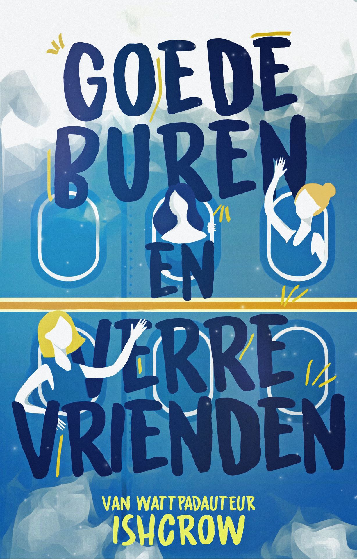
I drew the shadows on their faces without outline. I think that turned out pretty cute.
The second cover was kind of an experiment. I'm used to this app picsart and this one I made only with Photoshop! I'm still adjusting, but I'm starting to understand the basics.
Credits
Bokeh: coll HD wallpapers and backgrounds
Couple: Tahiry Humrich Photography
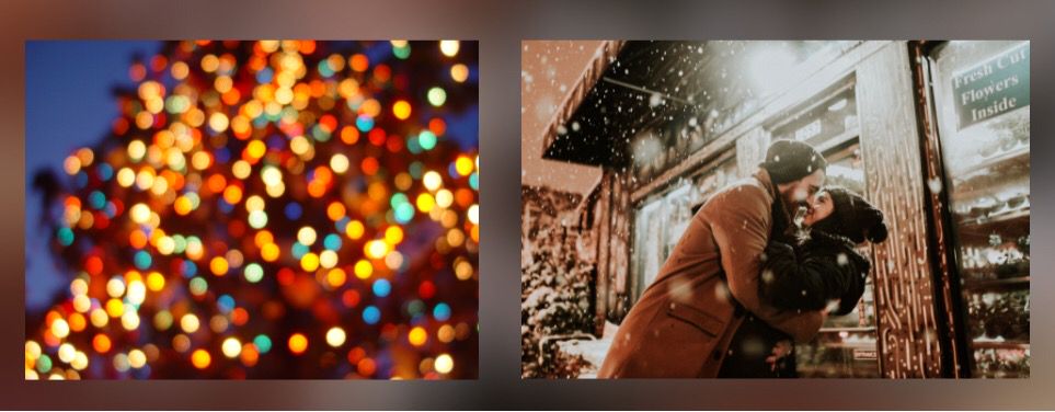
I drew the snow and some hints of colour. (Some blue, yellow and red in the corners and on the text). I wanted to have a christmas-y colour palet. And I guess Ibfelt like blue, yellow and red is Christmas? By the wat, it's annoying to draw with a mouse hahaha
Result
Graag credits in een beschrijving en hoofdstuk waarin je goldenways en minkadesign in tagt.
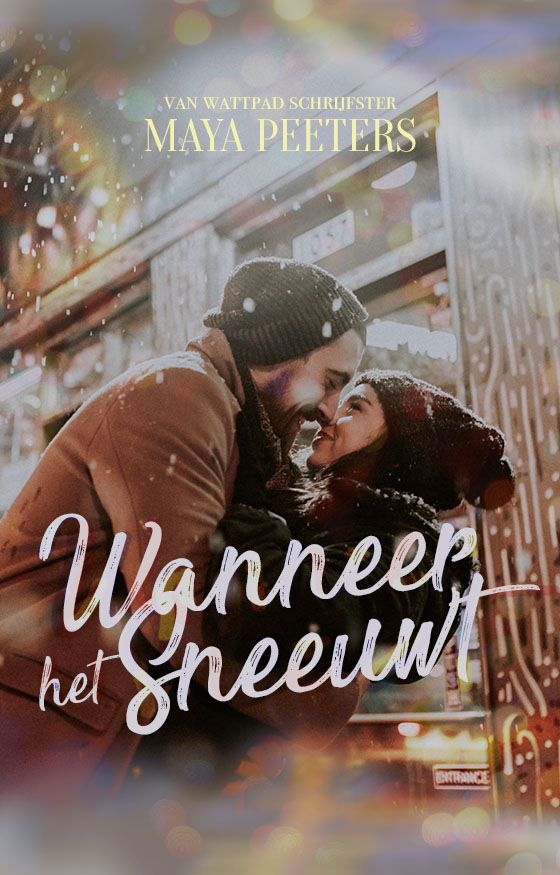
The only thing I'm disappointed about is the quality of the image. It's a little beneath the standard I'm used to, but I don't think you can really see it, right?
I also wanted to add a light vignette, but didn't really know how. I think I should edit in Photoshop and then finish up in Lightroom (color-wise). Note to self for another time.

Miles
This cover is delicious. Mawkish and cliché, but in such a way that it's OK and doesn't become a victim of a pile of forgettable covers. The colours are romantic and the light effects make sure the cover doesn't become boring and draws your attention to the image of the couple. The text isn't really special, but it doesn't really need to be. Everything complements each other and it forms to a nice entirety.
[Deze cover is heerlijk. Zoetsappig en cliché, maar wel zo verwerkt dat het ermee door kan en dat het geen slachtoffer wordt op de stapel vergeetachtige covers. De kleuren zijn romantisch en de lichteffecten maken dat de cover niet saai wordt en trekken je ogen naar het beeld van het koppel. De tekst is verder niet bijzonder, maar dat hoeft hier ook niet. Alles complimenteert elkaar en het vormt zo een mooi geheel]
May
I find the colour scheme quite unusual, but it suits really well. It, like, doesn't make the cover too crowded or heavy. In addition, I think the blur and the bokey around the edges are pretty. The text is okay, not really special or anything, but like Miles was saying: it doesn't have to be unusual. Namely since the title goes well with the cover. Maybe the author's name could be a different shade of yellow, but that isn't a must either. Overall very pretty, 10/10.
[Ik vind het kleurenschema best wel bijzonder, maar het past wel heel goed, het maakt de cover niet te druk en te heavy zeg maar. Ook vind ik de blur en de bokeh om de randen mooi. Ik vind de tekst wel oké, niet heel bijzonder of iets, maar zoals Miles al zei hoeft dat ook niet per sé, de titel past namelijk prima bij de cover. Misschien had de auteursnaam nog net een andere tint geel gekund? Maar dat is ook niet echt een must. Over all verie mooi, 10/10]
Bạn đang đọc truyện trên: AzTruyen.Top