Delivery #18
Covers by goldenways
Hullo. So I tried out something new. Well, at the end it doesn't really look like a new concept. I mean, I just ended up with vectors like always, but it felt kinda new.
Anyways. I first made a new cover for helskabaal
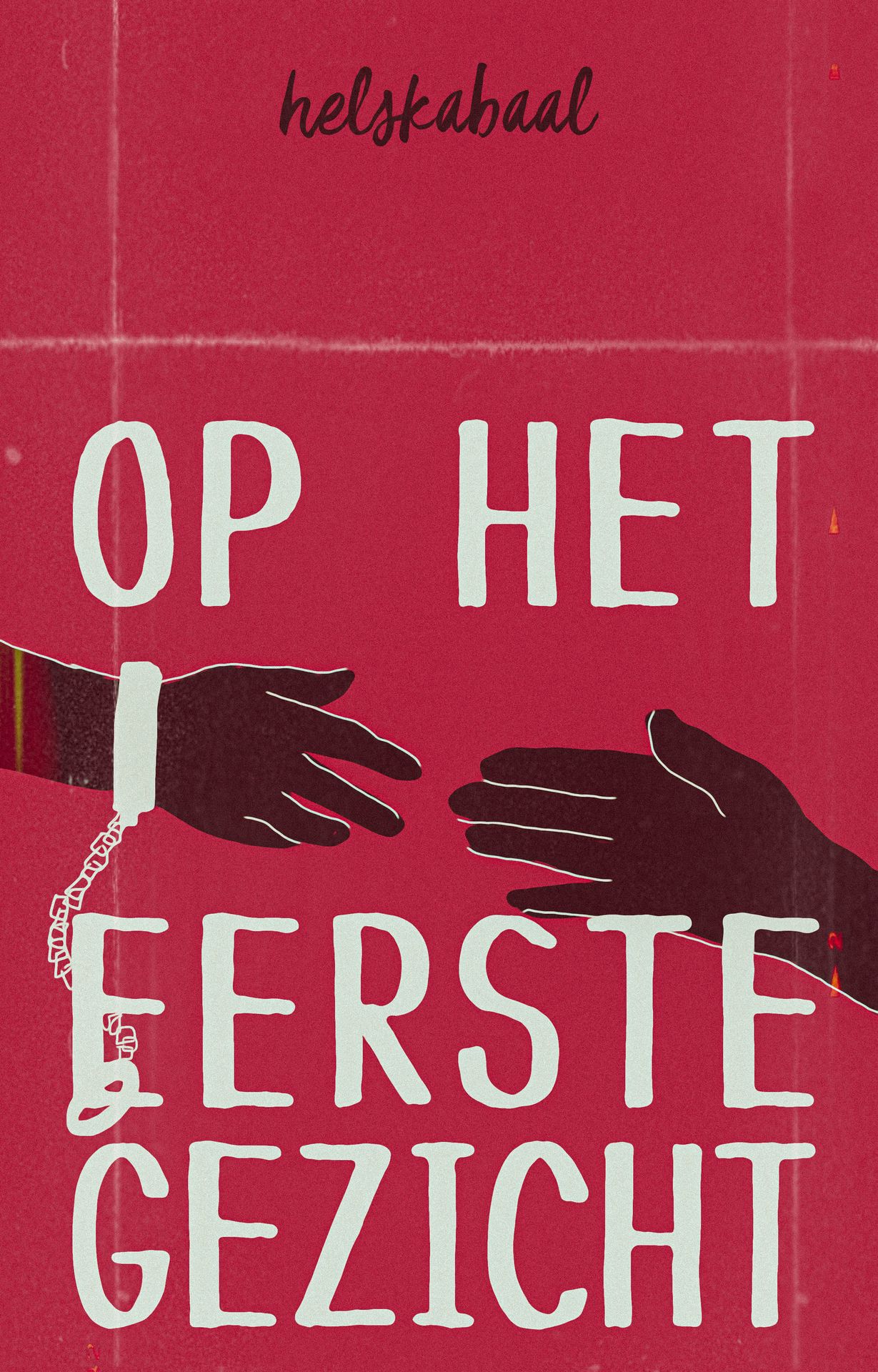
Low-key I'm afraid that I won't have inspiration for her future covers anymore. So far, it seems to go fine. They all still match 🌈
So I had another request
Credits
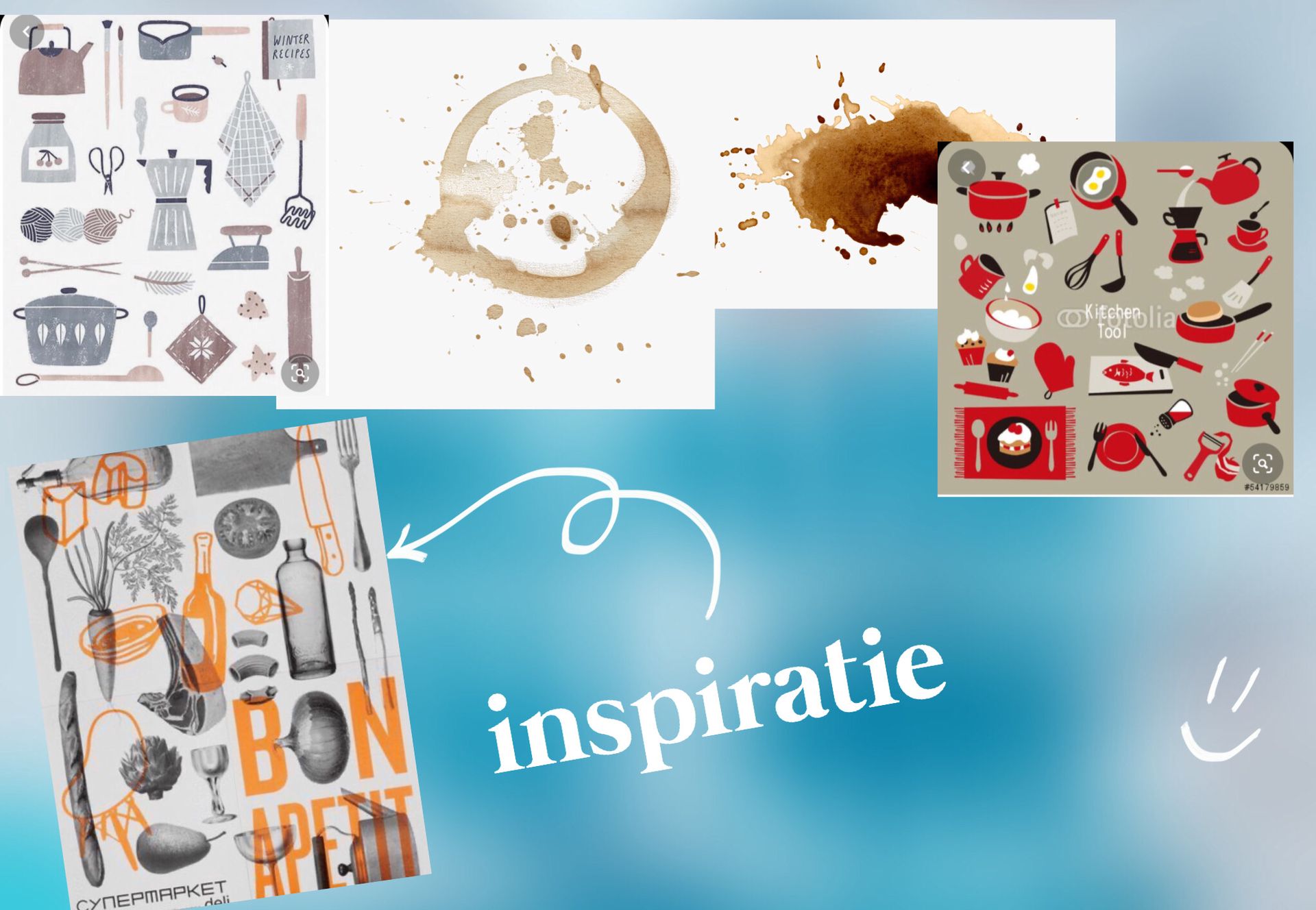
Coffee stains: pinterest
Kitchen supplies grey scale (used as a color scheme): flickr
Kitchen supplybred: jp.fotolia.com
Poster: pinterest
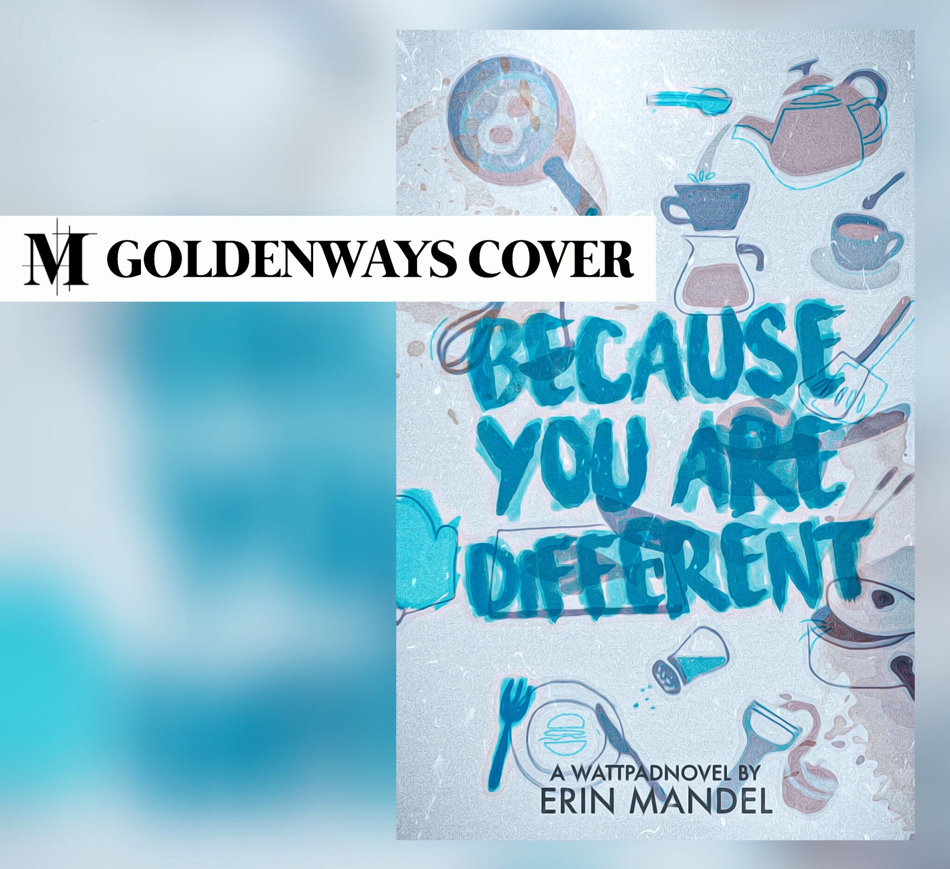
Okay, so the idea was that the orange overlay in my cover would be "dirt" from the kitchen. Like coffee stains. I've never tried this overlay kind of effect and wasn't sure how it would turn out. And then it didn't really work out exactly as I had in mind... Probably because I made the text blue. Ah well, it still looked pretty.
Challenge of the day: find the failed hamburger! (percysburrito couldn't find it)
Delivery
Graag credits in de beschrijving én hoofdstuk van je boek. Een simpele "cover by goldenways via @MinkaDesign" is voldoende
:)
Miles
Girl went crazy with the oil painting effects haha. I like the little symbols and they don't take away the attention from the title by using thin lines and discrete colours. The inspiratkon is clear. The title stands out by the use of a strong combination of colours that are not used anywhere else. The brownish edge gives it another layer and the extra dimension was needed. The downside is the amount of effects poured over it, makes it a bit messy. One the other hand, it also gives character.
[girl went crazy met de oil painting effects haha. Ik vind de symbooltjes leuk en ze nemen niet weg van de titel door dunne lijnen en onopvallende kleuren. De inspiratie is duidelijk. De titel knalt eruit door de heftige combinatie van kleuren die verder niet echt gebruikt worden. Dat bruinige helpt heel erg om de cover wat diepgang te geven en die extra dimensie was nodig. Enige minpuntje misscjien is de hoeveelheid effecten die er overheen zijn gegooid, wordt er wat messy van. Geeft het aan de andere kant ook wat karakter]
May
So, OK, it's not my number one favorite of all the covers that you've made (sorry not sorry, hahahah), but that's mostly because there's not much variation in color. Ah well, the requester didn't really want that, so I'll forgive you. Live the doodles and drawings and all the entanglement, but it indeed does make it a bit messy. But I kinda love the chaotic vibe, so I like it. I'm also really impressed by the font, because I've tried using it in the past, but it didn't work out for me, hahahha. Creds to you for that.
[Ja, oké, het is niet mijn nummer 1 favoriet van de covers die je hebt gemaakt (sorry not sorry, hahahah) maar dat komt vooral omdat er weinig spel met kleuren in zit. Maar goed, dat mocht ook niet van degene die hem had aangevraagd, dus ik vergeef het je. Love de doodles en tekeningetjes en de hele wirwar, maar maakt het inderdaad wel een beetje messy. Maar goed, ik hou wel van die chaotische vibe, dus I like it. Het lettertype ben ik ook erg van onder de indruk, want die heb ik in het verleden ook geprobeerd te gebruiken, maar mij lukte het nooit, hahahha. Creds to you for that]

Bạn đang đọc truyện trên: AzTruyen.Top