Delivery #13
Cover made by pronkend

Two covers in such a short time? This quarantine must be really hard on me.
Hi, it's Miles. This time I took it upon me to make a cover for someone. This doesn't happen often, so let's treasure it while we can.
The cover was made for towkeo. I actually made two covers, but the first one was made before I asked for some further elaboration on the book.
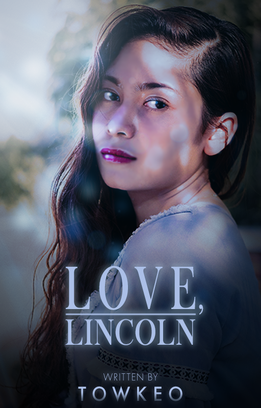
The cover is alright, but I wasn't too happy. That's why I asked for some more details and started work on the final one.
I used these images.

I'm in the mood for a trip to the Riviera, but something tells me I shouldn't go right now. It does, however, make me really like that hacienda/house.
Then I put them together like this.
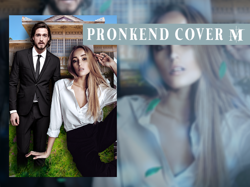
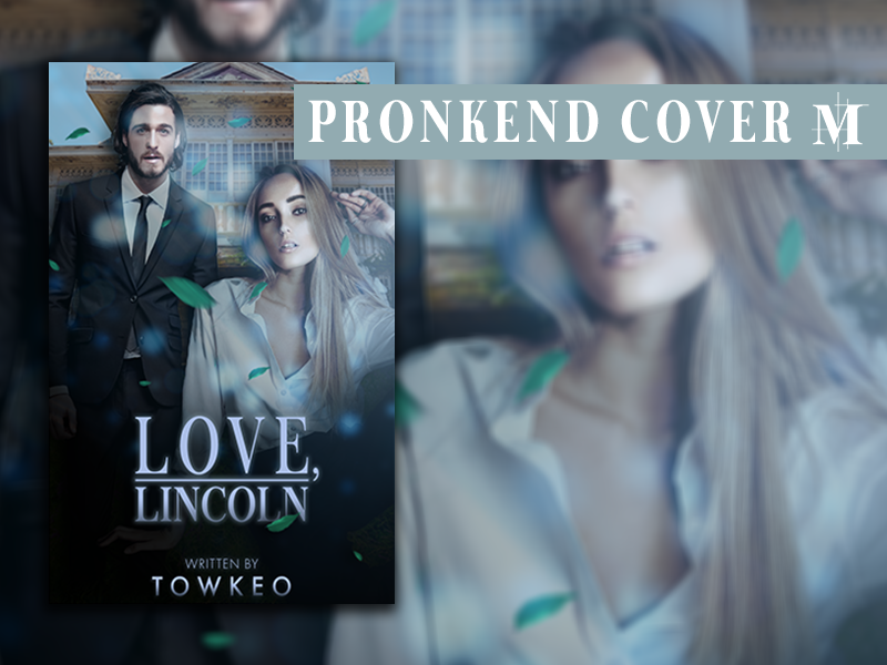
The layout is pretty good, leaving some room for the text but making the cover the stage for the two people on it. What was left though, was adding effects and the text of course. Which turned out to be a pain in the ass, but I liked the end result.
My first 'two people clumped together, that look mysteriously at the reader, with some sexual tension' cover, ladies and gentlemen!

May
I love the way you used the colors, and the glow on the letters of the title is also verie prettie. It grabs attention and is nice as a whole, so that's definitely a plus. Maybe you could have put the author's name a little higher? It would be more balanced like that. It could be up on top, although the building might be less visible, and I'm not sure if that would be desirable, hahaha. Very nice! :D
[Love it hoe je de kleuren heb gedaan, en de soort van glow op de letters van de titel is ook verie prettie. Het trekt lekker de aandacht en is een mooi geheel, dus dat is zeker een plus. Wel kan misschien de auteursnaam iets hoger? Dan lijkt het denk ik wat meer in balans. Misschien kan je hem bovenaan doen, al zie je dan misschien het gebouw wat minder, en ik weet niet zeker of dat wel zo handig zou zijn, hahahha. Verder erg nice! :D]
Moira
I really like the darker colors and the little bit of green of the leaves is a nice finishing touch. It's also fun how the clothes seamlessly transfer to a darker bottom part of the cover. The highlights of the texture don't fall off nice on the face. It makes her left eye too dark. You could have had her face be more smooth, if you catch my drift.
I like the author's name as is. Maybe it is omitted a bit in the vignette, but I think it adds to the mystery of it all. Nice cover dude!
[Ik vind de donkere kleuren echt heel mooi en dat beetje groen van de blaadjes is een leuke finishing touch. Ook leuk hoe hun kleren seamlessly overlopen in de donkere onderkant. De highlights van de texture die vallen alleen niet zo mooi in haar gezicht. Het maakt haar linkeroog erg donker. Misschien had je beter haar hele gezicht wat egaler kunnen houden, als je snapt wat ik bedoel.
Ik vind de auteursnaam op deze manier eigenlijk gewoon goed. Het valt misschien een beetje weg in de vignette, maar ik denk dat dat wel toevoegt aan de mysterie. Echt mooie kaft man!]
Bạn đang đọc truyện trên: AzTruyen.Top