Delivery #11
Fun fun so this is a combined chapter. *shock*
Made by goldenways
So due to corona my classes have been cancelled and my deadlines won't be graded. So suddenly I got some time to do some editing I guess.
Okay so starting with the banner.
Credits
Witches cauldrin: vectorstock
Colour scheme: your profile picture so it would match :)
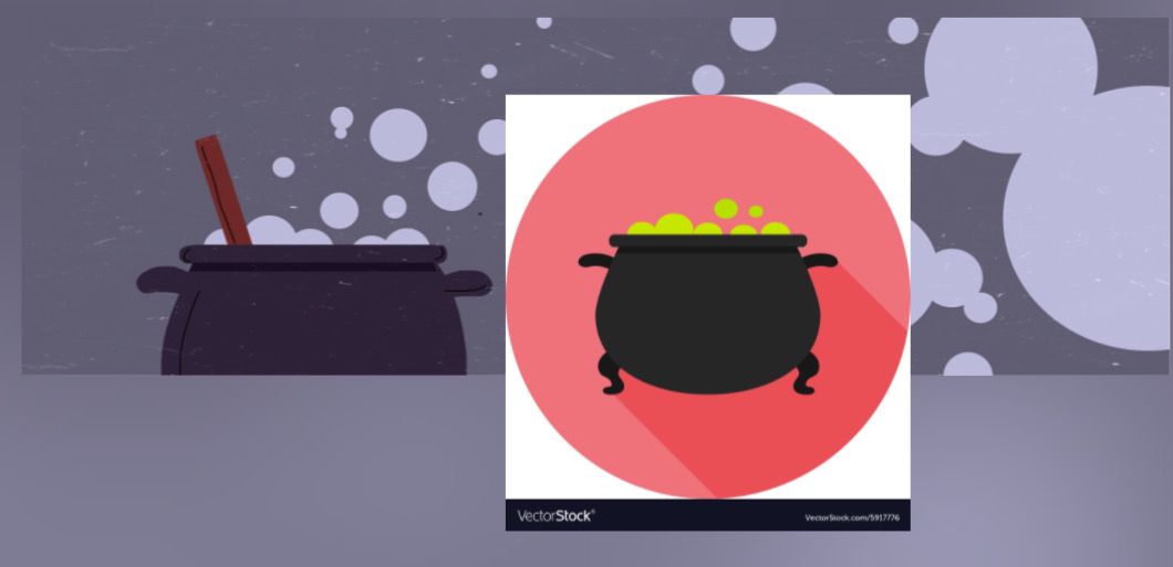
It's simple, but I kinda like it. Look, look with your profile picture!

Tadaaaa.
The Incandescence of Dark Corners
So now the cover. It started out a bit rough. I searched through all of pinterest to find me some inspiration and once I got it, it just wouldn't work out.
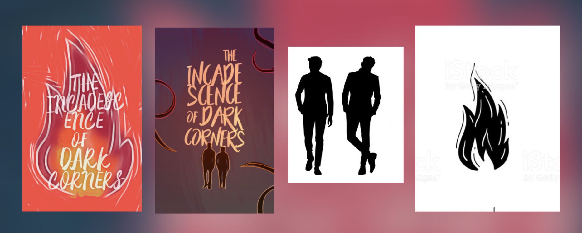
I had these two options, but they both had something missing. And then I realised!
I could combine them!!!!!
So after some colouring and trillion picsart effects later I got it.
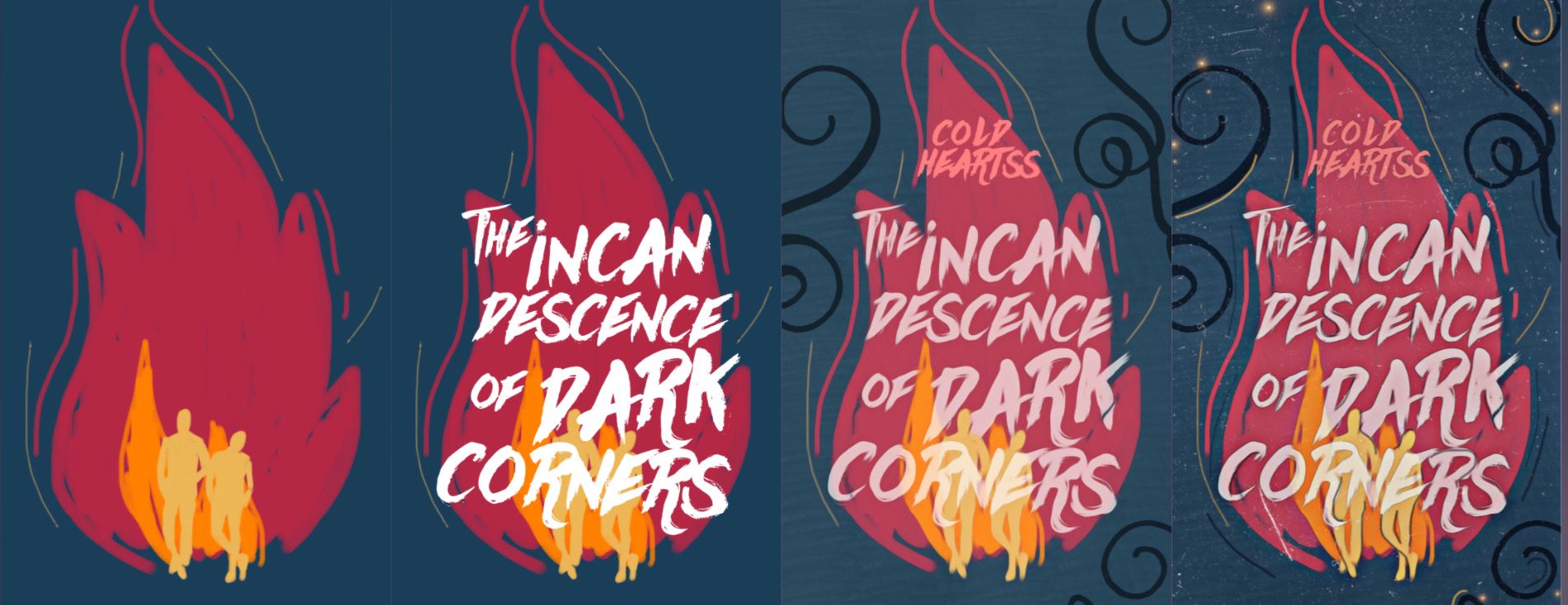
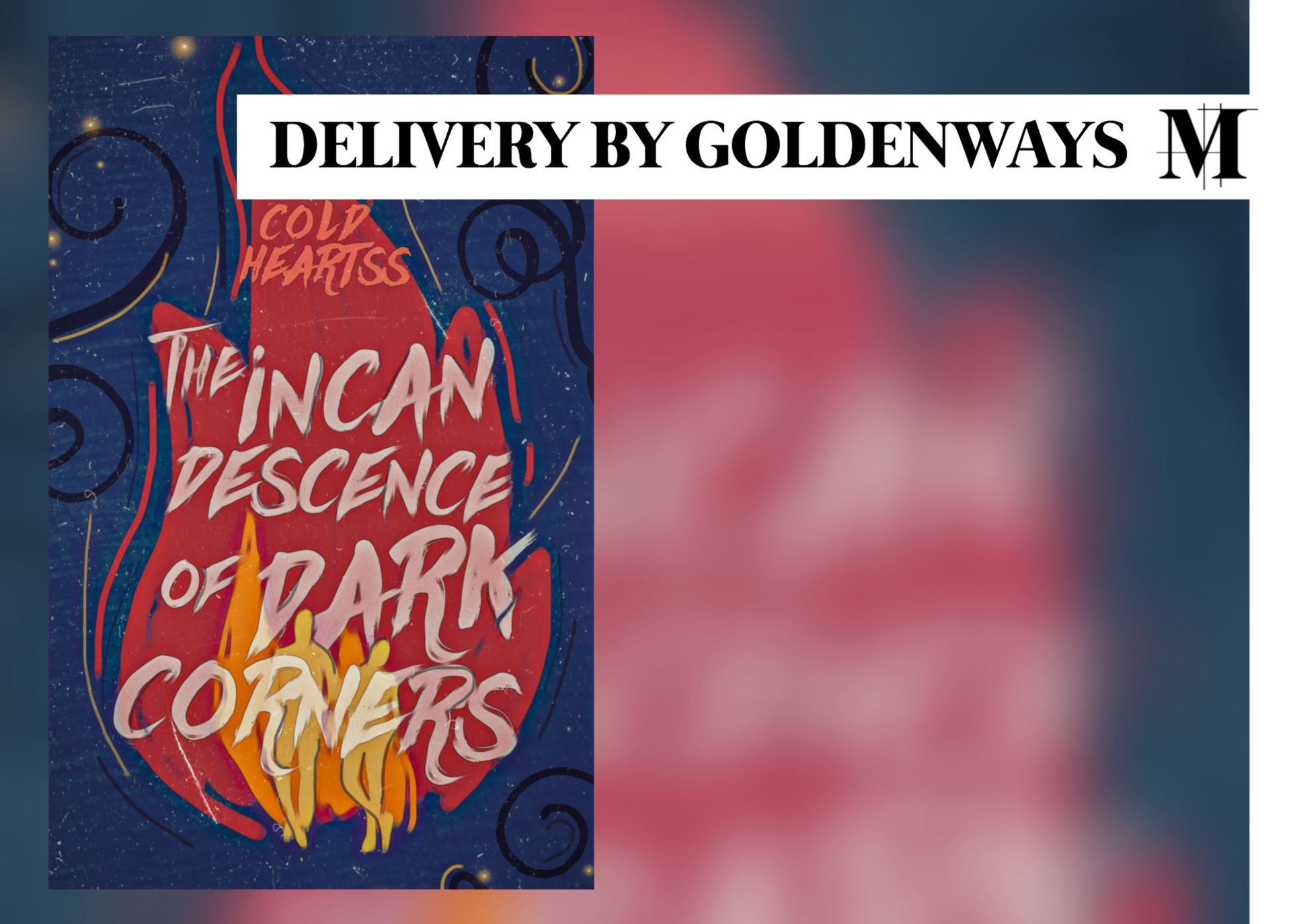
I got the fireflies and the fire from your examples. The idea was that there's a fire in a night sky with some little lights (= very subtle fireflies). I made the two people yellow so they's blend into the colours of the flame.
Yeah, I like this one.
Made by pronkend
Way Farers
Alright, Alright. Enough of you, Moira. We already knew you create gorgeous covers.
Hey, it's Miles. Your estranged designer foster child. Because yeah, I don't even remember what my last cover on here is.

I personally love fantasy covers. They are what inspired me to start doing this, and I want to get better at them. To train myself, I created this cover. While it's made for fun and practise, I do really like it.
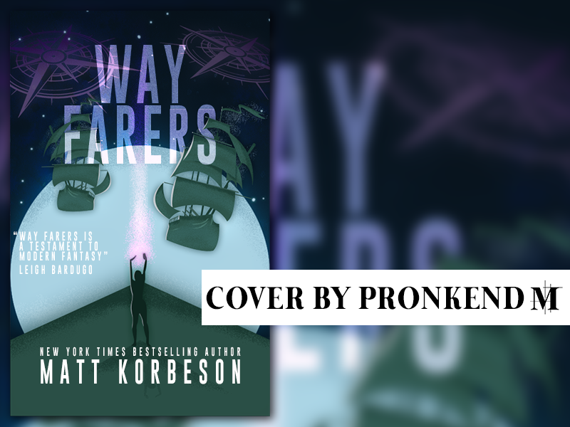
Besides telling a story, the cover was supposed to spark the interest of potential readers through interesting shapes and textures. I think this worked out pretty nicely.
On The Incandescence of Dark Corners
Miles
Moira is back, bitches. Again a nice cover! This style always works. The noisy texture and drawn lines make a kind of grungy and diy feeling, which adds onto the vectors. Because of this the vector is tealy in your face, which is important to stand out. I am not sure whether the text and people really work here, but it's a nice whole. Eye-cathing indeed.
[Moira is back, bitches. Weer een lekkere cover! Deze stijl werkt gewoon altijd. De noisy texture en getekende lijnen maken voor een wat een grungy en diy gevoel, wat toevoegt aan de vectors. Hierdoor is de cover heel erg in your face, wat belangrijk is voor opvallendheid. Ik weet nog niet helemaal zeker of de tekst en de personen helemaal optimaal zijn hier, maar het is een mooi geheel. Eye-catching indeed]
May
I think Moira's cover is again great. Really, girl, you just now how to nail it. The contrast of colours indeed makes it a striking cover and the font fits right in. 11/10
[Ik vind Moira's cover weer echttt een knaller. oprecht, girl, jij weet het iedere keer weer te nailen. het kleurencontrast maakt het inderdaad echt een opvallende cover en het lettertype past er super bij. 11/10]
On Way Farers
May
Odd, but still very nice as a whole. I especially like the colors, and I don't know if it was intentional, but the girl in the middle catches my eye immediately. Verie pretty!
[lekker apart weer, maar toch wel een heel mooi geheel. vooral de kleuren vind ik echt mooi, en ik weet niet of het met opzet was, maar je oog valt meteen op het personage in het midden van de cover. verder verie pretty]
Moira
Through the lines of the ground you really lay the focus on the person in the middle. The blue colors also really add to the fantasy/galaxy vibe it gives off. You could maybe have added some stars, but the cover is already chock full as is. Not busy, just stuffed with story. The shadow work with the black and white is subtle, but makes everything pop.
The quote may be too much, but doesn't retract from the cover.
[Door de lijnen van de grond leg je de focus echt goed op het mannetje in het midden. Ook geven de blauwachtige kleuren een soort fantasy/heelal vibe. Je had misschien nog wat heel kleine sterretjes kunnen doen, maar de kaft is eigenlijk al goed opgevuld. Niet druk, gewoon verhalend opgevuld. Je schaduwwerk met wit en zwart is ook subtiel gedaan, maar laat alles wel net wat beter poppen. Net als May stoor ik me wel aan die hoofdletters hahaha. Om het strakker te maken zou ik alles gelijk houden.
De quote lijkt me overigens overbodig, maar het stoort verder ook niet echt.]

Bạn đang đọc truyện trên: AzTruyen.Top