Cringe Factor
As both an author and graphic designer there are times it takes all of my restraint not to comment on Facebook posts of other authors posting their cover reveals. There are so many of them that make me scream internally (and sometimes out loud) and what makes it worse is the people who comment on the post and say things like "Beautiful colors. It's so perfect! Great job!"
Are we looking at the same cover? Do you not see the glaringly awful color? The tiny text? The wide-open, empty spaces? The awkward model placement?
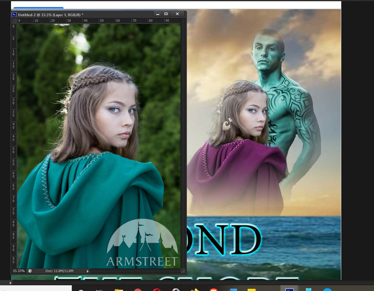
I saw this one today ...

(I covered the author's name and the names of the commenters, so ignore the black squares they are not part of the actual cover)
I'm sorry but the girl looks like she's checking to be certain the coast is clear before she gives him a BJ. (and for those who don't know what that means, I am not explaining it)
Why is he green? I'm sure there's a reason but it isn't clear from the title on the cover.
Also, I don't believe that the female model is a royalty-free image either, though I can't say for certain. She does look very familiar like I've seen it on Pinterest or something.
And why are they floating over the water?
The models do not look like they remotely belong in the same era. It's about as awkward as you can get.
The background image is also fuzzy.
There's just so much wrong with it I want to scream and it took everything I had not to post and list everything I saw wrong with the cover because apparently she's already published the book. I can't understand how people look at this image and see nothing wrong with it because I can't see anything redeeming about it.
I'm not perfect, and my books' covers aren't super epic, but things are spaced nicely, my text is centered, and big enough to be readable and not weird-ass colors. I don't make weird couple pairings and I try very hard to produce covers that will make people want to pick up my books rather than have them cringe and walk away quickly. It's covers like this that give self-publishing a bad name because people don't take the time to produce quality work. Because it has the stigma of "any moron with a credit card and publish a book". Which is true, but a lot of us put a hell of a lot of effort into what we publish and it's a shame we lose out because of things like this.
I FOUND IT! The image belongs to a costume company called Armstreet!

All she did was change the color of the cloak and shove a shell or something in her hair.

Bạn đang đọc truyện trên: AzTruyen.Top