[66] - tips for chaotic/'aesthetic' manips
I have finals today, but frick studying when I can cheat online.
*don't do this kids
...
References :
• basics with potato •
[9] - all I know about filter
• here's the 't' •
[63] - screen tone
[64] - manip tips
...
Requested by itsjustfireflies
Uh, if you noticed recently, I've been experimenting with manipulation covers, especially this type where I try to put a lot of stuff together and hope for the best.
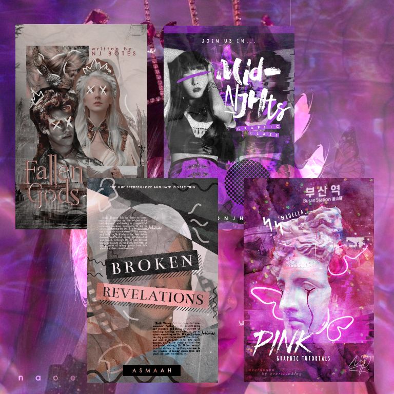
Ngl, kinda outdid myself in this book's new cover (weird flex but ok).
I want to make a tutorial on it, but I can't. Because all I did was just combining pictures until it looks nice to me.
So... I'm just handing out tips that I think might help :).
Enjoy.
1. Establishing a consistent color palette
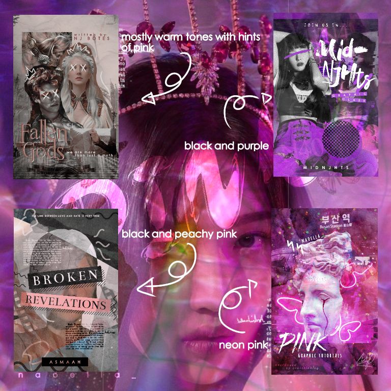
If you want your cover to look nice and coordinated yet still messy, using a color palette can prevent your cover from looking out of place.
You don't have to limit yourself to only one or two colors, you can also use palettes such as :
1. Rainbow (red, orange, yellow..., you know the drill)
2. Neutral (black, white, grey)
3. Pastels
4. Neon
5. Warm/cool tones (warm : brown, yellow, orange, etc; cool : blue, green, purple, etc)
But if you're still confused then start by using one or two colors only.
If you want to use a picture that you like but the colors are not in your range, just go exploit the hue/saturation/lightness filter.
2. How do I browse?
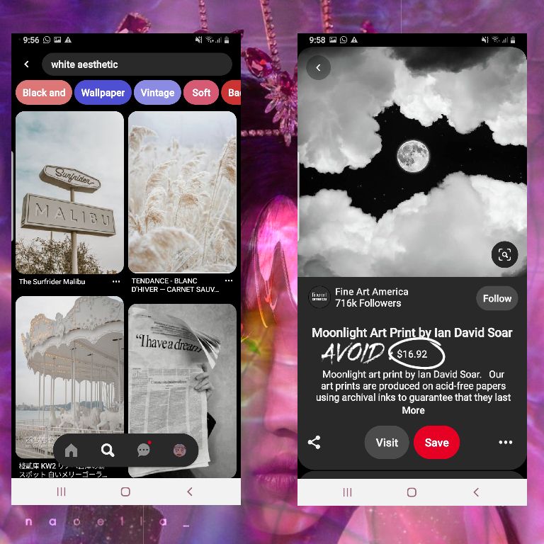
Go to your designated search engine and just type
[Color] aesthetic, e.g. white aesthetic
Text overlay
[Surface] texture, e.g. wool texture
*
Avoid any pictures/illustrations with a price tag on it. It means it is not free for us to use and we might get sued which we don't want :').
3. Do some doodling around, and adding good ol' screen tone
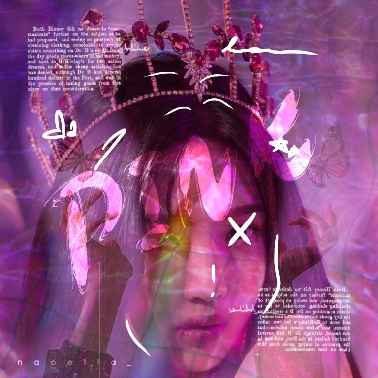
Legit, I always doodle something on these types of covers. It just makes the cover more cute and fun to look at.
You can cross their eyes out, draw lines around them, draw smol little shapes to make it cute. Normally I use white, but you can use any other color as long as it's still noticeable.
For my new cover, I drew fake black tears on the statue so it looks more uhm, 'aesthetic'?
*honestly, I always contemplate whether to call the stuff I make aesthetic because I'm not sure if my work is nice enough lmao
Also, screen tone matters, if you think something's missing, adding screen tone might help.
4. Play with blending mode and filters
At first, you might think this pic and that pic won't work together. Then filters and blending mode went : hold my beer.
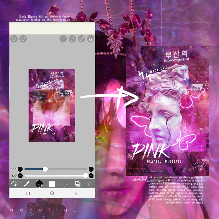
Here's an example how I used this pic to mold into my cover :
1. I add the pic
2. I change the filter to pin light and lower the opacity to 75%
3. Then I add the glitch filter at the artistic section of the filter tool.
4. I also adjusted the color with hue/saturation/lightness as per usual.
Idk how but after I did this it looks sort of like an ombre which I really like.
5. Every pic matters, gurl--
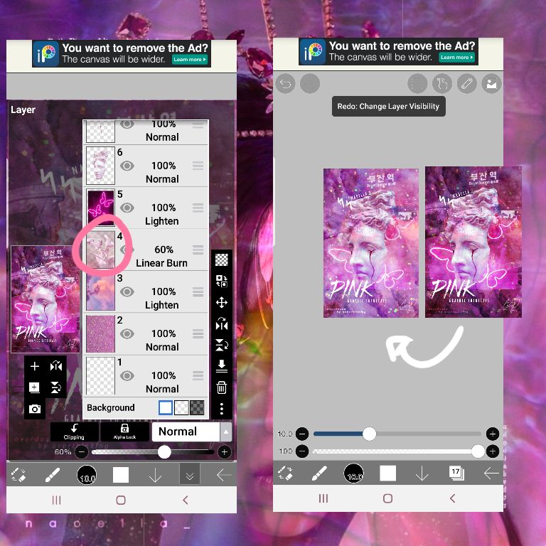
Pay attention to that layer with shoes (I circled it).
When I turned off that layer (the eye symbol), the aura of the cover changed. I know it doesn't look as bad but the vibe is like, different.
The statue is almost camouflaged into the background and I think it's too bright.
(I just don't like face claim/object(s) molding into the background, okay? It's just personal preference)
So moral : every. pic. matters. here.
6. Don't get carried away
Sure, mixing and matching pictures together are fun but don't get too carried away and make the covers too overwhelming.
Just remember :
1. Is the face claim / object the first thing people see when I show them the cover? (e.g. the statue in my cover)
2. Can I fit the title, subtitle, and the author's name in the cover?
3. Are the pictures I used in the background still noticeable or not overlapped by other pictures?
If all three of them are 'yes', you're good to go.
Extra tip : just mainly edit around the face claim/object/main focus to emphasize it. Like, I barely put anything at the edges and only edit around the face claim/object/main focus. Not only does it make it easier and save time, it won't look too overdone.
Another extra tip : just make the face claim/object/main focus REALLY BIG, so it catches the viewer's attention (it's basically a cheat code).
Done!
■ ■ ■
If there are anything you don't understand please ask away!
- next up (probably) : another anime cover
*this gif banner was so freaking big that I had to compress it so much so it's below 3 MB and it's a bit too pixelated that it's moving along with the pic but I kinda like it :v
Bạn đang đọc truyện trên: AzTruyen.Top