#8-How to make an angsty cover+How to add more depth to a render

As requested by @shittykvwa, today I'll be going through how I make an angst cover!
The second part of the chapter will come in much later, it's something I realised I said I would talk about but didn't end up doing, so I'll be doing it here instead. It's very important and I believe that it'll help a lot of people who wish to make graphics!
Usually for covers that have an angsty mood, it's always heavily blended. I find that it helps to show the mood a lot better. Trying to make a cover with an angsty mood using a light hearted mood is really, really difficult to do. Honestly if I ever see such a request I'd do it, and do another version in another heavily blended style. It gives more freedom to me.
Anyways, here's an example of one of my to show how I do the process. Forgive me though, I tried making a new cover for it like I did with the second request but I couldn't think of a proper idea, so I'll be reusing an old cover.
And this chapter is also pretty long. I'm sorry, but all I can say right now is, good luck!
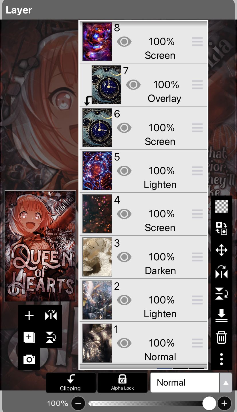
1-8: A bunch of textures to make the background. Nothing special here.
9: A png to help fill up space. It was a random selection from my gallery.
10: This layer is used to help colour the background so that instead of a mess of colours, all the textures are set to follow one colour scheme.
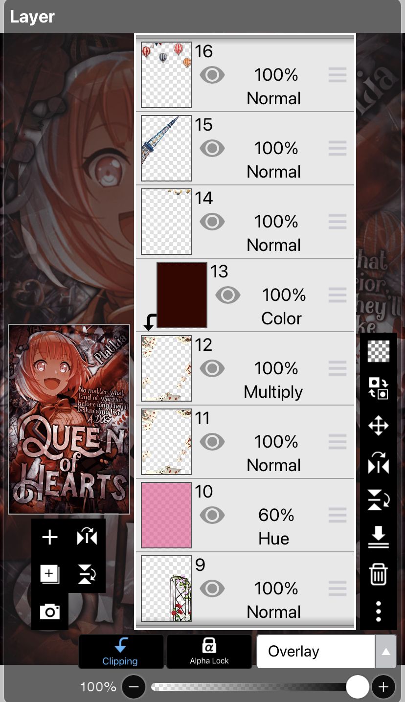
11-13: 11 and 12 are the same png, but set to different blending modes to help make them stand out more. 13 is used to make them look less bright and follow the colour scheme a little more.
14-16: All three are pngs. 16 is the only one that was not randomly chosen because it fits the mood of a sort of circus like theme that I tried to incorporate into it.
17+18: A texture to help tone down the brightness of the background. It's doubled because the first one wasn't enough.
19: A random png chosen to fill out the space above the render's right shoulder.
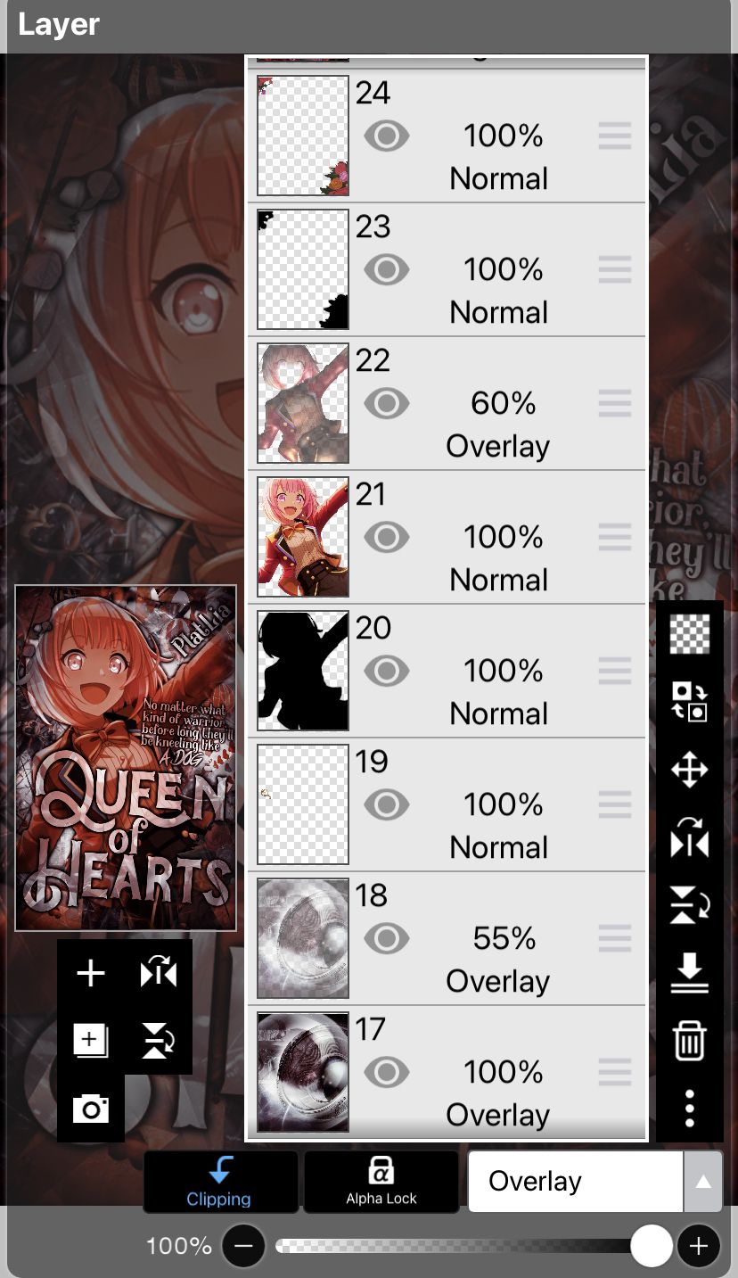
20-22: The render with a shadow behind her to make her stand out more. The overlay layer above her, is this specific function in ibisPaint that I'll be using another cover to demonstrate at the end of this chapter, so as to not make this section that cluttered.
23+24: Flowers added at the corners of the cover to make it seem a little nicer.

25: A layer that helps make the cover a little lighter.
26-30: The text layers, and they're in this way so that the text is visible, and also slightly transparent. I didn't feel like redoing the whole process so I just coloured layer 28 pink to match the render's hair more(in the original version).

31-34: Extra text layers because I only came up with the subtitle well after doing the title.
35: An extra version of the text layers before rasterisation, because I'm always paranoid something could go wrong lol.
36: A blue frame effect to make the whole cover have a darker feel.
37: A crystal texture I love using as an overlay, I find that using it helps a lot to focus more on some colours and add in more colours to the colour scheme. Plus it looks cool.
38: A colour layer to help make sure the cover's colour scheme is pink.
39: This layer is actually me using an airbrush over the render's eyes to make them stand out more, because I realised a little too late they were a tad bit dark. The same layer is also used to highlight a few strands of the render's hair.

40-42: Filters of the cover that I saved from Polarr, and used to mix around with here!
43: Another colouring layer because I realised it looked weird if it was pink, so I made the cover more red. And that's the end result for this cover!
Now here's the explanation of that overlay layer 22. Here's the example.

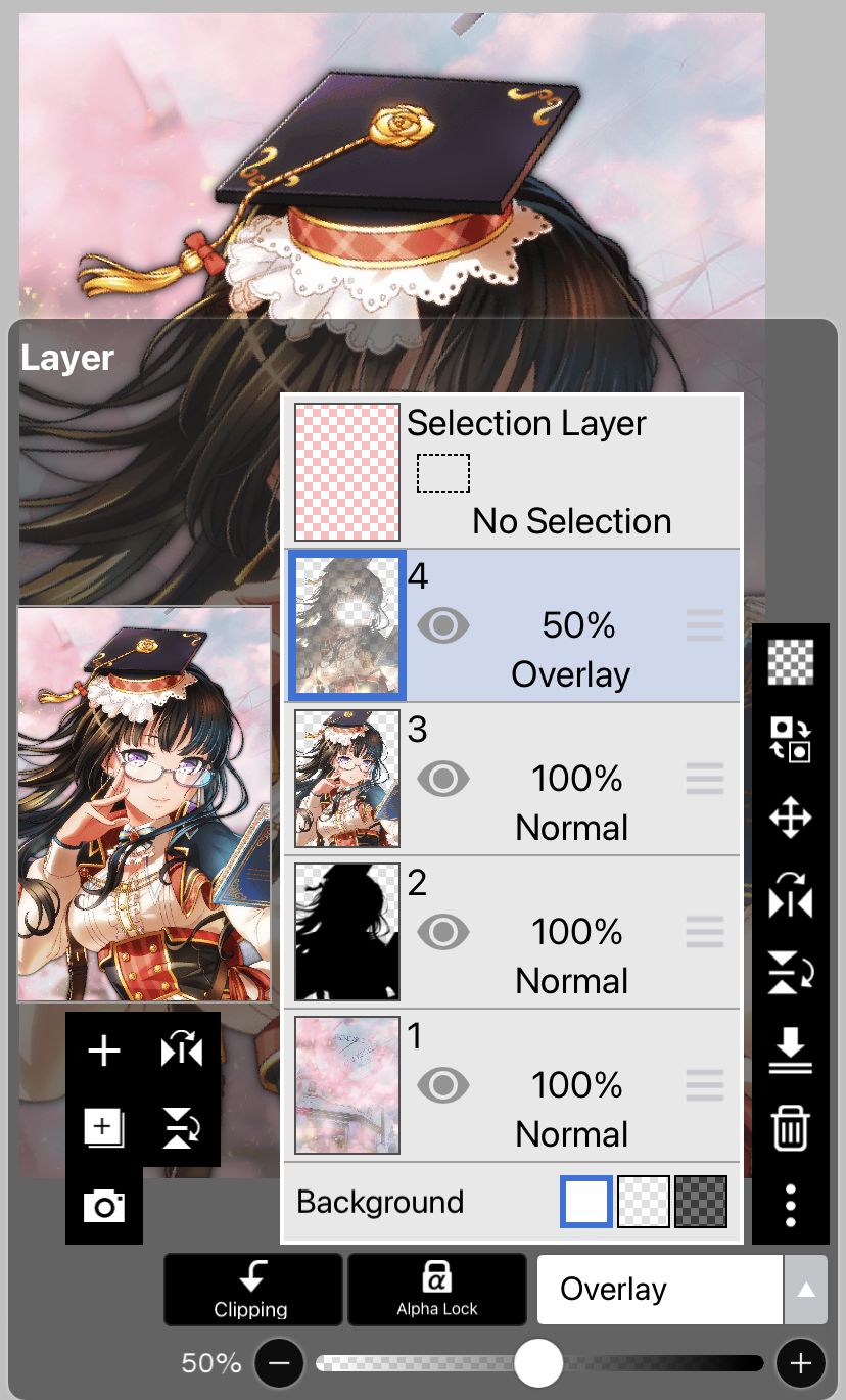

Can you see the difference in the render when I use this feature? This function is a way to add more depth to the render, in a way. I'm really bad at explaining but just think of it as a way to make the render stand out even more?
In the first image, that little button with the sun is the way you can adjust the lighting affecting the render. You pull it around the render and see which side the lighting acting on would look the best. You can also change the colours of the 'relief' effect by just scrolling down the pop up tab.
I recommend using the 'overlay' blending mode, as it looks the most natural, to create that depth. Of course just using it at 100% isn't good all the time, so play around with the percentage clarity till you see the best outcome for the render!
And that's it! I hope that this chapter managed to help you. Also please do tell me if these long chapters are annoying to read, I'm quite conflicted of having them here but I really need a lot of words to explain something well. I'll try to tone it down in the future!
Anyways, thanks for reading this and have a great day/night!
Bạn đang đọc truyện trên: AzTruyen.Top