BEST PRESENTATION RESULTS + REVIEWS
Congratulations to the winners!
There will be three placement winners and one honorable mention as it is a smaller category, so four overall winners.
If you have any questions or concerns, please let me know, though I am not tolerating disrespect or hate.
Please read your review all the way through before asking questions since I sometimes take a while to explain, so your question may be answered by the time I finish up the review.
Keep in mind this category factors in everything in terms of presentation. The four things I judged here were the titles, blurbs, covers, and additional aesthetics, so it's not just one thing here. It's about the overall presentation.
Like the cover and title categories, although I try to be as objective as I can, some of this may just come down to "I like it 🥺🥺🥺🥺🥺," so placements could be based on my personal preference for what presentation would drive me to clicking on the book.
This was a pre-planned chapter written in advance. I am currently on vacation and 16 hours away from my home state. Please give me more time than usual to reply, and please don't start any arguments while I'm vacationing for the first time in a long time. That will make me sad. Don't make me sad.
Next: Best style and best plot are next on my list, though as I am on vacation, it may take until next week for results to get here, hence why I posted three results this week instead of the usual two to give more results faster.
3rd Place
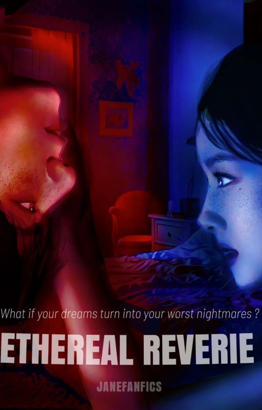
Ethereal Reverie by janefanfics
Review:
The title is really nice. It's short and to the point, and it has prettiness to it without needing a million words to do so. It doesn't overstay its welcome, and it gets the reader curious about what's going to come next and what this title could possibly mean. No criticisms.
The blurb overall tells the reader what the story is going to be about, though there could be some SPAG tweaks to make it more readable. It is consistently in UK English, which is good, but there are some punctuation errors, spacing errors, and some confusing sentences. Here's one alternative:
In the bustling streets of Seoul lives Y/N, and her days are filled with laughter and the scent of well-loved books. Her heart longs for love, yet reality often falls short of her romantic dreams. But one ordinary morning, everything changes when she stumbles upon Jungkook, a mysterious newcomer whose presence creates a spark within her.
As they explore the city together, both realise that, though they aren't perfect, they complete each other. But beneath the surface of their romance lies a haunting truth that threatens to shatter their new bond.
Join Clumsy-lina, aka Y/N, on a journey through the complexities of love and longing in "Ethereal Reverie." As she navigates the highs and lows of her enchanting romance with Jungkook, she must confront the shadows of her past and the uncertainties of the future. Will they forever be stuck in a dream or face a nightmare?
I made various SPAG changes, mostly to the punctuation since there were a few missing commas. That's one alternative, though I encourage you to play around with it and find what works for you.
The cover is cool as heck. I love the concept of this cover having the two sides represented by red and blue, almost like the blue is the good side and the red is the villain (almost like police sirens, too). The faces of the two are clear, as is the rest of the cover, and the colors blend together really well to make for a visually satisfying experience. The only criticism of the cover I have is the placement of the title since it looks off-center. The E of Ethereal is almost cut off by the left side of the cover, but the e in Reverie has plenty of space between it and the right end of the cover, so that's why I'd recommend center-aligning it more. With the subtext, I'd recommend making it a little smaller and down just a hair so it lines up more with the title. Otherwise, I like the cover a lot, especially the concept behind the cover with one face being normal while the other is upset down. Really cool.
There are a few additional aesthetics in this book, like banners and the occasional mood board. The banners are nice, match the atmosphere the cover was going for, and are easy to read since everything is clear and made a good size/font. As for the occasional mood boards, they're good as well.
Overall, Ethereal Reverie has great presentation, particularly with the title and cover. I had some suggestions for the blurb and some minor recommendations for the cover, but the overall presentation is cool and will attract readers!
2nd Place
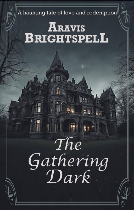
The Gathering Dark by Aravis-Brightspell
Review:
The title is solid. As I said in my thriller/mystery review of this story, I think the title works for the book, rolls off the tongue well, and has a unique spin on the "dark" part of the title. I see a lot of titles with "dark" or some form of it in them, but not quite like this, so I like the uniqueness of it.
The blurb is great. I didn't notice any SPAG errors, and there are noticeable improvements since the last time I read the blurb. Now, I have no criticisms and I think it looks great! It introduces us to the story well and has fantastic SPAG, so I have no suggestions.
The cover is also great. It looks like you've made minor changes to it since the last time I judged it. If I'm not mistaken, it looks like you changed the color of the title a little bit. Not sure if it's just my eyes playing tricks on me or not, but either way, I like it. I think the cover looks elegant and shows what the story is going to be about. The house is exactly how I imagined it in the book, so that's perfect. Overall, I like the cover a lot and I like the minor tweaks you made to it.
The additional aesthetics include a poem at the beginning and an end banner. The poem is very nice and leads readers into the story. Like MDjarin said, it feels like something from Haunted Mansion from Disney, and I think that works perfectly for the story's atmosphere. The only criticism I have about the interior aesthetics is about the end banner. While a nice banner, it doesn't feel very specific to the story and it feels more like a general banner. While that's not a huge deal, especially since the banner is nice, maybe consider something more specific to the genre and story to be more immersive and also give readers more looks at the vibes of the story. But again, that's more of a minor thing and not something I'm saying you have to do (I know graphics can take a while, so I wouldn't want to recommend anything that ends up being a burden for you), but if you're interested and find yourself playing around with banners in your free time, it could be something worth looking into!
Overall, you continue to impress me with your well-rounded talents for both writing and graphics. The presentation of this story is solid and does a great job giving readers incentive to read. I have the advantage of knowing the story inside is just as good as the presentation outside, but I think readers will discover that as well when they take a looksie. Other than the minor critique I had about the end banner, I think the presentation of this book is awesome!
1st Place
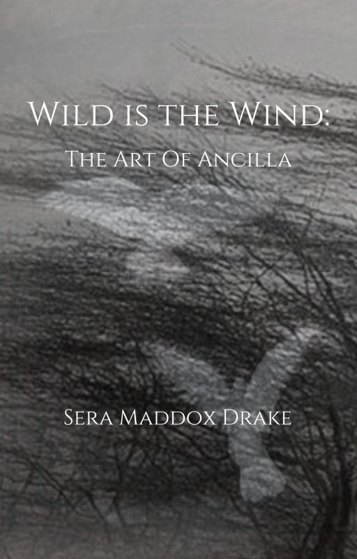
Wild Is the Wind: The Art of Ancilla by SeraDrake
Review:
The title is awesome. I love the repetition of the "W" sound and the way it connects to the second half of the title. It's a really pretty title, and it works perfectly for an art portfolio. No criticisms.
The blurb works great for an art portfolio by introducing what it's for, the content level rating, and offering alternative routes to view it for reader accessibility. The only minor, minor nitpick I have that will not impact this book's placement because it's such a nitpick is that there's a singular spacing error here: My art is often sensual, but it is "safe for work,"and having... there's a missing space between the " and the and. That's so minor that it won't impact standing at all, but still something worth mentioning since it's the only grammatical flaw in the blurb. The blurb is otherwise very good. No criticisms.
The cover is great. I love the background image and how it sets the atmosphere for the portfolio. The hand-drawn, rough edges of what I assume is a tree or a bush paired with the elegance and seemingly untouched innocence of the pure white birds makes for fantastic contrast. The only minor criticism I have is the same as from the best cover category where I believe you could benefit from moving the author's name down to a less-busy part of the cover. As is, the author's name is overlapping majorly with the second bird, but there's more than enough space on bottom for the author's name to fit. That being said, I like the font of the text, so it's really just the placement. Otherwise, I have no criticisms.
As for the additional aesthetics, I like how the portfolio is organized, making it easy for readers to see what they want to click on and skip around as needed. What I can appreciate is how experimental everything is and how no one graphic is the same. You play around with the characters and art to make everything unique and a new feast for the eyes, so not only is this book organized well, but it also has great art and graphics within the book.
Overall, Wild Is the Wind has fantastic presentation that feels like a museum in book form. Other than a minor critique I had about the cover and moving the author's name down so the pretty background image had more room to be seen, I liked everything and thought it was presented well. The presentation for this book will suck any reader in and get them to want to view the work inside.
HONORABLE MENTION
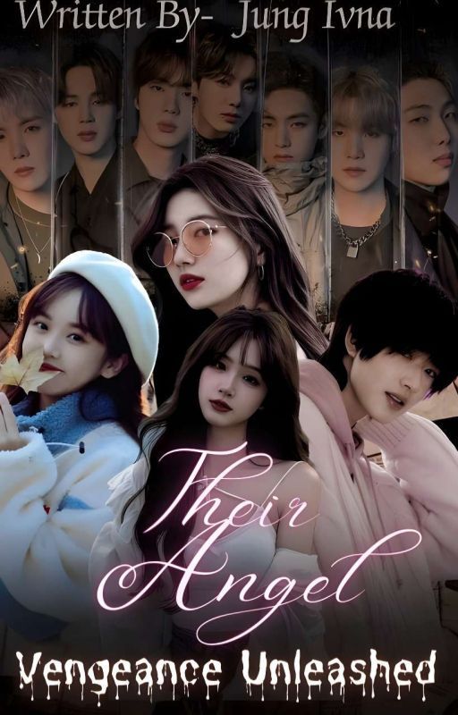
Their Angel: Vengeance Unleashed by ivna_jung
Review:
This is a sequel to the book Their Angel, so the usage of Their Angel again sets up readers' expectations, and it also adds a new part to the title that makes sense with the chosen storyline. No criticisms.
The blurb overall does a good job introducing the reader to the story. It's not too long and not too short, and for readers of the first book, it will attract them, but I can see it attracting those who haven't read the first book as well. The only thing is there's a comma error in the beginning.
This is the first sentence: YN's life falls apart after what happened, during that dangerous mission.
What I'd recommend: YN's life falls apart after what happened during that dangerous mission.
Otherwise, the SPAG looks good, as does the rest of the blurb.
The cover, like the blurb, is overall good, though I have two suggestions. One is I wasn't a huge fan of the placement of the author's name and how large it is. It looks like it's almost getting cut off by the top of the cover, so maybe consider moving it down and to the left a bit, and also consider making the size a bit smaller so it's not as distracting. The second thing is I'm not a huge fan of the font for the Vengeance Unleashed part. While I do see what you were going for with this font, for me personally, I was never a fan of that font since I always felt it came off as a bit much. Maybe consider playing around with it a little, though I acknowledge the font might just be a me thing. I always just thought it came off a little much and really only worked for horror books if even that.
The additional aesthetics include a header and ender, and I think they're good. I was a little confused with why the prologue had the same header and ender while the rest of the story didn't, though that's not something I'm going to dock mental points for, it was more a thing I was confused about, and I'm glad I clicked on the next chapter to see if the rest would have a different ender. The header and ender are good and work with the story.
Overall, the presentation for Their Angel: Vengeance Unleashed is good with a nice title, overall good blurb, and solid additional aesthetics. I had some minor criticisms throughout, but the overall presentation is good.
ALL REVIEWS:
Parth Probodhika: Pristine hues of his peace by dwarkaratna
Review:
The title is very pretty, as I've said in past reviews. It has a strong cultural element and will definitely hook readers in. I had some criticisms for the capitalization of the title in my past review, though I don't think that's major enough to warrant bringing it up again here, so I'll go ahead and say I have no criticisms for the title since it's pretty and fits in with the atmosphere of the story.
My suggestions for the blurb are the same as they were in the review I gave it for the completed category of the FN Awards. While the content within the blurb is interesting, it could use some major SPAG tweaks to make it more understandable. For example:
Love is [a] penance, and the phase of penance extends when we need to face challenges to ensure its presence. After long years, Arjun's penance of getting his love succeeds. But is this the end? Surely not; it's just a phrase completed.
Subhadra, who pledged to preserve peace in Arjun's life, was unaware that she had to face the cold war against the situation, which seems calm but has severity as its companion.
Marriage needs time before flourishing in society. How will Arjun and Subhadra battle their demons and settle into their new world?
The SPAG is tweaked here to have no errors that I am aware of after running it through three grammar checkers. So the content within the blurb is interesting, it could just use some presentation tweaks to give those interesting concepts more time to shine.
As stated twice in the rules, for this category and the best cover category, the cover, title, and blurb all must have been made by you. Since the cover is made by someone else, you are disqualified from the cover part of this category. It's okay if additional aesthetics are made by others as those are additions and not required for this category, though the core parts of the presentation must have been made by you, therefore the cover portion of this category will be docked.
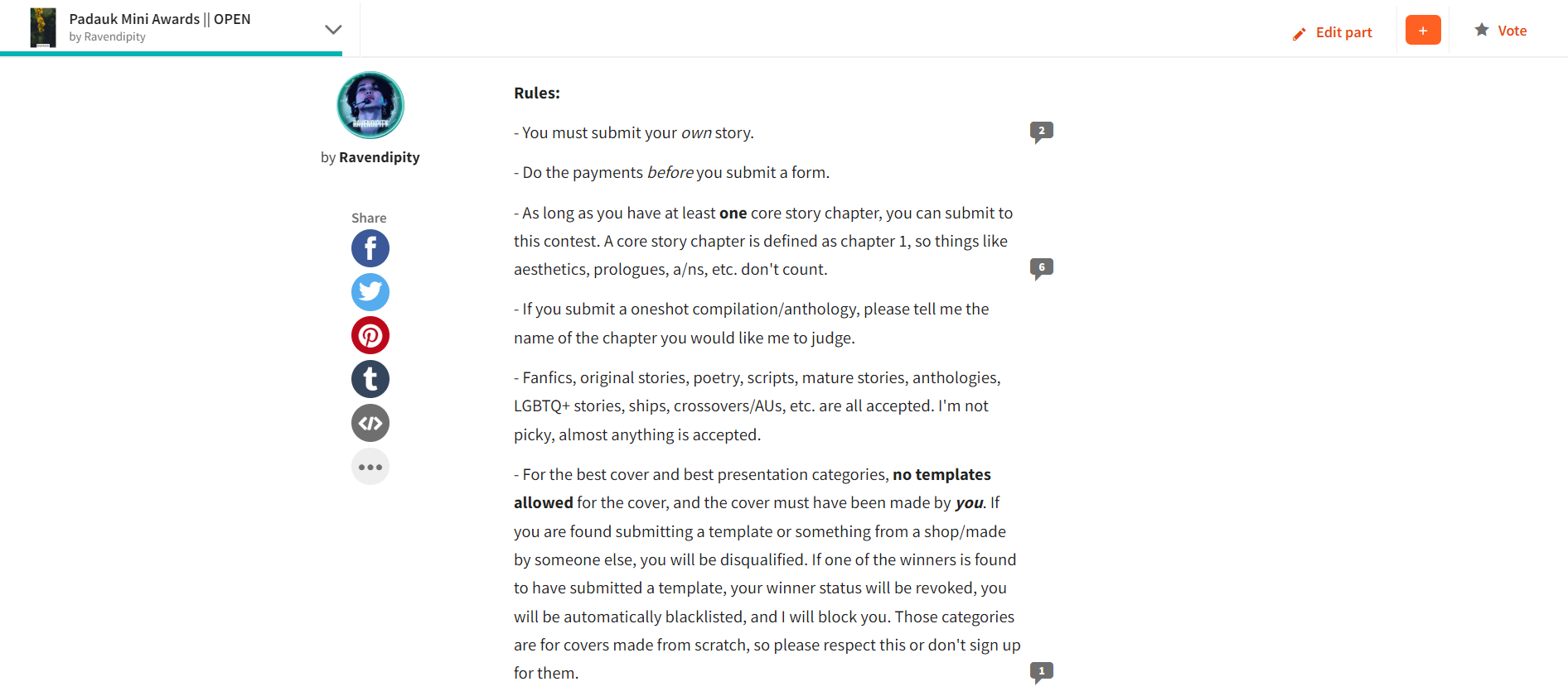

As you can see in the above screenshots, covers made by other people are not allowed.
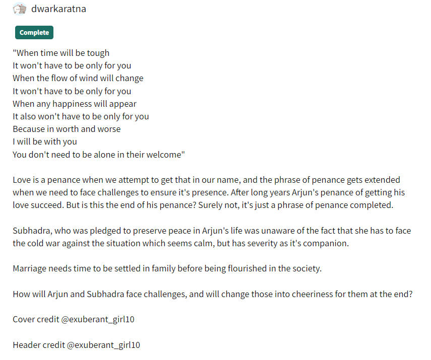
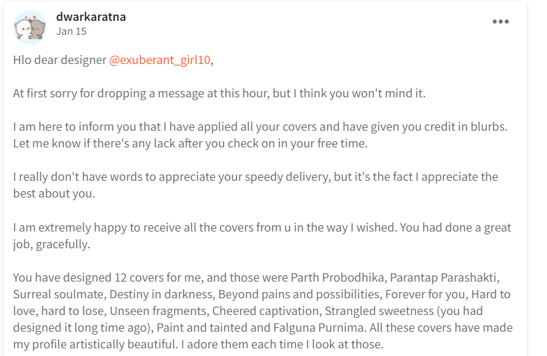
And there are screenshots showing the cover was not made by you.
Out of respect for how long you've been in my contests and how you have followed the rules before this point, I will not disqualify or blacklist you but rather disqualify just the cover as I think highly of you and believe this was likely an oversight where you didn't realize the rules said that, though for future graphics contests hosted by me, please do not submit a cover not made by you. I hope this does not come off as rude in any way as that is not my intention, just since it is in my rules, I have to be strict about it. I hope that makes sense.
The additional aesthetics include headers and enders, and the header is nice and matches with the cover and the overall atmosphere of the story. As for the ender, I'm not sure how to feel about it. It doesn't feel like it relates to the story much if at all. Consider playing around with it to have it match more in with the story. It's not a huge deal since enders are mostly meant to thank people for reading, but it is something worth considering if you have the time and interest in making an ender more related to the story. But only if you have the time and interest since I know graphics can take a while and be stressful, and the last thing I want to do is suggest something that would be stressful for you.
Overall, the presentation works for the story, and I'd say my favorite part is how it has a fluent color scheme of pink throughout every part of it. It matches the story well. I had SPAG suggestions for the blurb, and the cover has been disqualified, though things like the title and header are very nice and will do a good job pulling readers in.
Mr. & Mrs. CEO by kookiebear0901
Review:
The title works for the story. It is a title that's been done before, and it fits in with the common tropes related to this genre; however, I think it will do a good job attracting readers in to the story. Readers who are fans of the CEO genre will see this and will click on it, so it works for the genre even if it is something that's been done before, and I think that's the most important part.
The blurb is overall okay, I just recommend some grammar tweaks to make it easier and more entertaining to read. Here's what I suggest:
Lilac Carter is the CEO of 'LC Cosmetics'. If anger and danger were in the form of a lady, then she is that person. Everyone is scared of her bossy aura and dark, cold eyes—except one person. Her invisible soft side is only for one person.
But who knew that soft side would extend to two people?
Jeon Jungkook is the CEO of 'JJK'. He's known for his handsomeness and flirting. He has the aura to make any girl wet her pants with his gaze.
People say opposites attract and alikes repel, but what if alikes attract?
I made some changes to the SPAG to make the blurb flow a bit smoother. The overall blurb is okay, it just needed some SPAG fixes.
The cover is overall nice. I like the font of CEO, and I also like the picture of Jungkook used. I don't think I've seen that picture used before on a cover, so that makes it unique. My only minor critique is the subtext is a little hard to read because of its size and font. I don't mind the font (I write in cursive, so I actually like the look of it), but if you want to stick with that font, I'd recommend maybe increasing the size of the "A Jeon Jungkook fanfiction." The subtext above the title is fine. It's also a little hard to read, but I honestly think it's fine, it's more the "A Jeon Jungkook fanfic" that's really, really hard to read. Maybe you could make the text itself a little wider or a little larger if that appeals to you. The overall cover is good.
The additional aesthetics are good. The aesthetics consist of moodboards/character aesthetics, and I think they all work well and aren't so much that they become overwhelming. No criticisms.
Overall, the presentation of Mr. & Mrs. CEO works great, and it works even better for the specific trope (CEO) it's operating under. It will attract many readers to the book to see what's going on, so I suspect there will be a large audience for the book. Larger than there already is, I mean. I had some suggestions for the SPAG in the blurb and minor suggestions for the cover, though the overall presentation is good.
The Cheating Game by sugararmy07
Review:
The title is The Cheating Game, and I think this fits in with the concept of the story. It also inspires curiosity with how cheating can be a game, assuming it's related to relationship cheating (which it is), but it can also make viewers think of cheating in a video game or something of the sort, so it encourages curiosity in the reader. For that reason, I like the title.
Moving into the blurb, I have some critiques for it, mostly that I'm not a big fan of switching between three different special fonts. There are a few reasons for this. For one, it limits who can read the blurb because readers with conditions like dyslexia will have trouble reading it, and screen readers can't read it at all. Two, it's hard on the eyes to jump back and forth between one font to another to another, so I would suggest more consistency there. Three, it makes it difficult to tell what is and isn't a grammar error since the punctuation can be hard to miss. Like I can't tell if in that first sentence if the quote is "We need to stop,Jungkook" or "We need to stop, Jungkook." It's one thing to use alternative fonts for within the book for like the character aesthetics, but for a blurb, I'd recommend writing mostly in the normal font since the blurb is very hard to read otherwise and may prevent readers with certain conditions from being able to engage with your content. As for grammar, this is what I'd suggest for the core part of the blurb: They both knew they were playing a nasty cheating game, but they didn't stop, even though they knew it wouldn't end well. Those changes make the blurb make a little more sense grammatically and flow a bit stronger.
The Cheating Game has a great aesthetic style to the cover with the drawn image of Jungkook's tattooed hand holding down a mysterious women's hands. It's eye-catching, and the font for the title card is nicely chosen and placed. The only critique I have of the cover is I'm not a huge fan of the subtext. I like the contents of the subtext being "Ever read a story from the Villain's point of view?" The capitalization of the "villain" feels very purposeful and like it's trying to say something. The only reason I wasn't a huge fan was because of the placement. I feel like it was kinda squeezed in there and could have either been removed from the cover and placed as the opening line of the blurb, or moved elsewhere on the cover, like the bottom. Or you could move the title up a hair so the subtext has more space to breathe and stand out. You have plenty of room between the author's name and the title card, so that could be an alternative. Other than that small thing, I like the cover.
As for the additional aesthetics, they are all good. The character aesthetics, banner, and playlist are all well-placed and fit in with the vibe of the story. They're well-organized and have darker aesthetics to fit in with this being more about the "villains." No criticisms for any of the additional aesthetics.
Overall, the presentation of The Cheating Game is good. It could use some major tweaks to the blurb to help with the flow, but that was my main critique. I otherwise think the presentation is solid.
SMILE: A Terrible Night. by ParkAaimin
Review:
The title is SMILE: A Terrible Night., and I think that's a cool title. I'm normally not one to support all caps, though I actually like the usage of all caps for the SMILE as if you're telling us, the readers, to smile, then the follow-up being "A Terrible Night." with a full stop/period at the end paints a rather ominous picture. I overall like it. It's very stylistic. No criticisms.
The blurb isn't necessarily a blurb, it's an excerpt from the story, which is not the same as a blurb, so there's no real way for me to judge this category. I would strongly suggest including a short description of what happens in the story so the readers know what they're going to click on. As for the excerpt available, there are a couple grammar errors, so here's what I'd recommend:
I heard people groaning in pain, pleading for mercy, and suddenly, he spoke somewhere near me, "Do you hear them? The whispers of my victims, begging for release."
I was walking backwards until my back touched a hard chest. I froze when he ran his hand on my body, and a shudder flew down my spine.
"Do you feel that chill? That's the touch of death drawing near you," he whispered.
This alternative tweaks all the grammar errors and rewords some sentences to help with flow. That's just one idea, but I encourage you to play around with it and find what works best for you!
The cover has an interesting photo of Taehyung staring off into the distance at something we cannot see, which makes the reader curious to know what he could be looking at. The only suggestion I have is to consider playing around with the font. It seems you use this font for most if not all of your covers, so I would suggest some diversity so the covers have more individuality. The cover is otherwise good.
There are no other aesthetics in the story, like banners, playlists, character aesthetics, etc., and that's fine. I'm not going to take off any mental points from anyone for that since it's just optional, but that does mean I have nothing to judge for this category, so I will move into the summarizing comment now.
Overall, SMILE: A Terrible Night. has an awesome title matched with a cool cover. It could use some tweaks to the blurb as there is no official blurb, rather an excerpt from the story. So my main recommendation is to add a short summary describing the story so readers know what they're getting into, and consider playing around with the font on the cover to give it more individuality. For example, I like the font of the "A Terrible Night," so maybe consider making that the font for everything, if you think that'd look nice. Otherwise, I like the presentation of the story.
Sarveshwari Krishnapranadhika by KanhaiyakiSakhi9112
Review:
The title is overall good, though my main critique is how it's presented in an alternate font. I don't mind titles being written in alternate fonts as much as I mind blurbs being written in alternate fonts, though considering how long the title is, it is a little hard to read. That matched with it being a little hard to read on the cover as well made it so I had to copy paste the title from your form into here so I ensured I made no errors or anything of the sort. Consider using a less extravagant alternate font so it's a little easier to read or not using one at all. It's up to you and what you think will work best for the story, though in my opinion, it was a little hard to read. The title itself is good, though.
The blurb being in the form of a poem wasn't what I was expecting, but I honestly liked it. I know you write a lot of poetry, though I wasn't expecting it here, and it was a pleasant surprise since I think you're good at poetry, and I liked this a lot. I only have one recommendation for SPAG in the first line.
What I'd recommend for the first line:
"Supreme goddess, dearer to Krishna than his life."
I just added end punctuation and a space, so nothing major. Otherwise, I liked the blurb and thought it was cool.
The cover has a great color scheme, and I liked the choice to make the title color a pretty gradient that matched in with the overall atmosphere of the cover. I love the space-like feel, though I may be biased since I write sci-fi 24/7. The only minor critiques I have are about the author's name and the title. I honestly didn't even notice the "written by" until my third look. It's very hard to see and almost transparent. I can respect the decision to make it harder to see since you don't want to distract from the overall aesthetic, though I feel you could make it just a tad brighter so people notice it earlier. About the title, I like the gradient, so that's not what this is about. My one recommendation is to consider making it either larger or wider so the text is easier to read. The "wari" part in particular blends in a bit with the background, so maybe just making the letters themselves a liiiittle wider could give it more emphasis, if that makes sense. However, I overall really liked the cover, and I absolutely love the atmosphere it gives off.
The additional aesthetics consist of character aesthetics, a table of contents with multiple aesthetics within that chapter, and headers and enders. All of these are awesome and are my favorite parts of the presentation here. I love how you included a table of contents surrounded by the character aesthetics, and I love the header and ender. No criticisms for anything listed there.
Overall, the presentation is good, particularly with the interior aesthetics and blurb. I had a few suggestions here and there, though the overall presentation is solid and will draw readers in.
Bạn đang đọc truyện trên: AzTruyen.Top