BEST COVER RESULTS + REVIEWS
Congratulations to the winners!
There will be three placement winners and two honorable mentions, so five overall winners.
If you have any questions or concerns, please let me know, though I am not tolerating disrespect or hate.
Please read your review all the way through before asking questions since I sometimes take a while to explain, so your question may be answered by the time I finish up the review.
Remember that covers and titles are two of the most subjective categories, so while I try to be as objective as humanly possible, the placements may come down to just "I like it, it pwetty🥺🥺🥺🥺🥺," though I will give objective critiques for every single review. All the covers were honestly really good, so I had a bit of trouble choosing winners, but I feel satisfied with how this category came out.
Also keep in mind I am not a professional graphic designer, but I try my best to judge based on what I know. Take everything I say with a healthy grain of salt since this is a very subjective category.
This was a pre-planned chapter written in advance. I am currently on vacation and 16 hours away from my home state. Please give me more time than usual to reply, and please don't start any arguments while I'm vacationing for the first time in a long time. That will make me sad. Don't make me sad.
Next: Best blurb results will be out tomorrow, and best presentation will come out soon as well.
3rd Place
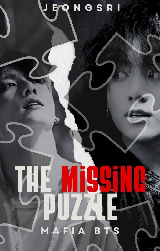
The Missing Puzzle by midnight_breezee
Review:
I've always liked the covers you've made, and I like the recurring theme of b/w mixed with red you have going on. It's like how YouTube thumbnails try to have a certain style so viewers see it and instantly know who the YouTuber is without needing to check the channel name. These covers have their own style that inform the readers you're the author without them needing to click to see the author's name for themselves, so I like how you kept that pattern up, and I like how you tried something different with this cover by incorporating the puzzle pieces to match with the title.
However, I'd say my favorite parts aren't any of those things. Instead, my favorite is the font. That may seem like a small thing in the grand scheme of things, but the font very nicely fits in with the story idea and the title. It kind of gives puzzle vibes, if that makes sense. It just looks like the font I'd imagine would be on the cover, and that's great. It matches perfectly, and I'd say it was my overall favorite part.
My main critique is there's a lot going on, and in terms of the visual hierarchy, it's unclear exactly where our focus should go since there are many moving parts here. You have the puzzle pieces, the tear, the "mafia bts," the author's name at the top, two pictures of Jungkook, two different text colors, etc. So there's a lot happening here. My suggestion is to consider downsizing a bit, and to be more specific, my two suggestions would be to consider removing the tear and/or reducing the size/amount of the puzzle pieces on the cover.
I love the concept of the puzzle pieces, so I definitely am not saying get rid of them since I think they add a unique spark to the cover, all I'm recommending is considering downsizing on how big they are and/or how many there are. I suggested considering removing the tear since, as much as I personally like it, it does add more to look at, but if you downsize on the puzzle pieces, I think it'd be okay. All I recommend is playing around with the visuals so we have more visual cohesion and know more what to focus on, if that makes sense.
All in all, the cover is good and interesting, and the font in particular is a standout for me. There could be some tweaks to the visual hierarchy to make it easier to focus on certain aspects and so readers know where to focus, but other than that critique about the hierarchy, I think it's overall good.
2nd Place
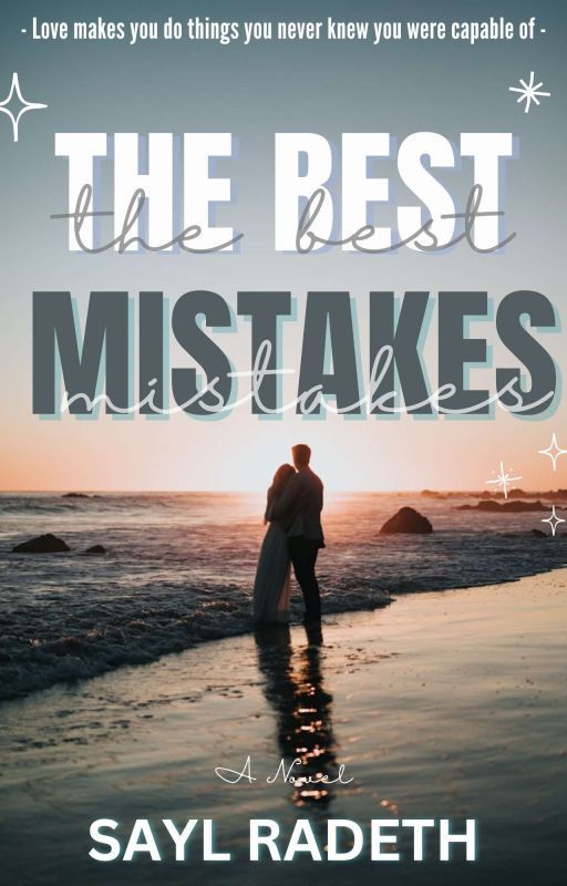
The Best Mistakes by saylradeth
Review:
The Best Mistakes has an absolutely beautiful cover that literally shines a light on you with its pretty background image. However, as nice as the background image is, my main praise is the title card and how the title is placed perfectly with little shadows of each word being present within the words themselves. The font and font color for every word on the cover is very nicely chosen, and I overall really like this cover and think it works perfectly for setting the vibe of the story and getting readers to want to click. If I saw this cover while scrolling through Wattpad, I'd probably want to click on it!
The only main critique I have is about the stars, the four-point ones. The one on the left cuts off a bit, and the three on the bottom right are easy to miss, so I'd suggest increasing their size, and also moving them a little bit away from the edge since two of the three look like they're on the verge of getting cut off. You might also benefit from increasing the font size of the "A Novel" above the author's name since that's also a little hard to read, especially in combination with the cursive font that's really narrow.
All in all, The Best Mistakes has a cool cover, with the title and how it's styled being one of the best parts. It's a gorgeous cover that will stand out from other covers on Wattpad. The only critiques I had were to consider playing around with the four-point stars on the cover and consider increasing the font size of the "A Novel" on the bottom. Otherwise, I think the cover is awesome.
1st Place
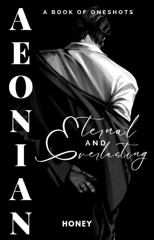
Aeonian by sugararmy07
Review:
You already know that I like your covers and think they're always good, and this one is no different. I think the aura this cover has is strong and gets the reader ready to, well, read. The text arrangement is good, and everything looks clear somehow despite the dreaded Wattpad blur. The background image is good, the chosen font is good, the black and white color scheme is good, and the placement of the title on the left side is unique and stands out. It's a great cover that caught my attention.
The only minor thing is the contrast. I like the choice to make this a black and white cover, though some areas blend together and could be fixed by playing with the contrast, like the man's jacket completely blends into the darkness of the rest of the cover, and some parts of his hair do as well. So consider playing around with the contrast to give it more distinguishability, though, with that being said, I still like the b/w concept and how it is applied here.
All in all, this is a very neat and elegant cover that chooses a mysterious image with good fonts and clear text placement to make it pop out. I liked the way you included the definition of the title as subtext with the E stretching down and filling both words Eternal and Everlasting. It's overall a good cover. The only minor suggestion I had was to consider playing with the contrast to make the dark colors stand out more from one another rather than blend together, but it is otherwise great.
Honorable Mention
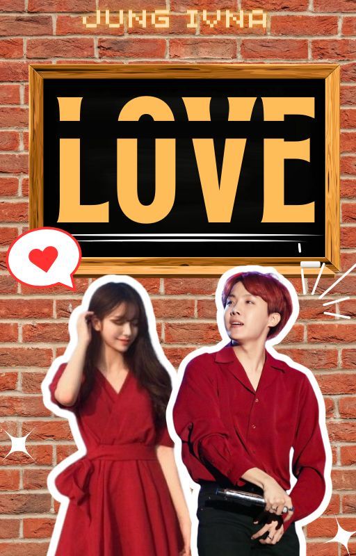
Love by ivna_jung
Review:
This cover, to me, screams 70s/80s sitcom. Am I the only one thinking that?
It's a cute, charming cover that gives us the vibe of the book perfectly. The brick wall is simple but works for giving the characters and the love sign some pop, and I really love the picture of Hobi. Hoseok being my bias wrecker is making me think of unspeakable things, so I'm gonna have to stop here before I start barking for Jung Hoseok in a public contest, and while I know you may like that, I would rather not embarrass myself.
...yet
I only have a couple of critiques. The first one is the woman looks a little blurry compared to the rest of the cover, particularly her face, and it's only really noticeable because she's right next to Hoseok, who is crystal clear. He's clearer than my eyesight, so the contrast is a bit noticeable, and that's why I'd suggest playing around with the image and making it a little clearer if possible. I like that image, so if you can make it clearer without needing to replace it, I think that's great since it's still a really nice image.
The second thing is the "Love" sign is a little off-center. By that I mean, you can see there's more space between the edge of the love sign and the end of the cover on the left side than there is on the right side, so consider moving it to the left just a bit to make it a little more center-aligned.
All in all, Love has a charming, unique cover that reminds you of old sitcoms and immediately sets you in the mood to read the book. My only critiques had to do with the picture of the woman being a bit blurry and the love sign being a little off-center. Otherwise, I think the cover is great.
Honorable Mention
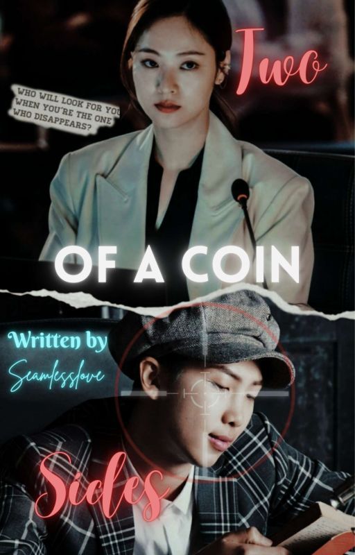
Two Sides of a Coin by Seamlesslove
Review:
Two Sides of a Coin has an interesting cover, and my biggest praise for it is that it fits the story perfectly. I cannot overstate how perfectly it fits in with the atmosphere of the narrative. I love all the pictures and how much style this cover has. It's one of the most stylized covers in the category, and it definitely oozes "Seamlesslove" vibes. The cover is clear, I like all the fonts, and I think it perfectly captures what the book is going to be about without anyone needing to even click on the blurb to find out.
I only have two critiques. One, I'm not the biggest fan of the placement of the author's name, and also the color. I feel white may work better, though I can appreciate what you were going for. If what I'm assuming is correct, the blue was meant to contrast the red to make it almost like police sirens, so I can appreciate that. If the placement is tweaked, I could probably get behind it, I just wasn't a huge fan of the placement being right in the middle, almost interrupting the flow of the way the Two Sides then the of a coin are placed. It's right in the middle of that, so consider shortening it to Seamlesslove and placing it near one of the four edges depending on personal preference and where you think it might work best. But it also depends on what your intention was by having the author's name in the middle, so it could go whatever way you think works best.
The second critique is minor and more of a nitpick, but consider moving the "Two" to the right just a tad since you have a lot of space on the right, and it's a little close to the woman's head and could benefit from being moved just a little bit to the side. Not much, just a tiny bit.
All in all, Two Sides of a Coin has a cool cover that perfectly captures the vibe of the story and pretty much tells you the plot and genre just by looking at it. I like the chosen pictures and the overall style of the cover. My only two critiques were to consider playing around with the placement of the "Two" and the placement of the author's name. Otherwise, I think the cover is super cool.
ALL REVIEWS:
FOREVER MINE by janefanfics
Review:
FOREVER MINE has a dark cover that reflects the mature subject matter that will be present throughout the narrative. I didn't read the book as it's the best cover category, but based on the blurb and the overall vibe the cover gives, I can tell this is going to go into angsty territory, which means the cover reflects the atmosphere well. I like the positioning of the characters on the cover and how Taehyung is more in the darkness with hints of light on his face while Jennie is almost completely shining in the light, giving the feeling that Taehyung is watching her and she's not aware of it. It's like the light is part of the story, and I love how you use every part of the cover to bring it life.
Moving into suggestions, the only thing about the cover I think could use improvement is the text. The author's name is fine, but the title and subtext are really, really hard to read, particularly the subtext. There are a few suggestions I have, like considering brightening the text. I like the font so I don't think any changes need to be made there, though I'd suggest considering making the text brighter, maybe making it larger so it captures more attention, and/or consider adding outlines to the text to give it more pop and readability. I'm not saying you have to do all three of those things or even one of them, but those are just a few suggestions to make the text more readable since the title is hard to read, and I don't know what the subtext says because of how dark it is. I encourage you to play around with it to make it more readable! I hope those suggestions make sense.
All in all, the cover has an interesting concept I think was executed well. I really love how Taehyung and Jennie are placed and how the lighting tells its own story. My only suggestion was to adjust the title and subtext, but particularly the subtext, because both of them are hard to read. Otherwise, I like the cover.
Summer, My Best Companion by shinhaari
Review:
Summer, My Best Companion is a Jimin story, so hey, that's cheating!!!! You know my bias toward that beautiful, gorgeous, pretty man-
Okay, I need to stop.
In all seriousness, that is a great, well-chosen and clear picture of Jimin that's clear enough to break the curse of the Wattpad blur, which is impressive. I really don't know how people get around it, but it's really clear to the point where not even Wattpad's blur curse can touch it. I also like the vibes the cover has with the pink background, and it looks like you did minor color correction and/or bumped up the saturation to give it more of a cherry pop, summer-like feel. Considering the title, I think that's the perfect atmosphere. When it comes to the vibes and picture, I think you did a great job with this.
The only critique I have is about the text. First and foremost, I don't think the subtext is needed. The font color is completely different from anything else on the cover. While the title is white, the subtext is like a brownish color, which, in my opinion, doesn't fit in with the rest of the cover. So I didn't think it was needed. As for the title card, I'm not sure how to feel about it. On one hand, I like the font, but I almost wonder if a gradient for the color would give it more pop. Like a summer-like gradient, or something similar. Maybe that's just a personal thing because the white still looks nice, but maybe it could look cool with a summer gradient. If it looks like it's doing too much with a gradient, then I'd say no don't do it, but if you think it looks nice, I'd say go for it. There also looks like there's a white underscore right in front of the "By" and over Jimin's shirt, right near the strap of his bag. I'm not sure if that was purposeful or not, but I'd recommend editing it out if possible.
All in all, Summer, My Best Companion has a clear cover that screams summer vibes, which is perfect considering the title and subject matter within the story. Jimin is looking as fine as ever, so that's always a plus. My only suggestion was to consider playing around with the font color and subtext to make the overall cohesion stronger. Overall, it's a nice cover.
Titles To Me by ParkAaimin
Review:
Titles To Me has a cover with a pretty, attractive color scheme. The red and black color scheme is visually satisfying to look at, and I like the picture selected of Taehyung. It radiates a feeling of elegance that I imagine matches the story's plot really well. Some people love blurs, others don't, but I personally like the blur effect the cover has here. It gives that aura of mystery, and after reading the blurb, I think the aura of mystery fits in perfectly with the narrative.
When it comes to suggestions, I'd suggest playing around with the text placement and font. The font is okay, though I feel a more elegant font may fit the concept of the cover more. The cover radiates this elegant vibe due to the color scheme being dark and mysterious, and the picture of Taehyung is very formal, so consider playing around with the font. As for the placement, consider moving the title card up a bit to be more center-aligned since it's a little off-center as is. I'd recommend playing around with where you place the title since I think there are many ways you can place it!
All in all, Titles To Me has a cool cover that has a fantastic color scheme and a blur on the cover that I personally like. The picture of Taehyung is a great one, too. My only suggestion was to consider playing around with the text placement and font to give it a little more visual cohesion. I hope that makes sense!
Whispers of the Heart by Hells07Dealer7
Review:
Whispers of the Heart features a very clear cover with an easy-to-read title card. I love the font of the title, and also the font for the cover/writing credits and the subtext. I like the contrast where the title is this elegant cursive while the rest is plainer but also not so plain that it draws unnecessary attention to itself. I also like the little twinkles surrounding the title. Those twinkles aren't overdone, and they add a little extra spark (literally) to the cover that makes it stand out more compared to other covers on the site.
My main critique is the picture feels a little oversaturated, and maybe consider toning it down a bit so the red isn't as overwhelming. The cover is mostly red, so it does feel a little overwhelming. Jungkook's face in particular is really bright and could benefit from being toned down a bit. My second criticism is to consider tweaking the text on the bottom of the cover. It's really hard to see, and upon zooming in, it's also blurry. It's the only part of the cover that's blurry. I feel like it isn't needed, too. It's really long and feels more like a blurb, but you have a blurb, so I don't think you need to have that much information on the cover. Consider making a short sentence as the subtext so you can still have something there, but you can make it clearer since it won't be as much text all in one area, and you can also make it a little larger so we don't have to zoom in to see it. I hope that makes sense.
All in all, Whispers of the Heart has a nice cover with cute elements, such as the little twinkle star-like things and the elegant font of the well-placed title. My only suggestions were to consider downsizing on the saturation, particularly on Jungkook's face, and considering tweaking the subtext on the bottom since it's a little long for a cover and hard to see. I hope those suggestions make sense.
Art? Graphics by SeraDrake
Review:
Sometimes the simple covers are the ones that go a long way. This cover is simple, but that makes sense considering this cover isn't for a book, it's for a graphics portfolio, so the focus is meant to be on the prettiness rather than a certain subject or theme the cover would show via subtext, so I can appreciate the simplicity. I also liked the choice to keep the "graphics" lowercase while the art remained capitalized, providing a nice contrast. The cover does what it needs to to introduce the audience to the graphics portfolio, and considering how pretty it is and how nice the font is, readers are going to get excited to see what awaits them in the full portfolio. The image is my personal favorite part because of how many layers and gradients it has. It looks like something a famous painter would paint, or the best photographer would capture during the most beautiful day of the year, and I think that works perfectly here.
The only critiques I have are I feel the author's name could be moved down just a hair, and also consider making the Art? graphics? part a bittttt larger so they're easier to see. Granted, I have the eyesight of a bat, but the author's name is placed over a busy part of the background image with what looks like a branch-like thing behind it, so it could benefit from being moved down a bit to avoid that branch-like thing and give itself more individuality, if that makes sense. Moving back to the Arts? graphics? part, I really like the style of them, and like I said, I liked the choice to keep graphics lowercase. All I recommend is considering increasing the font size. The background image is beautiful but busy since there are many gradients and pieces of nature that make the title blend in a bit, so that's why I'm recommending increasing the size, that way it stands out from the busyness and, like the author's name, has more individuality. I hope that makes sense!
All in all, the cover for Art? Graphics? works really well, especially for an art portfolio. The emphasis on the prettiness and aesthetics was awesome! I saved the picture to load it full-screen, and it looks 2x better in full-screen than on Wattpad, which is really unfortunate that Wattpad is hiding the quality of the beautiful background image, but considering it still looks gorgeous even on Wattpad, that goes to show how well-chosen the picture was. My only critiques were to consider tweaking the size and placement of the text on the cover, but it's otherwise very pretty and interesting to look at.
Roses and rifles by taekookiecookie
Review:
When I saw the title of this story, the American in me shouted RAAAAH GUNS N' ROSES RAAAAAH, so that made me think I was going to see a cover with literal rifles on it, though I must say what I saw instead was far better than that, haha. I wasn't expecting the elegant vibe this cover would have, but I mean that in the best way possible since the elegance is my favorite part.
I really like the concept of this cover and how there's a locket with the two pictures inside. Not only does this subtly hint at what's to come when we read the book, but it's also visually appealing. Taehyung in particular is photoshopped really well onto the locket, but both of them look good. I love the color scheme and the font of the title, and I think the title is placed well on the cover. You did a great job bringing this cover to life and making it feel sophisticated without overdoing it in any way. It subverted my expectations in the best way possible.
As for critiques, I don't have many. I have two, to be exact. One is the placement of the author's name. I feel like the placement could be either directly above the title or center-aligned with the overall cover. It's kind of hovering in between being over the title and being center-aligned, so it feels a bit oddly placed, in my opinion. I would suggest moving it over to align it with the title since I feel it'll look more visually coherent there as opposed to center-aligned, but if you think it looks better center-aligned, I'd say go for it! I'm far from a graphic designer, so I know a lot of this comes down to personal preference and what you think will work best for your cover. As for the second thing, it's about the subtext under the title. Since there are so many words, it's blurry. The more words there are, the blurrier it gets for Wattpad covers, so I have a couple suggestions for alleviating this. One is to cut down on how many words used and instead have one short line that can hook readers in. Or you can remove the italics and make the overall text a little bigger so it's easier to read. I don't have great eyes, but I did have to zoom almost all the way in to make out what the subtext was saying, so that's why I'm suggesting adjusting it so it's a bit easier to read. I hope that makes sense.
All in all, Roses and rifles has an elegant, attractive style to it that makes it stand out from other Wattpad stories. The concept of the cover with the locket and the two pictures inside was really well done. It's a visually appealing cover that will draw readers in. My only critiques had to do with the text placement and size, but it's overall a great cover.
The Sweets Baker and Jin by LAJoyner
Review:
The cover here is super cute and charming, and I think it fits in perfectly with the title and what I imagine the story is about based on the blurb. The picture of Jin is absolutely adorable and almost bias wrecked me. I love his eyes and how it radiates the story idea in them. I know that probably doesn't make sense, but what I mean is the way it's such a soft picture with his puppy eyes on display makes me think the story's gonna be super soft and fun, and that when combined with what I mentioned before (the title and blurb) makes me think I'm guessing correctly, so that means the cover perfectly matches the atmosphere of the book! I also really like how you can tell it's going to be about baking based on the background image.
I have a question, but this won't factor into the placement or anything: I saw the same cover used for your WWH story, and I'm wondering if that's like a sequel to this book? The cover is identical aside from the text, so I was just curious. I almost judged that one by accident, so that's why I was a little confused about it, and I'd be curious to know if it's like the spiritual successor or something of that sort. Again, doesn't factor into the placement, just something I'm curious about.
Moving more into the objective side of things, the only critique I have is a little major, and it's the title. I really like the color of the title, though the title feels a little, how do I describe it? I'd say compressed? It feels like it's kind of squeezed in there and not given space to breathe, so I'd recommend spacing it out a little since you have a bit of room on both the left and right sides to give it that space. You could also decrease the font size a little to fit some more in, that way you can space it out more and give it some space to breathe. As a result, it almost makes the Jin picture look a bit off-center. I don't think it actually is, but the compression is playing tricks on my eyes and making me think it is.
All in all, the cover for The Sweets Baker and Jin is very cute and charming, and it has an adorable picture of Jin that will make anyone go awwww. My main critique was the title felt very compressed, and as a result, it almost made Jin look a little off-center, so I would recommend playing around with the title and giving it more space to breathe, if that makes sense. Otherwise, I like the cover.
Bạn đang đọc truyện trên: AzTruyen.Top