i. color pallets.

✴️ O DE TO V IC ER O Y ─── an aesthetic assistance book , brought to you by E DD I E .
〰
color pallets can be both incredibly fun and stressful if you're not too sure about how to tackle them. through the years i'd like to think i've learned how to go about creating an aesthetically pleasing color pallet, although this is all evidently mostly just my opinion and preference ... don't take any of this to heart if it's not your style.
here are the basic steps i use when looking and combining images:
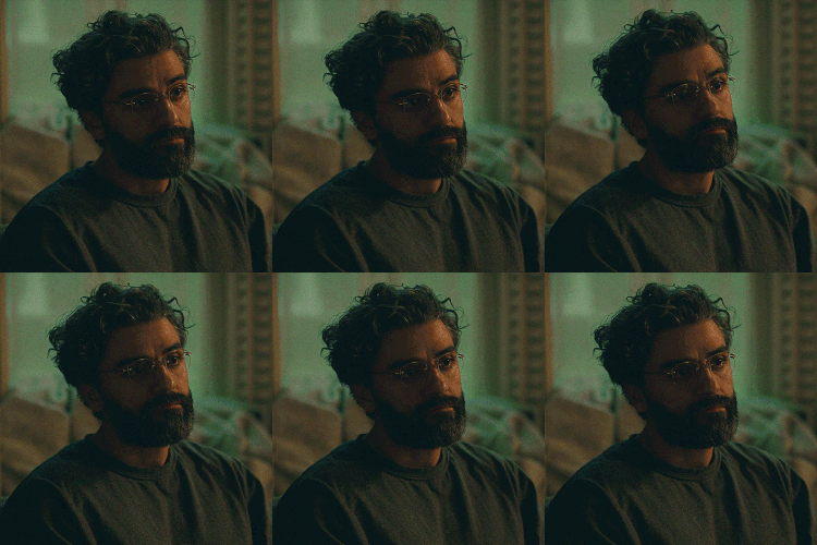
- start with one image that seems to fit your character or books aesthetic. one images color pallet can determine the entire vibe of the book. once you have a general imagery established, i'd look for a simple banner, especially if you're including a lot of text art, it's better not to overwhelm the eyes with multiple quotes or information to take in at once. this takes TIME, sometimes you'll collect sixteen pictures but only use a couple or crop out bits and chunks of it. i had MULTIPLE more images for my oc, buckett's form but i only used the ones that made it into the final cut!
example:

INSERT TITLE OR OC NAME !

yes, you may notice i use this bronze-ish line a lot. it goes really well with my preferred, more muted color palette, although you might prefer more bright or dark colors. you don't always want to use solid black, even if it matches your basic image. the brown, in my opinion, highlights more information. here's an example with grey, instead:

INSERT TITLE OR OC NAME !

not has popping, right?
the bronze brings out a bit more of the kittens tongue and brightens the image. welcome to color theory, i guess?
once again, this is my opinion and how i function - i'm just trying to show a bit of my process. feel free to tag me to books you'd like help with if you think i'm worthy of giving advice - ask questions below!

© DOWNSTAIRSNEIGHBOR , 2O24 .


Bạn đang đọc truyện trên: AzTruyen.Top