Contest #1 / Entries

If you've submitted your entry but can't find it then PM me ASAP!
1. STORM_cloudx

I like the cute animated girl kissing the guy at the back UwU. Ellipses after the title was unnecessary but that's okay (: Overall, I like the cover and it's very cute
2. thejadelover
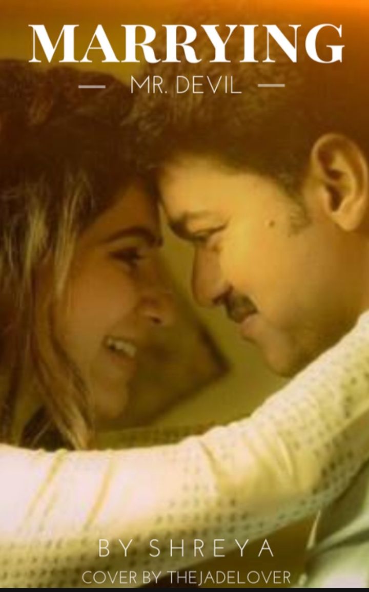
I saw your resources - you found a picture online, cropped it and pasted on text. But I feel like you could've put in more effort into your entry, found a better quality picture, but that's okay! Good luck next time (:
3. notsoaureate
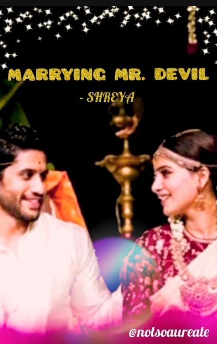
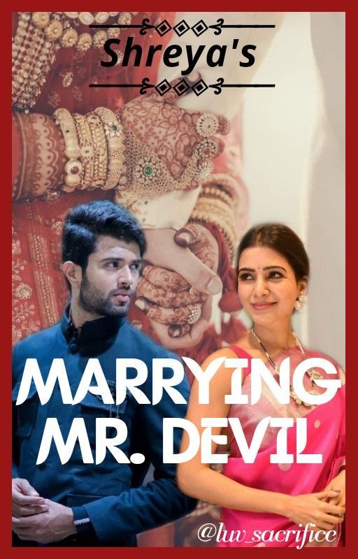
The picture you've used is blurry, And you could've used some other font that would've blended. Instead of golden coloured font you could've also gone for white.
Is it just me or have you cropped out a bit of Deverakonda's eyes? XD I like the cover, the Photoshop could've been done a bit better but that's all.

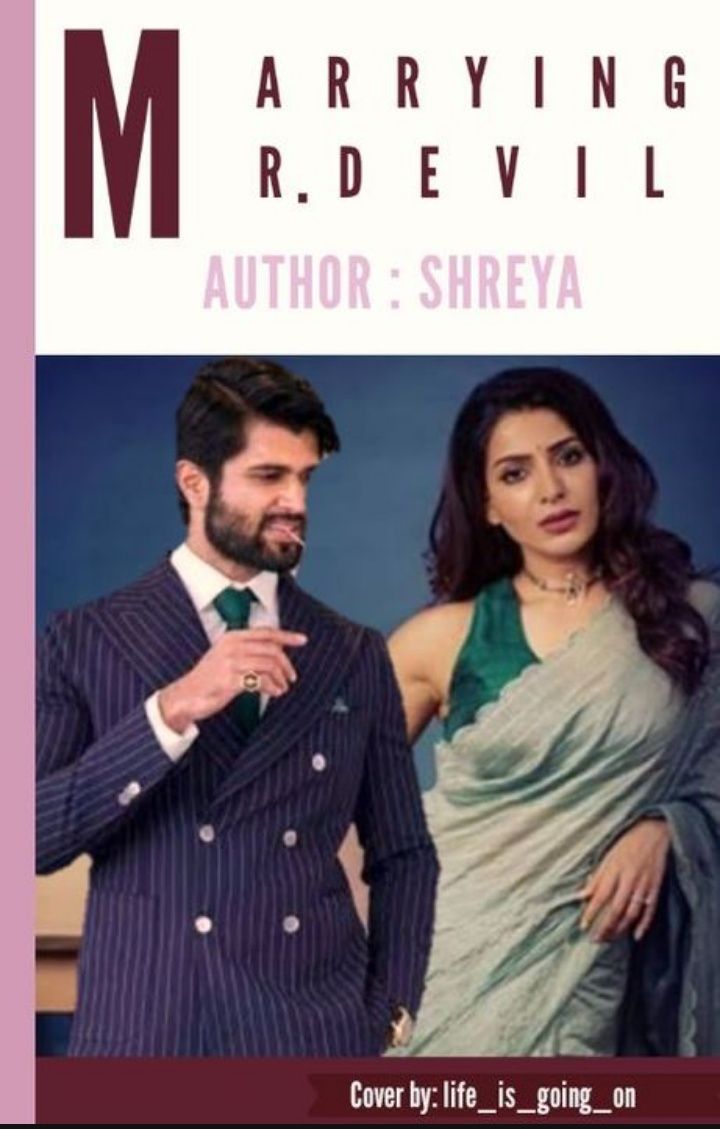
I absolutely love the cover! You've used both the face claim which I appreciate. The font placing is a bit messy, other than that I LOVE the cover! Good job!
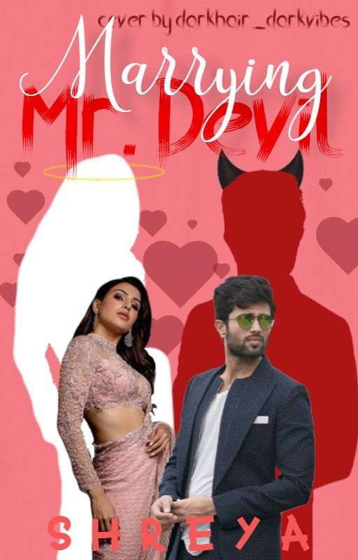
6. blissful_cat

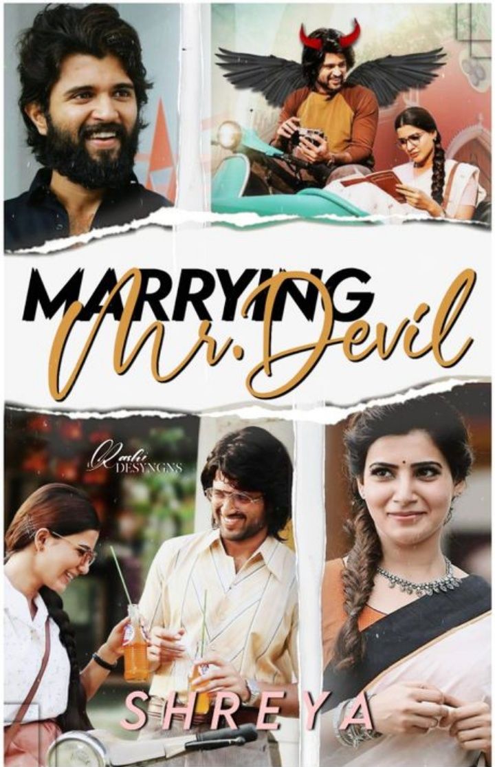
Brownie points for creative thinking ~ the horns! The author's name is not very visible, other than I love everything, including the font. Nice!
The cover looks professional! Definitely my favourite haha. I am happy that you used the face claims but I personally feel like they take away from the cover. Just the girl and guy with horns at the back would've sufficed (:
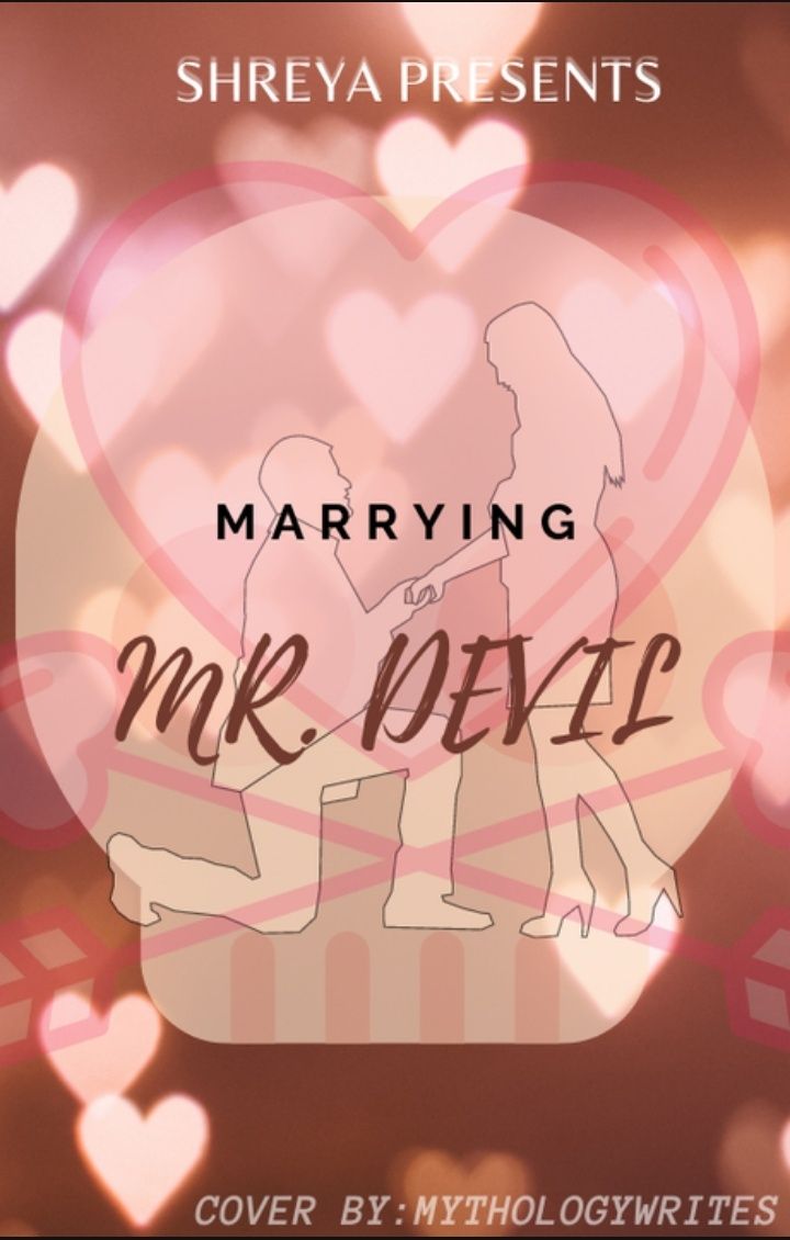
The font size and colour is too bold. The design at the top around the author's name sticks out like a sore thumb, also I feel that putting the author's name at the end and the book name at the top would've looked better.

Rashmika and Deverakonda are too cute! 💖 Love the font and pictures used. Amazing! (:
I love it! Those two look so cute together! <3 I like the font colour of the book name but the author name has blended in a bit too much and is not so visible until you look for it, maybe the change the colour? Nevertheless, Good job!

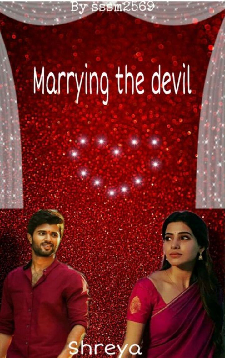
Was the white outline done on purpose? I suggest you remove those. The font doesn't fit in with the covers, the white colour of the font and the background blend in a bit too much and it's hard to see. The author's name is usually put in the middle but this isn't bad either (: Good luck!
12. 0855MADGIRL

The picture looks just a bit blurry-not sure if it's my phone or not. I like the neon blue background thing you've done. The author's name could've either be put in the centre at the top most or after the book name. Either way Good job! <3
13. MythologyWrites
14. sssm2569
15. KetamBolaa

The cover didn't turn out perfect—Anushka's face looks weird and Vijay's face doesn't look like his at all, BUT considering that this was your first time trying Manip this isn't bad at all (: Good job!
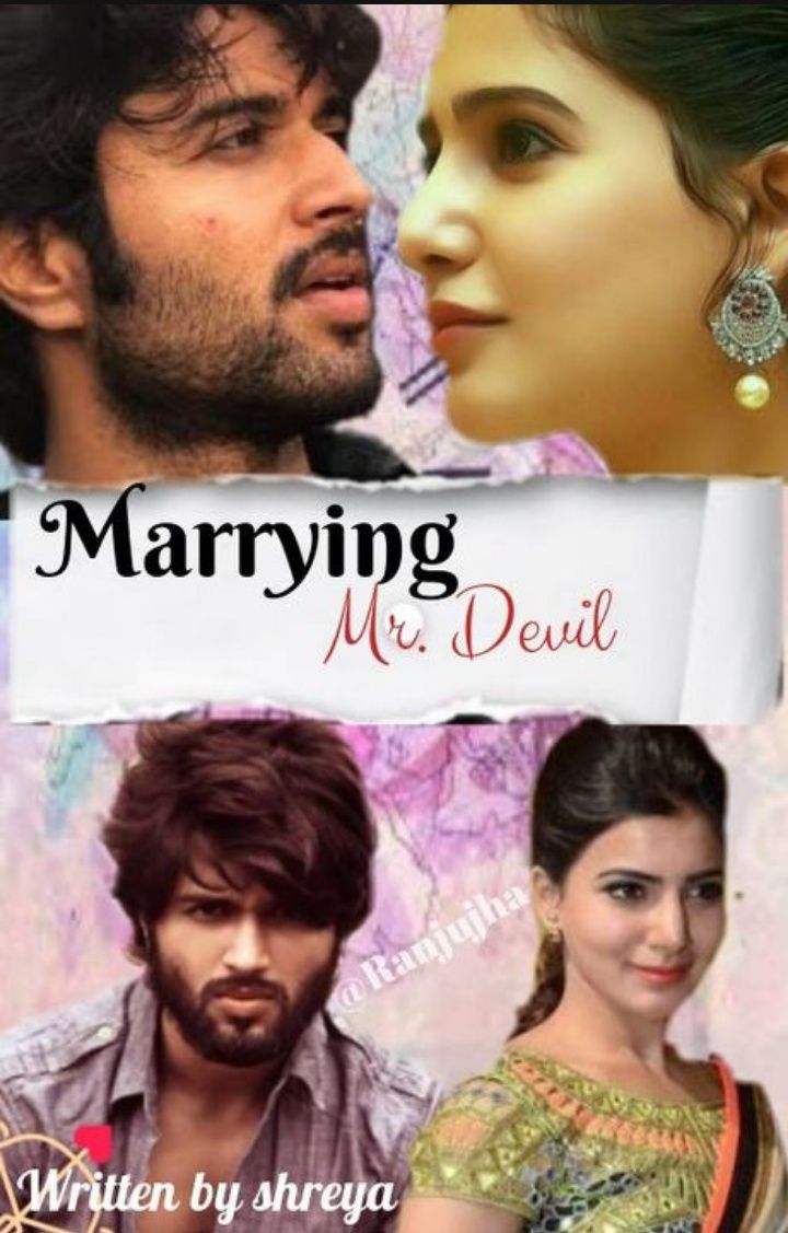
16. Ranjujha
Bạn đang đọc truyện trên: AzTruyen.Top