ıllı﹒𝗥𝗲𝘀𝘂𝗹𝘁𝘀 (𝗕𝗮𝘁𝗰𝗵: 2) 𓈒 𓈒 𓈒 🦇
Hello everyone!! We are back with the result. Thank you all for participating in this contest. Every cover was very good.
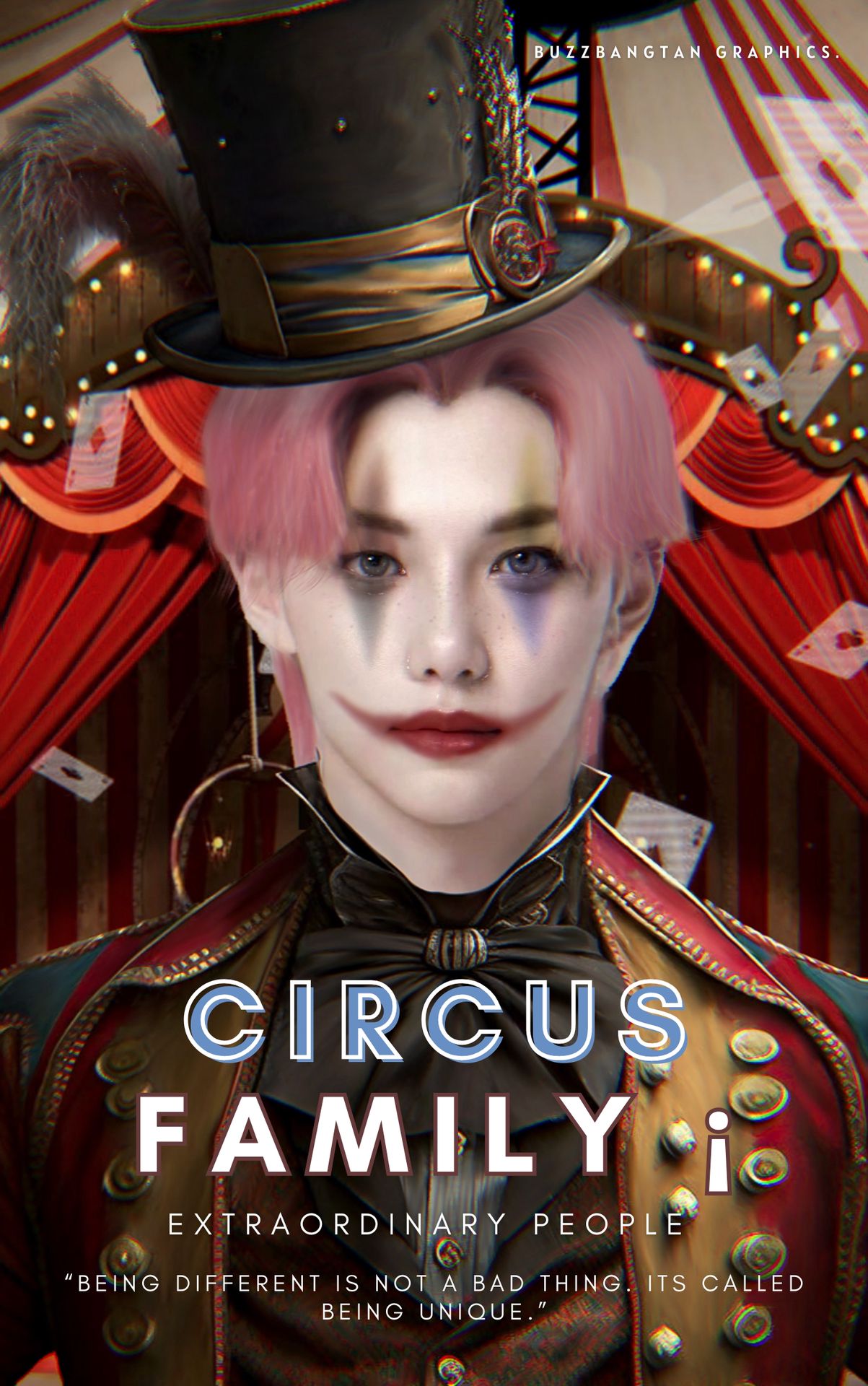
1st PLACE WINNER
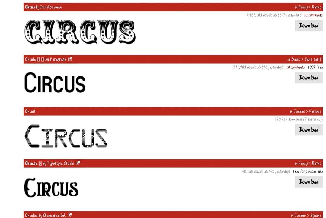
Font style: 2/5
Is not bad but try using something theme related here are some examples.
Font Colour: 3.5/5
It's just plain white but as you use some tints of white, like the mask and Felix's collar it can look great with the right type of font. Always stay in the same colors as the pictures itself.
Placement: 6/10
The placement of the title is a bit too low and small. A title is one of the main things that a reader should notice on the spot. Try to make the title longer in height.
Blending: 7/10
This is something that's very hard to do but you managed to do it so well. Only the hair on Felix is not cut out properly which is noticeable. Also one little thing: try to smoothen the edges.
Colour Scheme: 10/10
I really love the vibrant color. You really did what I asked for and it fits well together. So here well done!
Originality 7/10
The heart shape close up is really nice plus adding a mask and some clown make up is top notch! But a person just posing like this on a cover is not much creativity.
Quality: 9/10
The quality of Felix is great, the background is a bit blurry so I guess you wanted to make Felix stand out more? right? If not then use a much more high quality background. I will give you the benefit of the doubt for the points.
Total: 44.5/60
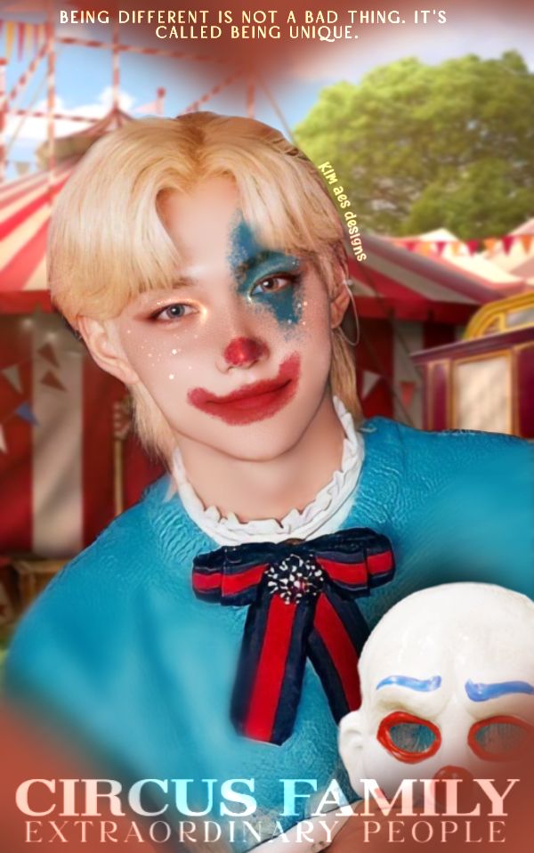
2nd PLACE WINNER
Font style: 2.5/5
The font style is too simple but not bad. Use these instead to get more into the theme.

Font Colour: 3/5
Use a gradient with red and white like the picture above (circus fun). But again it’s not bad.
Placement: 7/10
The title, subtitles are placed well but try placing, or title and subtitles above Felix's head or the quote above but not all. It’s too overwhelming if they are all at the same place.
Blending: 9/10
Blending is really nicely done! I don’t see edges at all and they all are sooo smooth. Plus his face is painted so well.
Colour Scheme: 6/10
It’s not very colorful, the only thing I notice (that pops out) are red and gold. It needed to be colorful, meaning with a lot more colors.
Originality : 7/10
Not very original as it’s just a front view of a person but adding a hat and doing a manip on the body makes it better.
Quality: 7/10
The quality of your cover is really good. Only thing I need to add is that Felix looks different from the rest. Meaning that he is too pale. Add some color saturation. Also add some sharpness so that he blends in more with his body.
Total : 41.5/60
Congratulations to both the winners, you guys did an amazing job the review of others will be provided through DMS.
Bạn đang đọc truyện trên: AzTruyen.Top