|| PORTFOLIO ||
{ ABOUT THE DESIGNER }
Hey, everyone! Lei here.
A quick background about me:
I'm a visual artist by trade. Although, I'm not as active since I'm teaching part-time at my old art school.
I'm not technically a graphic designer per sé. I'm a Fine Arts graduate (Note: "fine arts" instead of "design", and google the difference ), but I did have a Creative Design subject (which was 7 years ago where I almost flunked it. Yikes!) that I heavily rely on in making my designs.
I'm currently in the midst of writing two novels: DITCH (YA coming-of-age story) and The Misfits (YA Sci-Fantasy Romance). *You'll see their covers in a bit.*
I'm currently the mom of a rambunctious month-and-a-half-old puppy and a doting aunt of a 2 months-old puppy who made it her entire life's mission to be my shadow - so you can imagine how my day is spent.
The primary type of graphics I usually work with are: covers, banners and signatures.
The genres I have worked so far in are mainly teen fiction and romance. I did make graphics for poetry books, fantasy and thrillers.
I should probably mention that I've never tried making any character aesthetics, but I like to explore and develop my range in design. This include different types of graphics and genre.
I currently work with a Photoshop CS5 using a ten year-old Core I3 laptop. My newer laptop got broken and my PC is out of order, so I had to downgrade.
My designs range from minimalist styles (simple manipulation and word marks) to complex ones (full-on manipulation and effects). However, since I'm dealing with a relic of a laptop, I might only go as far as in the middle of that spectrum.
Please note that I generally use unlicensed photos and seldom use copyrighted photos (unless they're fan-fics or if I'm desperate ). The font types are either sourced from DaFont or 1001Fonts.
I am also very particular with my images and texts so I tend to overthink a lot and overstock photos and fonts (also, a leading factor in a prolonged work period).
I weigh my composition carefully by considering consistency of style, hierarchy, movement, contrast and the memorability of the design.
With all these said, I present to you my portfolio.
╫¤╫ ● ∞ ¤ ∞ ● ╫¤╫
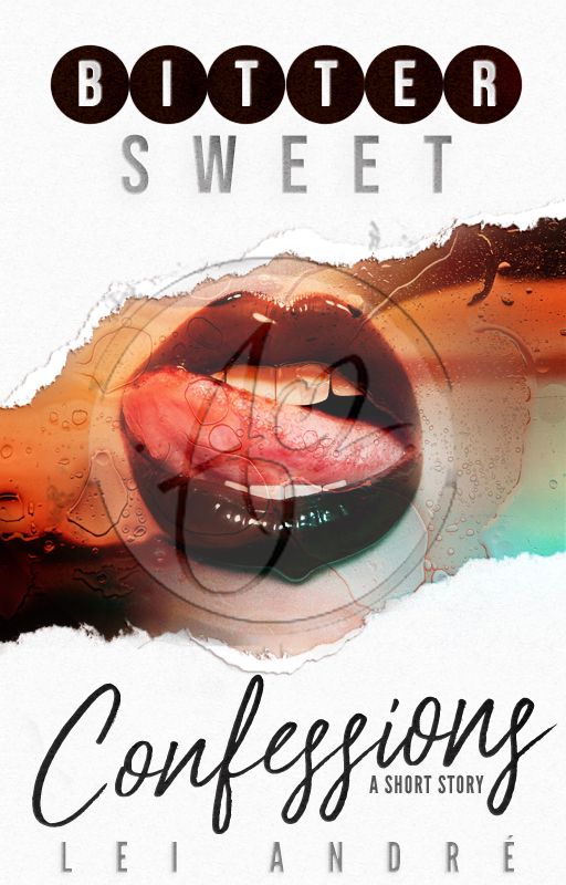
Title: Bittersweet Confessions by LeiAndre
Genre: Short Story
Graphic Type: Cover
Duration: 2-3 hours (within intervals)
Concept: A placid and soft-spoken girl who experiences a sensual awakening.
Aesthetics: The white papery background represents her self-view as innocent and pure. The torn paper is almost like a page from a diary (which is where people usually write their innermost thoughts). The woman licking melted chocolate on her lips personifies her acquired addiction, while the candy-ish surface hints that this addiction would eventually drown her in. I wanted to add contrast with the title, so I used chocolate-colored circles behind the letters for 'Bitter' and a script font style for 'Confessions.'
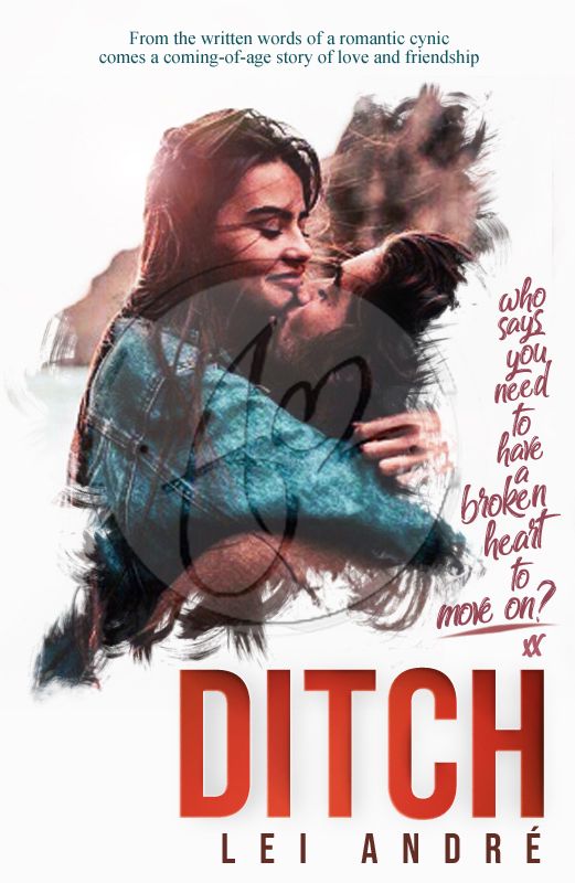
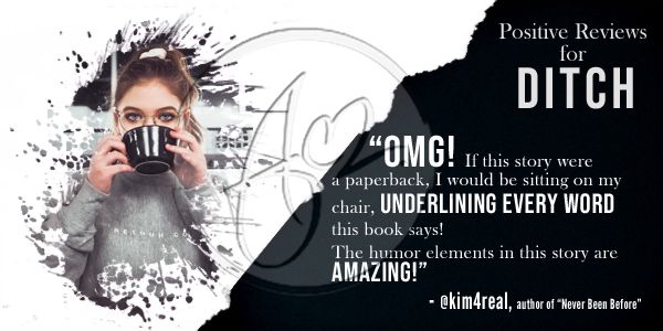
Title: DITCH by LeiAndre
Genre: Teen Fiction
Graphic Type: Cover (Front)
Duration: 3-6 hours (within intervals)
Concept: A contrasting misdirection from the meaning of the title; fun and vibrant colors like the mood of the story
Aesthetics: I've always been a huge fan of contrasts! My favorite contrasts are usually expressed through colors - hence, the split-complementary color scheme of red, orange and blue-green. The photo has been retouched from its originally dull hue and manipulated with some brushed. The white offers a minimalist style and simplicity to make the colors and star image pop out even more. The white space is likened to a sketch paper with the star image looking like they have been painted over it (a nod to the character's artistry). Fonts are comprised of a sans-serif for the title and author's name; a script for tagline #2, and; a serif for tagline #1. The blue font color corresponds to the main character. The tangerine color connects the word "DITCH" to the male character. The red font is the same shade of the main character's lipstick.
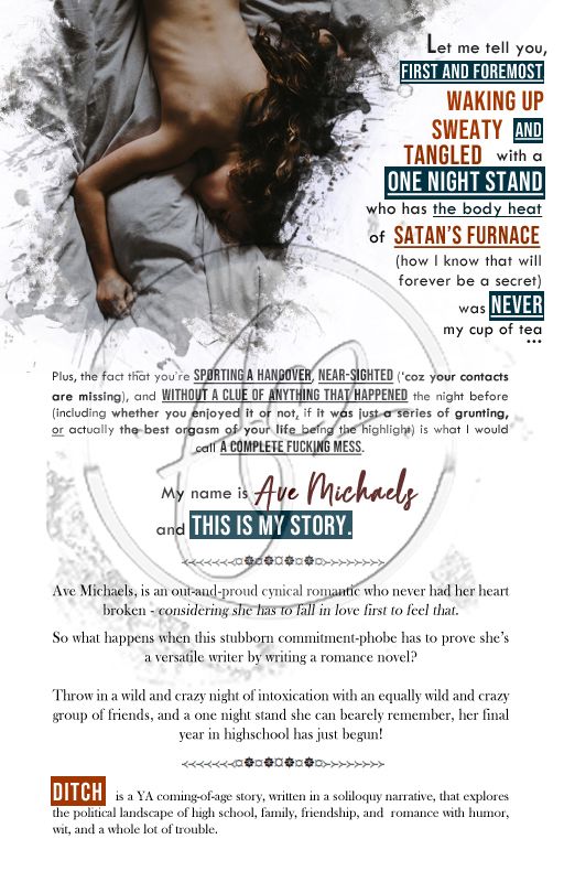
Title: DITCH by LeiAndre
Genre: Teen Fiction
Graphic Type: Cover (Back)
Duration: 2-3 hours (split between two days)
Concept: The heroine is splayed naked under the sheets - as if she's in quiet contemplation
Aesthetics: The star image fleshes out a scene from the prologue. I wanted to be consistent with the style and contrast, so I made sure to keep the split-complementary color scheme, as well as the fonts from the front cover. The sans-serif font is used for the passage taken from the book; the script font is used as the character's personal penmanship, and; the serif font for the synopsis.
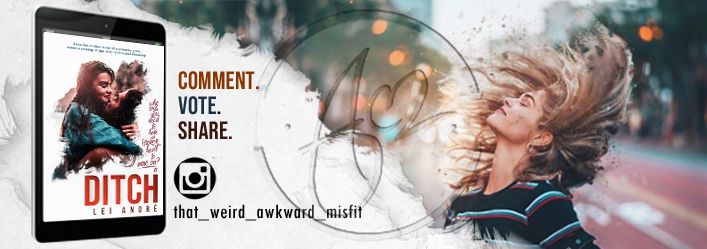
Title: DITCH by LeiAndre
Genre: Teen Fiction
Graphic Type: Signature
Duration: 2-4 hours (mostly on setting the dimensions size)
Concept: A carefree girl walking in the middle of the street; the book cover advertised as an ebook on a tablet, along with the reminder to comment, vote, and share.
Aesthetics: Again, I kept the style consistent - especially with the white space bordered by brush strokes. To balance the tablet, I included an image of - what I hope - embodies the main character's carefree spirit.
Title: DITCH by LeiAndre
Genre: Teen Fiction
Graphic Type: Banner
Duration: 1-2 hours (within intervals)
Concept: A quiet read with a cup of coffee; a more formal look for the text
Aesthetics: This time, I kept the colors simple with white as the main focus of color. The star image was masked and made to look like it's being painted on the white background. To give that neutral look, I used a darker shade of blue green to make the white stand out even more. The title retained its identifiable font style. The sans-serif was used sparingly to highlight the important lines.
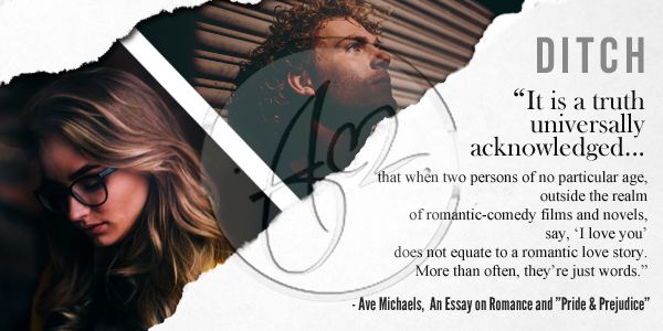
Title: DITCH by LeiAndre
Genre: Teen Fiction
Graphic Type: Banner
Duration: 1-2 hours (within intervals)
Concept: A guy and a girl representing the cynical view of the main character towards a love story
Aesthetics: In this design, the contrast is between the star image and the surrounding white space. The colors are focused with the two characters. The star image was retouched with an even more dramatic lighting. The text was made simple. The style remains consistent with the other graphics with its paper-tear effect and the title's font.
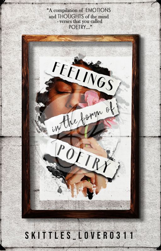
Title: Feelings in the Form of Poetry by Skittles_Lover0311
Genre: Poetry
Graphic Type: Cover
Duration: 3-4 hours (+ 30 mins of sketching a draft; within intervals)
Concept: A wall painting showing a girl with a melancholic expression despite the vibrant colors used on her and bordered with a wooden frame
Aesthetics: TBH, I was inspired from the cover album of the Civil Wars and Jay Asher's "Thirteen Reasons Why" book cover even before reading this book. The book itself is a compilation of different poem, its mood ranging from tears to laughter. Using the original book cover, I retained the image of the flower. This time, however, it's being held by a girl. The girl's expression represents sadness and melancholy, yet the image's saturation represents that there is a vibrancy there which we directly relate to joy. The empty frame is there to put the focus on her. Torn pieces of paper were used to cover her face, letting her written words speak for her. The fonts were limited to 3 as to not overpower the image, and I used a center-subject composition with a z-form navigation for the title.
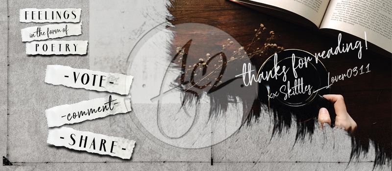
Title: Feelings in the form of Poetry by Skittles_Lover
Genre: Poetry
Graphic Type: Signature
Duration: 1-2 hours
Concept: The reader with a cup of coffee and a book
Aesthetics: Using some elements from the cover design, the signature remains consistent in style. This time the white space is overlayed with a wall texture, yet it resembles a papery effect at the edges near the star image. The star image - of course - is kept simple . I added the words: vote, comment, and share and made sure they resemble the title's z-form navigation - as well as the torn-pieces-of-paper-effect. The title, as well, retains its look so it would be easier to identify and remember. Lastly, to make it more personalized, a thank-you message from the author in a hand-written font.
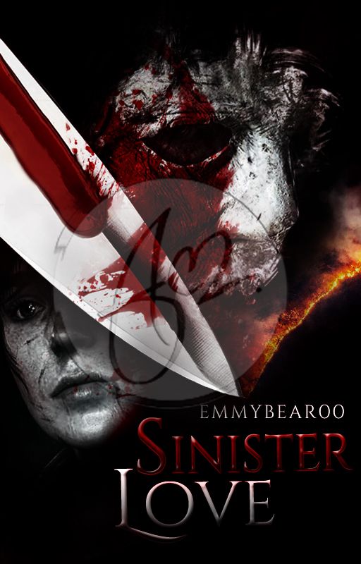
Title: Sinister Love by EmmyBear00
Genre: Fan-Fiction
Graphic Type: Cover
Duration: 4-5 hours (mostly on the scrapped design; within intervals)
Concept: Sammi and Michael torn apart by Michael's homicidal acts; thriller but with a hint of romance; dark and ominous with a hint if a bright color (as specified by the author)
Aesthetics: This was the first time I made a thriller type of cover . Luckily, there was a romantic undertone so I wasn't as nervous. The original concept was to have a white background and have these two appear from splotches of ink . But then, I realized that the instruction was to have a dark color scheme. So with an hour to spare, I made this. I scaled Michael's to be bigger showing that he is this ominous threat to himself and to Sammi. Sammi is seen to have abrasions on her face and a teary-eyed expression, torn between her love for the old Michael and fear for the Michael that she knows now. The rift, which is his homicidal tendencies, is expressed in the image of a knife that he uses to kill his victims. Stained and dripping with blood, a trail of embers follow its blade hinting that their passion might just be her destruction.
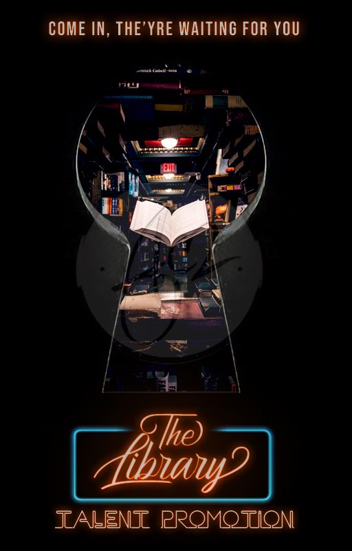
Title: The Library [Talent Promotion]
Genre: Random
Graphic Type: Cover
Duration: 3-5 hours (half for the scrapped design; within intervals)
Concept: A keyhole showing the interior of a secret library
Aesthetics: Initially, I was inspired by "The Lion, the Witch & the Wardrobe" and "The Secret Garden", where there this is magical entry in the woods that leads to a secret library. Needless to say, the product wasn't as what I hoped it would be. In a last-minute attempt, I made it seem like the reader is peeping through a keyhole, trying to discover what the inside is. With the black background I was able to direct the focus on three things: the star image, the tagline and the title. I wanted them to catch everyone's attention, yet I didn't want to settle for a flat white. I remembered that this is like a club, so I thought of another definition for "club" with the neon signs that comes along with it. Without a second thought, I decided on a neon effect on the text. To emphasize "The Library" I made sure to put a neon blue border around it, while the entire text are glowing with a vibrant orange. Again, 3 fonts were used: script, decorative and sans-serif; to establish hierarchy.
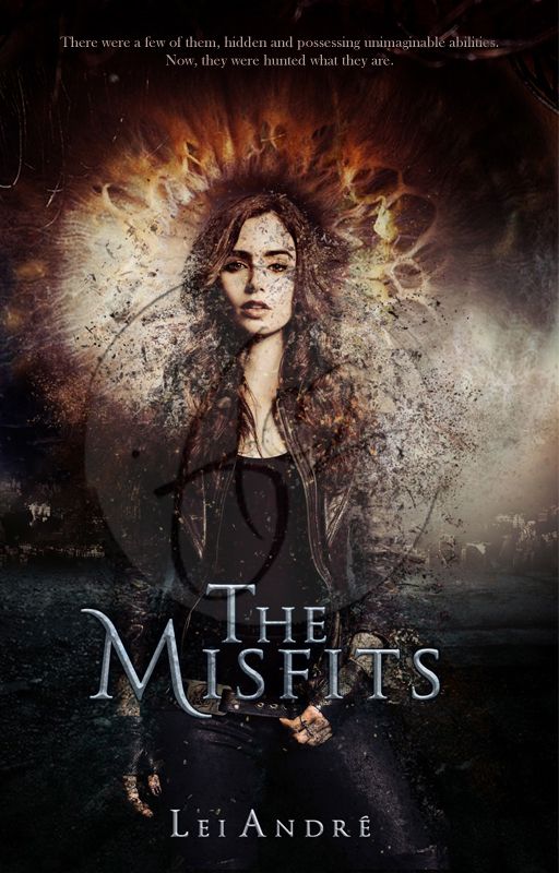
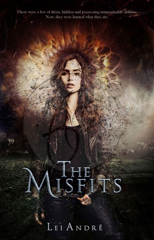
Title: The Misfits by LeiAndre
Genre: YA Sci-Fantasy Romance
Graphic Type: Cover
Duration: 6-8 hours (split between two days; from PC to laptop; within intervals)
Concept: Extinction; one of the main characters dispersing in the air like dust in the middle of a field; an eye that betrays their kind
Aesthetics: This was probably the oldest cover I made in this portfolio - dating back to a year and a half ago. I had zero intention of making this into a cover; I was only experimenting with smoke and dispersion when this happened. I made two options: #1 is a split-complementary scheme while #2 is a tetradic color scheme; mostly because I couldn't decide which one to use. I settled for #1- at the moment. In the story, their kind is being hunted down, and so their numbers are slowly disappearing through time (like dusts in an hourglass). One of the characters is a badass female is highlighted on the cover. The eyes behind her is an enlarged view of her eyes (since each of them has a unique color that eventually betrays what they are). Again, I chose a center-subject composition. The textual navigation is aligned in a straight vertical light. I had to combine two fonts together in order to get the semi-stylized effect of the "T" and "M". In #1, I made sure to divide the composition with the reds and oranges on top and blue at the bottom. In #2, it's more on warm color on top and cool color at the bottom.
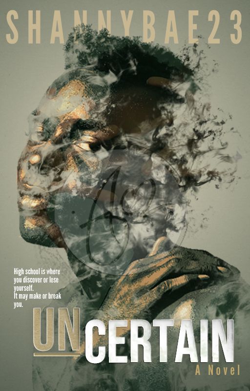
Title: UnCertain by Shannybae23
Genre: Teen Fiction
Graphic Type: Cover
Duration: 4-5 hours (split between two days; within intervals)
Concept: a young man slowly dispersing into smoke
Aesthetics: In the story, got the impression that the main character chose to turn to weed into forgetting the banalities of life and the angst and pain he harbors inside. He puts on this tough facade, yet he is vulnerable on the inside; a part of him screaming to get out. The cover depicts a boy smoking and losing himself in its temporary high, slipping out from the tortures of the physical reality. The colors are more somber and desaturated - except for the marks on his face that resembles a hand trying to escape - using an analogous color scheme. I had to manually add some smoke effects on his face and add a posterized effect on the image to give that nice gritty texture that contrasts with the feathery smoothness of the smoke. Texts are aligned in a Z-form navigation to guide the reader throughout the cover. This time, I only used two fonts in the sand-serif family; but I made sure to set them apart using colors and a paper cut-out effect.
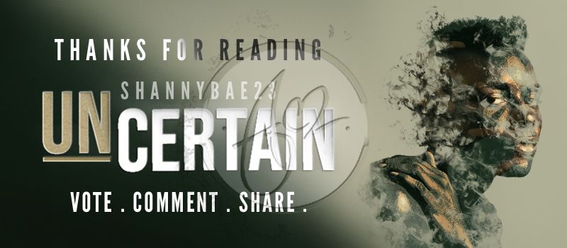
Title: UnCertain by Shannybae23
Genre: Teen Fiction
Graphic Type: Signature
Duration: 1-2 hours (within intervals)
Concept: a somber TV-esque ad
Aesthetics: I wanted to stay true to the cover's design, so I just used the same elements and reconstructed them. The gradient from a dark olive green to a very pale french-gray was all I needed to make sure the title's paper cut-out effect can still stand out. I had to brush on an overlaying layer above the text by hand to have that black-to-white gradient effect for "Thanks for reading". The opacity of the layer for the author's name was slightly lowered down.
╫¤╫ ● ∞ ¤ ∞ ● ╫¤╫
So, there you have it.
If you're still interested in making a graphic request, simply check the || RULES || first before going to the ||FORM||.**
**Note: The form will be uploaded on the same day I officially open the shop. **
Thank you!
╫¤╫ ● ∞ ¤ ∞ ● ╫¤╫
╫¤╫ ● ∞ ¤ ∞ ● ╫¤╫
Copyright © 2020 by Lei André
All Rights Reserved.
Bạn đang đọc truyện trên: AzTruyen.Top