|| FINISHED PROJECTS || - LIBRARY AWARDS (PART II)
Welcome back again, little shoppers!
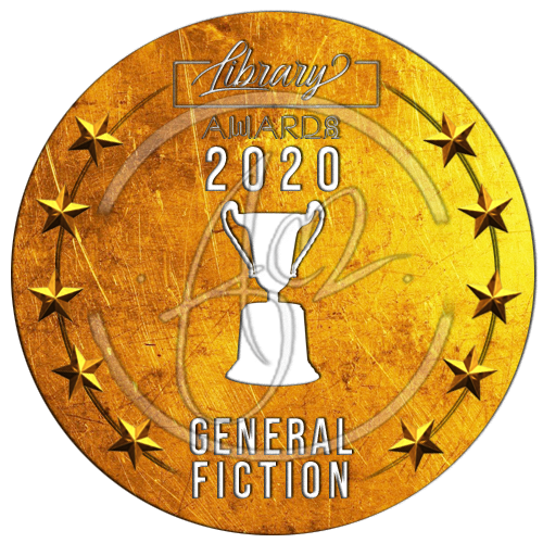
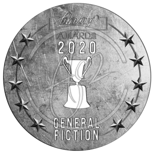
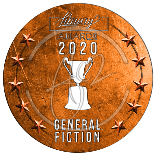
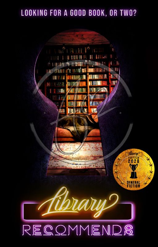
As promised, here is an exclusive of the stickers for the Library Awards winners !
╫¤╫ ● ∞ ¤ ∞ ● ╫¤╫
{ GRAPHIC TYPE: STICKERS}
Tip #5: Never forget to watermark your designs! It's the only thing separating you from - let's say, figuratively - donating blood and having said blood to be used in nefarious means instead.
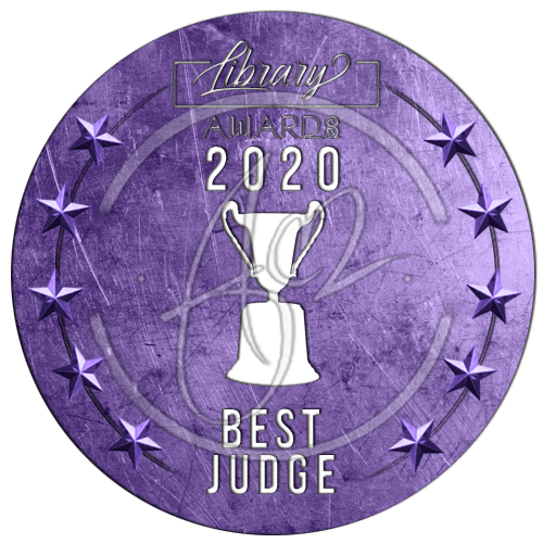
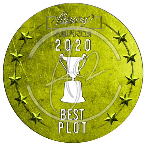
For the overall design of the 1st, 2nd , and 3rd place stickers, I didn't bother to label them as such. Instead, I let the colors do the talking.
Tip #6: Colors have a way of manipulating your perception. Plus, all colors have meanings that they're basically ingrained in our perspectives.
For instance, gold makes you think of a 1st place winner.
Now, at this point, you might be wondering, "What's so special about them?"
Well, aside from the fact that I simply converted the Photoshopped trophy from the cover into a shape, made an even and clear composition with a recognizable icon from scratch; probably nothing much - except...
Ta-Dah!
Before I make my case, note that I am not throwing any shade or tea here. I'm just giving my honest and good-natured observation.
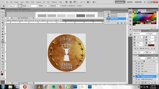
I've noticed that some stickers are set in a JPEG file format. And, even if they are set in a PNG format, there's still a background behind the image.
For me, it was no problem. I had my CS5, so I can simply edit the background out.
But, it doesn't have to be this way.
Tip #6: With stickers, make sure to check that your alpha transparency is on. Alpha transparency is basically one of the best features of PNG file formats, since the background isn't automatically filled with a default white like the ones you get when you save in a JPEG file format.
Of course, I may have elevated this concept a bit more.
Before saving the design in a PNG file format, I incorporated a deep "knockout" effect on the text and icon, ensuring that the positive space in both text and icon would disappear. This also enables the viewer to peek at the image underneath the sticker.
Furthermore, by adding a "drop shadow" effect on the text and icon, the sticker can be adaptable on any color of the book cover and both the contents inside are clear and readable.
╫¤╫ ● ∞ ¤ ∞ ● ╫¤╫
Okay, so now you know, some of the ways my mind and process works.
See you again on the next time I post my next finished project.
Also, give this shop some love and vote!
Thank you, and please come again!
╫¤╫ ● ∞ ¤ ∞ ● ╫¤╫

╫¤╫ ● ∞ ¤ ∞ ● ╫¤╫
Copyright © 2020 by Lei André
All Rights Reserved.
Bạn đang đọc truyện trên: AzTruyen.Top