__; hopeland:details
hopeland:details
:resources:
for hope:land,
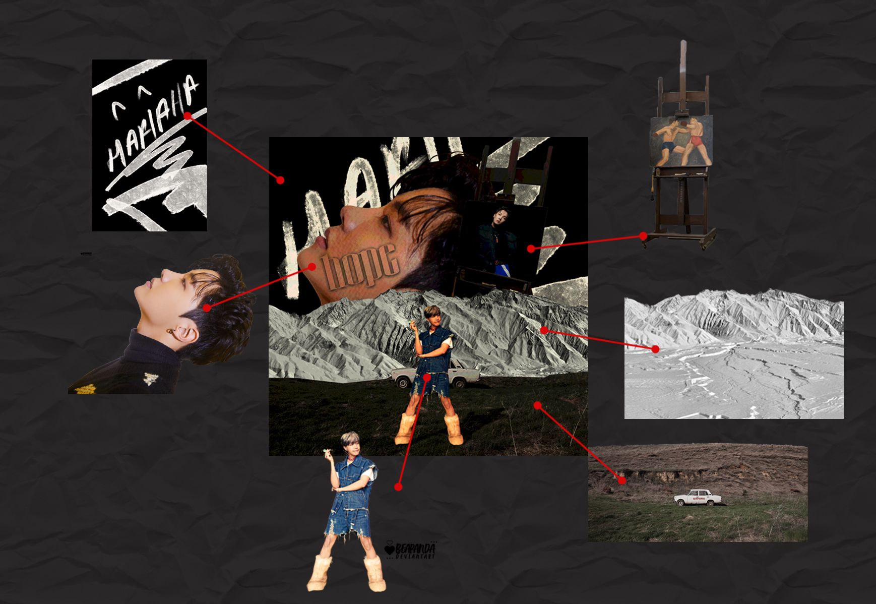
i used 6 materials from different owner.
the land, and the hills as my base, I got it from DevianArt.com through user Lilithdemoness.
for Jhope PNG, I used from Beapanda also in DevianArt. if i'm not wrong, beapanda has been move to new account which is xb3apanda. You can seacrh it on DevianArt.
the paint stand, I also got it from DevianArt on Cataclysmicly account.
and lastly the texture, I got it from Thatporcelain on DevianArt.
let's jump to a layers.
hope:land
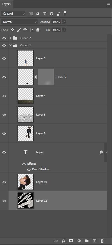
this the layer of hope:land.
[focus on the Layer's name]
as you can see, it's just a simple and not too many materials.
firstly, I opened up Layer 4 and cut it out the outer of the car so the upper of car will left out.

then, i put it as the base or as the land.
Right after that, i opened up Layer 5 and put it over Layer 4.
adjust the position until you set Jhope looks like stand in front of the car. or you may called it beside the car.
to make a shadow of Jhope, i make a copy of Layer 5, and drag the edge and bend it like the shadow lay down on the grass.
change Layer 5 to full black color, than make it gaussian blur. Adjust the opacity of the layer to make it see through.
next, opened up Layer 6 and put it under Layer 4.
adjust the layer until you set it the hills become a scenery view for your artwork.
for Layer 9, opened it and put it under Layer 6 and adjust the size for make it bigger.
to make it the paint replace with Jhope's picture. I used Pen Tools and select the paint, delete the selected one and replace it with Jhope's picture.
Layer 10 is same with Layer 9. Opened it and put it under Layer 9 and adjust it to a position that you like.
Layer 12 will be place the bottom of the layer to make it as a background.
i used font called Quinn and adjust the height of font cause the original font was so long. then i put above Layer 10 and put some shadow and lower the fill to make it see through.
hope:land
i also put some coloring into the artwork to make it more colourful and have a final touch.
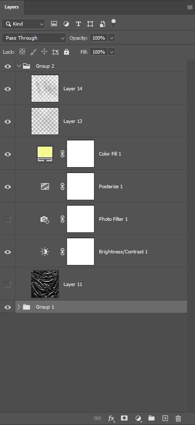
i adjust some brightness/contrast to make it suitable with the vibes that I want.
i also put some posterize texture to make it more vintage, but idk anymore.
i choose a light yellow as color filters for the artwork. that's why it looks like yellowish. HAHAHAHAH
Layer 14 and Layer 15 is the textures that I used from a brush that I've download it a long ago. I'm sorry I can't provide the owner cause I lost all the brush's owner name.
forget about Layer 11 and photo filter cause I just try and error for the final one and turns out it doesn't suit with my taste.
hope:land
that's all for the hopeland:details
hope you understand what I've been type at here.
and feel free to drop any comment here and question on f:aq section!
leonart.com
Bạn đang đọc truyện trên: AzTruyen.Top