#MIK'S GRAPHICON : A FEW ROUNDS WILL PROBABLY HELP ME IMPROVE
23 | LOVE BITES TILL YOU BLEED

ver. one
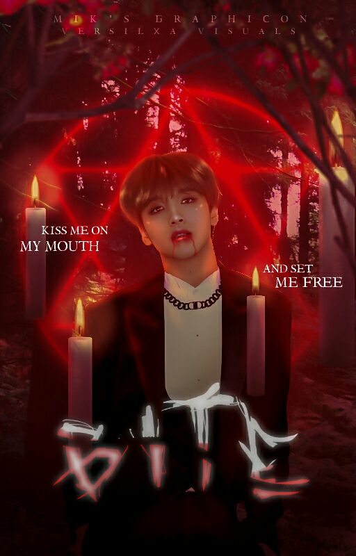
ver. two
okay! wassup guys~~ (so much cringe—) let's get this over with— okay, first up no, the heading of this graphic is NOT pertaining to hickeys. the word bite there serves as a verb.
ALSO this is not yet submitted because im still thinking which one is better!
WHAT DO YOU GUYS THINK I SHOULD SUBMIT? /yes candles or no candles/
now to the graphic! we were instructed to make a cover based on a song of our choice. at first i was browsing through dreamcatcher songs trying to get an inspo but i was left blank (im sorry girls, but you never disappoint me ok?) so instead i go and listened to the lyrics of a song that has been my go to shower song—
BITE by Troye Sivan. the music just gives yoy an unsettling feeling plus the way it's so creppy yet still sounds so sweet, it just hit me. so i present, vampire!haechan !!
let me say, making this was such a guilty pleasure. if you have known me for quite a while, you'd know how I'd love to make these hella creepy manips (you'd find ton of that in my past portfolio "To The Sky" *shameless plug*) so making those bloody drips and smudges on Haechan's lips were just *chef's kiss*
this is getting too long now ;-; i bet none of y'all bother to read through this anyway XD but the story behind the graphic can be summarized as Haechan's a vampire, mark was not and never wants to be one. But their love was strong, however not strong enough to last forever.
36 | I THINK IM GOING PSYCHO, DO YOU STILL LOVE ME?
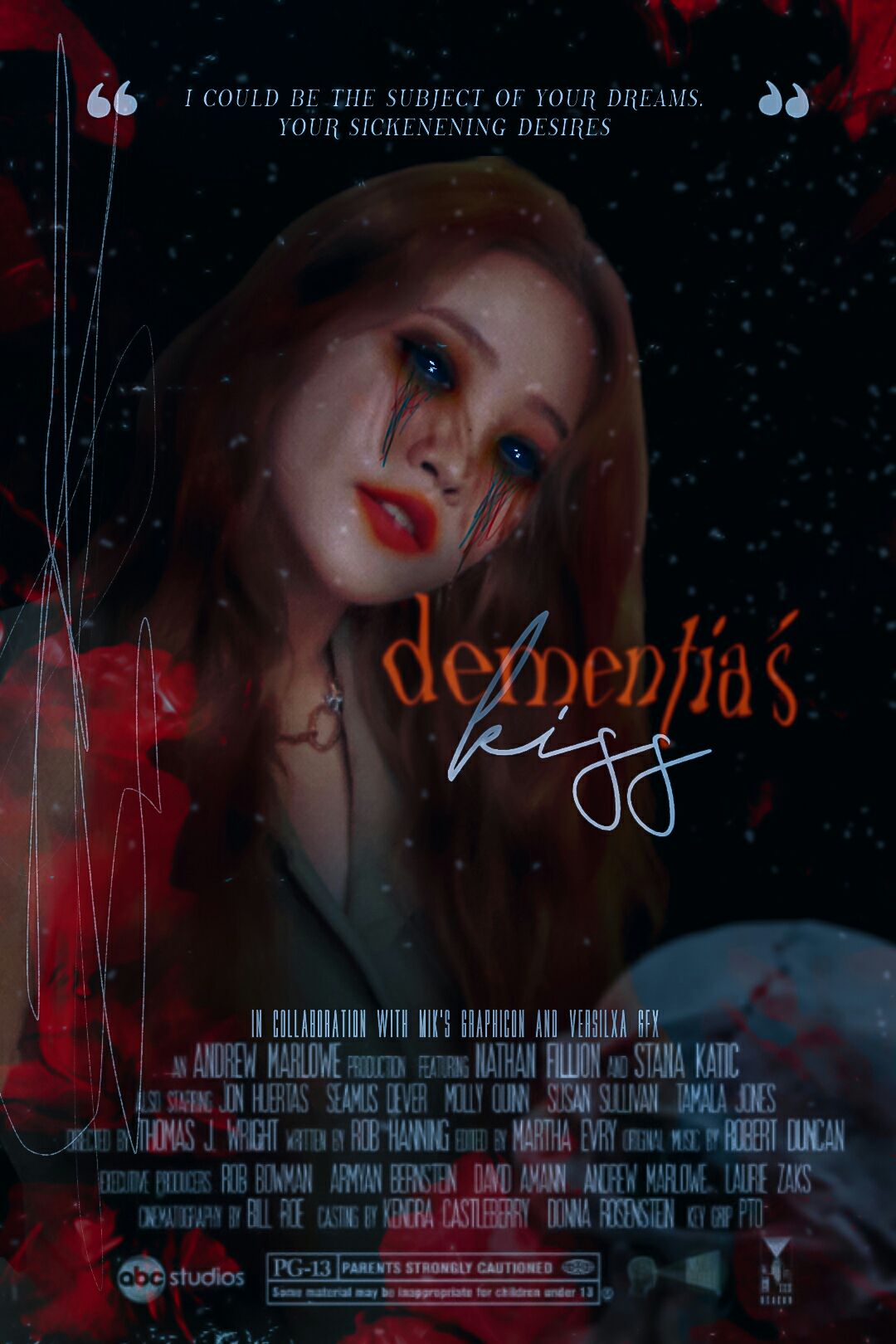
KKKK, IVE DELAYED SUBMITTING THIS FOR TOO LONG NOW, but its almost the deadline and I thik this is the best I could do.
for one, I'm not sure if that is considered a smile? but I think it could be as it is not a completely stoic face either and the corners are up by a bit.
but for starters, the prompt for this round was chosen by picking our chouse of one word from a selection of given :)) and I chose dementia.
I knew when choosing that word that I'd have to make a dark edit since I felt lacking in that area for a while when I used to almost do just those type of edits before (as proved by my past portfolio).
obviously I got the dark part correct, what I wasn't expecting was the style to be a blended movie poster— bECAUSE I CANT MAKE A BLEND FOR THE LIFE OF ME. also the typography for this was a challenge :'))
in the end, I finally got something that I was proud of thanks to an icon edit I found in instagram
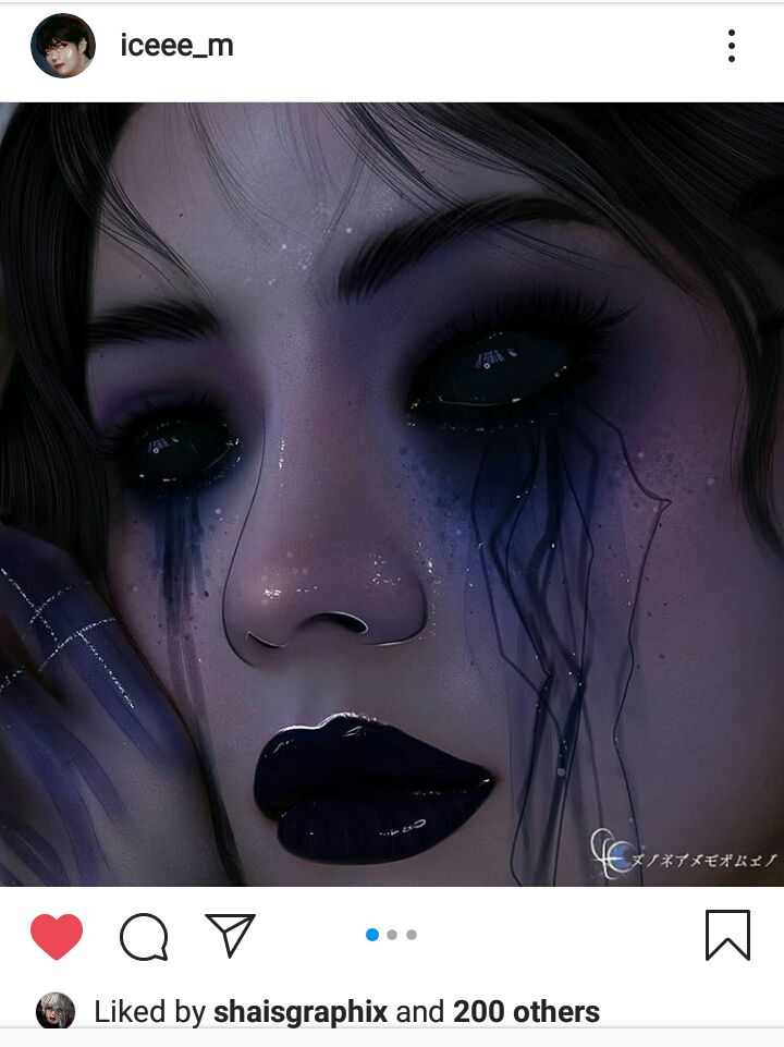
I really wanted to add a knife or blood splatters but I couldn't find the right place to put them so its not present in the graphic :((
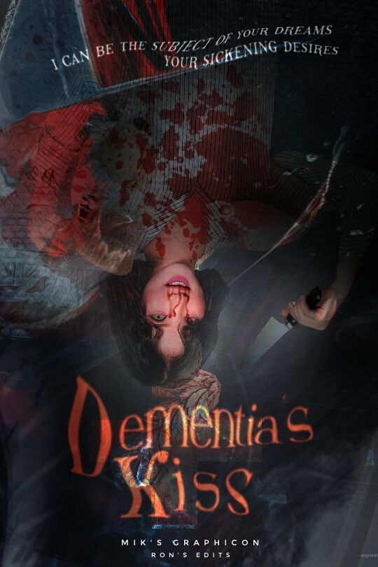
also a weird coincidence was that the quote I used for this graphic is also from the song BITE (aka the song I made a cover for in the previous round, aka the graphic above this)
and here's a confession, that poster wasn't the first one I made (I was highly unsatisfied with the first one) and I couldn't accept it in myself to submit it. the first cover screamed a lot more grotesque and twisted and creepy bUT I couldn't blend it in a dark way so it looks awkward (plus the fact that I had to hide the shoes she was holding as I can't bear drawing that many stripes w/ my poor fingers & it doesn't look like a movie poster)
53 | IN A FIELD OF PURPLE IN PHOTOSHOP
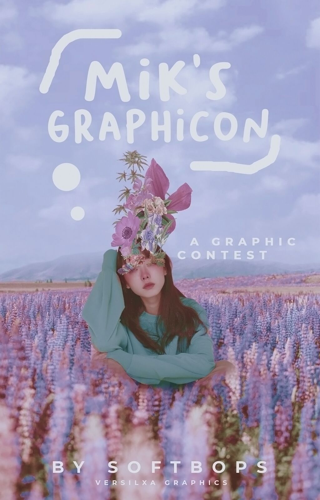
okay wow, this is also my first time seeing this cover on mobile and it looks better than I expected! I am definitely seeing areas I want to fix more but my neck actually hurts and I'm too lazy to spend more time with this graphic of
so this is my entry for the final round of mik's graphicon and we were basically tasked to make a cover for the contest itself. we were given freedom to do what we want to but we have to use pastel colors and me being not able to do pastels well, I decided to go for a pastel schemed manip!
this is actually inspired by lisrenity's Lisa manip and the first weekly task in ARTISTRY FLAIR!
I'm actually really happy with how this turned out (tho as I've pointed out earlier, i still want to fix a few areas there BUT IM TOO LAZY TO DO SO) especially since I'm a noob when it comes to Photoshop and I'm really wonky working with the mouse but it surprisingly turned out not too bad!
i did use a PSD coloring for this one tho I lowered its opacity then added my own adjustments. this is my first time doing that in Photoshop but I guess I got accustomed to adjusting photos on my own in ibispaint and lightroom that that idea didn't seem too daunting after all.
anyway, I also recorded myself editing this and I might actually put it up on YouTube as a speed edit ^•^ I've been wanting to post speed edits for a while now but I never got to do it because, well, my phone storage problem 😅
Bạn đang đọc truyện trên: AzTruyen.Top