ᴄᴏɴᴛᴇꜱᴛ - ᴏʙᴊᴇᴄᴛ ᴛᴏ ᴘᴇʀꜱᴏɴ (ᴏ4/ᴏ4/2ᴏ21 - 11/ᴏ4/2ᴏ21)
Heyho!
Back with another contest here, that I found especially intriguing, since the topic was something I've been wanting to do for ages now!
And that's to make a person out of an object, organised by MicaAppatossis.
Personally I think this is a great challenge in terms of character design and creativity, since it get's you to think in shapes, colours and patterns, that need to be present in the character later on for it to be somewhat recognizeable as the original object.
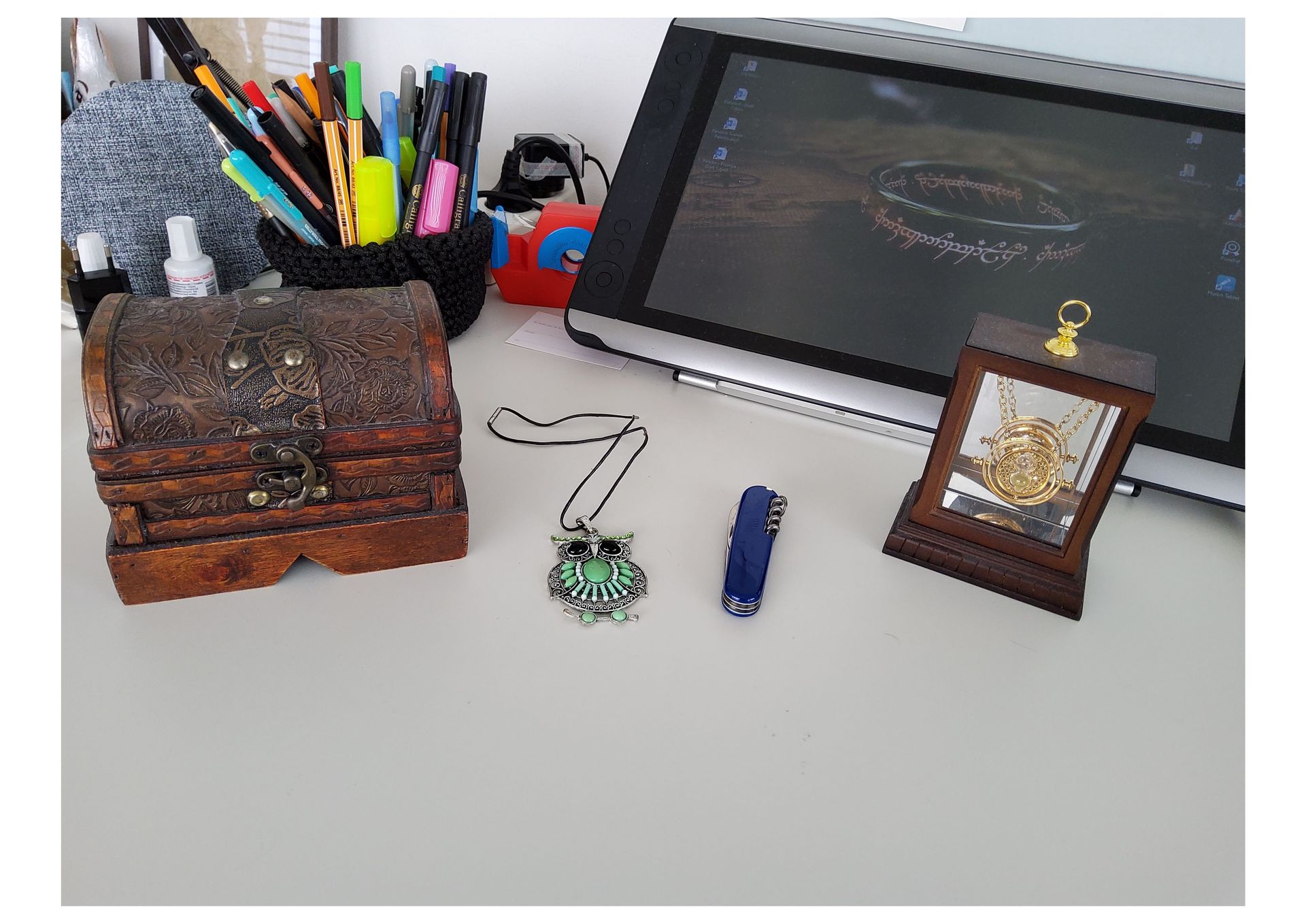
So to start things off I gathered some objects that I thought would be interesting to translate into humanoid figures and settled on these... I probably would've also added some of my lotr-merch, but those are all at boarding school, which is where I am currently not, so... QwQ
So my thoughts on the objects were the following:
The chest had many interesting patterns, and I could totally invision a rich, travelling merchant with a huge backpack and so on. It also has a fairly monochromatic colour scheme, so I could have fun with brown and rather natural tones.
The owl necklace has super pretty colours, and would be great as a priest, with complicated robes that have a lot of necklaces and beads all around.
The multitool would make an awesome jack-of-all-traits warrior, probably a retired military expert who could literally kill you with a snap of his fingers and just endure under any given circumstances. And the colours are just *chefs kiss*
The time turner would have made for a really cool astronomer, scientist or deity, because of the many rings, golden details and celestial patterns.
But in the end I chose the tape dispenser, because I thought it would be fun. Yep, that's the only reason... I had nothing really in mind at the beginning other than "ooh... fun shapes"
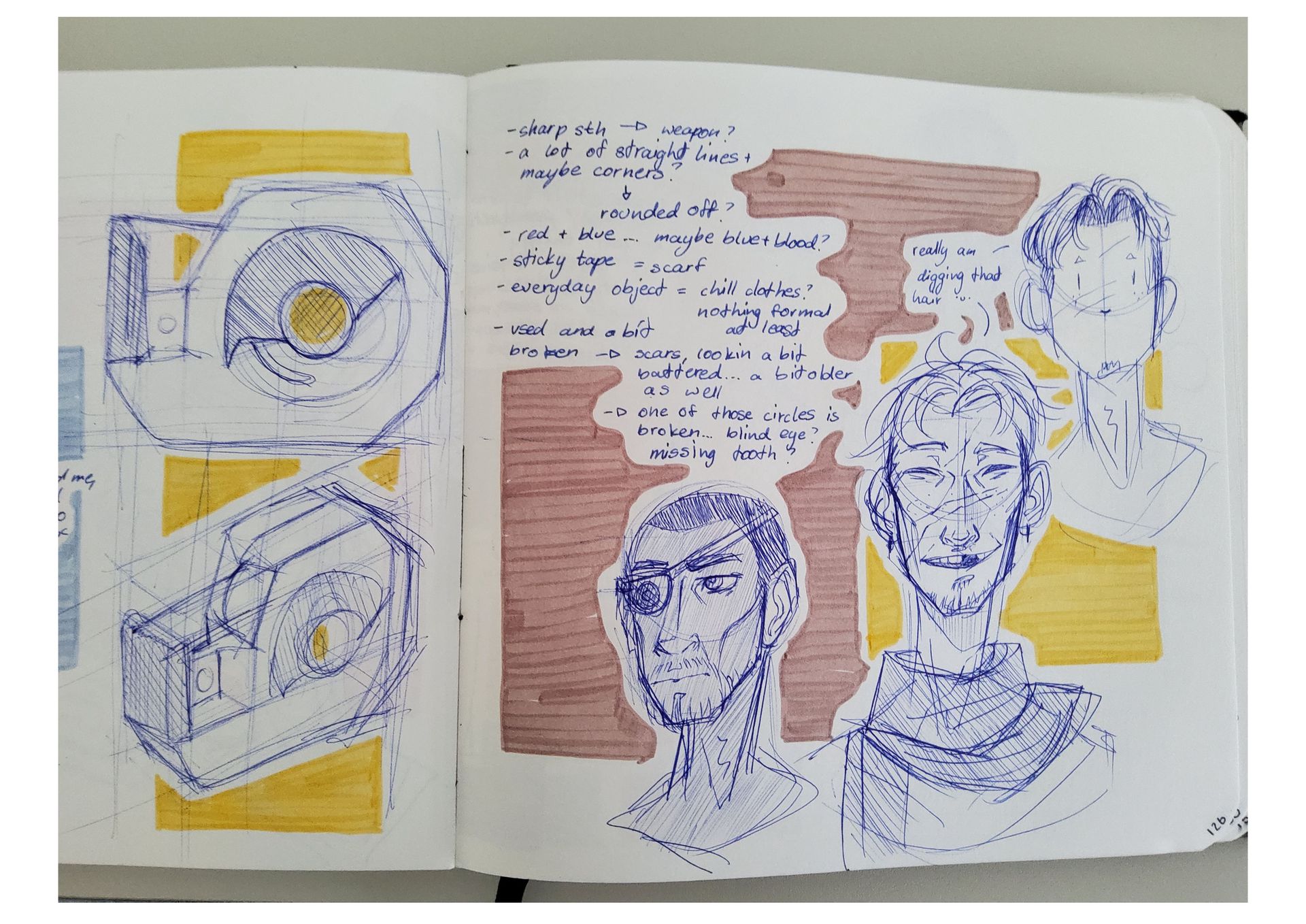
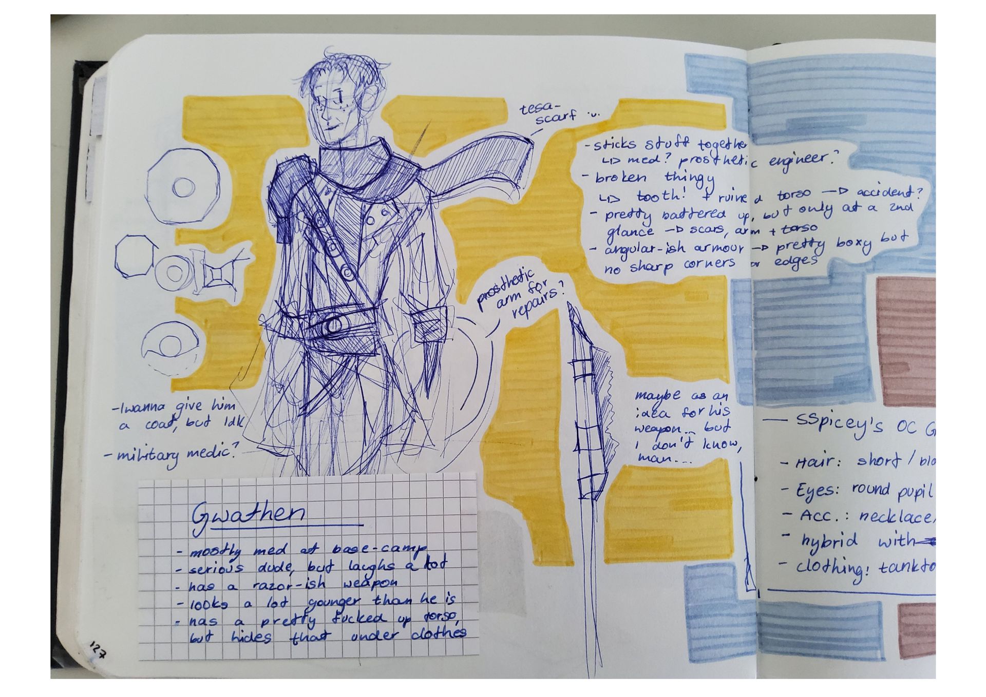
So I sat down and doodles two sketches of the actual object into my sketchbook (dang I got rusty at drawing objects... the lines are so wonky at times aahh), before continuing to jot down some things I realised and drawing a first idea of what the character might look like, and then giving it a second try, with which I did indeed settle ^-^
After that I just built on those ideas and jotted down some more thoughts about his clothing, personality and traits.
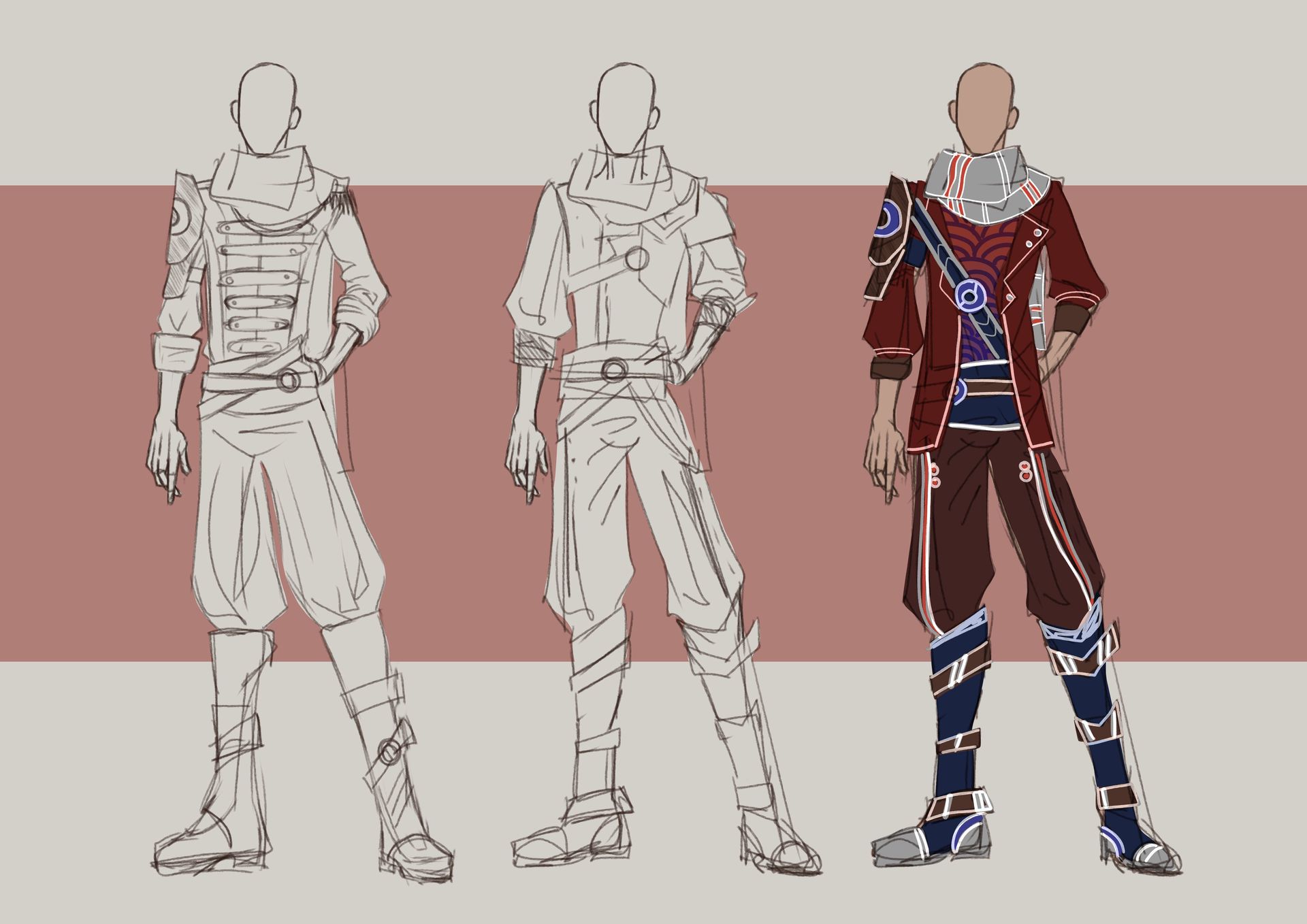
After I did that, I came back the next day and digitalised the outfit, alongside with some other ideas in order to be sure of what I really want.
I did indeed just go with my initial idea, since the one on the left was too formal in my opinion and the shirt of the middle one, didn't quite match the silouette I wanted, since I wanted to work with more blocky forms, focusing on squares and circles, but also paying attention to not adding too many sharp corners, since the sharpness really is only secluded to the weapon.
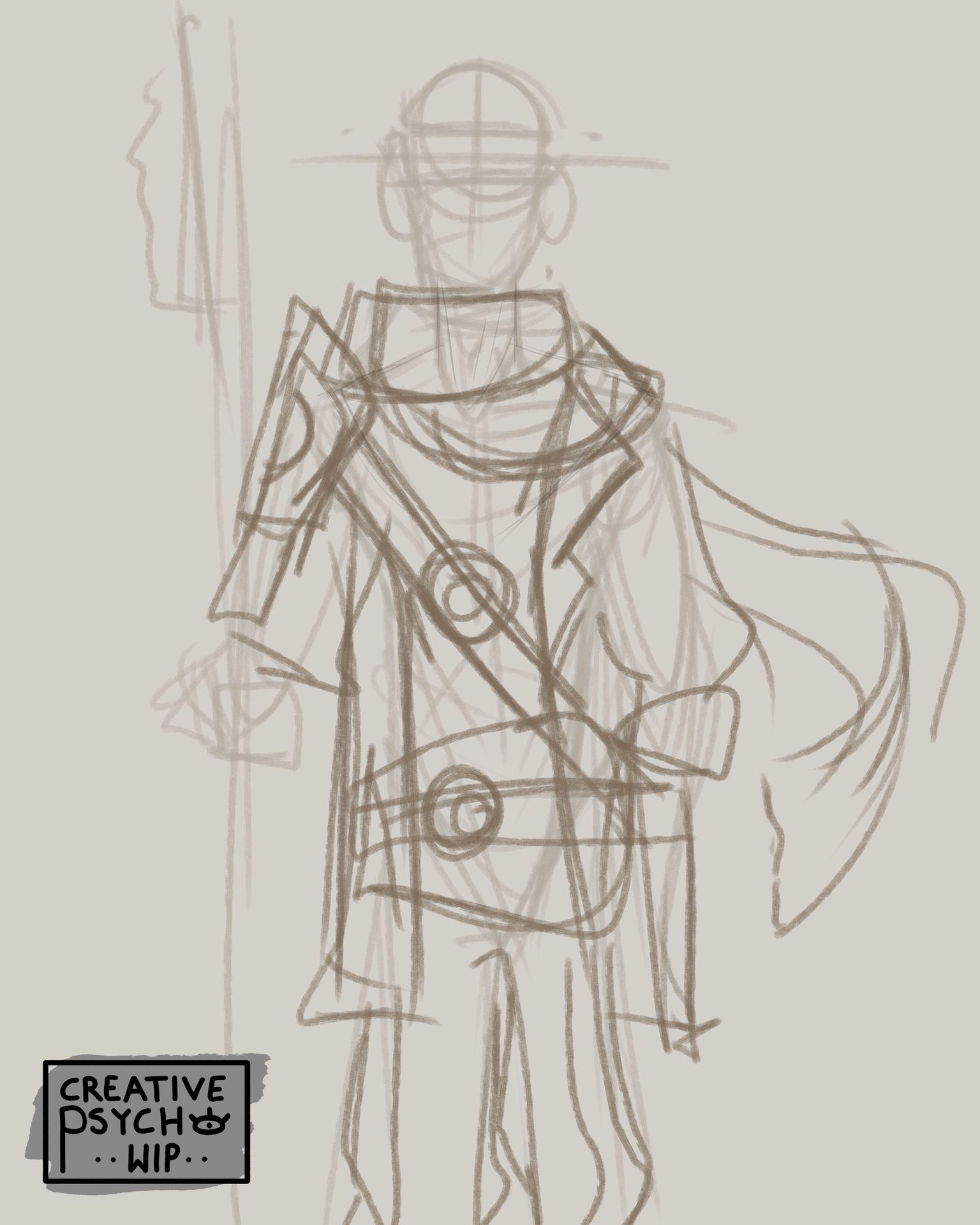
So then I went in to block things out, trying to get the mostly rigid silhouette done, loosening it up with the scarf and using it with the weapon and shoulder plate to break the symmetry.
I also kinda tried to have the general structure of the object carried through the composition, with that blade setting itself apart from the more square formation everything else has, but that was just a subtle thing I wanted to throw in there >w<
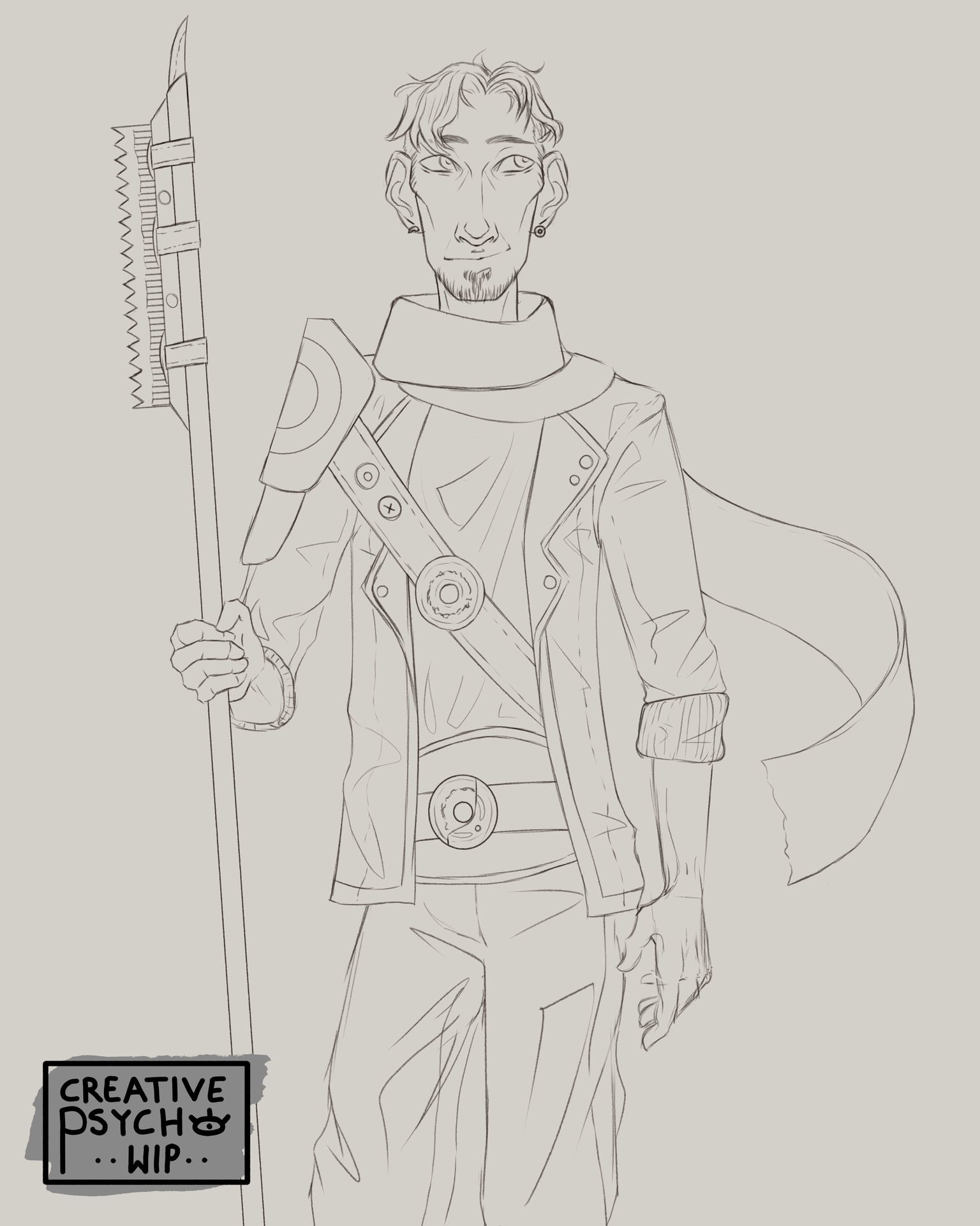
I then carried on with the lineart, trying to stick with the sketch as much as possible, but then later on changing up his legs and hips a bit, to loosen up the pose a bit and make it appear a lot more natural and fluid, since the rigidness and my initial goal with the silhouette contradicted with the readability of the pose. And we don't do trade-offs like that over here.
Something that I realised especially in this piece, is the importance of clarity. Especially in simple standining poses, it is hella important to make it read clear, or the image will lack in attractiveness towards the viewer.
Either way, I made the lineart, struggled at times here and there, but am extremely happy with the result at this point.
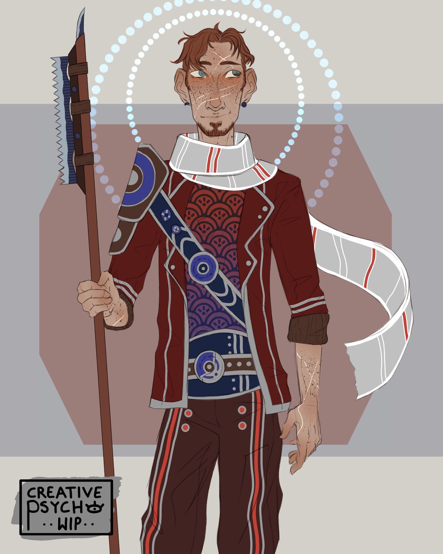
Next up we had the flats. Goal was, like in the original object, I wanted to limit my colours to blue, red and a bit of white/grey for fancyness and to represent the actual tape inside the dispencer.
Red should obviously be the main colour, which is why the hair and skin are both leaning towards the redder spectrum, and nearly all of the clothing consists of different shades of red. The details and accents were all made with blue-hues, since that should be the second largest colour, and only the scard is every purely white/grey. That was just for the flats though, and that colour dynamic did change a bit in colouring, since the extensive highlights did push all the metallic detailsi into the white range of colours >w<"
For the background I went pretty simply, attempting to add the rough shape of the actual object in there, also adding some blue circles behind his head, in order to draw the eye to the main focal point, since the saw-thingy did indeed lead the eye out of the drawing, and we don't want that, since the eye should stay focused on this thing we spent hours on creating.
And then we had the shading. As in my last piece, I went ahead with rather minimal shading efforts, but getting the illusion through details by adding some rather piercing highlights. Overall I am extremely happy with the overall result of the shading process, except for a few things.
In my last pieces, I heavily got into the habit of using overlay-layers and effects on top of the entire drawing, to pull everything together, as well as some texture at times, etc.
Usually this works out pretty well, since it just harmonises everything EXCEPT in this case.
When working on Gwathen I played a lot of importance on the colour, which did indeed get lost to a certain extend through those overlay layers and effects on top, especially my favourite: "combine norma map", which essentially is just a really extrem layer mode, except when you tone it down to less than 10% opacity. It helps neutralise my issues with contrast a bit, and give everything a more coheisive look.
But it clearly was the wrong choice in this drawing, as well as the choice of my usual "global highlight and shading " gradients, that I use to put extra emphasis on the light source.
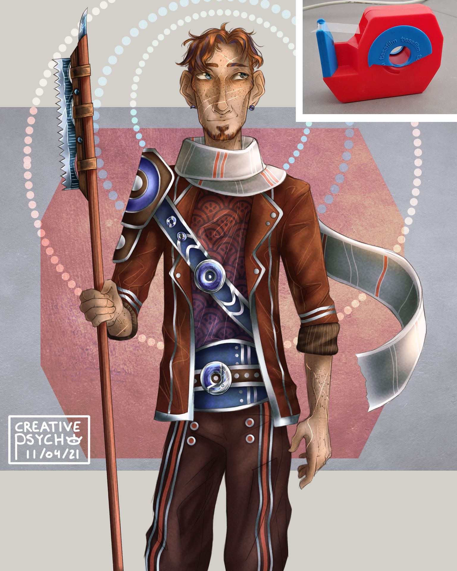
I don't know why, but the yellow-ish tint I got on top of everything because of that just annoys me quite a bit, which is why after finishing the drawing I went back and edited those layers to be a bit more clear and harmonious, especially with view upon the original object.

>>yeets close ups in chapter<<
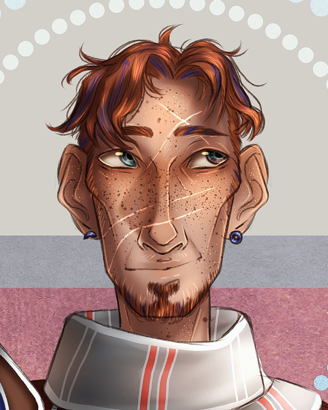
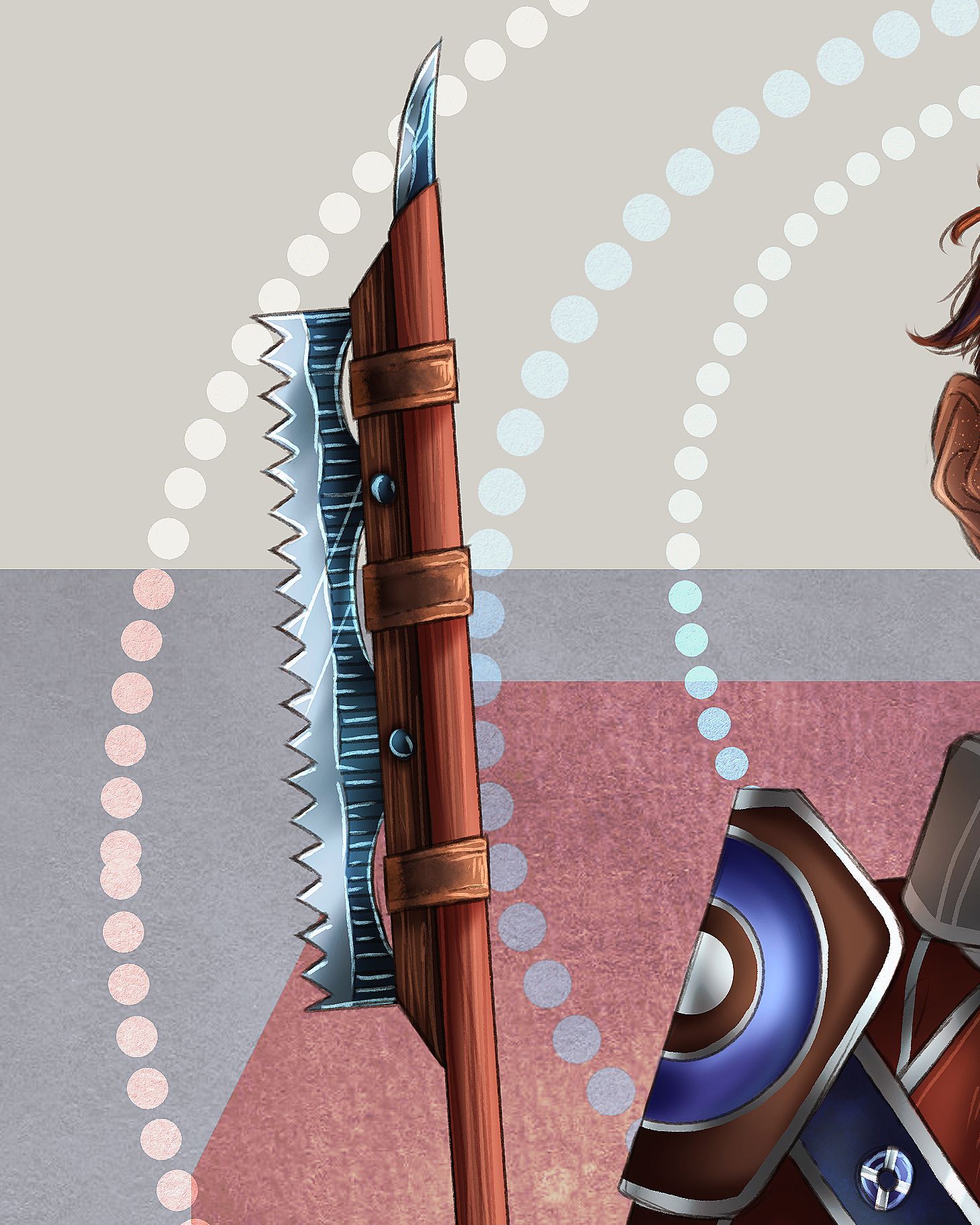
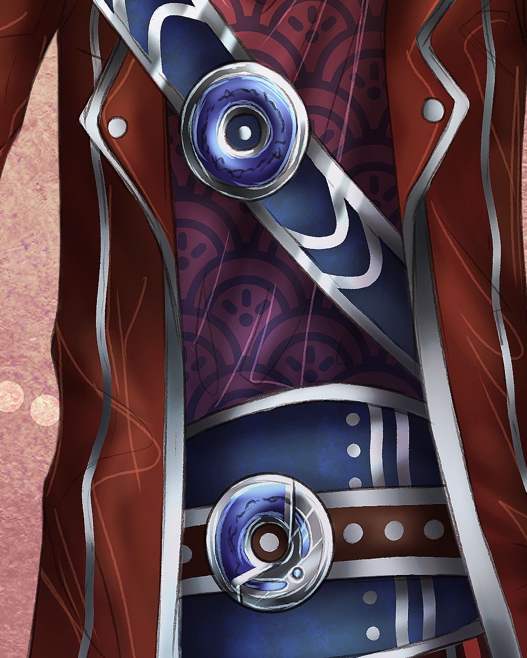
So yeah!
Overall this was a SHITLOAD of fun to do, and I will most certainly try and design the rest of those objects in the image above, since I do indeed like those first concepts I had.
[ this is where the speedpoint should show up, as soon as I uploaded it to youtube, so look out for that and ignore this message until then ^-^" ]
Welp, I hope you enjoyed the image either way and the process that I put behind that. I currently am trying to improve more on my art and improving on my weaknesses, so that's something to maybe look forward to ^-^
>>cuddles you and gives you blankets, tea and cookies<<
(LinaewenFinduilas vote-through my artbooks process whilslt i finished the chapter: Leaves - "oc - ruthrion")
Bạn đang đọc truyện trên: AzTruyen.Top